Navigation
Install the app
How to install the app on iOS
Follow along with the video below to see how to install our site as a web app on your home screen.
Note: This feature may not be available in some browsers.
More options
Style variation

-

Rd 13 Reviews + Club Forums »
ADE v GEE · HAW v WB · NM v FRE · GCS v BL · WCE v PA · SYD v StK · ESS v CAR · COL v MEL ·
Weekend Wrap and "Liked, Learned, Hated" right here -- How did tipping go?
-
Witness 32 nations clash in your Graphic Design boards biggest competition yet: The 2026 FJGD World Cup!

You are using an out of date browser. It may not display this or other websites correctly.
You should upgrade or use an alternative browser.
You should upgrade or use an alternative browser.
Discussion Logo Discussion Thread
- Thread starter akkaps
- Start date
- Tagged users None
🥰 Love BigFooty? Join now for free.

RedmanWasHere
Rarely in kitchens at parties.
- Joined
- Aug 23, 2010
- Posts
- 31,144
- Reaction score
- 38,554
- Location
- Information Superhighway
- AFL Club
- Essendon
- Other Teams
- Exers, Gryffindor, Rich+Ess AFLW, Tassie


Andonis1997
Sporting masochist
- Joined
- Jun 24, 2011
- Posts
- 26,689
- Reaction score
- 17,370
- Location
- Adelaide
- AFL Club
- Carlton
- Other Teams
- ΠΓΣΣ LFC Sturt Steelers Nix
Just realised that Cardiff City's old logo had Liverpool's ribbon incorporated in it.
Also balls are covering the eternal flames
You can even see the outline of the shield in their logo!


Also balls are covering the eternal flames
You can even see the outline of the shield in their logo!
Dylan8
Bar Up
- Joined
- Apr 7, 2013
- Posts
- 42,113
- Reaction score
- 85,175
- Location
- Burn City
- AFL Club
- Port Adelaide
- Other Teams
- Liverpool FC
Nice find.. shame Cardiff's heritage was completely destroyed by the foreign owners.
I love Liverpool's logo, there's so much too it but it pulls it off without being overcrowded - the bird, the torches and the gate.
I love Liverpool's logo, there's so much too it but it pulls it off without being overcrowded - the bird, the torches and the gate.
Log in to remove this Banner Ad
Andonis1997
Sporting masochist
- Joined
- Jun 24, 2011
- Posts
- 26,689
- Reaction score
- 17,370
- Location
- Adelaide
- AFL Club
- Carlton
- Other Teams
- ΠΓΣΣ LFC Sturt Steelers Nix
Malaysian owner isn't he?Nice find.. shame Cardiff's heritage was completely destroyed by the foreign owners.
I love Liverpool's logo, there's so much too it but it pulls it off without being overcrowded - the bird, the torches and the gate.
Yeah, I agree. You'd think with all the things incorporated that it'd look more crowded than it is.
I'm glad we modernised the logo, this is the definition of overcrowding IMO.

Well, ^^this, or this:

lmach
Naitanui2Yeo
- Joined
- Mar 13, 2010
- Posts
- 21,594
- Reaction score
- 32,560
- Location
- QLD via Perth
- AFL Club
- West Coast
- Other Teams
- Liverpool
It was always going to be updated haha. It's outdated even for the 90s. The 70s crest is a beauty:I'm glad we modernised the logo, this is the definition of overcrowding IMO.

Dylan8
Bar Up
- Joined
- Apr 7, 2013
- Posts
- 42,113
- Reaction score
- 85,175
- Location
- Burn City
- AFL Club
- Port Adelaide
- Other Teams
- Liverpool FC
Gross, worst in the league.Well, ^^this, or this:
I never even knew that shitty Liverpool logo existed, thought you were having a laugh. Looks like it was made in Paint.
- Joined
- Apr 23, 2012
- Posts
- 7,483
- Reaction score
- 5,428
- Location
- The Riff
- AFL Club
- GWS
- Other Teams
- Sydney Swans, St Kilda Saints
Heh heh heh. Nothing more needs to be saidAlso balls are covering the eternal flames
Andonis1997
Sporting masochist
- Joined
- Jun 24, 2011
- Posts
- 26,689
- Reaction score
- 17,370
- Location
- Adelaide
- AFL Club
- Carlton
- Other Teams
- ΠΓΣΣ LFC Sturt Steelers Nix
Always loved this one.It was always going to be updated haha. It's outdated even for the 90s. The 70s crest is a beauty:
- Joined
- Nov 15, 2010
- Posts
- 2,452
- Reaction score
- 2,193
- Location
- Western Australia
- AFL Club
- Fremantle
- Other Teams
- WACA, Western Force, Arsenal, Glory
The 70s crest is a beauty:
Still reckon they should use something like this one. The only problem I have with it is that "LIVER" and "POOL" are two separate words on it.
cannavo
Kabigon Resonator
- Joined
- Aug 4, 2012
- Posts
- 4,788
- Reaction score
- 8,017
- Location
- South Nunya, Nunya Bizmate
- AFL Club
- Collingwood
- Other Teams
- Yes
- Staff
- #161
Malaysian soccer team
Johor Darul Takzim F.C

Johor Darul Takzim F.C
Stromageddon
Hour of Pessimism
- Joined
- Jul 27, 2012
- Posts
- 16,084
- Reaction score
- 28,477
- AFL Club
- Port Adelaide
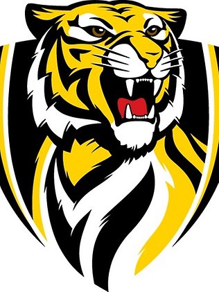
Can't believe they'd just rip off the Tiger lager logo like that.Malaysian soccer team
Johor Darul Takzim F.C
Feraligatr
Werribee Tigers 2024 VFL Premiers 🐅
- Joined
- Jul 19, 2010
- Posts
- 8,746
- Reaction score
- 12,869
- Location
- Melbourne
- AFL Club
- Richmond
- Other Teams
- Anahiem Ducks, Wolves, Raptors & Twolves
Was going to say, that logo looked very familar. I just couldn't put my finger on where I had seen it before.Can't believe they'd just rip off the Tiger lager logo like that.

In all seriousness, can they actually use that tiger?
Stromageddon
Hour of Pessimism
- Joined
- Jul 27, 2012
- Posts
- 16,084
- Reaction score
- 28,477
- AFL Club
- Port Adelaide
It's squashed, so maybe? Malaysian law probably doesn't care
RedmanWasHere
Rarely in kitchens at parties.
- Joined
- Aug 23, 2010
- Posts
- 31,144
- Reaction score
- 38,554
- Location
- Information Superhighway
- AFL Club
- Essendon
- Other Teams
- Exers, Gryffindor, Rich+Ess AFLW, Tassie
Malaysian soccer team
Johor Darul Takzim F.C
Is that legitimate or photoshopped?
Poor effort if the former.
Too Richmond like with the logo and too Coburg like with the colours.
Stromageddon
Hour of Pessimism
- Joined
- Jul 27, 2012
- Posts
- 16,084
- Reaction score
- 28,477
- AFL Club
- Port Adelaide
Is that legitimate or photoshopped?
Poor effort if the former.
Too Richmond like with the logo and too Coburg like with the colours.
It's legit.
Mero
Brownlow Medallist
- Joined
- Jul 9, 2003
- Posts
- 10,122
- Reaction score
- 14,255
- Location
- Vancouver, Canada
- AFL Club
- Essendon
- Other Teams
- I played Ammos in the 80s
Tiger Lager?Can't believe they'd just rip off the Tiger lager logo like that.
was this

Stromageddon
Hour of Pessimism
- Joined
- Jul 27, 2012
- Posts
- 16,084
- Reaction score
- 28,477
- AFL Club
- Port Adelaide

Mero
Brownlow Medallist
- Joined
- Jul 9, 2003
- Posts
- 10,122
- Reaction score
- 14,255
- Location
- Vancouver, Canada
- AFL Club
- Essendon
- Other Teams
- I played Ammos in the 80s
Maybe, but that soccer logo is squashed version of the Richmond logo.
🥰 Love BigFooty? Join now for free.
- Joined
- Nov 13, 2006
- Posts
- 4,329
- Reaction score
- 3,198
- AFL Club
- Collingwood
- Other Teams
- Boston Celtics
it is literally squashed versionMaybe, but that soccer logo is squashed version of the Richmond logo.

Feraligatr
Werribee Tigers 2024 VFL Premiers 🐅
- Joined
- Jul 19, 2010
- Posts
- 8,746
- Reaction score
- 12,869
- Location
- Melbourne
- AFL Club
- Richmond
- Other Teams
- Anahiem Ducks, Wolves, Raptors & Twolves
Their original logo was a lot better than Squashed Richmond.
Geeky Grub
Team Captain
Noticed this one today. Subtle update.
Old:

New:

Old:
New:
Craegus
One and Only
- Joined
- Aug 8, 2008
- Posts
- 7,999
- Reaction score
- 8,727
- Location
- Campbelltown
- AFL Club
- Sydney
- Other Teams
- Macarthur FC
Noticed this one today. Subtle update.
Old:
New:
And yet a downgrade.
Stromageddon
Hour of Pessimism
- Joined
- Jul 27, 2012
- Posts
- 16,084
- Reaction score
- 28,477
- AFL Club
- Port Adelaide
For a bank, that's shit.
