Navigation
Install the app
How to install the app on iOS
Follow along with the video below to see how to install our site as a web app on your home screen.
Note: This feature may not be available in some browsers.
More options
Style variation

-
Witness 32 nations clash in your Graphic Design boards biggest competition yet: The 2026 FJGD World Cup!


You are using an out of date browser. It may not display this or other websites correctly.
You should upgrade or use an alternative browser.
You should upgrade or use an alternative browser.
Discussion Logo Discussion Thread
- Thread starter akkaps
- Start date
- Tagged users None
🥰 Love BigFooty? Join now for free.

RedmanWasHere
Rarely in kitchens at parties.
- Joined
- Aug 23, 2010
- Posts
- 31,138
- Reaction score
- 38,545
- Location
- Information Superhighway
- AFL Club
- Essendon
- Other Teams
- Exers, Gryffindor, Rich+Ess AFLW, Tassie
That's horrible.
Reminds me of some old shopping centre interiors.
Strauchanside
Team Captain
Ugh. That SkyCity is H O R R I B L E
Mero
Brownlow Medallist
- Joined
- Jul 9, 2003
- Posts
- 10,122
- Reaction score
- 14,255
- Location
- Vancouver, Canada
- AFL Club
- Essendon
- Other Teams
- I played Ammos in the 80s
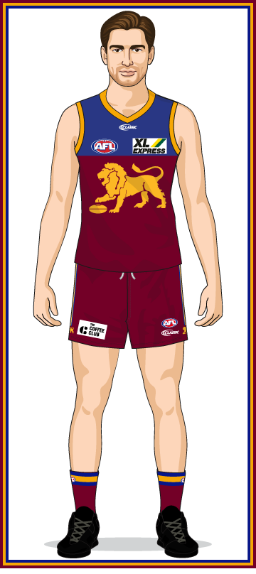
Is on Brisbane's shorts this season
Log in to remove this Banner Ad
- Joined
- Mar 30, 2014
- Posts
- 3,102
- Reaction score
- 5,316
- AFL Club
- Brisbane Lions

- Other Teams
- Dolphins, Seattle Kraken
Bleh, lots of bad logos on the new kit 
Andonis1997
Sporting masochist
- Joined
- Jun 24, 2011
- Posts
- 26,689
- Reaction score
- 17,370
- Location
- Adelaide
- AFL Club
- Carlton
- Other Teams
- ΠΓΣΣ LFC Sturt Steelers Nix
The thing is, TCC have had their logo integrated on sport designs before. Why wouldn't they do it again? Maybe it's new branding, but to be quite honest it's not "new" new. I've seen the logo in Adelaide's Westfield Marion for months.Bleh, lots of bad logos on the new kit
.jpeg")
- Joined
- Mar 30, 2014
- Posts
- 3,102
- Reaction score
- 5,316
- AFL Club
- Brisbane Lions
- Other Teams
- Dolphins, Seattle Kraken
It's not that the logo is integrated, it's that the new logo is bland and not well thought out. To be fair their old logo was nothing fantastic either.The thing is, TCC have had their logo integrated on sport designs before. Why wouldn't they do it again? Maybe it's new branding, but to be quite honest it's not "new" new. I've seen the logo in Adelaide's Westfield Marion for months.
View attachment 886559
- Joined
- Oct 5, 2017
- Posts
- 1,470
- Reaction score
- 1,281
- AFL Club
- Sydney
- Other Teams
- Port Melbourne, Norwood, St George
FOX Broadcasting's new logo, take it away I never want to see it again 

TheLoungeLizard
The world's most handsome man
- Joined
- Oct 21, 2010
- Posts
- 13,599
- Reaction score
- 19,076
- Location
- England
- AFL Club
- Richmond
- Other Teams
- Newcastle United, New York Yankees
Ooft
- Joined
- Mar 30, 2014
- Posts
- 3,102
- Reaction score
- 5,316
- AFL Club
- Brisbane Lions
- Other Teams
- Dolphins, Seattle Kraken
- Joined
- Oct 27, 2016
- Posts
- 6,135
- Reaction score
- 11,298
- AFL Club
- Collingwood
- Other Teams
- Packers, Raptors, Renegades
So we have transitioned to the point where logos are no longer minimalist or just simplistic, but are instead abstract and devoid of character. God help us all.
fancyscum
Radical Crommunist
Reads as Vox to me rather than Fox. Don't mind the ultra minimalist style of the characters, but if it can't be read correctly, it has failed as a logo.
- Joined
- Jan 3, 2017
- Posts
- 5,300
- Reaction score
- 7,414
- AFL Club
- Collingwood
- Other Teams
- Celtics, Packers
POXReads as Vox to me rather than Fox. Don't mind the ultra minimalist style of the characters, but if it can't be read correctly, it has failed as a logo.
- Joined
- Oct 23, 2018
- Posts
- 7,447
- Reaction score
- 6,913
- Location
- Victoria
- AFL Club
- Gold Coast
- Other Teams
- Storm, Western Utd
Sydney have been using this lately- I wonder if it a sign of things to come?

Andonis1997
Sporting masochist
- Joined
- Jun 24, 2011
- Posts
- 26,689
- Reaction score
- 17,370
- Location
- Adelaide
- AFL Club
- Carlton
- Other Teams
- ΠΓΣΣ LFC Sturt Steelers Nix
It's not celebrating a milestone or anything. I don't know, seems like there's nothing in that apart from pleasing the old supporters.Sydney have been using this lately- I wonder if it a sign of things to come?
View attachment 891382
- Joined
- May 7, 2019
- Posts
- 3,043
- Reaction score
- 1,637
- AFL Club
- Essendon
Seems like a members logo to me. No difference to the current one, apart from the "Bloods" tag line and the year. Swans may need a logo refresh but i would think you would need a whole different design similar to how the tigers almost completely had a rethink.It's not celebrating a milestone or anything. I don't know, seems like there's nothing in that apart from pleasing the old supporters.
RedmanWasHere
Rarely in kitchens at parties.
- Joined
- Aug 23, 2010
- Posts
- 31,138
- Reaction score
- 38,545
- Location
- Information Superhighway
- AFL Club
- Essendon
- Other Teams
- Exers, Gryffindor, Rich+Ess AFLW, Tassie
Then.

Before.

After/now/current.

Before.
After/now/current.
RedmanWasHere
Rarely in kitchens at parties.
- Joined
- Aug 23, 2010
- Posts
- 31,138
- Reaction score
- 38,545
- Location
- Information Superhighway
- AFL Club
- Essendon
- Other Teams
- Exers, Gryffindor, Rich+Ess AFLW, Tassie
A long serving logo has died.
Before.

After.

Before.
After.
🥰 Love BigFooty? Join now for free.
- Joined
- Jan 3, 2017
- Posts
- 5,300
- Reaction score
- 7,414
- AFL Club
- Collingwood
- Other Teams
- Celtics, Packers
Boycott.
bomberclifford
Importer/Exporter
- Joined
- Sep 2, 2005
- Posts
- 44,044
- Reaction score
- 141,032
- Location
- Cerebral Cortex
- AFL Club
- Port Adelaide
- Other Teams
- Port Adelaide Magpies
This was done a few years ago now.
RedmanWasHere
Rarely in kitchens at parties.
- Joined
- Aug 23, 2010
- Posts
- 31,138
- Reaction score
- 38,545
- Location
- Information Superhighway
- AFL Club
- Essendon
- Other Teams
- Exers, Gryffindor, Rich+Ess AFLW, Tassie
This was done a few years ago now.
It's only hit my conscious in the past week.
bomberclifford
Importer/Exporter
- Joined
- Sep 2, 2005
- Posts
- 44,044
- Reaction score
- 141,032
- Location
- Cerebral Cortex
- AFL Club
- Port Adelaide
- Other Teams
- Port Adelaide Magpies
It's only hit my conscious in the past week.
It's an odd change. Previous one was very distinct and recognisable from years of use. New one feels very generic.
RedmanWasHere
Rarely in kitchens at parties.
- Joined
- Aug 23, 2010
- Posts
- 31,138
- Reaction score
- 38,545
- Location
- Information Superhighway
- AFL Club
- Essendon
- Other Teams
- Exers, Gryffindor, Rich+Ess AFLW, Tassie
Next one.

RedmanWasHere
Rarely in kitchens at parties.
- Joined
- Aug 23, 2010
- Posts
- 31,138
- Reaction score
- 38,545
- Location
- Information Superhighway
- AFL Club
- Essendon
- Other Teams
- Exers, Gryffindor, Rich+Ess AFLW, Tassie
French news company Agence France-Presse, the French equivalent of AAP, has a new logo.


