- Joined
- May 9, 2011
- Posts
- 967
- Reaction score
- 2,568
- Location
- VIC
- AFL Club
- St Kilda
- Other Teams
- San Francisco Giants


 More Toblerone pics
Follow along with the video below to see how to install our site as a web app on your home screen.
Note: This feature may not be available in some browsers.

 BigFooty Tipping Notice Img
Weekly Prize - Join Any Time - Tip Round 13
The Golden Ticket - Corporate tickets, functions, Open Air Boxes at the Adelaide Oval, ENGIE, Gabba, MCG, Marvel, Optus & People First Stadiums. Corporate Suites at the Gabba, MCG and Marvel.
More Toblerone pics


Log in to remove this Banner Ad


vomit
Would have looked better with the gap at the top and the crown in the gap. Also should have stayed the darker green
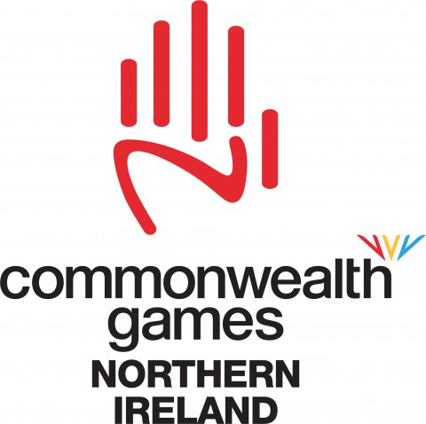
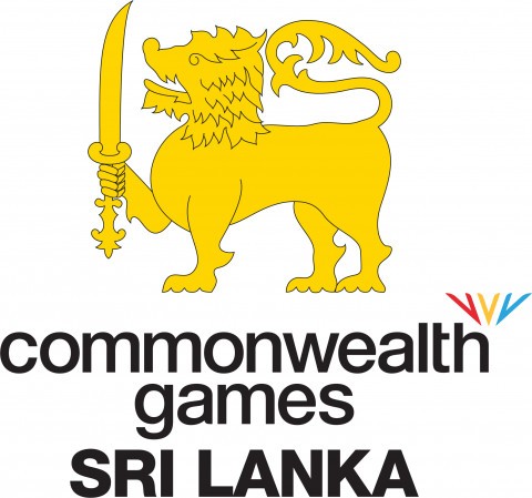
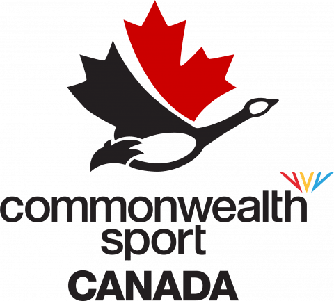
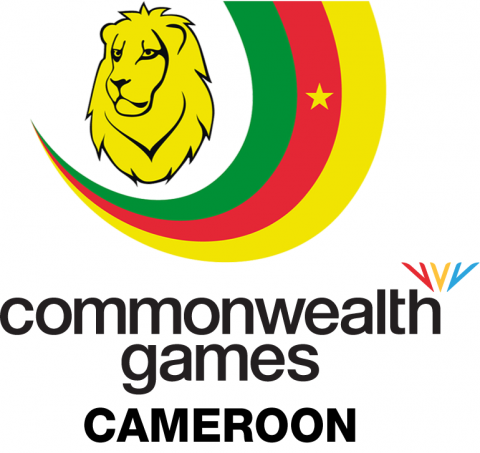
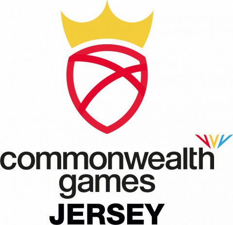
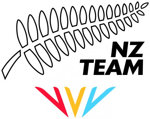
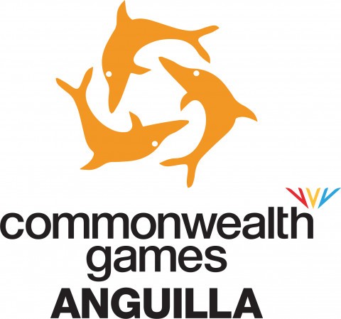
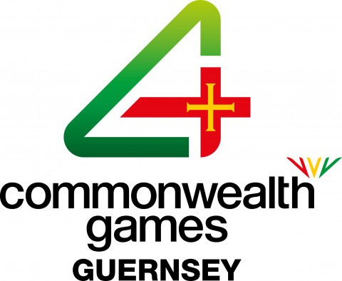
Ahead of the Commonwealth Games next week, here are some of the updates NCWF logos featuring the new CGF logo
boyohboywowee thats bad
I genuinely like it. It has that whole acid house funkyzeit 70s retro vibe that a lot of clubs used to have (Leeds and Newcastle seen below). Sure, it wouldn’t look right for a new AFL side, but for Bruges I think it’s a fresh take on the boring clipart one before.


New
Old


That was the aim. BUGATTI UNVEILS NEW CORPORATE IDENTITYBetter add Bugatti to this ever growing thread.
----------->
Looks like a street sign now.