Welcome to 'Logo Europeanisation Competition' #13
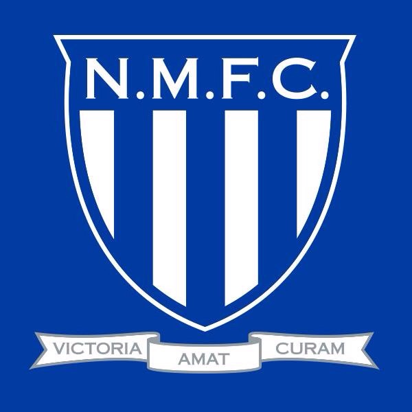
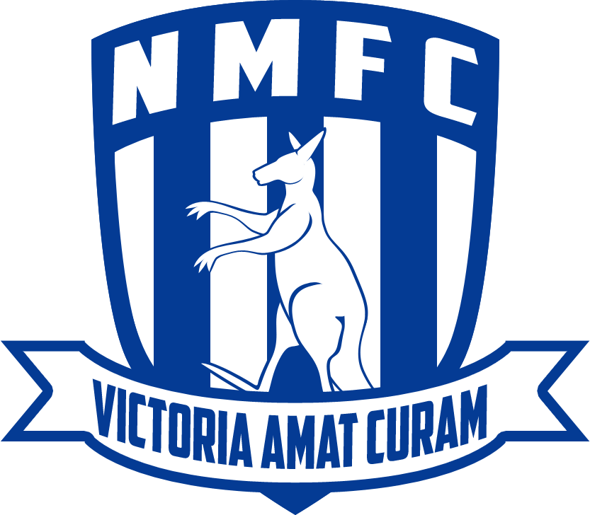
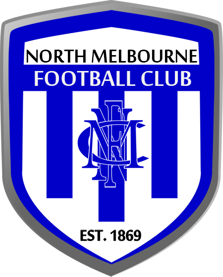
This week's club is the North Melbourne Kangaroos. Entry will be closed on the 8th of May and a poll will be created running for 4 days to decide the winner.
The idea is to recreate a club's logo in the style of a European football club. Starting with the AFL, we will cycle through each of the 18 clubs, chosen by the previous round's winner.
Terms
- Try to stick to original art only - no recolours (current real life logos can be used as inspiration and elements from logos can be taken in moderation)
- No limit to the number of entries one person may enter provided they vary enough
- Stick the aesthetic of European football logos (see below), straying too far may see your entry disqualified
Some examples of the European style can be seen here:
http://www.sportslogos.net/leagues/list_by_category/31/European_Football/logos/
http://www.footballasfootball.com/
(THESE CRITERIA AREN'T REQUIRED BUT COULD BE USED AS HELPFUL GUIDELINES) Logos of this style are typically based on a flat shield or roundel, and can often feature stars on top of the logo representing championships. Monograms also often find their way onto European emblems.
Previous Winners
Last edited:


")