

Kinda like this but with the twin stripes joined ( no gap).
And the colour scheme as per my post above. View attachment 568551
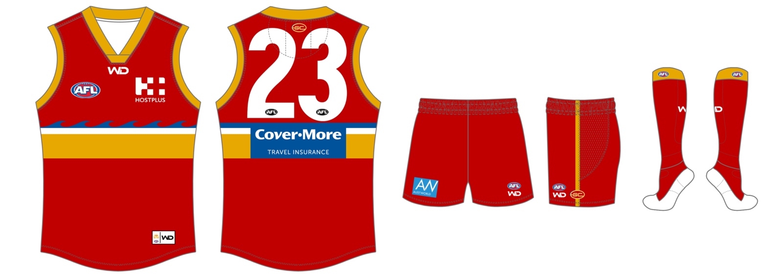
like this?

Follow along with the video below to see how to install our site as a web app on your home screen.
Note: This feature may not be available in some browsers.
Kinda like this but with the twin stripes joined ( no gap).
And the colour scheme as per my post above. View attachment 568551
I agree that a gold guernsey would be unique, but in my opinion you really have to give up your current blue hue, or give up red in order to use the blue. Darkening the colours might help, but you're teetering ever so close to Fitzroy territory if you continue with blue red and yellow.We are called the suns. We should be yellow or gold as main colour IMO. The eagles and tigers look great when wearing their clash jumpers and we would too if it was our main jumper.
We can keep our red and blue as our other colours. Darken the red but not to maroon. And darken the blue perhaps (altho i like sky blue and think our clash should be mostly sky blue)
To the design. Well. I like traditional designs also. But not hoops. Not chevrons and not a sash or stripes.
I think a twin vertical stripe design - off centre.
So all yellow base.
And the twin stripes of sky blue and dark red.
Clash would be sky blue with twin stripes of yellow and dark red.
Yep. Slightly darker red and lighter blue perhaps.


Here you go, I'm not a fan of the blueI would like to see that with blue side panels
Sent from my iPhone using Tapatalk

Yeh blue shortsMaybe blue shorts though???
Sent from my iPhone using Tapatalk
I was wondering what GC fans on this board thought of about the idea of changing the club's logo and guernsey.
The Suns branding has never been popular on the graphic design board but I'm interested to hear the opinions of people who actually support the team.
Ideas have been thrown around this thread lately which lead me to work on this new logo concept.
View attachment 266323
With this logo I'm trying to create a strong, memorable symbol that could be synonymous with the club's image. Similar to what Carlton have with their monogram.
The logo is in the shape of a sun that combines to create a G on the outside, while the C sits inside the centre. The left version features waves of red and yellow in the style of a life guard flag to represent the club's seaside identity. The right version is simplified to match the colour scheme of the home guernsey.
Along with this concept I've created a few redesigns for the club guernseys.
View attachment 266322
The top left and right designs are the same as the old jumpers, just with the new logo.
The top centre design is my own design which is a modern take on the yoke/sash, with sun rays shining from the club logo on the chest.
The bottom 2 show how the blue version of the logo could be adapted as a guernsey design. These might be better suited as clash/alternative guernseys.
Let me know what you think.
Hey guys, I was mucking around with the whole Suns rebrand idea and came up with this. My main area of discontent is that it does not really scream 'AFL', but on reflection not that many logos actually do.
View attachment 315653
I like this option, not sure if the Swans would be open to it
View attachment 330599
Lets just keep our guernsey as it is.

Wow.gave a new monogram logo a go. will try incorporate a few different styles of it with different shadows/effects so that the monogram is a bit more guernsey friendly.
View attachment 573725
Wow.
Very impressive presentation.
I don’t particularly like the GCS pattern - seems very convoluted but like the idea.
I’d also have football club alone on the lower lettering with subs at the top.
moved the suns part to the top. one of the guys on the footy guernseys forum suggested to make the monogram more of a beveled look so i changed that as well.Wow.
Very impressive presentation.
I don’t particularly like the GCS pattern - seems very convoluted but like the idea.
I’d also have football club alone on the lower lettering with subs at the top.
.png")
-(v2).png")

