Discussion Logos that need to be updated

Remove this Banner Ad

We need to find a new Gold Coast logo. I like the idea of a oval shape with GC in it and everything that we have now when there's no shading but in the past its been crap. And please decide, do we put suns belowit or not make up your mind
Here's one I just came up with:
GCFCLogo2.png
Thought it couldn't hurt to have a logo that looks like a traditional footy club logo. Simple and bold without anything that dates the logo.
The latin means "The Sun Rules Over All." thought it was pretty fitting
 
Here's one I just came up with:
View attachment 775531
Thought it couldn't hurt to have a logo that looks like a traditional footy club logo. Simple and bold without anything that dates the logo.
The latin means "The Sun Rules Over All." thought it was pretty fitting
I like but I'm not sure whether we're an old enough club to have something so traditional. Imagine in a few years with that on a heritage guernesy though how cool
 
So I've been working on this other Saints design for the better part of two years.
I really wanted it to be a symbol of strength an unity, and wanted something unique that noone else had seen before.
View attachment 764406
The bottom triangle is awesome, but that black square with the logo is a really unsuitable font and having the T that much smaller is impractical for small scale versions and doesn't work aesthetically IMO. I'd keep the triangle in its own as a secondary logo.
Saints updated crest talk..

View attachment 757262
I personally think St Kilda's is one of the blandest logos I've seen, even for traditional shields. I don't see anything timeless or appealing about it, but I guess if their fans like it, that's the main thing.
As a Saints supporter, I concede that I don't entirely disagree, but I like a lot of things about it too. What's interesting is that any alternative version I've seen looks FAR worse, especially the name banner at the top. Like when you see some knock-off perfume at the market or wherever that's come over from SE Asia and the logo is an attempt to look chic and comes off looking cheap and lame.

SFGiant has produced the best update I've seen but as I've told him before, you just can't ditch the Futara font for the ST. K.F.C. I personally am not a big fan of his update, it looks a bit like a stained glass window, but I like what he's done with the lines and I reckon there's plenty there to work with.

I quite like what the club have done recently, making the ST. K a separate logo.

Just one Saint's opinion.
 

Log in to remove this ad.

The bottom triangle is awesome, but that black square with the logo is a really unsuitable font and having the T that much smaller is impractical for small scale versions and doesn't work aesthetically IMO. I'd keep the triangle in its own as a secondary logo.As a Saints supporter, I concede that I don't entirely disagree, but I like a lot of things about it too. What's interesting is that any alternative version I've seen looks FAR worse, especially the name banner at the top. Like when you see some knock-off perfume at the market or wherever that's come over from SE Asia and the logo is an attempt to look chic and comes off looking cheap and lame.

SFGiant has produced the best update I've seen but as I've told him before, you just can't ditch the Futara font for the ST. K.F.C. I personally am not a big fan of his update, it looks a bit like a stained glass window, but I like what he's done with the lines and I reckon there's plenty there to work with.

I quite like what the club have done recently, making the ST. K a separate logo.

Just one Saint's opinion.

Haha my logo was just a joke. The new Port Adelaide logo was apparently "in development for 2 years" even though it looks blatantly stolen from another Big Footy designer :)

New port logo
1575268693313.png

my "new" logo

1575268726036.png
 
Aside from the obvious Port resemblance, it also reminds me of São Paulo FC

View attachment 773150
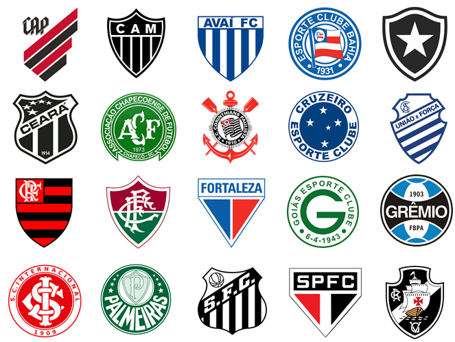
Here, all the 2019 Brazilian-league teams' logo:

D-I
iu


D-II
images


D-III
images
 
What's the Brazilian fixation with red white and black?
Good question. I have no idea.

I haven't thought about it; probably because only a minority of the clubs with black, red, and white logos are actually "red-black-white:" São Paulo (SPFC); Botafogo-SP (BFC); and Ferroviário and Santa Cruz.

D-I: Athletico (CAP) and Flamengo (CRF) are red-and-black; Corinthians and Vasco (CRVG), black-and-white;
D-II: Atlético-GO (ACG), Brasil (GEB), Oeste (OFC), and Vitória (VEC) are red-and-black;
D-III: Botafogo-PB is black-and-white.

Also I love that CAP logo in the top left of the first division.
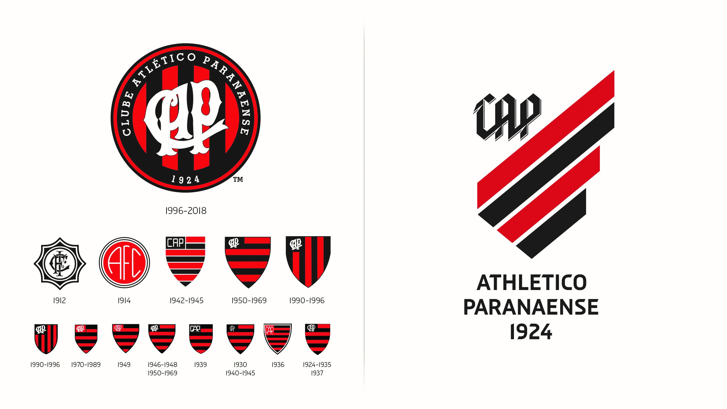
Clube Athletico Paranaense, the "Hurricane," is from Curitiba. It is one of the most popular clubs in the state of Paraná. Athletico is the result of a merger between a black-and-white and a red-and-white clubs in 1924. They have been red-and-black ever since.

Their logo is brand new. They have changed it after last season. Here, their logo's history:
iu
 

(Log in to remove this ad.)

Bought this hat at Arden St a few years ago, the logo really caught my attention. Perhaps it could me slightly modified to include the ‘1869’ aspect.

View attachment 850875
That would have been a great logo!

North, like a few other clubs, seem to be going the 'kid friendly' logo rather than the Professional club logo (mine included)
 

Remove this Banner Ad

Back
Top