- Dec 18, 2014
- 3,989
- 10,955
- AFL Club
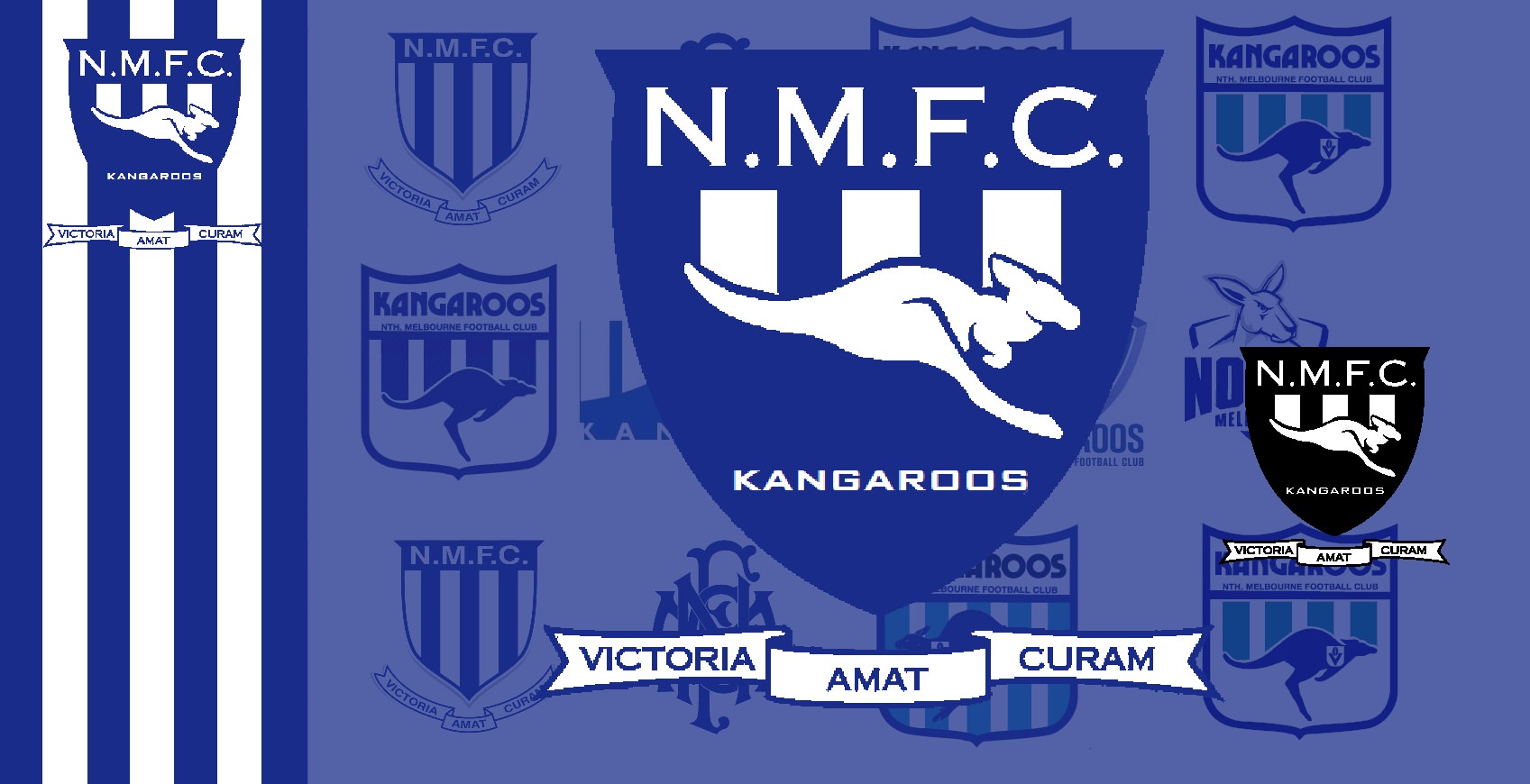
- North Melbourne
- Other Teams
- Pierce & Pierce, Stratton Oakmont
Yeah, I wish some AFL Clubs adopted a more ‘traditional’ logo. The Cartoon Kangaroo should be used for our footy clinics and kids merchandise. That’s one thing I really like about Association Football Clubs (Man United, Chelsea, Liverpool,). The old style logo gives off a feeling of history, rather than marketing to youngsters.That would have been a great logo!
North, like a few other clubs, seem to be going the 'kid friendly' logo rather than the Professional club logo (mine included)