Discussion Maligned designs you like (and opposite)

Remove this Banner Ad

Sep 22, 2011
40,696
88,243
Your girlfriend's dreams
AFL Club
Essendon
Pretty simple. Which jumpers / logos etc that are pretty widely disliked to you actually like?

And which beloved ones do you dislike?

Here’s your chance to be a big brave contrarian.

I couldn’t find a thread for this elsewhere, feel free to merge if there is.

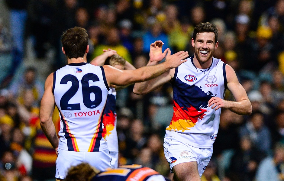
I’ll start - I thought the West Coast tri-panel was a great jumper and one of the best in the league. I guess there was the emotional attachment to the wings but personally I think the tri panel is a way better design.

I didn’t like the early one with the big ugly picture -

images


But the latter design with the logo was great imo...

images


Strong, bold colours, a classic football design with the three stripes / panels, and one of the rare times a logo on a jumper seems to work.
 
I liked the WCE Tripanel as well despite being different colours from different sides. Like Port's current home it was more maligned because it was being worn against the will of the fanbase who wanted a more famous design returned.

For me, the Sky Blue Carlton clash. Forgetting about Sturt, I liked it and I'd like to see more of it. Carlton's monogram is so iconic that they are the perfect club to experiment with non club colour clash designs. Fluro green, bright pink, whatever.
 

Log in to remove this ad.

There's obvious bias but since I love the 'Flaming Demon' logo so much, some of the jumpers others say are ugly are some of my favourites. In fact every single 'ugly Demon Head' jumpers are my favourites.

The Red of 2003-2004 and the Stylised 'M' of 2005-2007
1593085298945.png 1593085585461.png

The Revised Demon of 2009 and lastly, the Clash Demon of 2009-2010.
1593085660189.png 1593085752155.png
 
anyone thinking of talking s**t about the ochre best know I’m watching, and I’ll come for you.
 
This isn't the worst jumper ever like it was made out to be at the time.
Otten%20Douglas%20WEB.jpg

I don’t love it but I prefer it to your current clash. My main criticism is that the design on the front doesn’t really gel with the diagonal stripes on the back. I think the original concept with the graphics being repeated below the number works better overall.

2F916CBB-CE18-4ED5-BAA4-50B3CF2404F3.jpeg
 
I don’t love it but I prefer it to your current clash. My main criticism is that the design on the front doesn’t really gel with the diagonal stripes on the back. I think the original concept with the graphics being repeated below the number works better overall.

View attachment 899858
I think it does though. get what you are saying about the two distinct elements, but on the one from the guernsey vote, the graphic just stops on the side of the jumper, whereas on the one they actually made, at least it wraps around and then is stopped by the stripes (which I believe were a puma template thing, as the Hawks guernsey launched around the same time also had them.)
 
I aslo like the gold coast kit its just very simple and is s good colour scheme. I did quite like wave design. Looking back not sure of the quality of the actual design but do like the design concept. Gold_Coast_Suns_Away_Guernsey.png
 

(Log in to remove this ad.)

Agreed. I reckon it sits comfortably alongside their 2019 "Dreamtime at the 'G" guernsey as the best 'clash' jumpers they've had.
It’s strange but it works, although would be better without the writing and the “heritage gimmick”
Yeah agree, putting the number panel on Ports current clash has really made it. I think it's the best recolour of the current home we've done.
Yes, that was the seller for me. At first hated the silver clash but its really growing on me and now the addition of the number panel has really made it a ripper. Would be superb hand in hand with a home prison bar jumper.
 
didn’t mind the white shorts and red jumper tbh, same with the wave i reckon they should come back
The Suns have only ever worn white shorts on a red jumper twice, and both times it was a red based indigenous jumper
The 21 times the wave jumper was worn in the season, it was always with red shorts.

Hawthorn v Gold Coast Suns (2015)Melbourne v Gold Coast Suns (2017)
1593329721602.png 1593329774095.png
 
The Suns have only ever worn white shorts on a red jumper twice, and both times it was a red based indigenous jumper
The 21 times the wave jumper was worn in the season, it was always with red shorts.

Hawthorn v Gold Coast Suns (2015)Melbourne v Gold Coast Suns (2017)
View attachment 901958View attachment 901959
Still a nice kit design, especially with the juxtaposition of the blue wave and the red kit/logo combo
 

Remove this Banner Ad

Back
Top