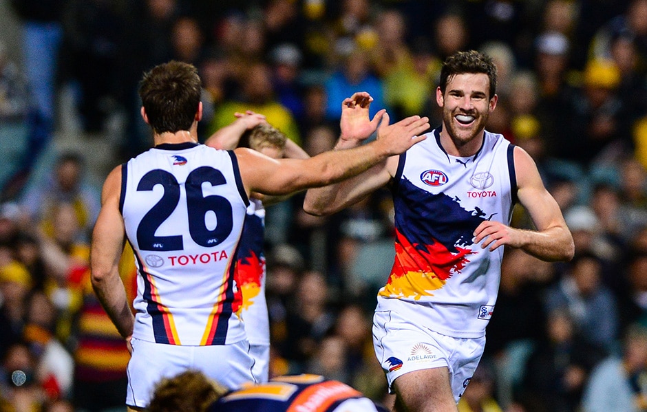
Pretty simple. Which jumpers / logos etc that are pretty widely disliked to you actually like?
And which beloved ones do you dislike?
Here’s your chance to be a big brave contrarian.
I couldn’t find a thread for this elsewhere, feel free to merge if there is.
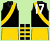
I’ll start - I thought the West Coast tri-panel was a great jumper and one of the best in the league. I guess there was the emotional attachment to the wings but personally I think the tri panel is a way better design.
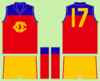
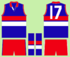
I didn’t like the early one with the big ugly picture -

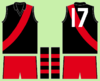
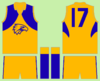
But the latter design with the logo was great imo...
Strong, bold colours, a classic football design with the three stripes / panels, and one of the rare times a logo on a jumper seems to work.
And which beloved ones do you dislike?
Here’s your chance to be a big brave contrarian.
I couldn’t find a thread for this elsewhere, feel free to merge if there is.
I’ll start - I thought the West Coast tri-panel was a great jumper and one of the best in the league. I guess there was the emotional attachment to the wings but personally I think the tri panel is a way better design.
I didn’t like the early one with the big ugly picture -
But the latter design with the logo was great imo...
Strong, bold colours, a classic football design with the three stripes / panels, and one of the rare times a logo on a jumper seems to work.