MKMatty
Busy Vibin’
Handful of my personal faves.
Melbourne Red Clash ‘15

Kangas 2003-2005 Away

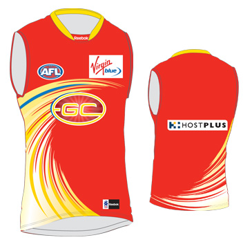
Adelaide Clash 16/17

Melbourne Red Clash ‘15

Kangas 2003-2005 Away

Adelaide Clash 16/17

Follow along with the video below to see how to install our site as a web app on your home screen.
Note: This feature may not be available in some browsers.

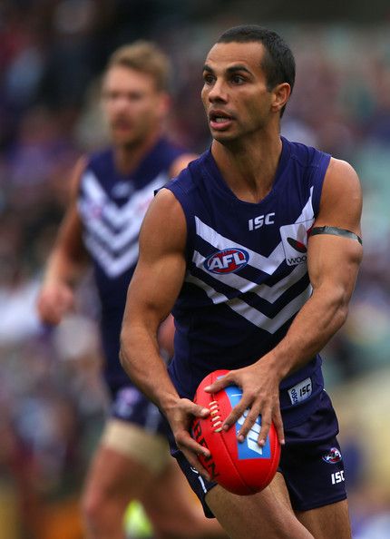
Adelaide Clash 16/17
View attachment 904770

came here to say this... I think my, uh, enjoyment(?) of it doesn't really translate through still images though, I think it looked really good on TV.
That guernsey was an instabuy for me. Just pissed that I got the mustard BLK version when we switched to ISC a year later. Have wanted a gold clash ever since our 2005 Heritage.
Can't understand why it gets so much hate from Crows supporters. Being yellow instantly puts it head and shoulders above any white design we've attempted purely due to being one of our colours. I've long been an advocate for us having 3 guernseys. Regular home (can be worn with blue or white shorts), and then 2 versions of the above, one in red and one in yellow. Not a single club we'd clash with if we had those 3 options, and no need to wear white ever again.


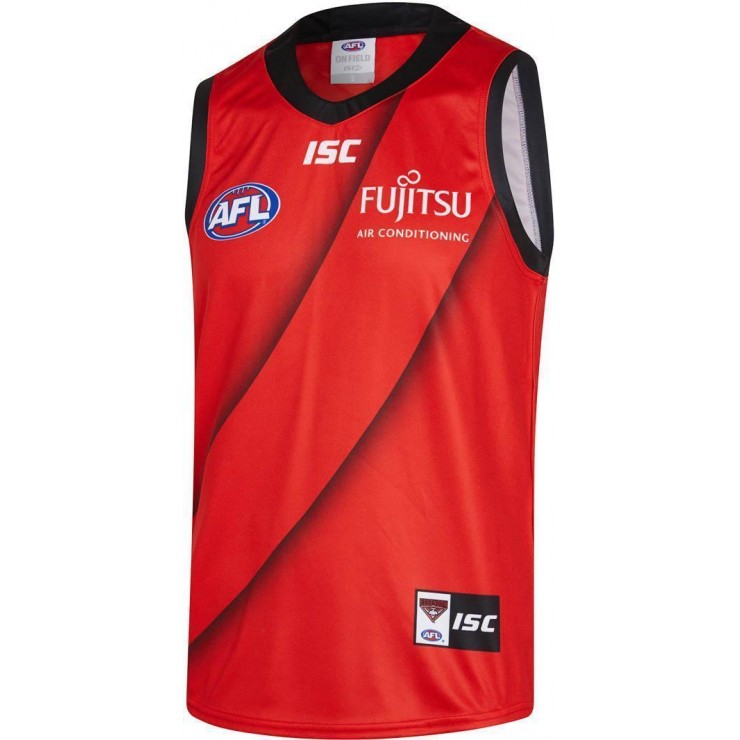
Im not the biggest fan of the dons clash either, and think such a design can be done a lot better. But with the "heritage" clash of several years ago (which is arguably worse) I dont think you can call the decisions conservative. Unfortunately (or fortunately depending on your side of the coin) within the clubs constitution it states that the jumper must consist of a red sash, which means any alternate kit needs to have the sash. If the club were to change this I could not see the membership base agreeing on how an alternate kit could be designed (and getting rid of that stipulation)
I really don't like our clash, not really that controversial since most people are pretty split on it. It's ugly and too red. I'm sick of Essendon having this conservative traditionalist complex. We haven't won a final in 15 years, the hell are we trying to uphold the status quo for? Honestly I'd love us to wear an away kit that doesn't have a red sash, and we need a new logo. Upon reflection maybe I'm just sick of Essendon.
Also Doggies' hoops are too low, and Freo's purple is too dark...
While I'm at it I have always found the Pies 2010/2020 ellipsed back design visually offensive.
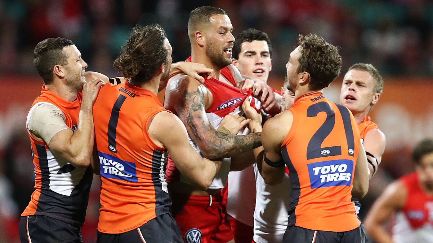
Over the years I've changed my opinion on the Giants. I used to think their kit was messy without a charcoal back... but I've come to love the orange back, I think it's one of the best looks in the league and important for GWS' brand.
and Freo's purple is too dark...
Haven't we debunked the constitution thing?Im not the biggest fan of the dons clash either, and think such a design can be done a lot better. But with the "heritage" clash of several years ago (which is arguably worse) I dont think you can call the decisions conservative. Unfortunately (or fortunately depending on your side of the coin) within the clubs constitution it states that the jumper must consist of a red sash, which means any alternate kit needs to have the sash. If the club were to change this I could not see the membership base agreeing on how an alternate kit could be designed (and getting rid of that stipulation)
I personally find the gws kit can go either way depending on the year. I find the alternate kits have been pretty poor for most of its history with some being alright and some being pretty bad.
love that dees one!!!Handful of my personal faves.
Melbourne Red Clash ‘15
View attachment 904768
Kangas 2003-2005 Away
View attachment 904769
Adelaide Clash 16/17
View attachment 904770
This was an elite portfolio, just had another look at it. We never got to find out about AFLTV though...
I reckon it would look great with their regular blue socks. Whilst I like the Bulldogs' white 'clash' strip, this combination would provide a great contrast against the home uniforms of Carlton, Collingwood, Essendon, Port Adelaide and Richmond whilst still maintaining a traditional look.Don't mind this:
View attachment 904179
likes for Footscray, Richmond, Hawthorn & St Kilda. Indifferent for Brisbane. The fat sash was ridiculous though.
I really don't like our clash, not really that controversial since most people are pretty split on it. It's ugly and too red. I'm sick of Essendon having this conservative traditionalist complex. We haven't won a final in 15 years, the hell are we trying to uphold the status quo for? Honestly I'd love us to wear an away kit that doesn't have a red sash, and we need a new logo. Upon reflection maybe I'm just sick of Essendon.
This was an elite portfolio, just had another look at it. We never got to find out about AFLTV though...
I didn't mind the look of it, but we never seemed to win while wearing it.What a pearler. They should wear it more.
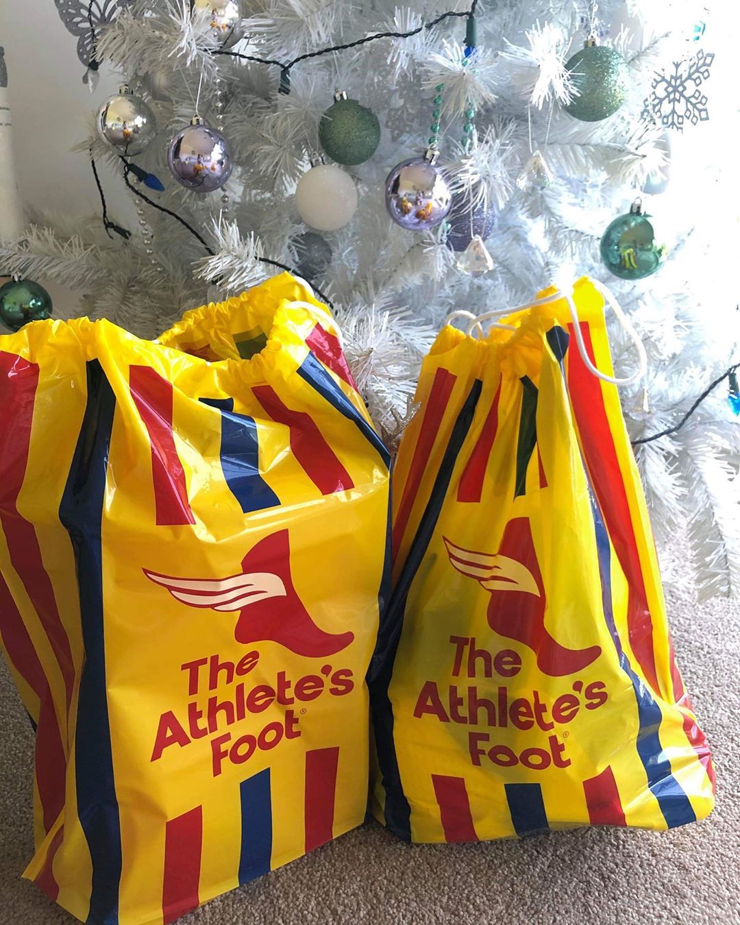
Great bag thoAdelaides yellow jumper has always reminded me of this
I didn't mind the look of it, but we never seemed to win while wearing it.
Probably more due to the fact that it was during our terrible days.
I'm not sure why they don't just amend their constitution and invert the colours.
I really don't like our clash, not really that controversial since most people are pretty split on it. It's ugly and too red. I'm sick of Essendon having this conservative traditionalist complex. We haven't won a final in 15 years, the hell are we trying to uphold the status quo for? Honestly I'd love us to wear an away kit that doesn't have a red sash...
I'm the opposite. Red guernsey with a black sash looks much better. It is still consistent with our brand. Richmond wear the black sash on yellow and it looks great.I like that we always have a red sash on our clash jumper, it's a nice touch to keep our brand consistent. I just wish we would drop the ugly drop shadow gradient and just make the red on the sash darker to make it stand out.