Discussion Maligned designs you like (and opposite)

Remove this Banner Ad

194216.jpg

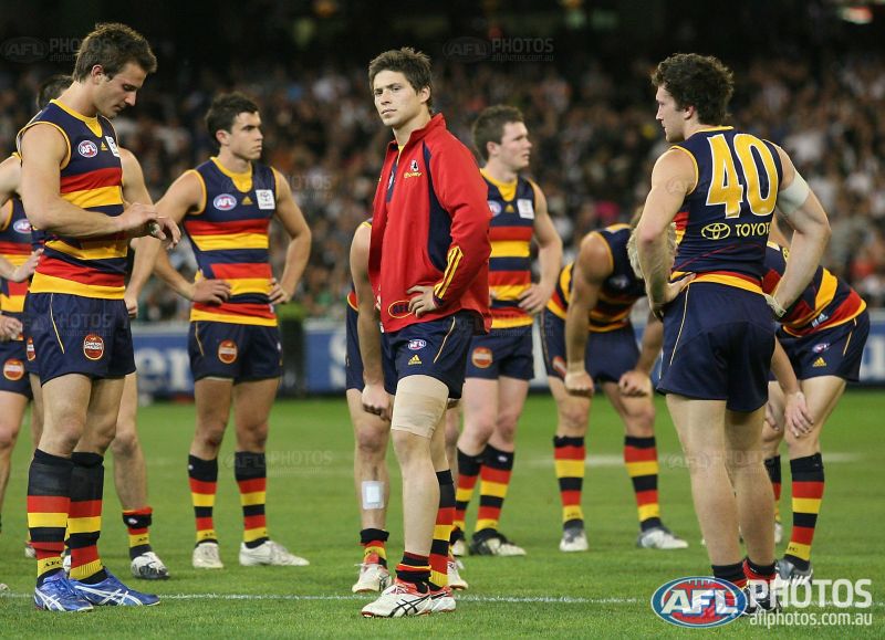
I love the 2009 Crows guernsey (the one with the 'bib').
Find it a really cool guernsey, most of the back of the guernsey is mesh and it has an unusually ultra-tight cut (supposedly to not let oppo players pull your guernsey). Seems a bit futuristic.
 

Log in to remove this ad.

:hearteyes::hearteyes::hearteyes:

That guernsey was an instabuy for me. Just pissed that I got the mustard BLK version when we switched to ISC a year later. Have wanted a gold clash ever since our 2005 Heritage.

Can't understand why it gets so much hate from Crows supporters. Being yellow instantly puts it head and shoulders above any white design we've attempted purely due to being one of our colours. I've long been an advocate for us having 3 guernseys. Regular home (can be worn with blue or white shorts), and then 2 versions of the above, one in red and one in yellow. Not a single club we'd clash with if we had those 3 options, and no need to wear white ever again.
Exactly! couldn't have said it better myself
 
Opposite time. A much-liked design that I hate:

Sydney-2004.gif


Reasons:
-- It's a bastardisation of the classic South Melb jumper
-- The Opera House is kitsch, it's technically poor design
-- The front and back have completely different proportions of colour (not a cardinal sin but doesn't work well on field)
-- I hate the overall aesthetic of this with red shorts, and the thin stripy socks do not go with this block-colour design at all either.

It has no redeeming features except that the colours pop against some other teams like WCE.

This actually comes in about 5th in my all-time worst jumpers. Sorry everyone, especially Freight Train, who just nominated it for best ever.
WW.png
 
Last edited:
The front and back have completely different proportions of colour (not a cardinal sin but doesn't work well on field)
yep, can't stand this, would look so much cleaner if it was treated like Brisbane and Melbourne do their yokes.
 
Opposite time. A much-liked design that I hate:

Sydney-2004.gif


Reasons:
-- It's a bastardisation of the classic South Melb jumper
-- The Opera House is kitsch, it's technically poor design
-- The front and back have completely different proportions of colour (not a cardinal sin but doesn't work well on field)
-- I hate the overall aesthetic of this with red shorts, and the thin stripy socks do not go with this block-colour design at all either.

It has no redeeming features except that the colours pop against some other teams like WCE.

This actually comes in about 5th in my all-time worst jumpers. Sorry everyone, especially Freight Train, who just nominated it for best ever.
I agree on all points. They need to go back to the Bloods V.
There's Wally, what do I win??!
 

(Log in to remove this ad.)

Opposite time. A much-liked design that I hate:

Sydney-2004.gif


Reasons:
-- It's a bastardisation of the classic South Melb jumper
-- The Opera House is kitsch, it's technically poor design
-- The front and back have completely different proportions of colour (not a cardinal sin but doesn't work well on field)
-- I hate the overall aesthetic of this with red shorts, and the thin stripy socks do not go with this block-colour design at all either.

It has no redeeming features except that the colours pop against some other teams like WCE.

This actually comes in about 5th in my all-time worst jumpers. Sorry everyone, especially Freight Train, who just nominated it for best ever.

If it were up to me in 1986 to change the Swans jersey to prevent a identity clash with St George (who were also playing their home games at the SCG in the period 85-87), the Swans would've gone to stripes like what North Adelaide in the SANFL wore in the 80s. I do like our current clash guernsey though.
1595584919806.png
 
If it were up to me in 1986 to change the Swans jersey to prevent a identity clash with St George (who were also playing their home games at the SCG in the period 85-87), the Swans would've gone to stripes like what North Adelaide in the SANFL wore in the 80s. I do like our current clash guernsey though.
View attachment 918556
I'd have gone hoops as an homage to rugby league in Sydney whilst maintaining a club-worn design if you're going to avoid the vee. In the era of sublimation it would have been interesting to see if they would have chosen a different design instead though.

South-1897.gif
 
Never really understood why Sydney don’t make more use of the South jumper. Even if just for a game or two a year in Melbourne. It’s a great design to have access to.

I don't know the answer to that but my guess would be that they prefer the brand consistency. A lot of South people understandably felt like they lost their club so maybe it's also a paradoxical way of respecting them.

Then again, nothing stopped them wearing the V for the first 5 years after relocation. I can't help but think that it's no coincidence that the current design appeared in 1987, as if they saw the inaugural Bears jumper and the peril announced in late 1986 and thought, we don't want to get left behind.

As I've said in another thread, I think the reason why the change happened was to stop a identity clash with St George in the NSWRL even though both teams play different codes of football. It didn't help when in 1985 we ditched blood red for a shade of red very similar to St George's and the fact they played their home games at the SCG in 85, 86 and 87 before moving to Belmore and eventually back to Kogarah
 
I don't know the answer to that but my guess would be that they prefer the brand consistency. A lot of South people understandably felt like they lost their club so maybe it's also a paradoxical way of respecting them.

Then again, nothing stopped them wearing the V for the first 5 years after relocation. I can't help but think that it's no coincidence that the current design appeared in 1987, as if they saw the inaugural Bears jumper and the peril announced in late 1986 and thought, we don't want to get left behind.

Perhaps earlier on but approaching 40 years on, I doubt many supporters would have a problem with the South jumper being worn in Melbourne, if only once or twice a year.

I’ve heard the idea that they should play a pre season game in Melbourne every year against Brisbane, in the full South and Fitzroy strips. That’d be pretty cool.
 
Opposite time. A much-liked design that I hate:

Sydney-2004.gif


Reasons:
-- It's a bastardisation of the classic South Melb jumper
-- The Opera House is kitsch, it's technically poor design
-- The front and back have completely different proportions of colour (not a cardinal sin but doesn't work well on field)
-- I hate the overall aesthetic of this with red shorts, and the thin stripy socks do not go with this block-colour design at all either.

It has no redeeming features except that the colours pop against some other teams like WCE.

This actually comes in about 5th in my all-time worst jumpers. Sorry everyone, especially Freight Train, who just nominated it for best ever.

Most jumpers with the colour balance out from front to back look bad, look at gws and how perfect they could get their colour balance with the back being an orange yoke, black predominantly and white numbers, would match the front perfectly.

For the record i actually like the essendon clash jumper it looks good and stands out being all red.
 
Opposite time. A much-liked design that I hate:

Sydney-2004.gif


Reasons:
-- It's a bastardisation of the classic South Melb jumper
-- The Opera House is kitsch, it's technically poor design
-- The front and back have completely different proportions of colour (not a cardinal sin but doesn't work well on field)
-- I hate the overall aesthetic of this with red shorts, and the thin stripy socks do not go with this block-colour design at all either.

It has no redeeming features except that the colours pop against some other teams like WCE.

This actually comes in about 5th in my all-time worst jumpers. Sorry everyone, especially Freight Train, who just nominated it for best ever.
Is it just an opera house though? I always thought it was a clever double-symbol representing the opera house and swan feathers?
 
Is it just an opera house though? I always thought it was a clever double-symbol representing the opera house and swan feathers?
There's a few people around that think that. Personally, I've never seen any part of a swan's anatomy that looks exactly like the Opera House. The shape is a literal, perfect silhouette of the building. If it was supposed to reference feathers as well, you could push it to become more abstract/feathery and it would become a decent design concept. As it stands, it ain't.

Now I can't help but see it as the feathers atop Howard the Duck's head.

I think you will find it's actually Donald Duck's butt ;)

duck.png
 
Last edited:

Remove this Banner Ad

Back
Top