Universal Love Merchandise Idea - Would you buy this?

Would you buy and wear this?

  • Ken Oath!

    Votes: 7 25.9%
  • Nope.

    Votes: 14 51.9%
  • Can you do one in Teal?

    Votes: 1 3.7%
  • Only if the font is Helvetica.

    Votes: 1 3.7%
  • Is this gonna be another Ports Cap schamozzle?

    Votes: 6 22.2%
  • I did Nazi that coming.

    Votes: 1 3.7%

  • Total voters
    27

Remove this Banner Ad

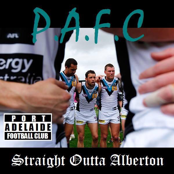
I don't like the full stop at the end.

I'm not 100% sold on the font.

It has potential and is almost there. I'd buy it with a slightly better font and without the full stop.

The full stop seemed weird, but then I got the message:
"Alberton. Period."
Nothing more is necessary.

I like the font, but not sure how it works in association with the club.
 

Log in to remove this ad.

I like the font, but not sure how it works in association with the club.

It doesn't.

There was a conversation on here in 2015 about merchandise for PAFC that was different from the usual stuff.

Someone posted the Compton logo used on NWA merch and I ran with it.

The only reason I posted it here is that I've got a few blokes in real life who would like one, and I've got a mate's 50th coming up, so I was going to print a batch.

It's been interesting to see that the reaction here has been markedly different to my network.

I must associate with Nazis without even knowing it.
or context illiterate font nerds
 
It doesn't.

There was a conversation on here in 2015 about merchandise for PAFC that was different from the usual stuff.

Someone posted the Compton logo used on NWA merch and I ran with it.

The only reason I posted it here is that I've got a few blokes in real life who would like one, and I've got a mate's 50th coming up, so I was going to print a batch.

It's been interesting to see that the reaction here has been markedly different to my network.

I must associate with Nazis without even knowing it.

I’ll have one of that batch.

Usual money order to pappagallo?
 
Alberton “compton” style, no full stop, location on the shirt needs to be higher too (more across chest, rather than across bust).
Just my two cents.

I like your thinking!
 
Here's an alternative option based on the "Unbeatable at Alberton" sign as shown on post #27

View attachment 678077
Nice! But do not listen to those against the "full stop." It is better with it!

I like Chokito's idea of having the text higher, and perhaps a bit bigger. It seems bigger in the OP, and it looks better.

On the Compton's idea. The only "Straight outta Alberton" I have found is this one (with the "Old English" font!):
CCByAFcWAAAgGmt.jpg
 

(Log in to remove this ad.)

Back
Top