- Sep 6, 2005
- 144,837
- 94,709
- AFL Club
- Fremantle
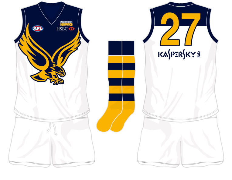
the logo on the front is one of the reasons why i would buy it.
when it works it works.
when it doesnt (which is often---see most AFL teams), it really looks bad.
when it works it works.
when it doesnt (which is often---see most AFL teams), it really looks bad.


 ) wants extra time, just say