Klim
Brownlow Medallist
- Sep 17, 2013
- 12,532
- 10,363
- AFL Club
- Sydney
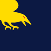
Two colours only.Tigers needs white, so does the Dragons, Sea Eagles and Roosters. Canberra needs yellow and blue, and remove the black.
Follow along with the video below to see how to install our site as a web app on your home screen.
Note: This feature may not be available in some browsers.
Two colours only.Tigers needs white, so does the Dragons, Sea Eagles and Roosters. Canberra needs yellow and blue, and remove the black.
Two colours only.
Read this thread and find me a logo with three colours or more.Where is the rule that states a minimalist logo only can have two colours?
You cannot do that with Rugby League (actually many sports) teams tend to have more than two colours and excluding one or more can cause issues.
For example:
Tigers - Excluding white would seriously p*** off half of the fan base (not going into the argument but white has to be included with the orange and black).
Roosters - Their alternate name is the Tri Colours, yet only two are used?
Read this thread and find me a logo with three colours or more.
My attempt
View attachment 13837
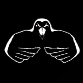
Had trouble minimizing the "Port fist"
Added the beak to distinguish the hawk
Couldn't do much with the tigers, blues and eagle
My crack at a-league minimalist logos
Only using parts from their official logos. Definitely can be better.
Thoughts? Changes?
View attachment 17477
Added Adelaide stars, tweaked a few others
View attachment 17602
With team strips
View attachment 17603
Furys current strip, andonis' idea
View attachment 17604
To me, the basic forms of each teams jumpers are a minamilistic as you can get. This means no logos or wordmarks, just the block colours. Hence; My attempt
View attachment 78364
Im a real novice, but this thread really triggered me to come up with some ideas I rushed a few to get a full set.

Ive also split them out if people want to save them down seperately to use as avatars
EDIT: Just realised my north one is just a shitty version of the one done by Quadzilla - was trying to make them all at least a little different to what was in this thread already - and didnt notice that one (some ideas were hard to do differently because a previous idea posted was near perfection IMO). Also - I didnt stick to 2 tone as I think all club colours are relevant and help differentiate the teams.
Ok how's this guys?
View attachment 100586


Placing arbitrary rules on yourself (like Klim is doing here with the two colours max rule) while tyring to achieve a particular outcome (i.e. retaining the identity of the clubs) is part of the fun. It won't work out perfectly given the restrictions but you gotta lighten up.Where is the rule that states a minimalist logo only can have two colours?
You cannot do that with Rugby League (actually many sports) teams tend to have more than two colours and excluding one or more can cause issues.
For example:
Tigers - Excluding white would seriously p*** off half of the fan base (not going into the argument but white has to be included with the orange and black).
Roosters - Their alternate name is the Tri Colours, yet only two are used?
Placing arbitrary rules on yourself (like Klim is doing here with the two colours max rule) while tyring to achieve a particular outcome (i.e. retaining the identity of the clubs) is part of the fun. It won't work out perfectly given the restrictions but you gotta lighten up.
It's better and definitely along the right lines. With Canberra, get rid of the Viling and just keep the helmet, that'd be enough. The Broncos and Sharks was alright the first time, Canterbury you could've just used the monogram on their logo. At George is still too complicated, as is Wests, and Roosters.Ok how's this guys?
View attachment 100586

Not much you can do with everton and hull.Everton is a tad complicated, as is Hull City and Newcastle. The Hammers, you could get away with, but to make it even more minimalist, you could use either the castle on its own, or just the Hammers
You could do tiger claw slashes for Hull. Be a bit more creative than just the logo they already haveNot much you can do with everton and hull.
Definitely agree with this.Not much you can do with everton and hull.
Here's what I've whipped up.
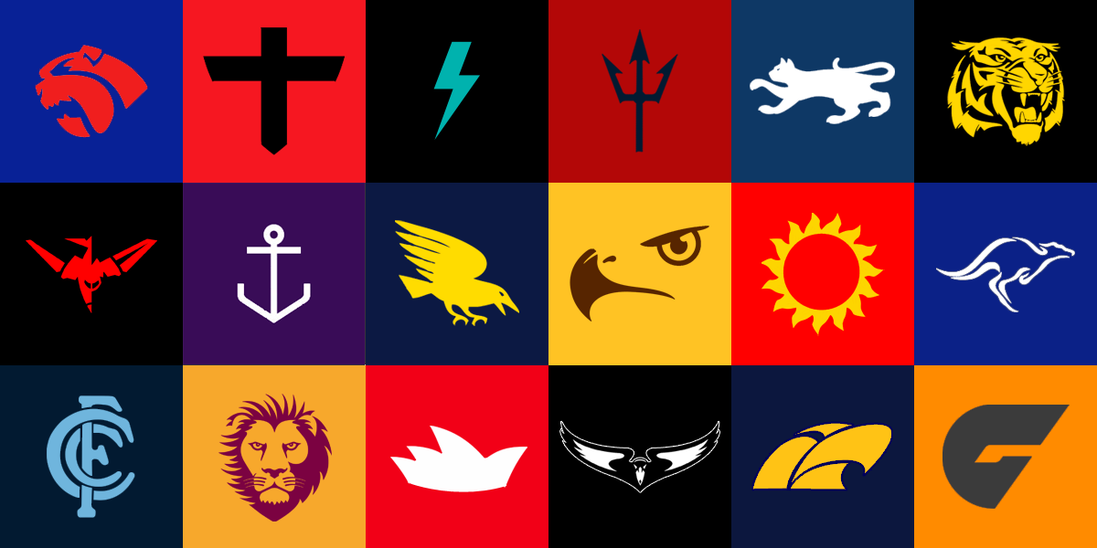
Minimalist AFL logos.

Not sure you're going to get an answer, he hasn't been online for a little while..Do you mind if I use these at my site (thearcfooty.com)?

Can u do the bbl ones?
He doesn't work for Optus, who designed those EPL ones..Can u do the bbl ones?
Yeah sorry, where I work we haven't even heard of the telephone, let alone graphic design.He doesn't work for Optus, who designed those EPL ones..