Discussion Minor Details on Jumpers That Irritate You

Remove this Banner Ad

Hey folks,

The title pretty much sums it up, but what are some really minor details on jumpers that really irritate you?
It can be as petty as you like, for instance:

1595302774902.png 1595302774902.png
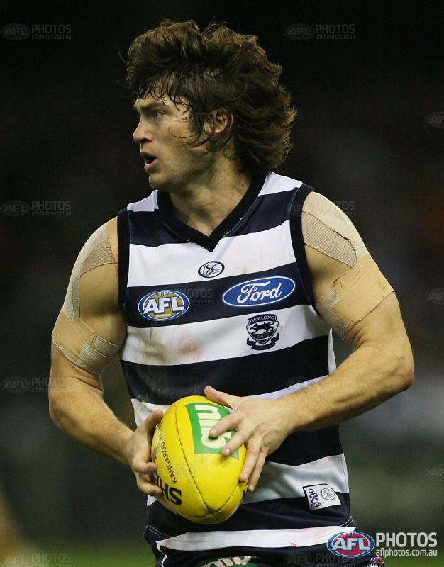
The white outline on our clash jumper.

Why? Why is it there?
Literally a black number on a bright yellow background...

I do not understand it.

Over to you.
 
1595303518722.png

The Giants' side panels on the back. They're just there and their existence is what annoys me. Just remove them or at least have the curve downward with how the yoke curves down. The gap between the curve and side panel is ultimately what annoys me the most.
 

Log in to remove this ad.

View attachment 916471

The Giants' side panels on the back. They're just there and their existence is what annoys me. Just remove them or at least have the curve downward with how the yoke curves down. The gap between the curve and side panel is ultimately what annoys me the most.

^^^ this so much! They got it right in 2017 then reverted back

Injuries behind them, who exactly is in GWS' best 22?
 
Pretty much anything above the number. Monograms, numbers, logos, initials.

White outlined numbers on adelaide, Brisbane’s and Richmond clash. When west coast removed it, it looked so much cleaner.

The “apparel” sponsorship of GC and St Kilda

Club Logos on the front of jumpers bar St Kilda.

Logos/numbers/whatever in the middle stripe under the number and below the sponsorship. Hawks dark jumper had this and I think North did it for a while
 
For me what makes or breaks sports clothing is the templates and collars provided by the manufacturer, this is not a AFL example but when St George Illawarra went to Reebok after leaving Adidas, Reebok gave us this for 2010 and 2011, in my opinion, a horrible looking collar.
1595332817198.png

It was just as intrusive when the collar was white...
1595333812151.png

Whereas Rebook's AFL customers at the time (Melbourne, Richmond, Gold Coast, Port Adelaide and Freo) got a way better and more subtle looking collar.....
1595333766038.png
 
Last edited:

(Log in to remove this ad.)

View attachment 916776

Cotton On's Geelong jumpers.
The logo placement is so low and so far apart, the cut off cuffs at the back looks bad and why are Cotton On so obsessed with the letter G? It's not even an interesting, stylised G and the "G" branding is already taken by GWS.
+1 with all that. Especially the G and the weird introduction (and blatant copy) of the Cleveland Cavs font on their runout shirt.
delly-association-front__72957.1544546551.jpg
9801048-01-1__28877.1581911572.jpg

It's obvious someone at Cotton On is a basketball fan, ripping off Nike's NBA template too.
00235762_00.jpg
cats-2-jpg.550666
 
Cotton On's Geelong jumpers.
The logo placement is so low and so far apart, the cut off cuffs at the back looks bad and why are Cotton On so obsessed with the letter G? It's not even an interesting, stylised G and the "G" branding is already taken by GWS.

Funny you mention this, it always annoys me how wide the AFL logo is on Tom Hawkins.
Tom Hawkins explains goalkicking slump but is far from deterred
 
View attachment 916776

Cotton On's Geelong jumpers.
The logo placement is so low and so far apart, the cut off cuffs at the back looks bad and why are Cotton On so obsessed with the letter G? It's not even an interesting, stylised G and the "G" branding is already taken by GWS.

I don't mind the G on some streetwear-style merchandise or New Era caps, but the logo and hoop placement bothers me. The sponsor hoop looks so much better when it's up close to the collar, which then means the logos are visible and much closer together, and overall produces a much more aesthetically pleasing look

Our first ISC jumpers nailed the hoop and logo placement

156474.jpg
 
This is Central District in the SANFL, I hate how the Holden sponsor's name infringes over the red hoop.
It ruins the jumper design and it should be above the hoops. You're lucky in the AFL that sponsor badges are smaller size.
 

Attachments

  • Central District James Boyd.jpg
    Central District James Boyd.jpg
    585.9 KB · Views: 235
Mentioned in the Podcast.
Indigenous Jumpers featuring Faux Indigenous art.
I recognise the people designing them are not working for the apparel sponsor, and therefore not converting them to Illustrator so they can be sublimated.
However, sometimes, the person that does takes the easy route of perfect circles and lines where the original art would not have looked like that.
If not perfect circles, they take one or two unique dots then replicate them across the whole of the jumper
(if you were tracing/re-drawing them you would notice this)

1595346079169.png

Adelaide's 2020 jumper is the same
 
Last edited:
This is Central District in the SANFL, I hate how the Holden sponsor's name infringes over the red hoop.
It ruins the jumper design and it should be above the hoops. You're lucky in the AFL that sponsor badges are smaller size.
In their glory days as you'd know, before Holden updated their text they had it above the red stripe - that was probably the best outcome. Now... 😐
Or they could do a Glenelg and put it in the white hoop... But at least it works for Glenelg. Maybe not the Dogs.
 
The sizing of the ISC logo on Eagles guernseys is smaller than other clubs, and the wings look a bit fat these days. Are they meant to be like that? Puma had em thinner, and I liked that more. And the colours don't seem very vibrant on the ISC compared to the Puma.
752411.jpg

551176.jpg

fat wings are the correct wings.

but yeah puma stuff was better and comes down to the materials used and how they take the colour.
 
In their glory days as you'd know, before Holden updated their text they had it above the red stripe - that was probably the best outcome. Now... 😐
Or they could do a Glenelg and put it in the white hoop... But at least it works for Glenelg. Maybe not the Dogs.

You're right Andonis, above the stripe was the best position. The Glenelg one seems to work well, I'm not sure it would work as well with the white stripe, but it may be better than the current situation.
 

Remove this Banner Ad

Back
Top