Discussion Minor Details on Jumpers That Irritate You

Remove this Banner Ad

The sizing of the ISC logo on Eagles guernseys is smaller than other clubs, and the wings look a bit fat these days. Are they meant to be like that? Puma had em thinner, and I liked that more. And the colours don't seem very vibrant on the ISC compared to the Puma.
752411.jpg

551176.jpg
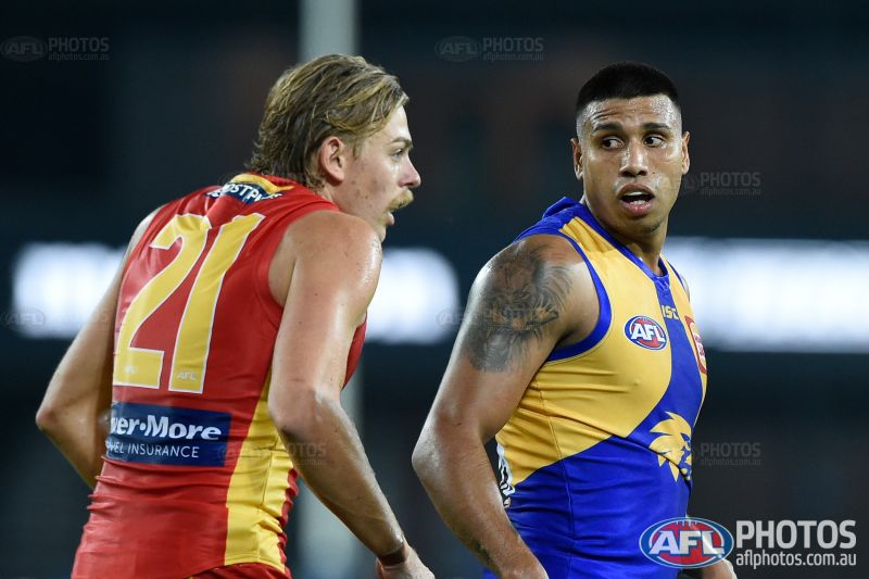
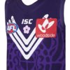
As a side note I completely forgot that Petrie played for West Coast
 
He played really well from memory and was probably a chance to go around again if he wanted too
 

Log in to remove this ad.

The St Kilda shield is being treated very poorly recently by manufacturers. It has reduced greatly in size and moved to the underboob area where it should be directly over the heart. This season, it has been lowered even more to make room for a massive sponsor logo, meaning it can often not be seen at all while the boys are running around on the ground.

Several clubs have slapped their logo of the minute of their guernsey, but the shield should be treated with more respect and made a key focal point of any strip that features it.
 
Club logos and their placement.

Collingwood's been all over the shop with this, it's come and gone and changed and shrunk and moved around everywhere (5 different kinds since 2010!).

This mini one is atrocious:

iu


In before Mayne picking his nose.

If your logo is going to change every ten years, I say it's not really a club crest and doesn't belong on the jumper.

In hindsight, was the following a good decision?


iu


I don't think so.
 
Last edited:
images (83).jpeg
I never liked how they changed the Woodside logo in 2018 to this. I preferred the old one in 2017
 

Attachments

  • images (86).jpeg
    images (86).jpeg
    29 KB · Views: 58
The sizing of the ISC logo on Eagles guernseys is smaller than other clubs, and the wings look a bit fat these days. Are they meant to be like that? Puma had em thinner, and I liked that more. And the colours don't seem very vibrant on the ISC compared to the Puma.
752411.jpg

551176.jpg
The fat wings are supposed to be a return to the original 1987 wings. They’re glorious.
 
When West Coast removed the outline from the eagle head. For some reason I held a really strong vendetta against it. Although, I always used to watch the 2006 Grand Final whenever I was staying with my Grandparents because they had the DVD for some reason and just automatically loved that jumper (nostalgia I guess). I always thought it was so much cleaner with the white on the wings, although, it is better now.

1595510536113.png 1595510558390.png
 
Club logos and their placement.

Collingwood's been all over the shop with this, it's come and gone and changed and shrunk and moved around everywhere (5 different kinds since 2010!). This mini one is atrocious:

iu


In before Mayne picking his nose.

If your logo is going to change every however many years, I say it's not really a club crest and doesn't belong on the jumper. In hindsignt, was the following really a worthwhile exercise for two seasons?


iu
Roughie looks like the little kid from Jurassic park

On SM-G925I using BigFooty.com mobile app
 
When West Coast removed the outline from the eagle head. For some reason I held a really strong vendetta against it. Although, I always used to watch the 2006 Grand Final whenever I was staying with my Grandparents because they had the DVD for some reason and just automatically loved that jumper (nostalgia I guess). I always thought it was so much cleaner with the white on the wings, although, it is better now.

View attachment 918056View attachment 918057
Never really noticed that before. There ya go.

prefer the white outline.

On SM-G925I using BigFooty.com mobile app
 
Shame about the faded colours. That should be fixed next year though with whoever new manufacturer is, as long as its not BLK:drunk::drunk:
I’m quite happy with our guernseys this year, the colours are the best they’ve been under ISC and they finally got the logos and numbers spot on.

I particularly love the gold Guernsey under lights, looks spectacular. BDCD01B9-DE5D-4F30-A259-6D72F3E4DF19.jpeg
 

(Log in to remove this ad.)

F8986C5A-D909-4F01-BB3B-2EA41F49436F.jpeg
4979C0B0-1B8B-4A74-A9DE-BDA0E9A9EE24.jpeg
minor details i hate about the north melbourne jumper
1. the pinstripes are horrible
2. where the canterbury logo is and how it doesn’t let the stripe go all the way up
3. shineboner on the side on the front of the jumper
4. the est.1869 does it even need to be there?
5. the mazda is big and cuts off way too much off the stripe, why can’t it be like how the mazda logo was from 1999-2008
6. the fact it’s white stripes on a blue jumper when it should be the other way around

all these minor details really bug me. because we had the best looking jumper till the started adding all these little details and made our jumper the worst looking jumper in the AFL
 
North is a prime example of taking a basic jumper and butchering it by doing too much
 
I’m quite happy with our guernseys this year, the colours are the best they’ve been under ISC and they finally got the logos and numbers spot on.

I particularly love the gold Guernsey under lights, looks spectacular. View attachment 918084

I have no issues with the home, royal blue guernsey of West Coast, but I am annoyed every time I see the clash. The Eagles logo should be inverted to blue.

SHOULD BE:
Royal - gold wings with gold eagle head
Clash - blue wings with blue eagle head

The Eagles used it for the ribbon cutting tape at their new headquarters - so no issues to use it it seems.

65896452_10156594277232224_3687820973756645376_o.jpg


VAPFVi9.jpg
 
Last edited:
I have no issues with the home, royal blue guernsey of West Coast, but I am annoyed every time I see the clash. The Eagles logo should be inverted to blue.

SHOULD BE:
Royal - gold wings with gold eagle head
Clash - blue wings with blue eagle head

The Eagles used it for the ribbon cutting tape at their new headquarters - so no issues to use it it seems.

65896452_10156594277232224_3687820973756645376_o.jpg


VAPFVi9.jpg
This doesn’t work well imo. in the standard yellow on blue, the blue is where the shadows are on the eagle and when you invert this so that the lighter colour is the ‘shadow’ colour, it looks wrong. The outlined logo may not look as pronounced on the clash jumper, but it looks far more professional.
 
This doesn’t work well imo. in the standard yellow on blue, the blue is where the shadows are on the eagle and when you invert this so that the lighter colour is the ‘shadow’ colour, it looks wrong. The outlined logo may not look as pronounced on the clash jumper, but it looks far more professional.

From a distance shadows don't matter and historically the guernsey has had matching colour for wings and logo.
 
Hey folks,

The title pretty much sums it up, but what are some really minor details on jumpers that really irritate you?
It can be as petty as you like, for instance:

View attachment 916469View attachment 916469
The white outline on our clash jumper.

Why? Why is it there?
Literally a black number on a bright yellow background...

I do not understand it.

Over to you.
Cheers campaigner. I'll never unsee that now.
 
I have no issues with the home, royal blue guernsey of West Coast, but I am annoyed every time I see the clash. The Eagles logo should be inverted to blue.

SHOULD BE:
Royal - gold wings with gold eagle head
Clash - blue wings with blue eagle head

The Eagles used it for the ribbon cutting tape at their new headquarters - so no issues to use it it seems.

65896452_10156594277232224_3687820973756645376_o.jpg


VAPFVi9.jpg

big disagree my dude.

I went over this when the logo first leaked and I did the mockup that leaked to 7News and I stand by what I said then - the blue outline looks way better than a blue fill.
 

Remove this Banner Ad

Back
Top