- May 25, 2009
- 4,014
- 2,765
- AFL Club
- Port Adelaide
CLOSES 22:08 FRIDAY. NO VOTING FOR YOURSELF.
TOP TWO (2) INC TIES WILL GO THROUGH TO THE FINAL POLL.
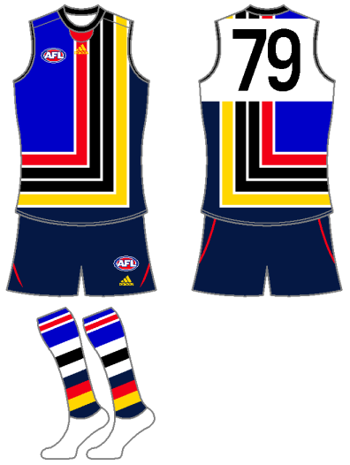
Footy Legend (Adelaide Dalmations)

Furla81 (Collingwood All-Stars)
Omegaville (Collingwood are an uncessary element)
pie-machine (Western Cows)
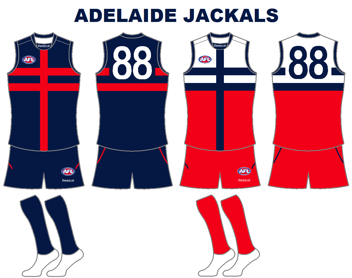
Heyzeus (Adelaide Jackals)
Tigerdrive (Southern Bulldogs)
mobitout (Collingwood Crows)
Punk Rooster (Adelaide-Collingwood-Footscray Bulldogs)
Eagles1992 (Adelaide Bulldogs)
GANTY (East Adelaide Bruisers)
TOP TWO (2) INC TIES WILL GO THROUGH TO THE FINAL POLL.
Footy Legend (Adelaide Dalmations)

Furla81 (Collingwood All-Stars)

Omegaville (Collingwood are an uncessary element)
pie-machine (Western Cows)

Heyzeus (Adelaide Jackals)
Tigerdrive (Southern Bulldogs)

mobitout (Collingwood Crows)

Punk Rooster (Adelaide-Collingwood-Footscray Bulldogs)

Eagles1992 (Adelaide Bulldogs)
GANTY (East Adelaide Bruisers)