Poll NAFL 2018-19 - Round Ten

Vote for your favourite in each match


  • Total voters
    26
  • Poll closed .

Remove this Banner Ad

MVFjifl.png


Poll will be open for 3 days.
Do not vote for yourself or ask people to vote for you. You will be penalised.
Vote once in each game - besides your own.
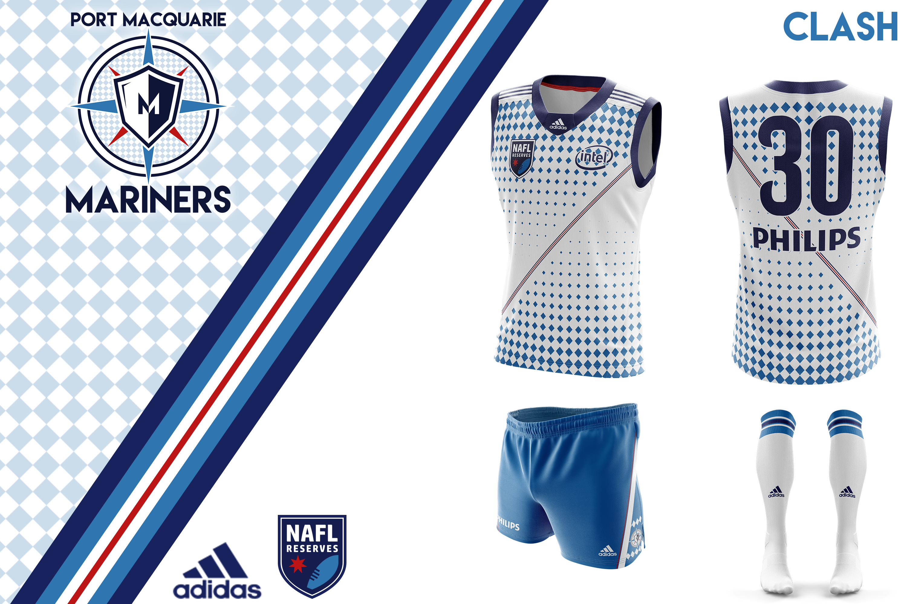
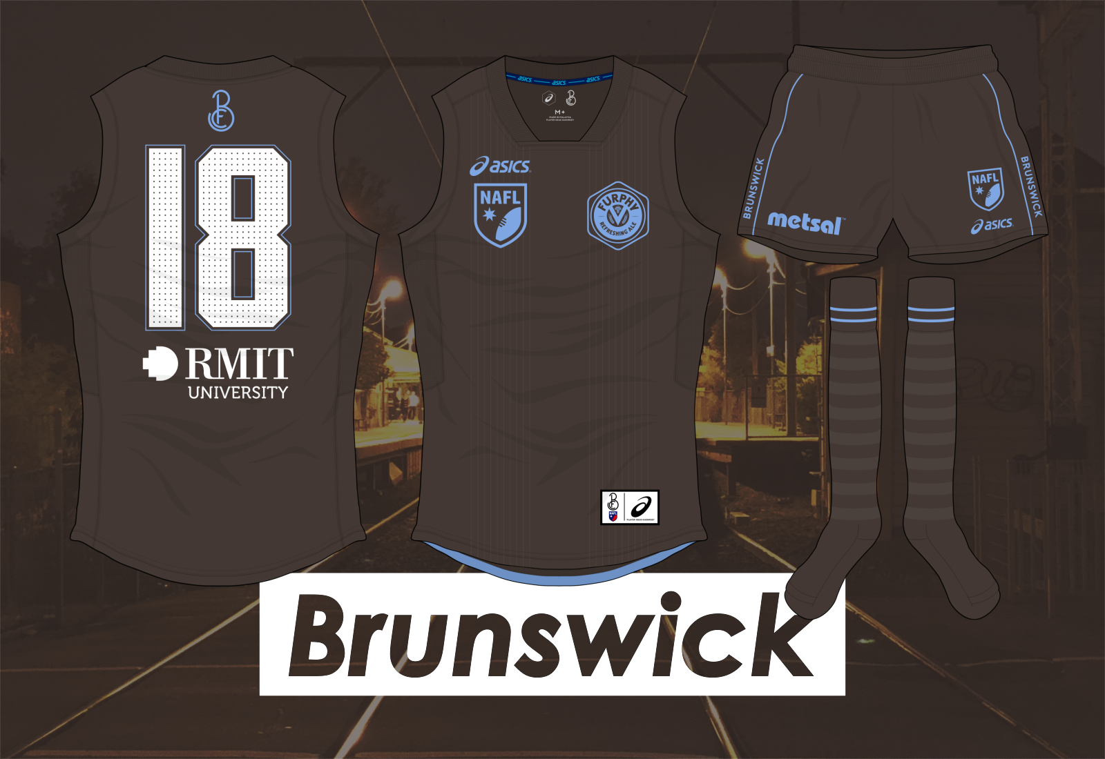
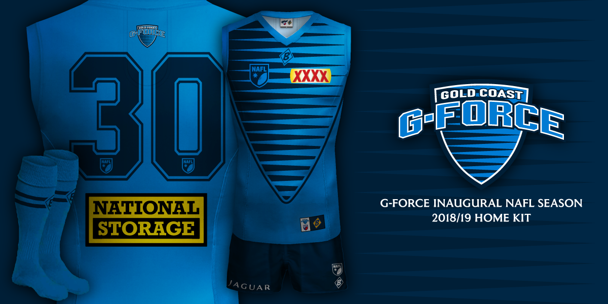
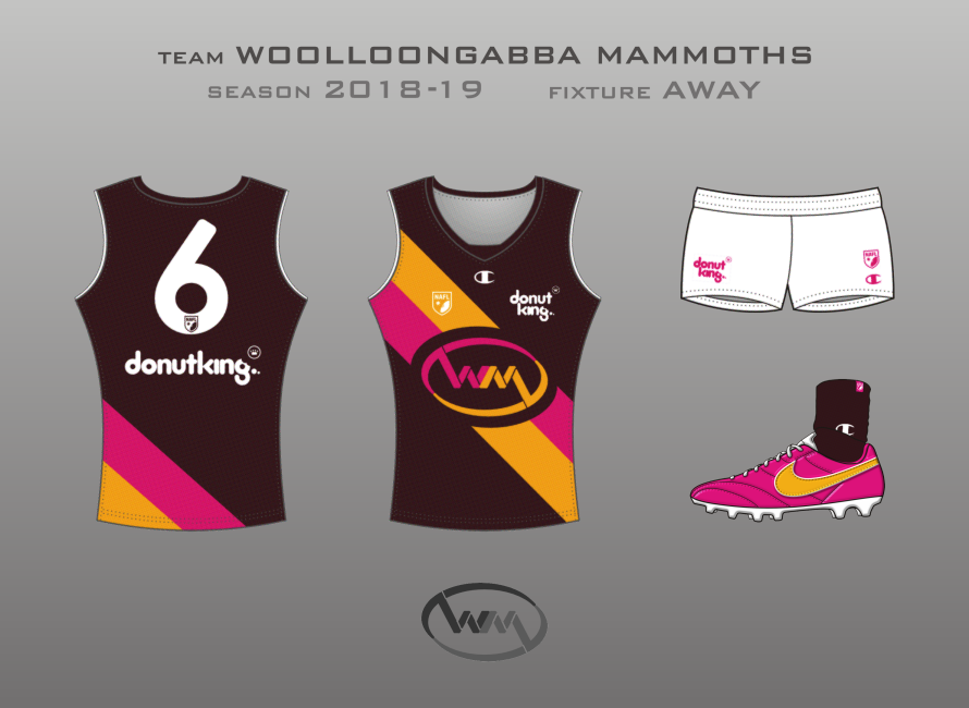
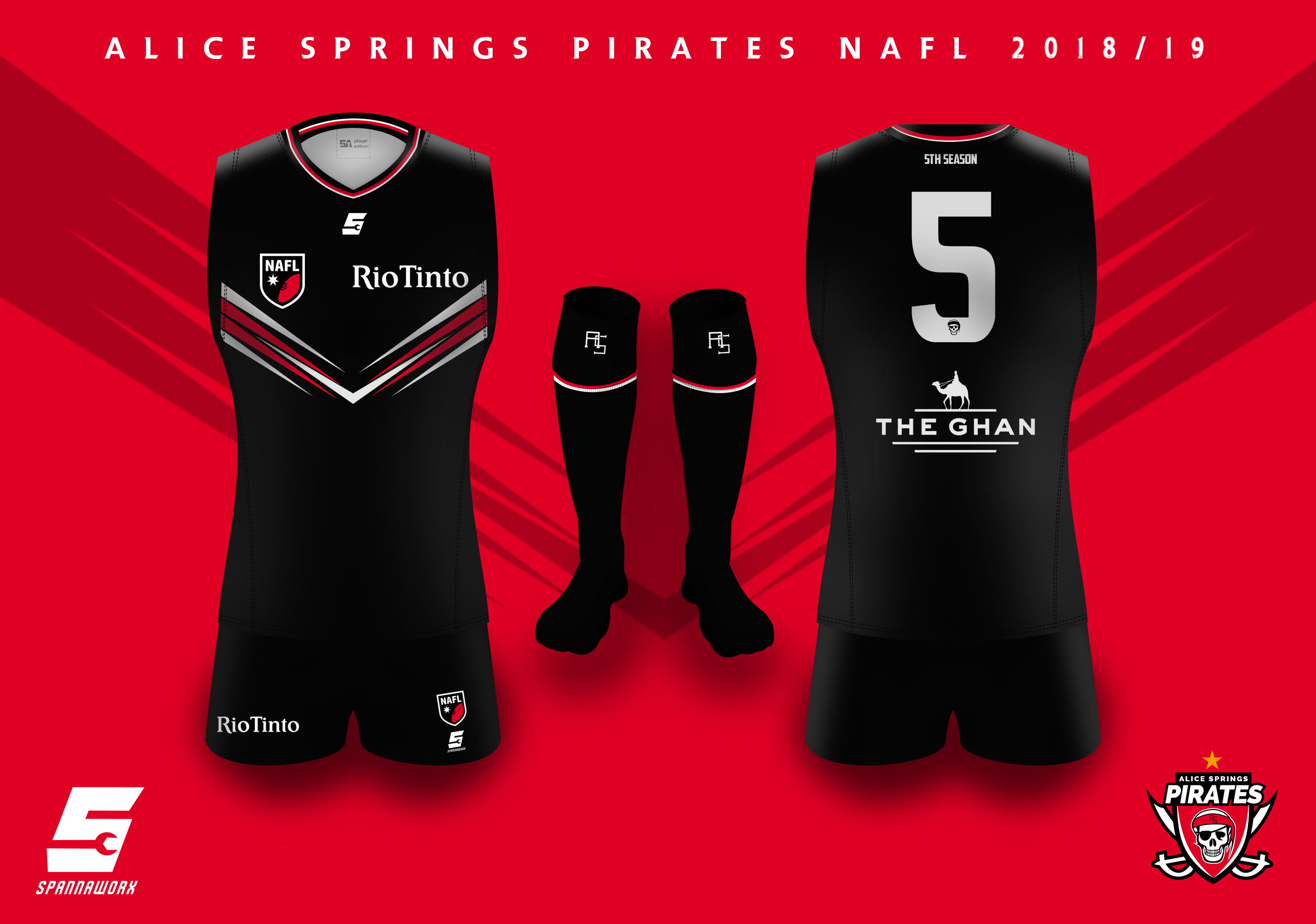
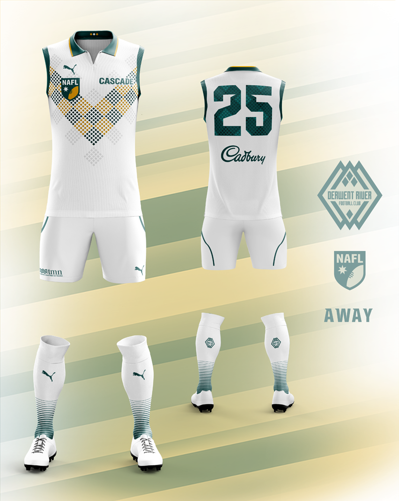
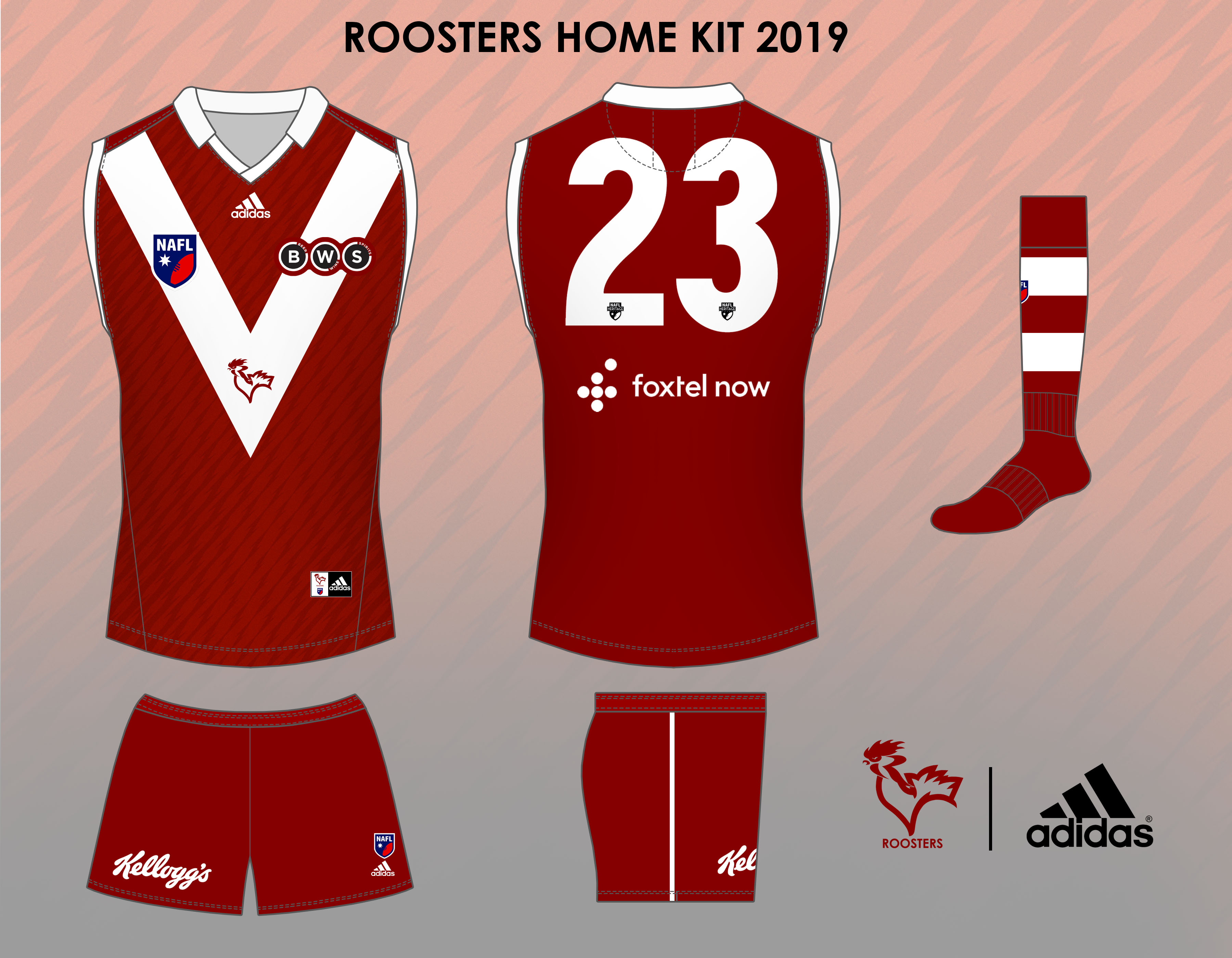
Home team image is on top.


***


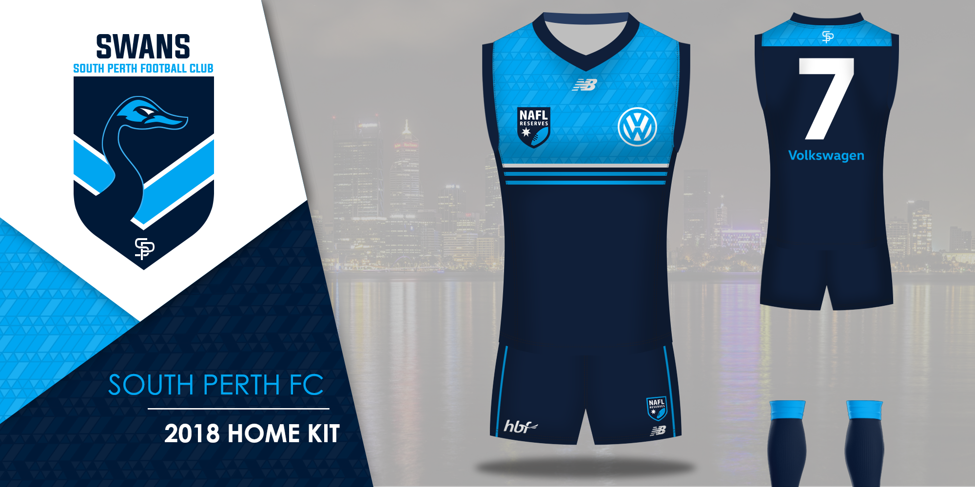
South Perth Swans v Port Macquarie Mariners

AbKuhHW.png


owbjLM1.png


Brunswick FC v Busselton Hornets

757c5yI.png


U7Ls7yo.png


Gold Coast G-Force v Woolloongabba Mammoths

zGq6Ftq.png


576403_56a8235e88457b9bb040bc3442f3778a.png


Alice Springs Pirates v Derwent River

n4ZJNjY.png


proxy.php


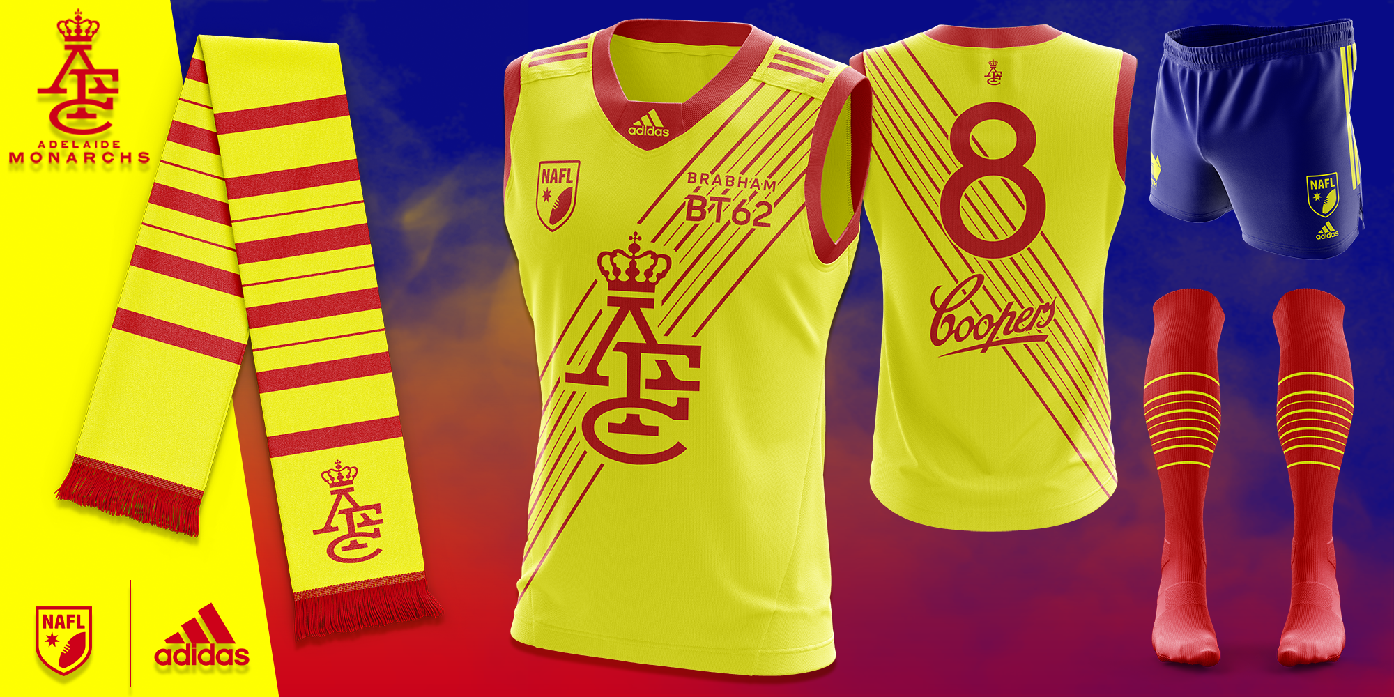
Renmark Roosters v Adelaide Monarchs

d1PKntG.jpg


3SvxMiy.png


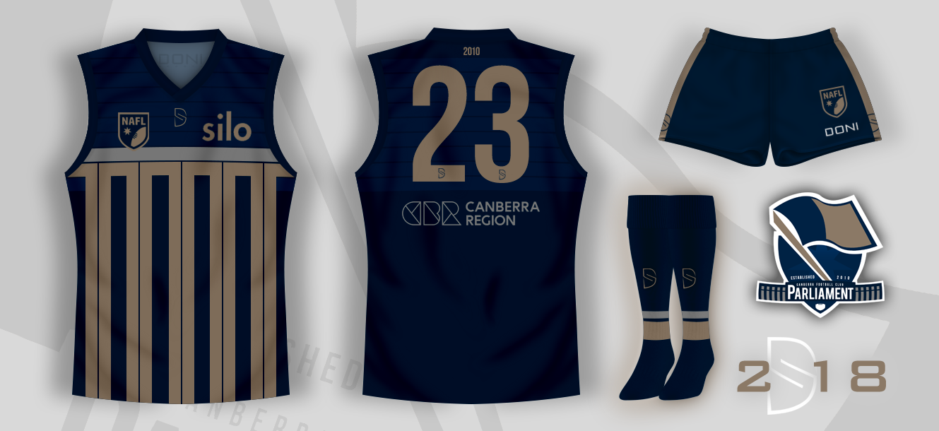
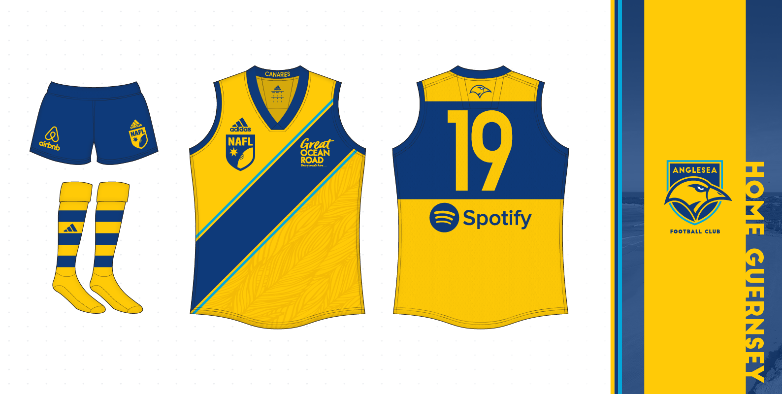
Canberra Parliament v Anglesea Canaries

575455_89d0252b911c9b2201f12e279fa66606.png


ZuDI08M.png


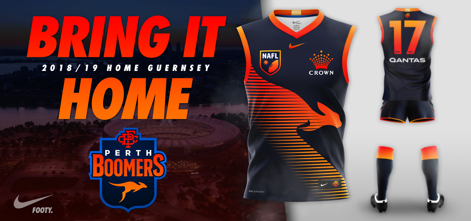
Perth Boomers v Waikato Tigers

42794044784_5eec05d30f_o.png


8ds3jHm.jpg


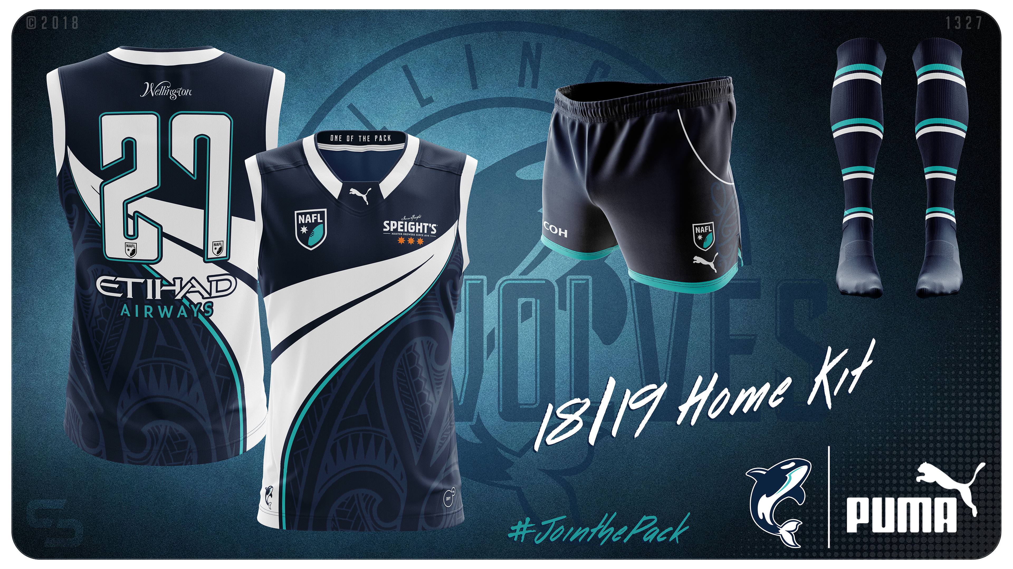
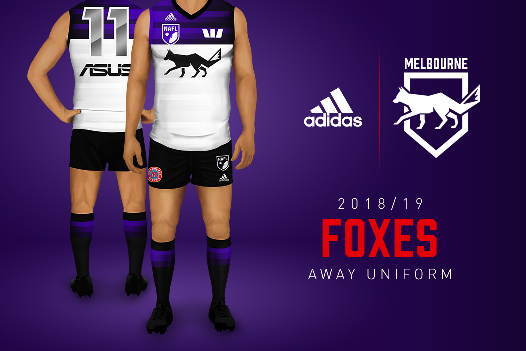
Wellington Seawolves v Melbourne Foxes

XySHJR9.jpg


IluZEK1.jpg


  • Thread starter
  • Moderator
  • #3

Log in to remove this ad.

  • Thread starter
  • Moderator
  • #5
That away kit is the most beautiful thing I've seen on BigFooty.

His whole set this season, IMO, is one of the best of any team in NAFL history. So simple and classic, great logo mark, great colour schemes and yeah.
 
Last edited:
  • Thread starter
  • Moderator
  • #8
Alright, feedback time. I know my design is dark (my computer settings are different from my phone settings) but I'm surprised at some of the names voting for Woollongabba over Gold Coast. What am I missing here?

Personally, I think there's just a massive lack of contrast or pop - maybe because the design is dark, but yeah. Something about WG's orange and pink on the brown base really pops, and I quite like the wordmark.
 
Personally, I think there's just a massive lack of contrast or pop - maybe because the design is dark, but yeah. Something about WG's orange and pink on the brown base really pops, and I quite like the wordmark.
Fair enough. I've seen my design on my phone and it's night and day, pardon the pun.
 
Alright, feedback time. I know my design is dark (my computer settings are different from my phone settings) but I'm surprised at some of the names voting for Woollongabba over Gold Coast. What am I missing here?

I must admit, I'm not sure why Woollongabba is polling ahead of the G-Force. The G-Force is not the best design in the comp (it's hard to back up a winning NAFLR design with something original in the NAFL that can achieve similar success) yet I think it's much better overall than Woollongabba

In regards to feedback on your design, I'd look at presenting the jumper in a similar way to Busselton, where the design is bright, clear and easy to see. Unfortunately, the G-Force design gets lost in the whole presentation, and even switching to a brighter colour scheme (such as going from light blue to cyan) will liven the whole design up a little. Also, the back of the jumper and the way it's presented and the use of two blues means everything gets lost within each other
 
Alright, feedback time. I know my design is dark (my computer settings are different from my phone settings) but I'm surprised at some of the names voting for Woollongabba over Gold Coast. What am I missing here?
I'm just really not a fan of the shield shape you've tried. And it's such a big part of the design that it ruins the rest of the kit and colours for mine.. :(
 
  • Thread starter
  • Moderator
  • #12
Fair enough. I've seen my design on my phone and it's night and day, pardon the pun.

It does look better on my phone I'll admit, but there's nothing really "highlighted". I preferred the scheme in reverse last season when you won the Ressies, I think the small amounts of sky on the navy base really popped, where as it just doesn't seem to work as well inversed. This is where my reasoning for voting for the Mammoths takes shape in this - the colours really pop, and the monogram really stands out. I'd have gone with a black base though, tbh.
 
I must admit, I'm not sure why Woollongabba is polling ahead of the G-Force. The G-Force is not the best design in the comp (it's hard to back up a winning NAFLR design with something original in the NAFL that can achieve similar success) yet I think it's much better overall than Woollongabba

In regards to feedback on your design, I'd look at presenting the jumper in a similar way to Busselton, where the design is bright, clear and easy to see. Unfortunately, the G-Force design gets lost in the whole presentation, and even switching to a brighter colour scheme (such as going from light blue to cyan) will liven the whole design up a little. Also, the back of the jumper and the way it's presented and the use of two blues means everything gets lost within each other
He could probably achieve just the same by making the background a lighter shade of blue to create a better contrast.
I quite like G-Force's two-shaded design personally.
 

(Log in to remove this ad.)

It does look better on my phone I'll admit, but there's nothing really "highlighted". I preferred the scheme in reverse last season when you won the Ressies, I think the small amounts of sky on the navy base really popped, where as it just doesn't seem to work as well inversed. This is where my reasoning for voting for the Mammoths takes shape in this - the colours really pop, and the monogram really stands out. I'd have gone with a black base though, tbh.
I agree but thought I'd take the risk to avoid the sameness factor.

He could probably achieve just the same by making the background a lighter shade of blue to create a better contrast.
I quite like G-Force's two-shaded design personally.
The shades of blue are identical to the shades I used last season. I should have known better on this part as Scorch highlighted this when I was going through it last season. Good to have it pointed out though.
 
Alright, feedback time. I know my design is dark (my computer settings are different from my phone settings) but I'm surprised at some of the names voting for Woollongabba over Gold Coast. What am I missing here?
There's too much going on for my tastes, especially with two such similar colours. I'd have gone with either the shield or the stripes but not both. If the stripes then probably thicker more AFL style. It seems more like a NRL top to me.
 
I think contrast is your biggest issue BarryBran. Contrast is difficult with the double blue colour scheme unless you really make an effort to make your navy dark and sky bright. I don't know whether using a bit more white might make things pop a bit more? I'd definitely push your navy darker and your sky brighter though. Contrast is far more important on a screen than it might be in real life as well.

The Mammoths entry is really good though. Really interesting colour scheme, clever and unique designs, clean template and everything pops. No real shame in losing to it.
 
  • Thread starter
  • Moderator
  • #19
Less than 24 hours to go and we have a tied game and two games only a couple of votes apart!

Please get voting if you haven’t already. :)
 
I really like the Tigers jumper, but reckon with some minor tweaks would be even better;

- tone down the background image (it detracts from the actual jumper)
&
- run an all yellow back

Love it otherwise. Just my 2c.
 
Back
Top