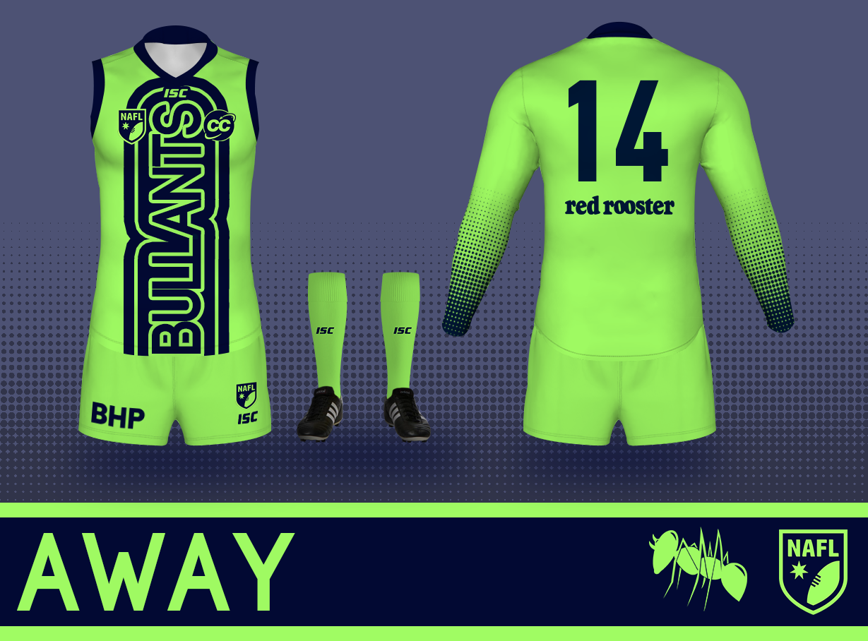
Poll NAFL 2020 - Round 1, Matchday 3

Vote for your favourite in each matchup


  • Total voters
    55
  • Poll closed .

Remove this Banner Ad

5YeMS3d.png


Poll will be open for 3 days.
Please vote in each of the games.
Do not vote for yourself.


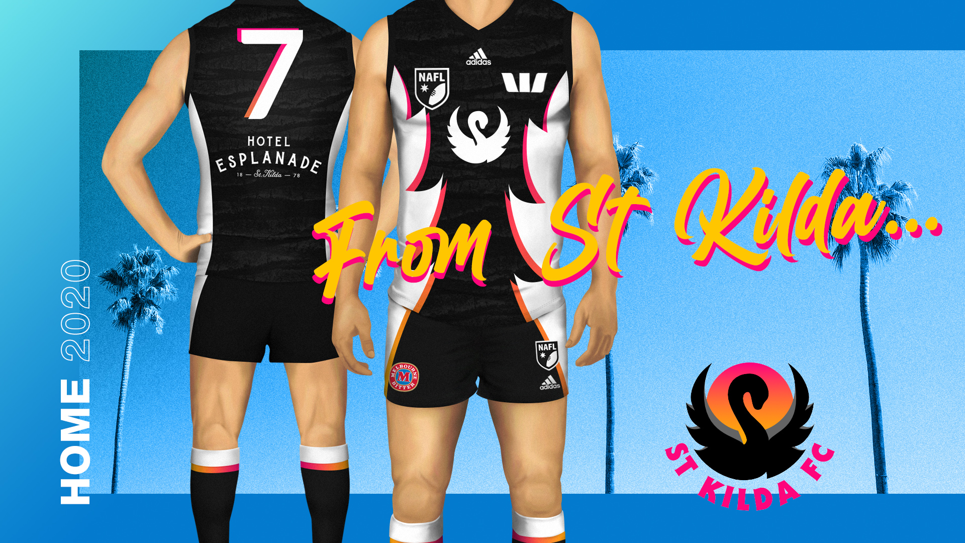
St Kilda vs. Barossa Valley

wJSFeKA.jpg


5Smzp11.png


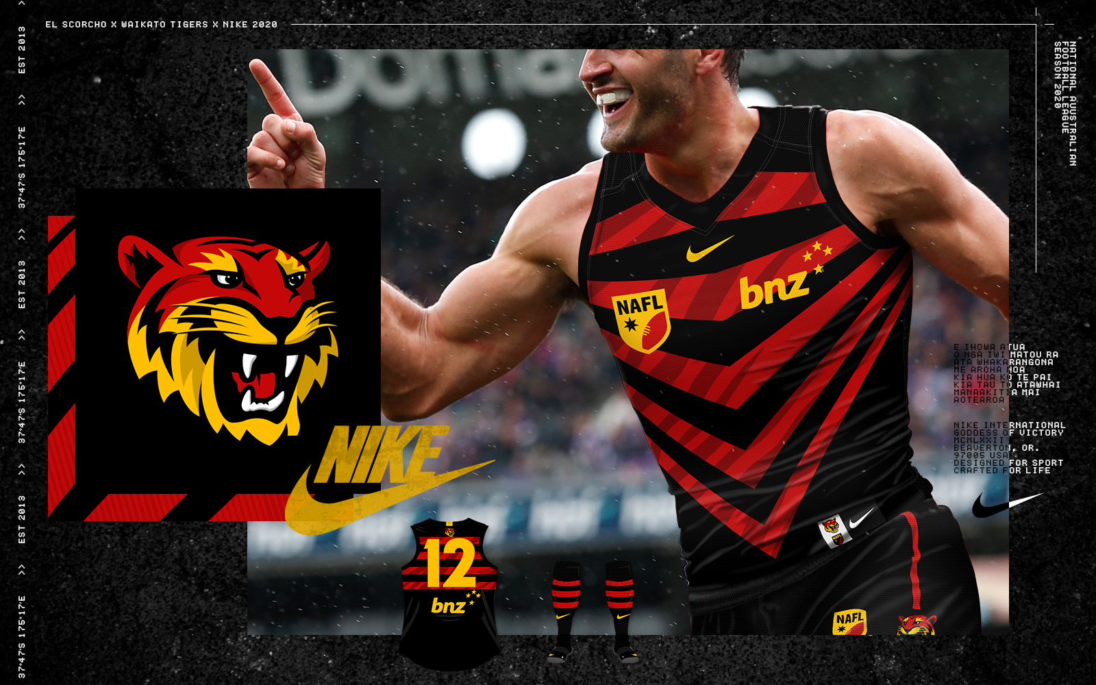
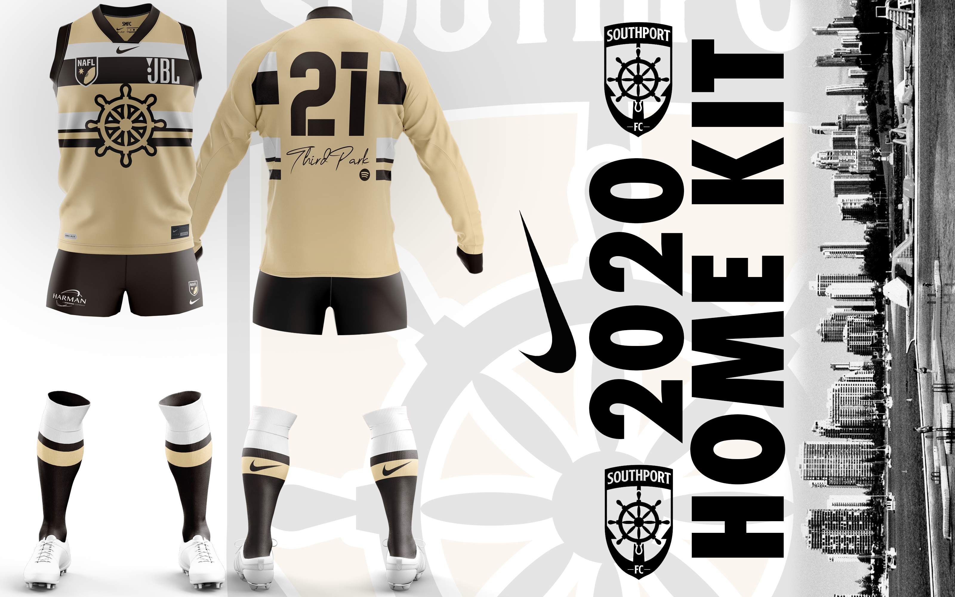
Waikato vs. Southport

cnKzmwf.jpg


QY8RKCD.png


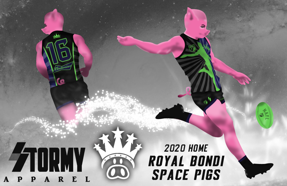
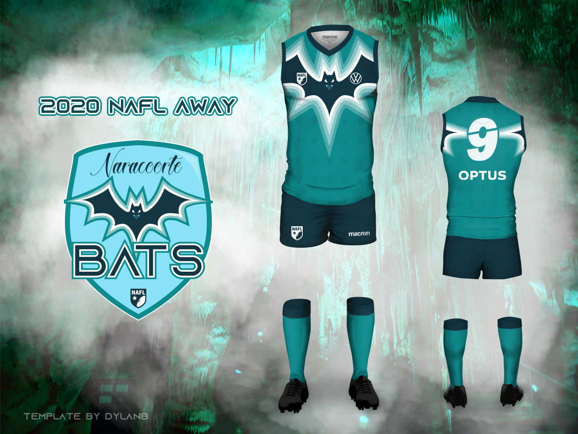
Bondi vs. Naracoorte

z3KLnf0.png


Y2PGe3B.png


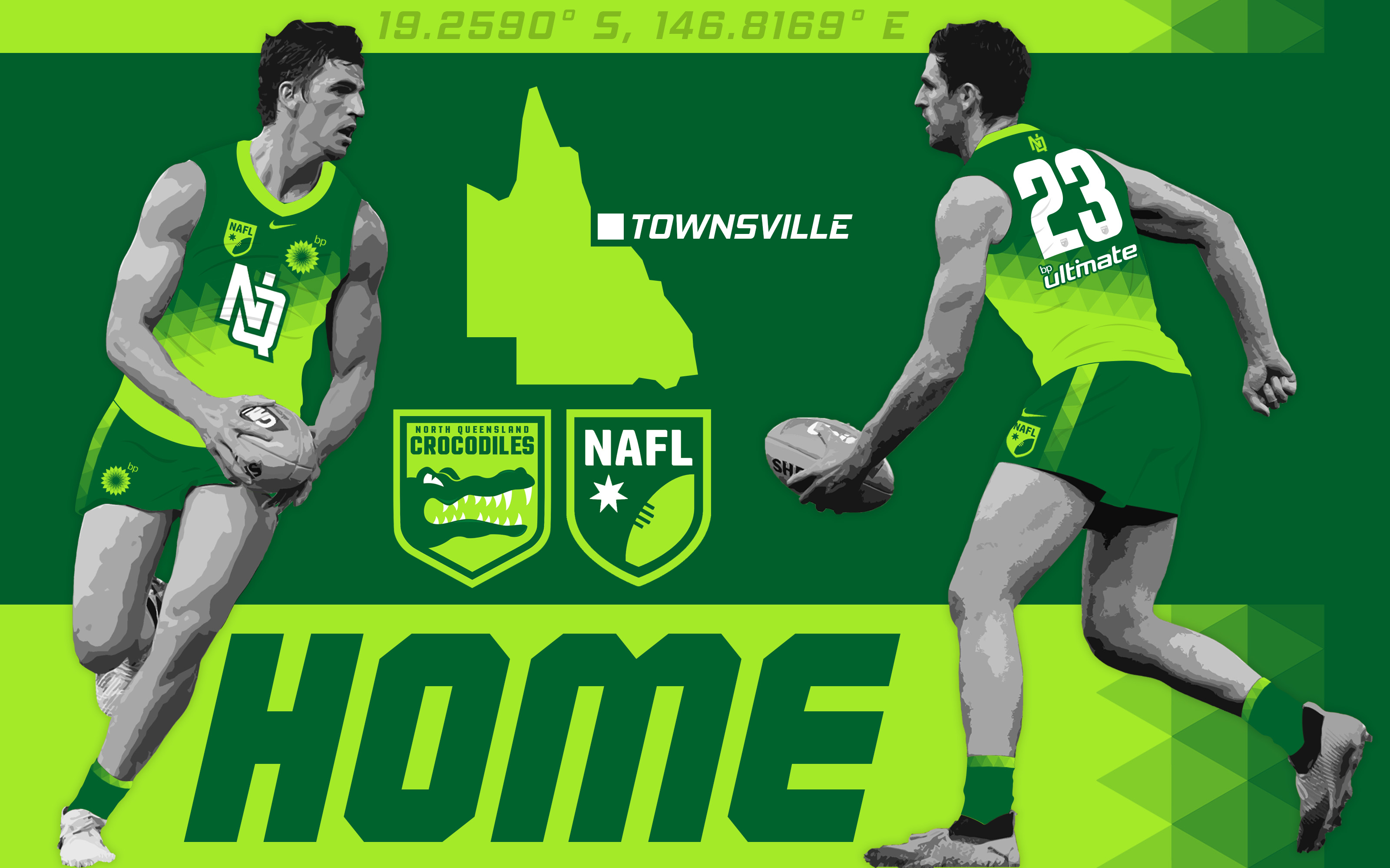
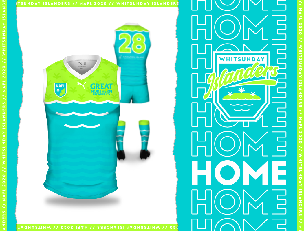
North Queensland vs. Whitsunday

6HiubNc.jpg


8j0W3f8.png


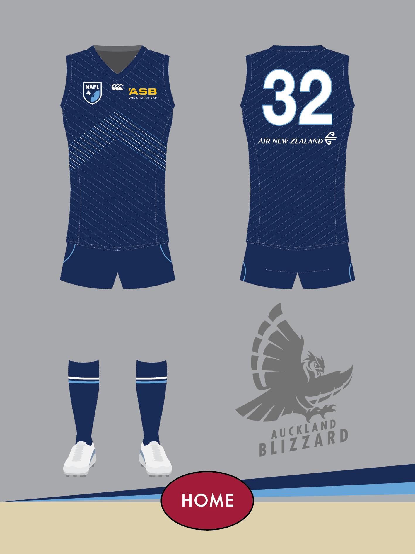
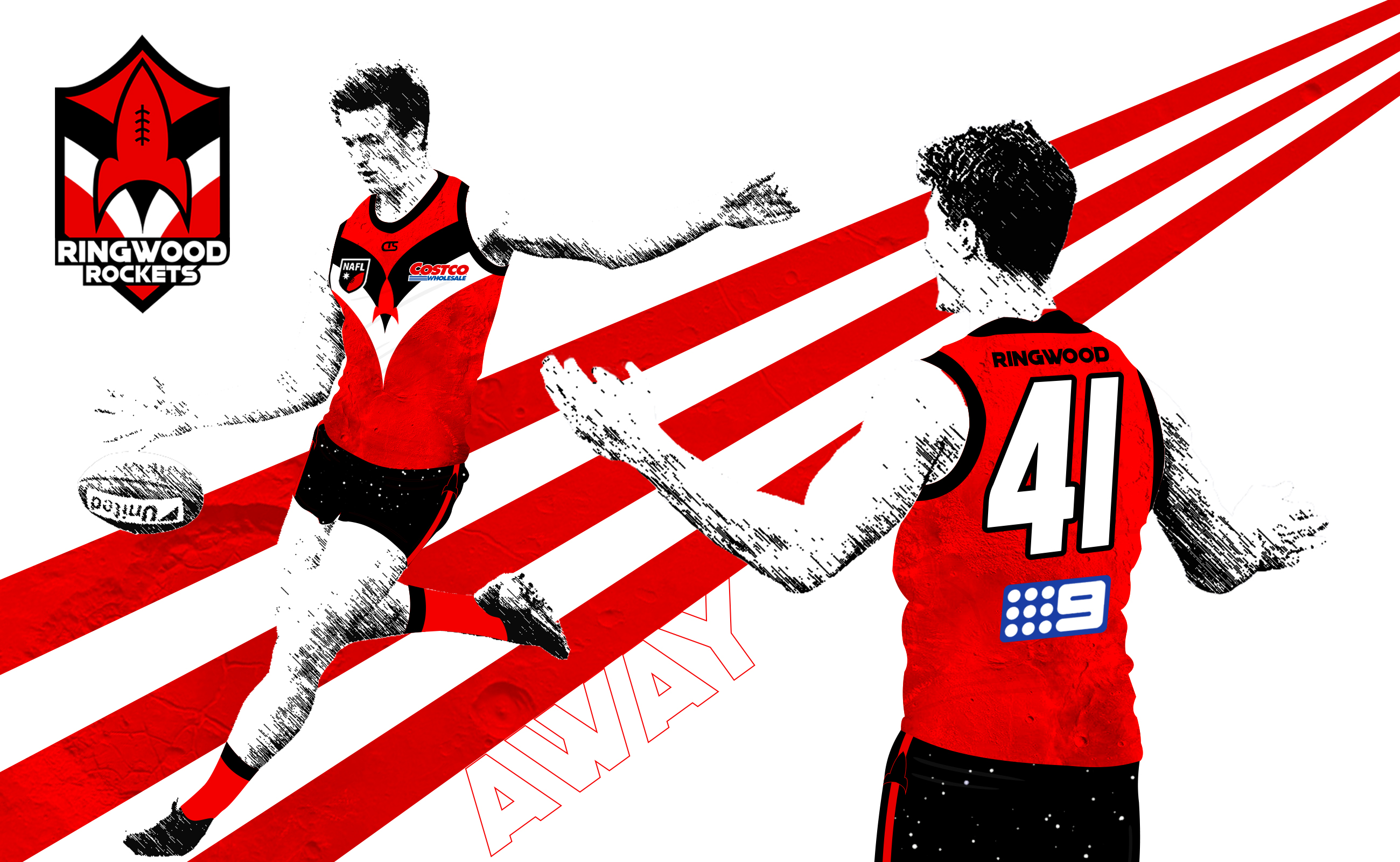
Auckland vs. Ringwood

Zy7BOjr.jpg


g4ephLh.jpg


Alice Springs vs. Wembley

ZrCC4ak.png


PBhy6GH.png


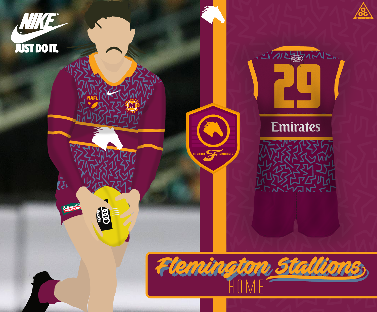
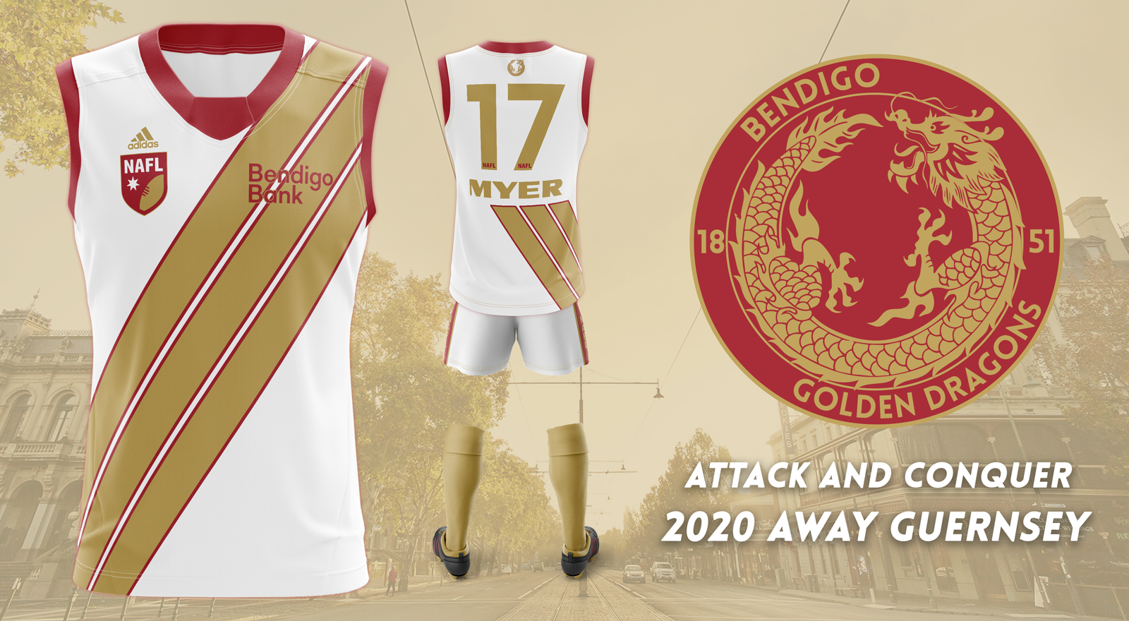
Flemington vs. Bendigo

50308293466_7a31e20f75_o.png


FBXp4ga.png


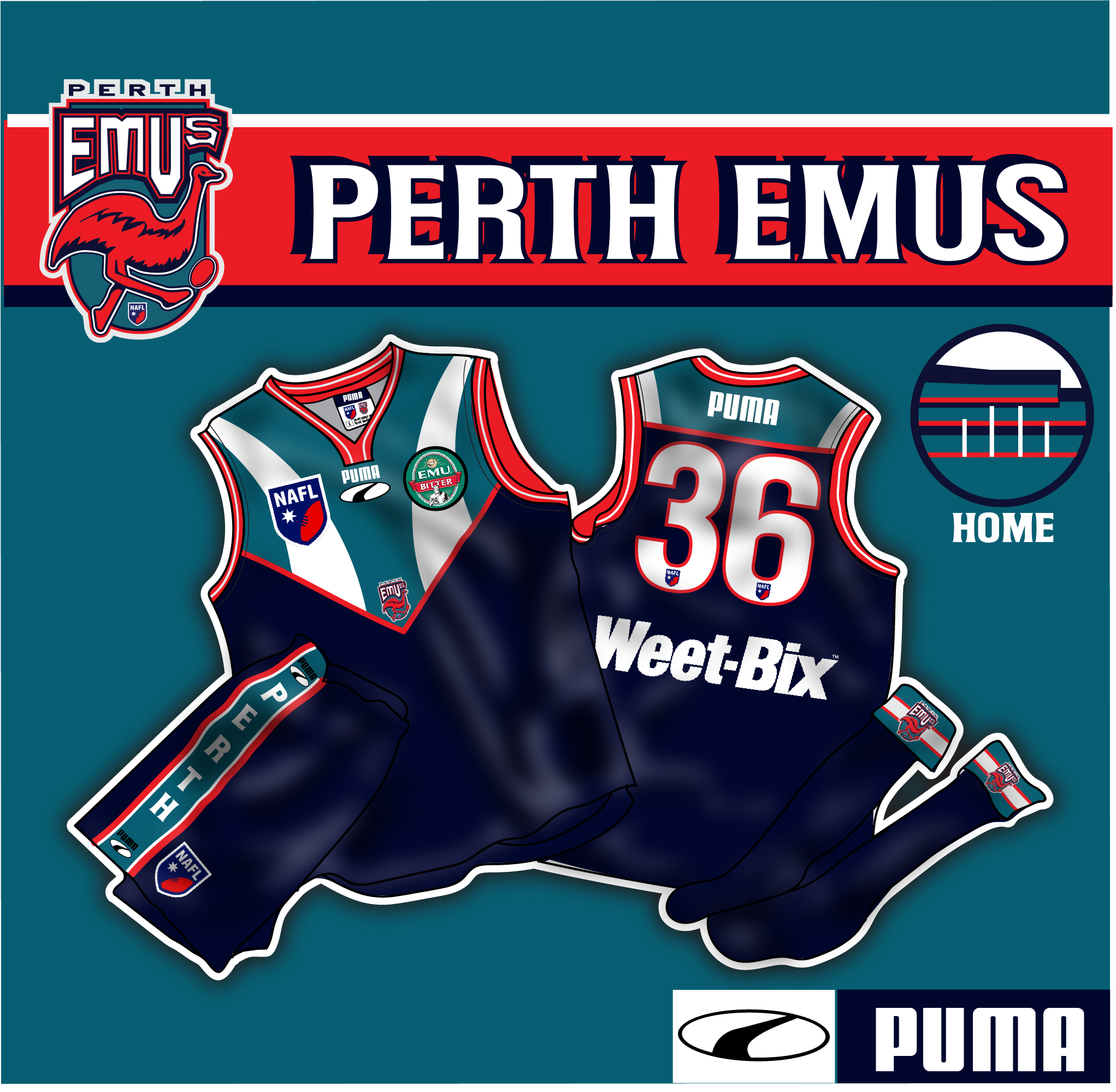
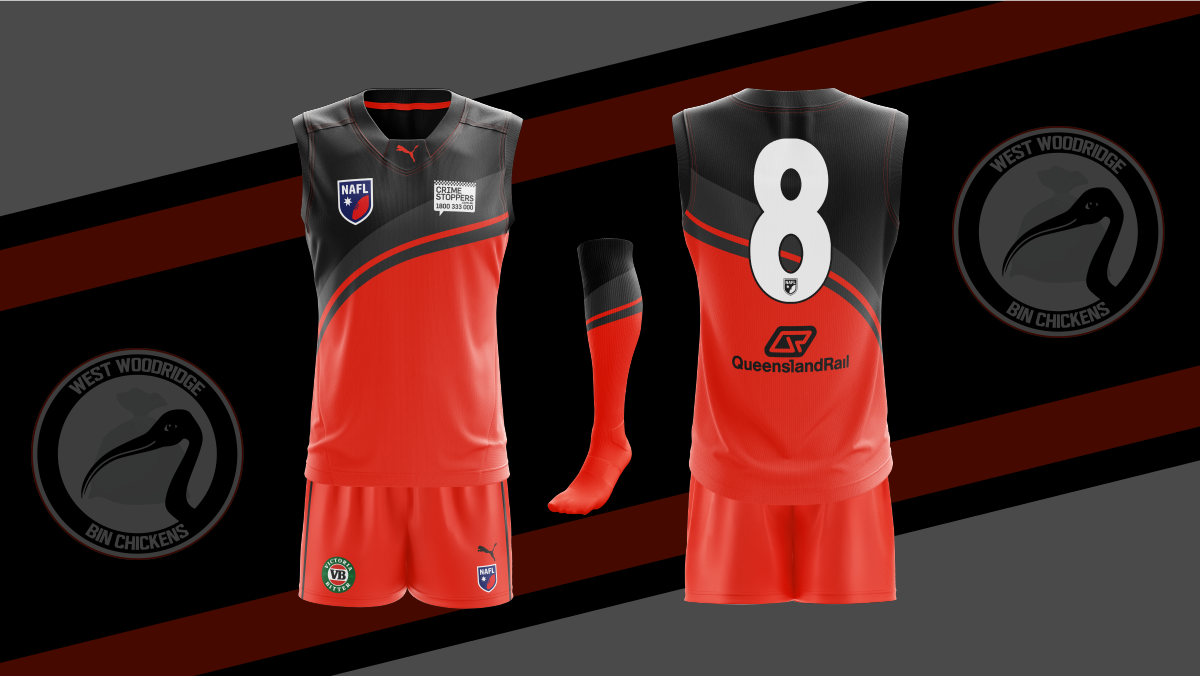
Perth vs. West Woodridge

nqfQPUT.png


dSg1QVi.png
 

Log in to remove this ad.

I think the pigs would have appreciated a tail hole.

Presentation League points go to St Kilda, Waikato.
 
Stormy what the *.
Also I hope everyone likes the utensil kit I made for Wembley. Sort of a last minute attempt at getting a clash jumper done that wasn’t a recolour of the home.
Also I can’t seem to find an edit button but I must’ve forgotten to put in a vote for the Bondi vs Naracoorte game, is it possible to add +1 for Bondi?
 
Perth colours and logos looking so 90s, I love it.
Big 90s rugby league vibes from it. Presentation gives it that level of authenticity too. An excellent entry, kudos to the designer.
 

(Log in to remove this ad.)

Thoughts on new direction for Ringwood this season?

Love it overall. The new template is obviously a winner and I like how your presentation has stepped up from MSFL. Design is simple but fairly unique, I like how you've worked the rocket into the curved chevrons. Really nice! Should go far, even with the incredible strength of the comp this year.
 
Thoughts on new direction for Ringwood this season?

One of the problems I found with putting together my entry was that everyone I showed it to would just say it was "really good" and wouldn't criticise or saying anything negative, and the thing you really need to improve is people's honest opinions that are critical, so I'll give you mine.

I think the logo is really good. I think the jumper design is really good. I think the way the logo and jumper design are related is really good. And those are the main elements, so well done. I don't really go for the scratchy effect but that's a personal preference. You've tried something different with the presentation and deserve credit for that. My main criticism is that I find those huge three stripes really distracting, like a running track or something. Overall, well done.
 
Last edited:
I feel like I've missed a memo or a tutorial somewhere. So many jumpers on actual footy players this year.
I trialed my first player-based template in the MSFL inaugural season, which was inspired by what I saw from Melbourne Foxes and Brunswick from previous NAFL's. I've seen Fizzler working on player-styled templates for a while now and Nato got inspired from me, but I'm glad to see so many kicking around now because they're not that hard to make for less experienced designers, but look incredible all the same.
 
Feedback on Naracoorte? Both positive and negative. It ended up being a bit rushed so the presentation quality got sacrificed. :(

Sent from my SM-A505YN using Tapatalk
The bat itself in the logo is awesome! Unfortunately the rest of the logo doesn’t do the bat justice. Would love to see the bat on its own as the logo.

The bat has transferred over to the jumper design really well. I see why you’ve shrunk your logos but I’d prefer if you hadn’t. The colours are great. Really cool concept.
Thanks :) I had the bat with just the text (in a different font) originally but I didnt have the outline at that stage.

Cheers. I did try and make the bat bigger to fit normal sized logos but I felt like I lost too much of the wings to the back. Maybe I could have tried to change the bat a bit too fit the logos but like I said I was pretty time strapped in the end, work has been a madhouse.

AFWIW I started a realistic template on Dixon a-la magpienato, caloschwaby among others but I ran out of time.
 
I trialed my first player-based template in the MSFL inaugural season, which was inspired by what I saw from Melbourne Foxes and Brunswick from previous NAFL's. I've seen Fizzler working on player-styled templates for a while now and Nato got inspired from me, but I'm glad to see so many kicking around now because they're not that hard to make for less experienced designers, but look incredible all the same.
I have given this style of template a go a few times but never been able to get it to work (largely down to not being able to extract the texture properly from the original image). May give it another go for FLO now if I have the time after seeing just how good it can look.
 
Back
Top