Poll NAFL 2020 - Round 2, Matchday 1

Vote for your favourite in each matchup


  • Total voters
    53
  • Poll closed .

Remove this Banner Ad

SWb7sLu.png


Poll will be open for 3 days.
Please vote in each of the games.
Do not vote for yourself.


Sydney vs. Brunswick

gup87hX.jpg


HMS0jQ7.png


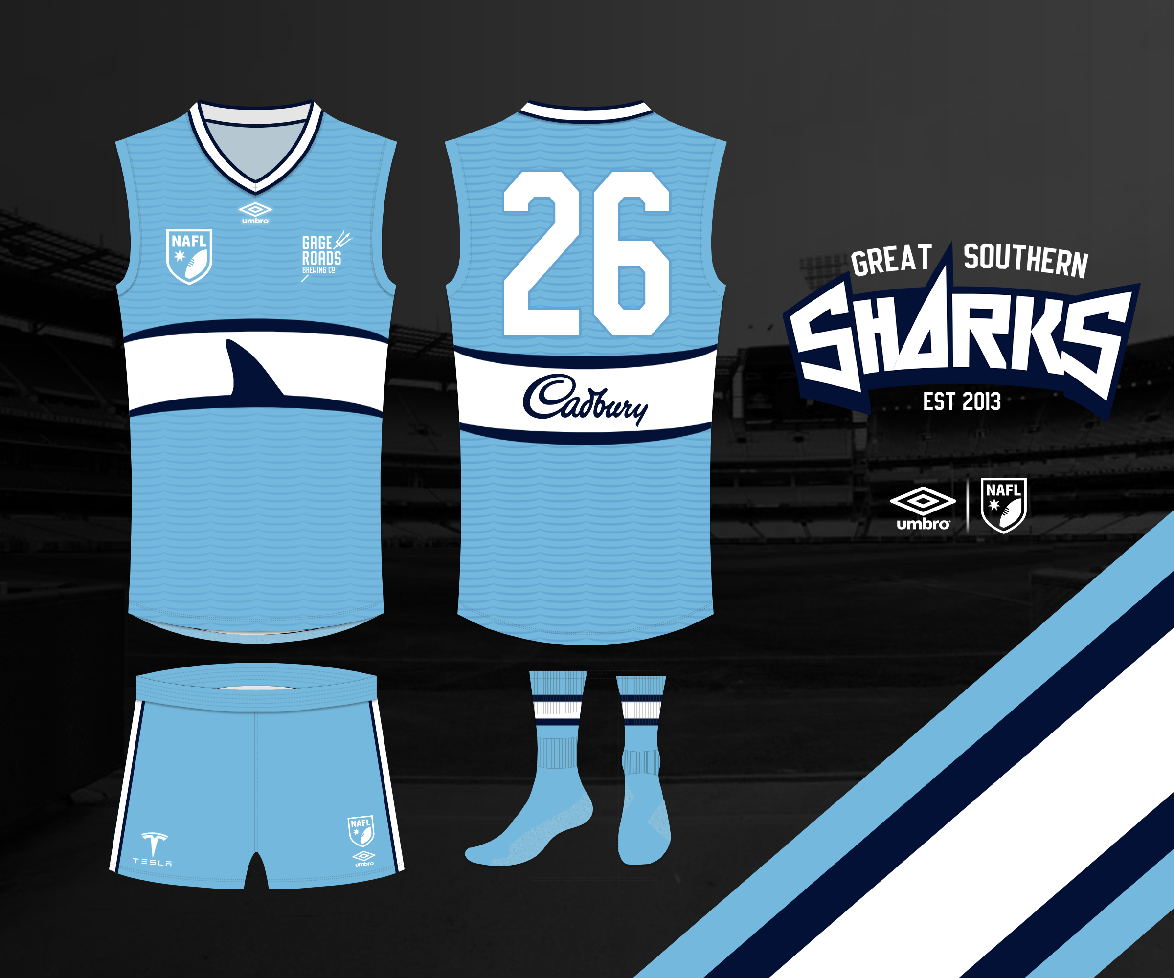
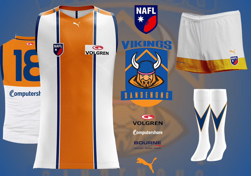
Great Southern vs. Dandenong

caCXIOu.png


aKntgso.png


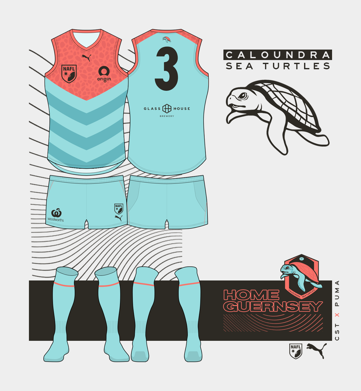
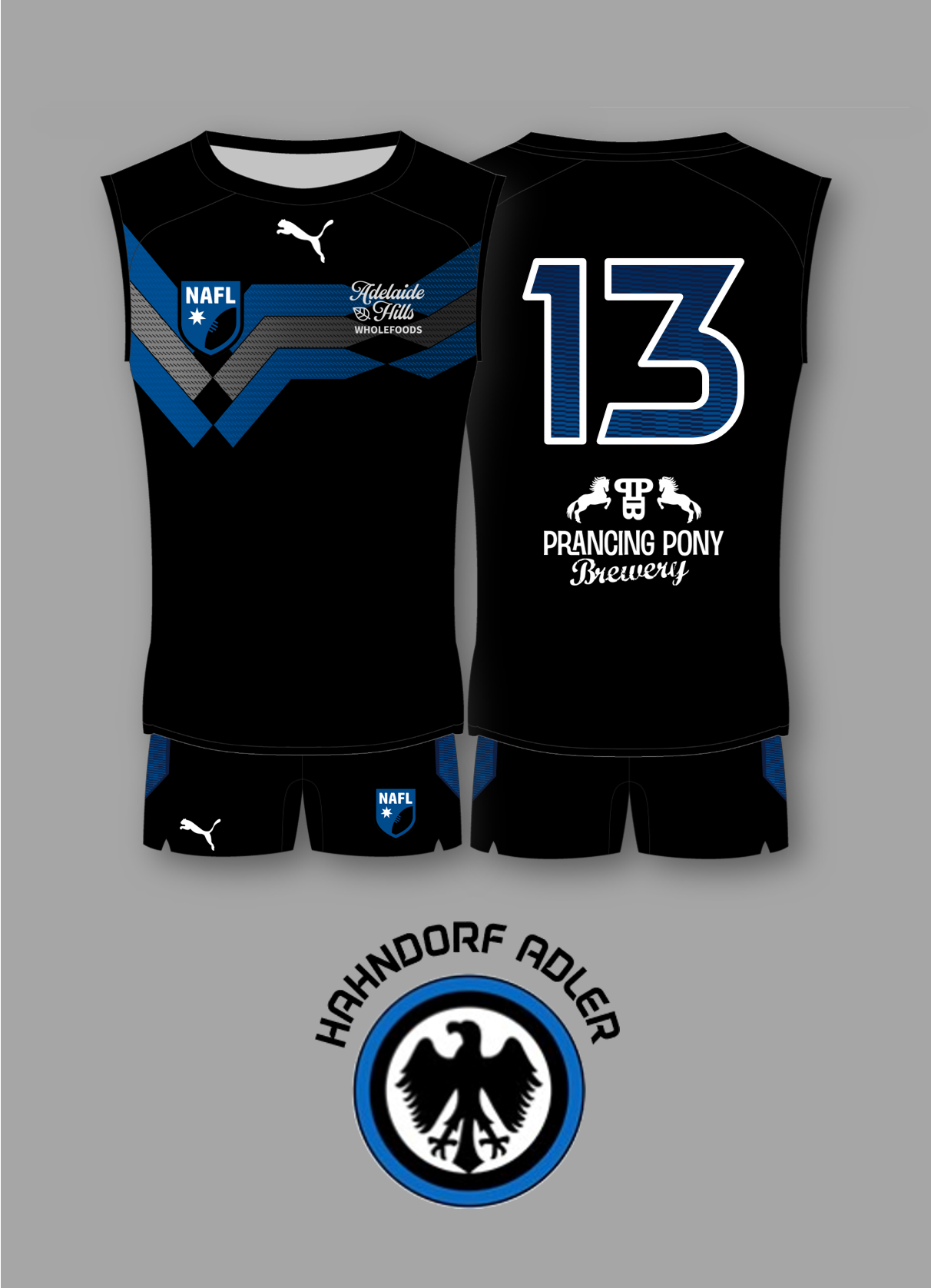
Caloundra vs. Hahndorf

kTacY4D.png


ux3c7lt.png


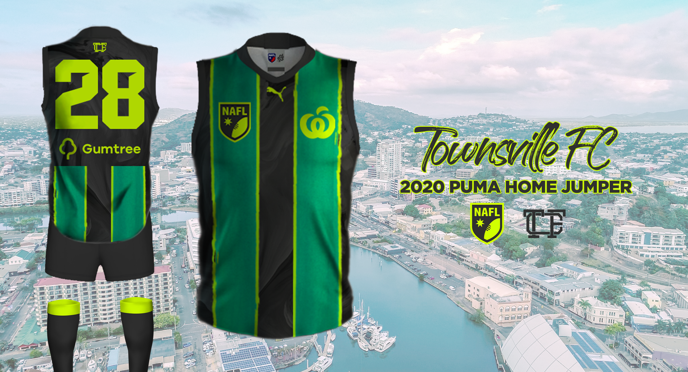
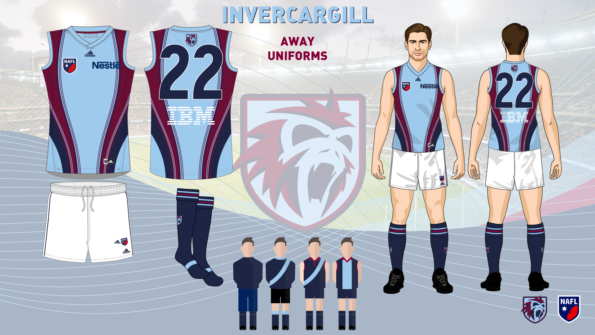
Townsville vs. Invercargill
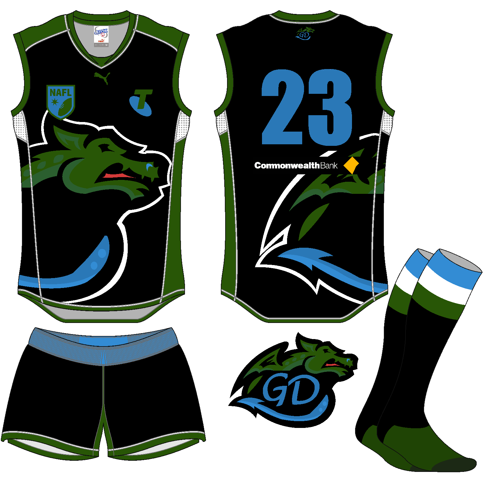
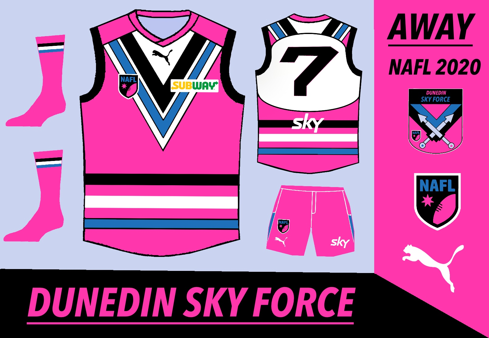
oywB5NI.png


NAFL-Invercargill-Away.png


Geelong vs. Dunedin

qxyOkXI.png


UIoI4vy.png


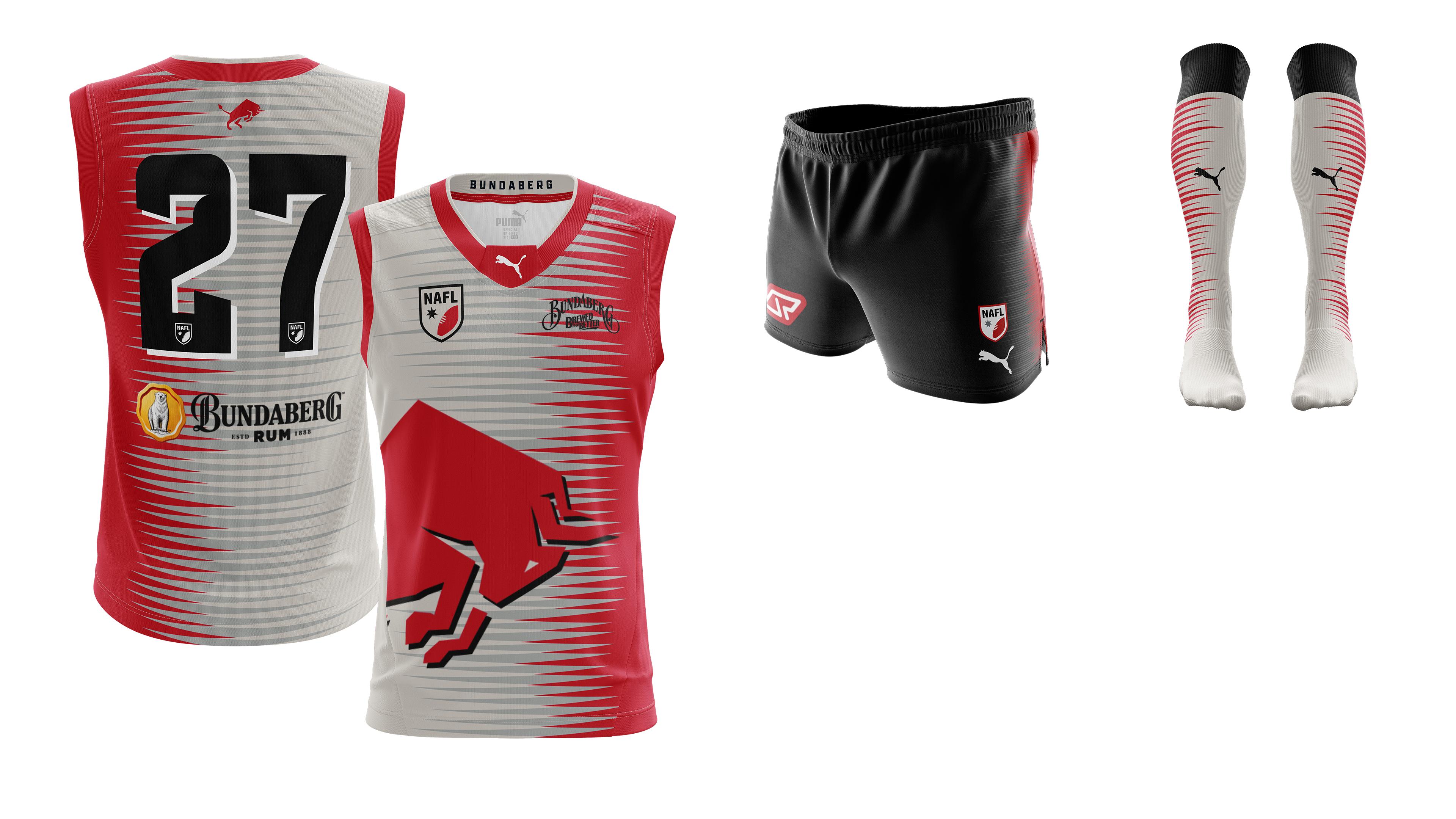
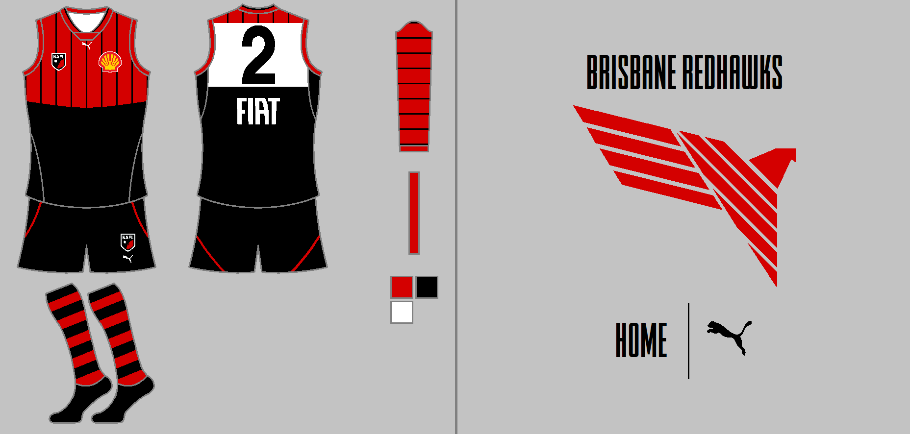
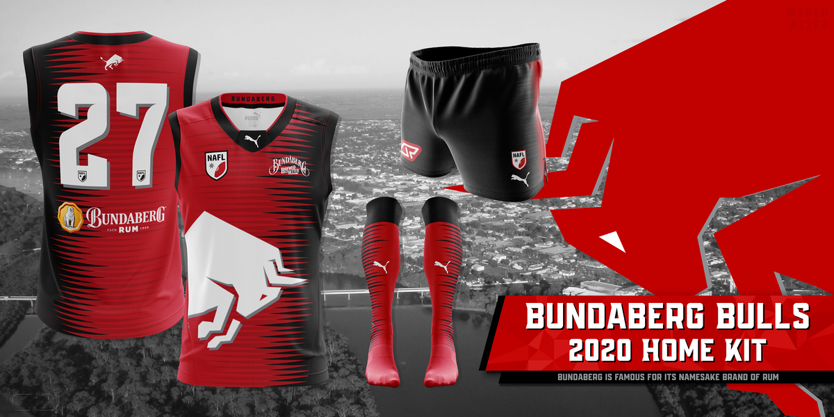
Brisbane vs. Bundaberg
(otherwise known as the round I wish I had have enforced lighter shorts on Bundaberg's away kit, jfc.)

RamZJeR.png


GG6YGNE.png


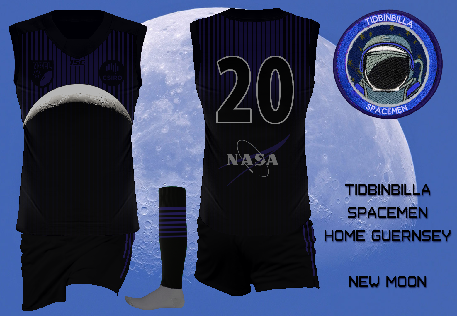
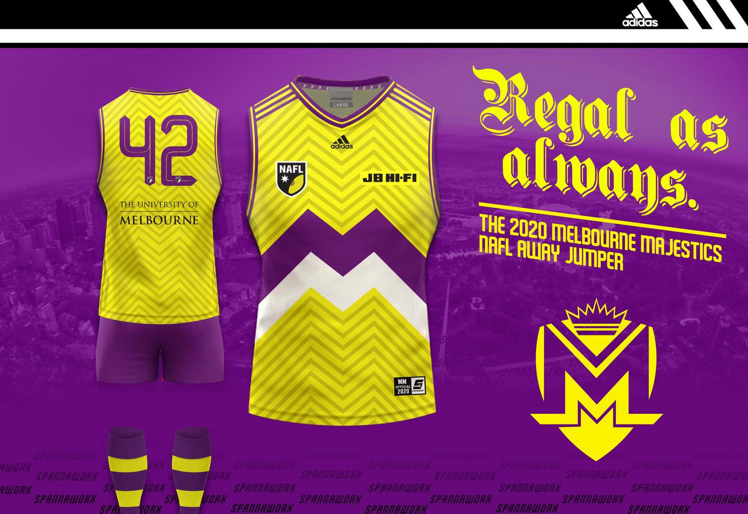
Tidbinbilla vs. Melbourne

OPdJPCg.png


Rg5CTjQ.jpeg


Uluru vs. Adelaide

50040648616_3e5d5165ef_o.jpg


Xk4vBUZ.png
 

Log in to remove this ad.

  • Thread starter
  • Moderator
  • #4
  • Thread starter
  • Moderator
  • #7
Wait so for Bundaberg, which jumper am I voting for exactly? Like why are there two different home jumpers? I’m very confused.

would you believe me if I told you that bundaberg's away was even more of a clash?

again, this is not craegus's fault at all, he submitted something, I allowed it.
 
would you believe me if I told you that bundaberg's away was even more of a clash?

again, this is not craegus's fault at all, he submitted something, I allowed it.
No I believe you, I’m just interested at the purpose behind the red jumper and the blue jumper that alternates through the gif.
 
  • Thread starter
  • Moderator
  • #9
No I believe you, I’m just interested at the purpose behind the red jumper and the blue jumper that alternates through the gif.

That blue jumper is a glitch that I noticed too, but it only happened once or twice so I let it be. He hasn't intentionally put a blue version in there.
 
Take this as just my opinion, as worthless as it is in reality, but the only thing stopping me from voting for Adelaide here and in Round 1, was the number font, particularly on the 6. it just looks wrong and to me is off-putting. Otherwise, loving the designs in this comp, some very tough match ups to decide upon.
 
Wait so for Bundaberg, which jumper am I voting for exactly? Like why are there two different home jumpers? I’m very confused.

I can confirm that there is no blue kit. As FT said it seems to be a glitch in the image, but from my end I have never seen it happen, the design has always shown up as being red.
 
I really like the Brisbane Redhawks logo, it appeals to my personal taste more than many. The typeface chosen is good too, goes well with the logo.

Unfortunately, it is just so hard to compete against Photoshop templates using a Paint template. :(
 
Last edited:

(Log in to remove this ad.)

Take this as just my opinion, as worthless as it is in reality, but the only thing stopping me from voting for Adelaide here and in Round 1, was the number font, particularly on the 6. it just looks wrong and to me is off-putting. Otherwise, loving the designs in this comp, some very tough match ups to decide upon.

Whereas for me, the number panel is my favourite part of the Adelaide kit! I love it! Uluru just wins out for me, but it's definitely the match of the round.
 
I think clearly since Bundaberg have failed to bring an appropriately contrasting kit for their match against the mighty Redhawks, the only fair sanction is disqualification from this round :D:p;)

I believe you can blame FT completely for this. Not only did he accept the designs that now are in play, but when I was designing Bundaberg I prototyped this design and showed it to him;

fUIEw8j.jpg


But was told that it would be a "death sentence" to go with grey, so my away kits colours were changed.
 
  • Thread starter
  • Moderator
  • #18
I believe you can blame FT completely for this. Not only did he accept the designs that now are in play, but when I was designing Bundaberg I prototyped this design and showed it to him;

fUIEw8j.jpg


But was told that it would be a "death sentence" to go with grey, so my away kits colours were changed.

Yeah as I said, there’s no fault on your end here. I encouraged and accepted the designs you submitted so 100% on me.
 
I believe you can blame FT completely for this. Not only did he accept the designs that now are in play, but when I was designing Bundaberg I prototyped this design and showed it to him;

fUIEw8j.jpg


But was told that it would be a "death sentence" to go with grey, so my away kits colours were changed.
To be fair, I used grey in my first season and finished dead last with only one win
 
Back
Top