Discussion NAFL Jumpers That Never Were

Remove this Banner Ad

Yeah, I think the new look works far more than this design. Thoughts on the embossed chest design? Did it work or would a watermark have worked better?

I still don't see and issue with the shorts, but we are not getting into that argument again.
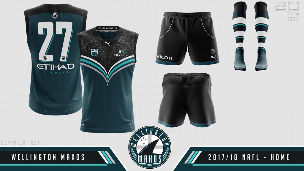
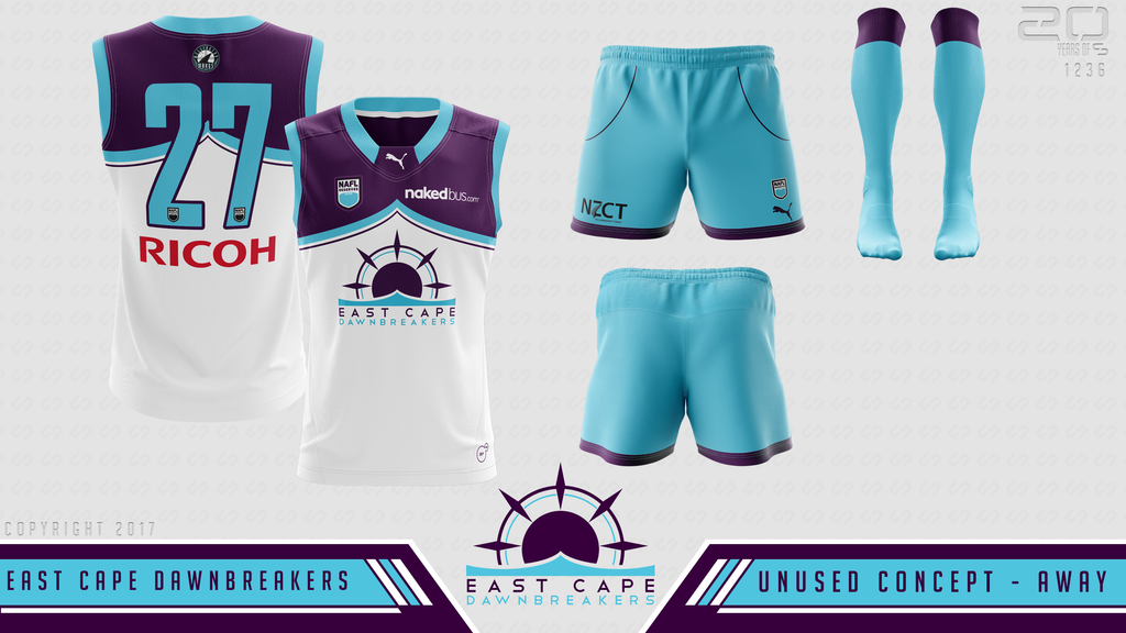
I picked it up straight away, looks sharp.
 
re the shorts, to me the size ratio should be more or less 2:1 where yours are 1:1 so they look too long

walker.jpg

apologies for dicing your stuff up here but this makes it plain as day to me that they're a bit lengthy

makos1.jpg

the design is really good though, definitely the most focused and flashy makos effort yet. hope the final design doesn't veer too far from this.
 

Log in to remove this ad.

This was to be the 2017-18 Wellington Makos home kit before the change to the Midnight colour scheme.

Wellington%20Makos%20Home%201718edit_zpsoiuuzwo2.png


C&C welcome as the design is no longer being used.
I like it, it's similar to the design I had for last season's NAFL Reserves.

(Hate to be a dick because I keep going around the forum saying this^^ but it was my observation so I don't really care.)
 
What does the design in the yoke represent?

Nothing specific (it is from a general Maori tattoo design that had no actual meaning, but dies feature elements of a fern design), but it fit in with my idea of the V being the wake of a sharks fin through the water, so apart from being a link to the teams NZ heritage (being a Maori design and having the fern element) it adds to the disturbed water look.
 
The embossing is definitely cooler than a straight watermark, that part looks great. Having it any more prominent than it is would have resulted in the whole thing looking a bit busy.

Not sure I see a disturbed water look though.

I have a very basic Maori type pattern, but only on my Waikato River themed location kit, and it's quite subtle.
 
Nothing specific (it is from a general Maori tattoo design that had no actual meaning, but dies feature elements of a fern design), but it fit in with my idea of the V being the wake of a sharks fin through the water, so apart from being a link to the teams NZ heritage (being a Maori design and having the fern element) it adds to the disturbed water look.
Not trying to have a dig at you specifically but isn't this the sort of thing we've been discouraging with Indigenous designs here? Seems like the same issue to me.
 
Not trying to have a dig at you specifically but isn't this the sort of thing we've been discouraging with Indigenous designs here? Seems like the same issue to me.

Not at all. Yes the Aboriginal and Torres Strait people do not want people not of that heritage creating designs as people do not understand the meaning behind them (even if they are fully researched). However, not all Pacific Islander tattoo designs these days have a specific meaning. Yes traditional tattoos do have this, but with the popularity of these designs within the wider community in recent years, there are far more designs that are just patterns and shapes that have no specific meaning. Just look up Maori tattoo designs and see how many designs are out there that use similar shapes and designs but are just generic designs that look traditional. There also isn't really any outcry about these designs being made so perhaps the Pacific Islander community do not have as stronger view on this.
 
Not at all. Yes the Aboriginal and Torres Strait people do not want people not of that heritage creating designs as people do not understand the meaning behind them (even if they are fully researched). However, not all Pacific Islander tattoo designs these days have a specific meaning. Yes traditional tattoos do have this, but with the popularity of these designs within the wider community in recent years, there are far more designs that are just patterns and shapes that have no specific meaning. Just look up Maori tattoo designs and see how many designs are out there that use similar shapes and designs but are just generic designs that look traditional. There also isn't really any outcry about these designs being made so perhaps the Pacific Islander community do not have as stronger view on this.
Fair play, just thought it was important to raise the issue
 

(Log in to remove this ad.)

Seen the away did not receive much discussion, here is the former colour schemes location kit:

Wellington%20Makos%20Location%201718%20edit_zpsynlvfqre.png


The text is the towns within Gisborne, Wellington, Hawke's Bay, Manawatu, and Wanganui (mentioned in the collar effect) and the watermarked map is of those regions which happen to fall into the Wellington Makos support region.
 
As the East Cape Dawnbreakers brand has now shifted across to T20 cricket, and was never really going to ever eventuate in the NAFL or NAFL Reserves, here are the two designs that were going to be used for the team;

East%20Cape%20Dawnbreakers%20Home_zpsc4earzxj.png

East%20Cape%20Dawnbreakers%20Away_zpsbxclu3y0.png
Love the colour scheme. Unusual yet effective
 

Remove this Banner Ad

Back
Top