Freight Train
Once hit the sign at the Mercantile Mutual Cup
- Moderator
- #1
NAFL Logo Competition
Part One
The voting for a potentially new NAFL logo will take place in two parts through two 48 hour polls. The first poll will feature all of the new concepts, and the winning design from that will then be polled against the current NAFL design.
***
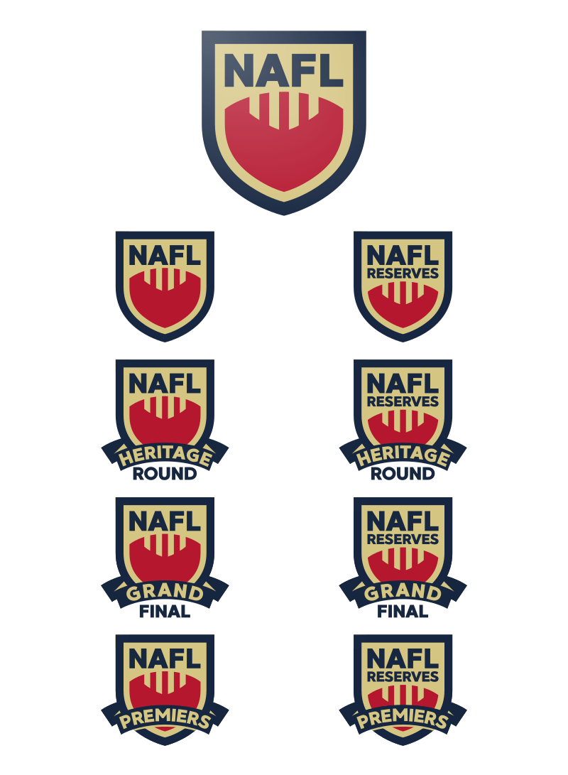
Design One

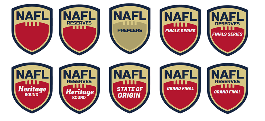
Design Two
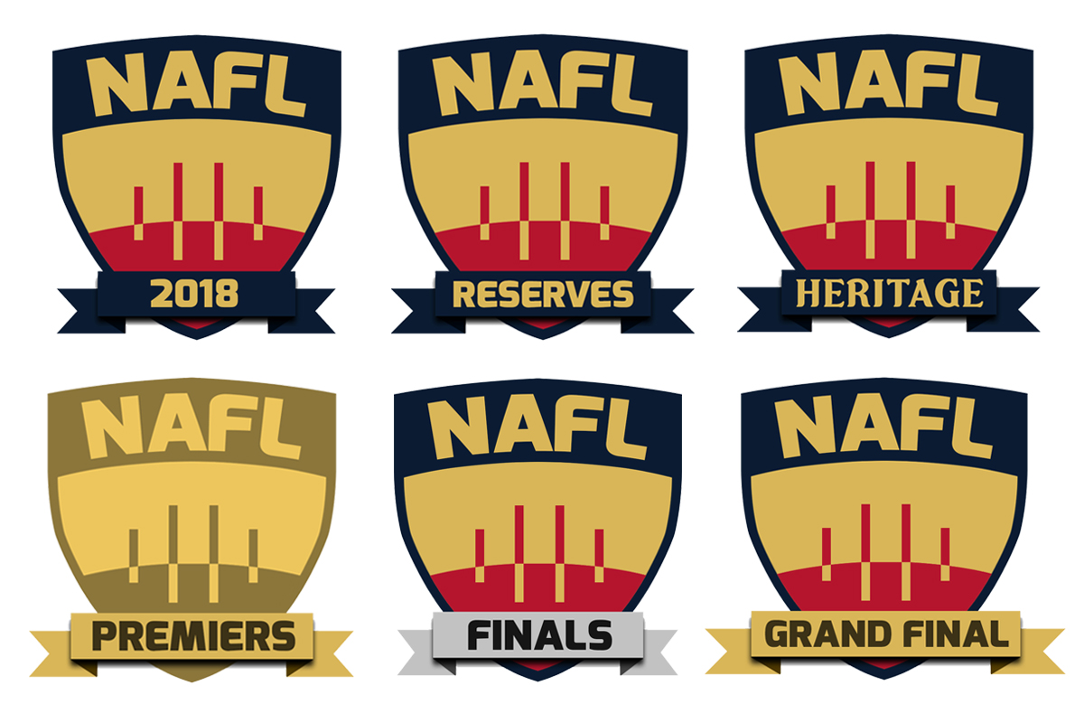
Design Three
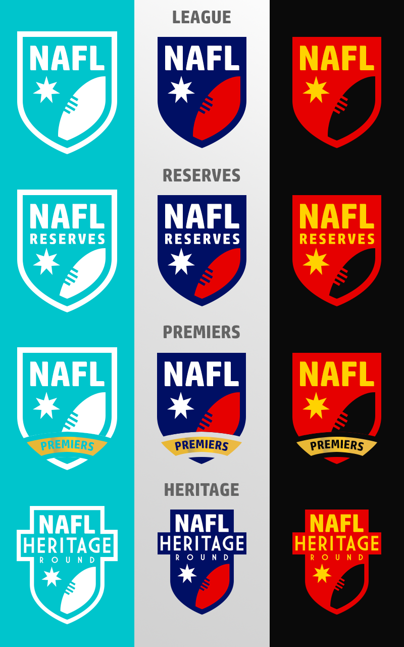
Design Four
Design Five
Part One
The voting for a potentially new NAFL logo will take place in two parts through two 48 hour polls. The first poll will feature all of the new concepts, and the winning design from that will then be polled against the current NAFL design.
***
Design One
Design Two
Design Three
Design Four
Design Five