Competition NAFL Reserves 2016/17 Hub Thread

Remove this Banner Ad

The rules clearly state that submissions are final. That means no deleting and re-uploading.
You have ~24 hours to get your images hosted on a third party website and sent to me, or your team will forfeit round 3.
Please show me such a rule and I will happily agree. I am sending them now though.
 
Please show me such a rule and I will happily agree. I am sending them now though.
Sending me your designs

  • PM me an all in one image with all your designs in it (any size).
  • PM me separate images of your designs (all the jumpers). Use www.footyjumpers.com as a rough guide for how big your images should be.
  • All designs must be sent to me by the 3rd of November or you may lose your spot.
  • If I get every ones entries before that date I'll possibly start the season earlier. The aim is to start one week before the NAFL seniors.
  • Your designs are considered final when sent, if something is wrong I'll tell you.
 

Log in to remove this ad.

Now that my three regular season designs have been revealed, I'd really appreciate some honest feedback on what I need to improve on for future comps coming up soon. Here is the set all together (crop from my all-in-one, sorry for the crappy quality):
SE3FzsP.png
 
Now that my three regular season designs have been revealed, I'd really appreciate some honest feedback on what I need to improve on for future comps coming up soon. Here is the set all together (crop from my all-in-one, sorry for the crappy quality):
SE3FzsP.png
I love the home and clash but I really wasn't feeling the away jumper. I put it down to the lighter blue; the darker blue would be better or even an inversion of your home jumper (yellow on top).
 
I love the home and clash but I really wasn't feeling the away jumper. I put it down to the lighter blue; the darker blue would be better or even an inversion of your home jumper (yellow on top).
Yeah I definitely agree with you in regards to the away kit and I probably could have picked a navy or something in my colour palette to help make a better dark kit. I could have gone for an inverse but then the clash would have looked out of place. my other option was to go for a BLacK guernsey but I wasn't sure whether I could introduce a new colour like that.
ZCNIVEd.png
This is nicer and I think your clash still has relevance. The only time it may become an issue is if there is a team with a predominantly yellow home jumper but even then, your back is blue so it shouldn't matter.
 
This is nicer and I think your clash still has relevance. The only time it may become an issue is if there is a team with a predominantly yellow home jumper but even then, your back is blue so it shouldn't matter.
Yeah, I didn't know if anyone was going to use a yellow home so I decided to err on the side of caution and not have anyone be forced to change out of their home because of me.
 

(Log in to remove this ad.)

I think the top 8's final at the moment, teams are just fighting for order. Happy to see some changes in there (though not at my expense!)
No way is it set in stone, teams 5-11 still all battling it out for top 8 spots at the moment.
 
Change your name. Northern Storm is about as boring and generic as it gets.
The name is a WIP. I was hoping for some c&c on the actual logo.

P.S. Isn't this a design comp, not a naming comp?

Edit: What makes the name Northern Storm more boring and generic than every other name in both NAFL divisions?
 
It should be never too early to release a preview of what next season might be like...
View attachment 317606
Thoughts?
The name is a WIP. I was hoping for some c&c on the actual logo.

P.S. Isn't this a design comp, not a naming comp?

Edit: What makes the name Northern Storm more boring and generic than every other name in both NAFL divisions?
Good on you SilvaComet for getting on the front foot and wanting to improve, big respect. When I first posted my designs on here back in 2012 and they weren't the best I didn't post again for 4 years so you're ahead of me in that regard.

Just quickly on the name, I think the 'Northern' is what makes it sound a bit generic Cairns, Townsville or even Darwin is more direct and something people can associate with. Also you've picked a fairly tricky name 'storm' as Ideally you want to have some character and it tends to be easier to do that with something that has a face/body language. You might have been onto a winner with your original design in that case then, but there's no reason you can't make the cloud work. The one you have at the moment looks far too friendly and the black outline really makes it look clip-arty like Barrybran said.

If I'm going to be honest about helping you then I don't think it's any secret that you need to improve technically as well if you're going to match it with the best. They best way to do this is practice, I reckon you should have a go at making logos to go along with jumpers to go along with your guernseys for the unlicenced AFL comp, I don't put much effort into mine but I'd like to think that adds something a little extra to my entry. I've just started a portfolio to get feedback on a particular style of logo that I'm looking to improve at, perhaps you could do the same? Get a few stored up with uniform designs (basically commit to finishing it) to go along with them post one a day so that you can go back and improve it based on the feedback that you get.

Another thing that I like to do is to do some research into logos that I'd like to replicate and have them next to me the whole time that I'm designing, both so I can check that I am 'doing the right thing' and to make sure that I'm not just copying one in particular. For example, with my Anglesea logo (not saying this is the gold standard, I just know the thought process here) I wanted a canary so I looked at the NCFC logo (and fan made versions) for how to present that animal as well as the Baltimore orioles to get my sort of style, it wasn't perfectly executed but as my my first real go at a sports style logo, I was fairly happy.
2FnxjTO.png

You can see a bit of both designs in there with that sort of upstanding and ready to fight attitude from the canary like the Norwich logo with the feathers technically laid out similar to the Baltimore logo. Your logo just doesn't quite have that sort of attitude to it yet, with a storm you are looking to be describing it as scary and menacing and I'm not seeing that yet. The type really doesn't add anything to it either and you haven't really personalised it to work with the logo, it doesn't always need to be but If it is going to be that big I'd want to be editing it a bit to make it a uniquely 'Northern Storm' wordmark.

Anyway I hope my rambling isn't too much for you, I'm not the greatest at all this but I think that sometimes it's best to see how someone else can think through the same problem as I get a lot out of that. I'd love to see what you come up with in the lead up to next season and hopefully FIRA as well.
 
Last edited:
The name is a WIP. I was hoping for some c&c on the actual logo.

P.S. Isn't this a design comp, not a naming comp?

Edit: What makes the name Northern Storm more boring and generic than every other name in both NAFL divisions?
Storm is fine, Northern is a bit generic. I've no idea where your team is from lol.

That's just me though.
 
Good on you SilvaComet for getting on the front foot and wanting to improve, big respect. When I first posted my designs on here back in 2012 and they weren't the best I didn't post again for 4 years so you're ahead of me in that regard.

Just quickly on the name, I think the 'Northern' is what makes it sound a bit generic Cairns, Townsville or even Darwin is more direct and something people can associate with. Also you've picked a fairly tricky name 'storm' as Ideally you want to have some character and it tends to be easier to do that with something that has a face/body language. You might have been onto a winner with your original design in that case then, but there's no reason you can't make the cloud work. The one you have at the moment looks far too friendly and the black outline really makes it look clip-arty like Barrybran said.

If I'm going to be honest about helping you then I don't think it's any secret that you need to improve technically as well if you're going to match it with the best. They best way to do this is practice, I reckon you should have a go at making logos to go along with jumpers to go along with your guernseys for the unlicenced AFL comp, I don't put much effort into mine but I'd like to think that adds something a little extra to my entry. I've just started a portfolio to get feedback on a particular style of logo that I'm looking to improve at, perhaps you could do the same? Get a few stored up with uniform designs (basically commit to finishing it) to go along with them post one a day so that you can go back and improve it based on the feedback that you get.

Another thing that I like to do is to do some research into logos that I'd like to replicate and have them next to me the whole time that I'm designing, both so I can check that I am 'doing the right thing' and to make sure that I'm not just copying one in particular. For example, with my Anglesea logo (not saying this is the gold standard, I just know the thought process here) I wanted a canary so I looked at the NCFC logo (and fan made versions) for how to present that animal as well as the Baltimore orioles to get my sort of style, it wasn't perfectly executed but as my my first real go at a sports style logo, I was fairly happy.
2FnxjTO.png

You can see a bit of both designs in there with that sort of upstanding and ready to fight attitude from the canary like the Norwich logo with the feathers technically laid out similar to the Baltimore logo. Your log just doesn't quite have that sort of attitude to it yet, with a storm you are looking to be describing it as scary and menacing and I'm not seeing that yet. The type really doesn't add anything to it either and you haven't really personalised it to work with the logo, it doesn't always need to be but If it is going to be that big I'd want to be editing it a bit to make it a uniquely 'Northern Storm' wordmark.

Anyway I hope my rambling isn't too much for you, I'm not the greatest at all this but I think that sometimes it's best to see how someone else can think through the same problem as I get a lot out of that. I'd love to see what you come up with in the lead up to next season and hopefully FIRA as well.

Awesome post, this is the great type of feedback I'd love to see more of
 
Although not setting the world on fire :rolleyes: 
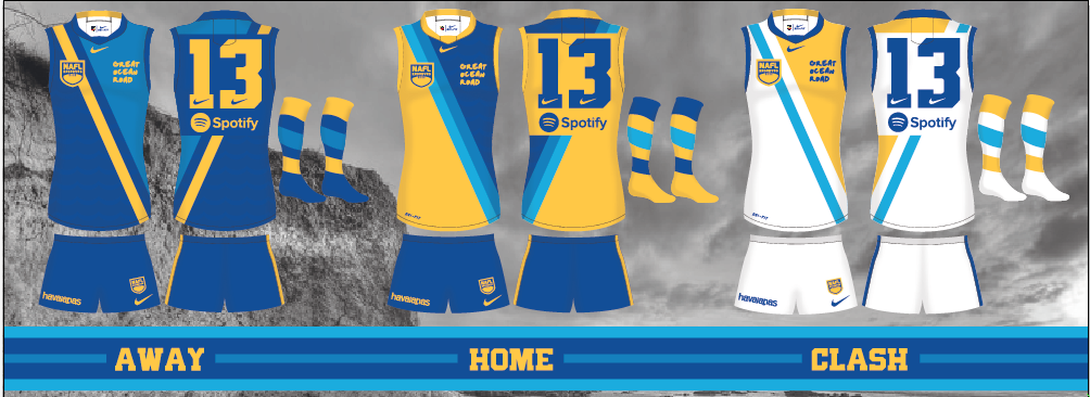
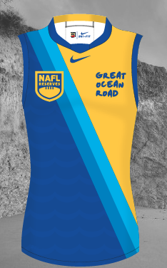
I'm pretty happy with how I'm going as a newcomer (& an old bustard). I'm already thinking of some changes based on the feedback and the experience so far (thanks to all).

My away design seems to be faring a bit better than the home one & has me thinking I should have perhaps stuck to my original home design:
upload_2016-12-9_18-53-23.png

Also, I thought I was being mighty clever;) using the thick ISC collar on akkaps' template as a smoke/ash plume, but nobody's commented on it so far :'(.

All told though, an enjoyable (& educational) experience.
 

Remove this Banner Ad

Back
Top