Discussion NAFL Reserves 2018-19 hub thread

Remove this Banner Ad

The final ladder
- Two forfeited matches, disappointing. These matches have been scored the same as the biggest margin from the round (22 votes)
- A huge win enabled Canberra to jump a couple places and steal the last finals ticket
- Dandenong with probably the biggest own goal in NAFL history - forfeiting their match and dropping to 4th, losing home guernsey advantage in the finals
- A final round win allowed Geelong to hand the spoon off to Floreat
- Some huge matchups to kick off the Finals


Log in to remove this ad.

- Comfortable wins for Palmerston and Camberwell. Palmerston advance to play Dandenong.
- A real thriller in the Volcanoes-Golds match. Mt Gambier prevailed and will move on to face Ringwood
- Nato got the better of his brother again as his Tsars move into the Prelims
- We must now say goodbye to Greensborough and Canberra. Congrats on making it to the finals and hope to see you again next season.

Finals.png

 
Dandenong with an epic facepalm moment, in what could only be a moment that will be rued next season when i'm in the NAFLr again.
Don't be kidding of yourself :p Dandenong's kit is excellent and still has great room for more improvements, especially with the Viking-imagery.
TBH I tipped it to win or at least make it to this GF at the start of the season, but sometimes it just goes that way.
 
Never thought I'd make it this far into the season so thanks to everyone who has voted and given me feedback over the course of the season. Win or lose in the next round, I've learnt heaps and cant wait to start designing for next seasons kit, already got a few ideas up my sleeve...
 
Dandenong with an epic facepalm moment, in what could only be a moment that will be rued next season when i'm in the NAFLr again.
Don't be kidding of yourself :p Dandenong's kit is excellent and still has great room for more improvements, especially with the Viking-imagery.
TBH I tipped it to win or at least make it to this GF at the start of the season, but sometimes it just goes that way.
I've got a different take on this and I offer it up in the spirit of improvement. Dandenong's design is incredibly bland and has made it this far due to the template. It does well to not be a basic vertical stripes jumper but it doesn't offer much more than that. It needs the bells and whistles to go the next step.
 
I've got a different take on this and I offer it up in the spirit of improvement. Dandenong's design is incredibly bland and has made it this far due to the template. It does well to not be a basic vertical stripes jumper but it doesn't offer much more than that. It needs the bells and whistles to go the next step.
Good feedback BB, much appreciated. the template is quite good and i spent a lot of time on it to make it look nice without forking over $50 odd on a YI template.
i do think the kit is lacking some finer touches, and in all honesty i do realise that it doesn't have the point of difference that would set it up for the next step. next seasons kit will really add to this design.
It's a really strong starting point
 

(Log in to remove this ad.)

My point exactly :)
A step in the right direction after a rebrand (Dandenong was Red/Green last season IIRC?)
they were, and i couldnt get a good colour combo (palmerston actually did it better this year than i did), and always felt that blue/orange is a better contrast.

Great season all, good luck to the final 4. Dandenong (hopefully) will be back next season looking to take that next step.
 
Well, it took two extra time polls, but we've finally ended up with a Grand Final matchup. Congrats to Camberwell and Toowoomba on making the GF and your promotion to NAFL for next season. Also wishing good luck to Ringwood and Palmerston in the pro/rel series. Who knows; we might even get 4 promotions from the ressies this season!

Finals.png


Each design has heaps of potential, however they all feel like they are the simplest form of that design (almost a silhouette showing only the basics). The home needs more detail and refinement, the away looks like it was slapped together at the last minute, the head on the heritage seems like an afterthought, and the community leaves a bit too much to the imagination. Each has massive potential, but lack that factor that makes them work.
 
Home 5/10 - Adopting the K.I.S.S method is good though it looks like an eagle staring at a triangle
Away 3/10 - Very audacious but is probably suited for something like Kmart PJ's
Heritage 4/10 - The orange outline looks out of place for me, perhaps it could be watermarked or positioned elsewhere ala WCE's scrapped preseason jersey
Community - 7/10 - Nice colour scheme + sunburst design replicating the vertical part of the waterslide
The only way is up!
 
While we're at it
#RoastMe
FanOMCB.png
 

Home: 5/10 - Don't mind the concept, but it needs detail (see the little patterns and details on Busselton, that's what takes it up another level) and some refining to get the shape right
Away: 1/10 - Not your best work. It's bad. No point dwelling though, shelve it and move on
Heritage: 4/10 - Again, not your best work. Looks like someone took one of Mero's jumpers and used Paint to draw over it. I'd consider a fauxback next season
Community: 6.5/10 - My favourite of the design suite. Love the concept, but like the home, some further patterns and detail will elevate it to the next level

Unfortunately, this season just hasn't hit the mark for Whittlesea. I wouldn't dwell on it too much. I'd work with the home jumper

While we're at it
#RoastMe
FanOMCB.png

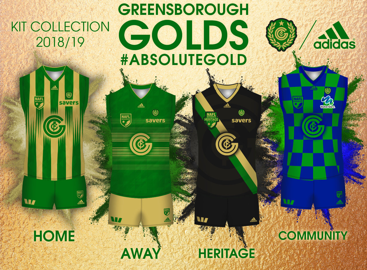
Home: 6.5/10 - You have a great logo and colour suite to work with, but the stripes haven't worked. Love the little details though
Away: 7.5/10 - Definitely the best of the lot. Green short would have worked better though
Heritage: 8.5/10 - The black, gold and green colour combination is sensational. I'd look at building on these colours to use full-time
Community: 7/10 - Love the 3D effect, I'd look to use something along these lines again next season

Overall, I'm surprised these didn't garner more votes throughout the season. I'd look at using black with green and gold highlights full-time next season, possibly in a design similar to the away
 
Home: 5/10 - Average at best, lacks finish to it but the idea is there, just needs tweaking and more trial and error.
Away: 1/10 - Sorry dude but don't rate this at all, you tried and you failed. Move on now.
Heritage: 2/10 - Basic, very basic. Lacks a lot and is quite boring.
Community: 6.5/10 - Decent, rate this one and it could be tweaked a lot to become a real nice jumper.

Fizzler, I know this season did not turn out the way you were expecting it too. A real Richmond 2016 about it. Take it from me, 2 NAFL ressies seasons ago I was in the same boat as you, finished ass end of the ladder and did not expect to do so bad. I dropped my bundle and basically stopped designing for a lengthy period of time and found other hobbies outside of design simply because I could not be bothered as I didn't think i'd do any good. I didn't enter last season and took a break. However this season I decided to have another crack and I made a new team (not saying you should make a new team) that I would put a lot of effort into and be creative and i'm currently playing in the grand final. Your designs this season look rushed and looks as though you have designed one thing and said ''yep, this will do'' *submit* Thats exactly what I did 2 seasons ago.

My advice to you is to start designing maybe 2 months until the competition starts and sit down and really work hard on achieving something big and trial designs. Get feedback off others as well (pm me and I can give you feedback even) I know you can do it mate, i've seen quality from you. Stick at it. :thumbsu::thumbsu:
 
ALL-IN-ONE Presentation.jpg

While we're at it - #RoastMe
(I know the community kit is pretty bad. With hindsight I think I should've just kept the vVv with the same mono-colour scheme)

Bonus points for feedback as to why my team fell to the Tsars and 'wells ;)
 

Remove this Banner Ad

Back
Top