Poll NAFL Reserves 2018-19 - Round 7

Vote for your favourite in each game


  • Total voters
    25
  • Poll closed .

Remove this Banner Ad

Jul 19, 2012
6,430
8,433
Wanneroo
AFL Club
West Coast
Other Teams
Swan Districts, Phoenix Coyotes
Poll will be open for 3 days.
Do not vote for yourself or ask people to vote for you. You will be penalised.
Vote once in each game - besides your own.​
Home team image is on top.
***

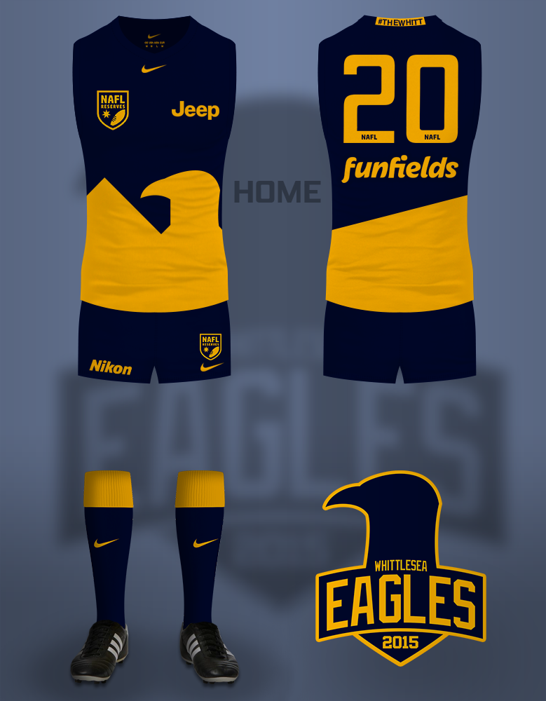
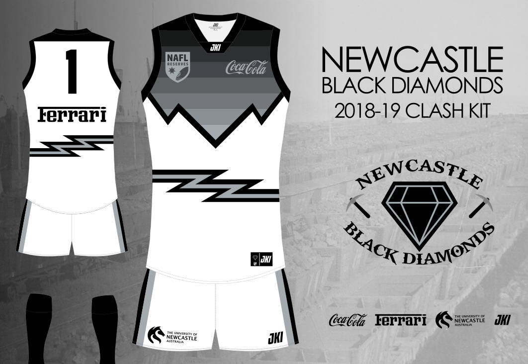
Whittlesea Eagles vs Newcastle Black Diamonds

0xgQcvO.png

wtfxKtw.png


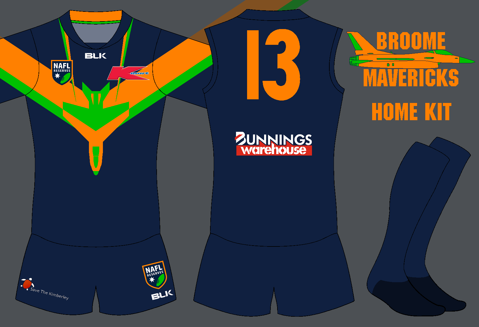
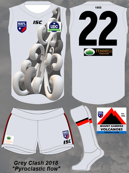
Broome Mavericks vs Mt Gambier Volcanoes
StrM5A1.png

afdoGOj.png


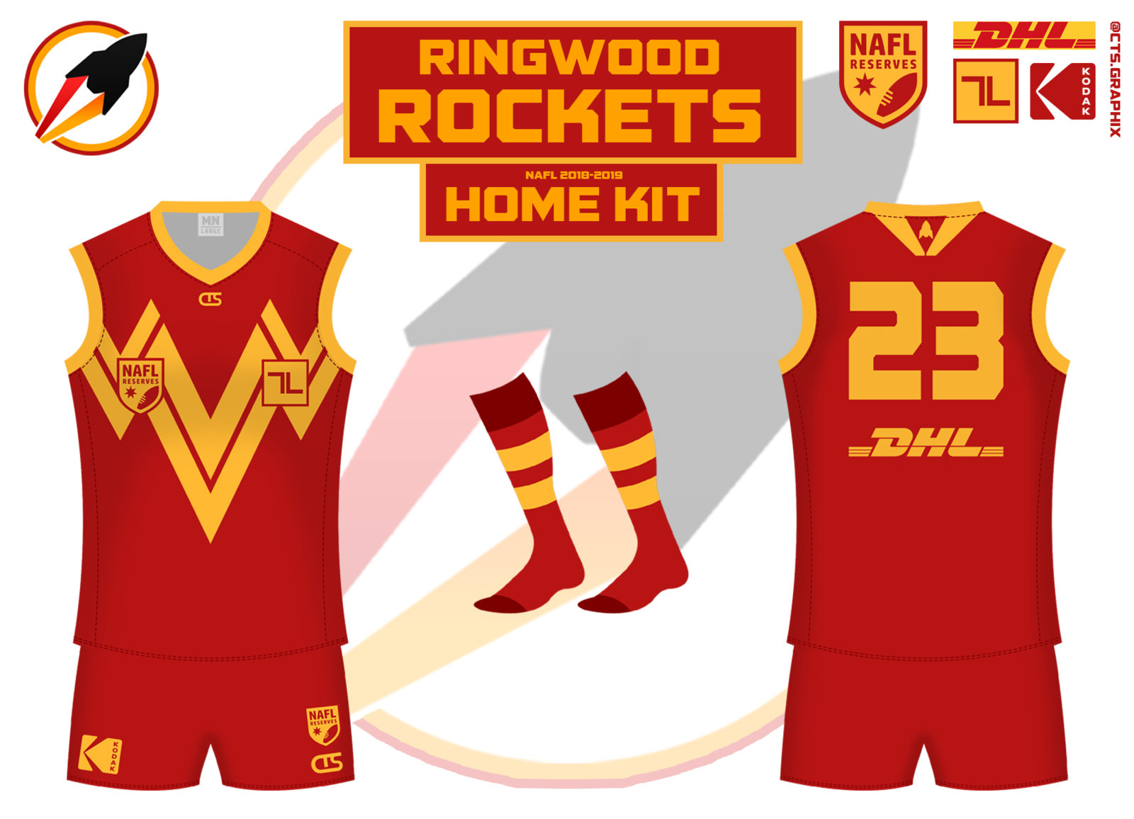
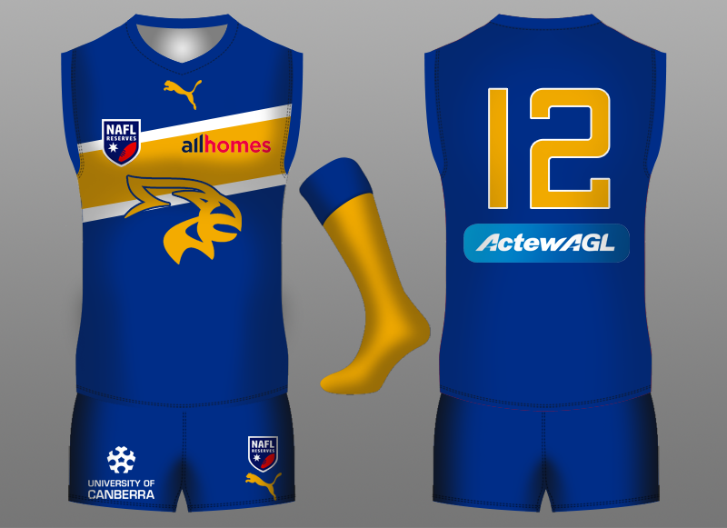
Ringwood Rockets vs Canberra Griffins

571068_c7a6d198a2bcadacc46eef85899b3c83.jpg

566420_4d793e519f7c1c8514e39ebb120b2fa1.png


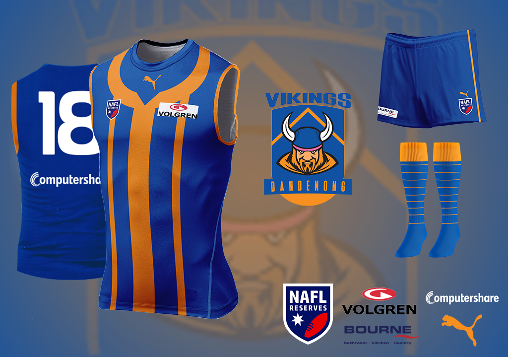
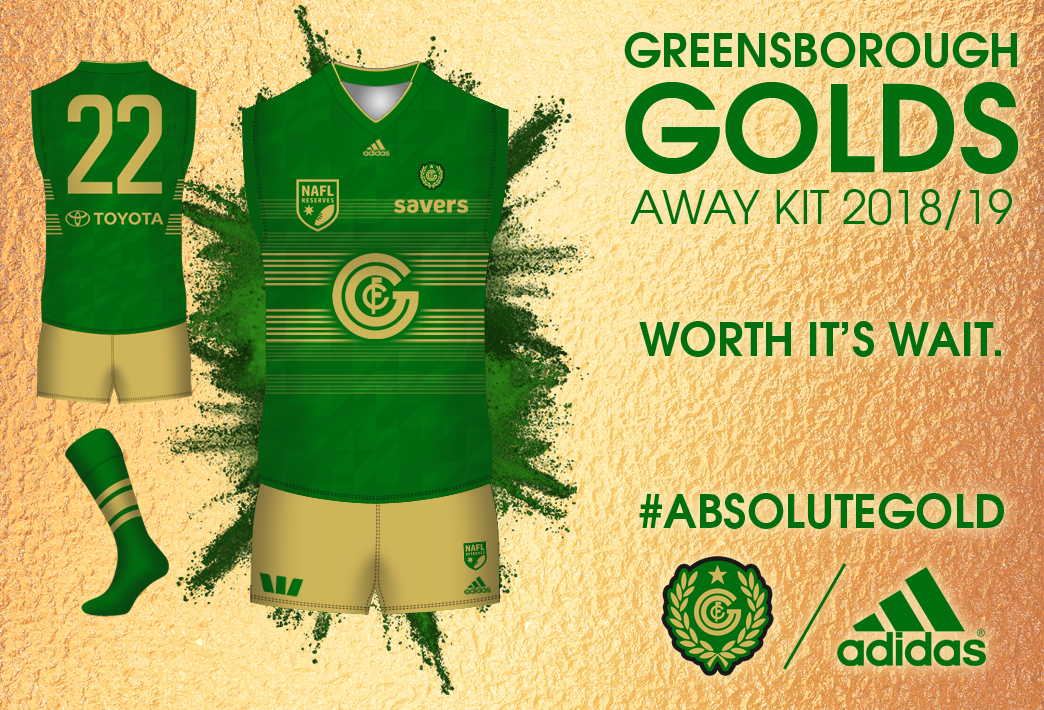
Dandenong Vikings vs Greensborough Golds

ILL0rKi.png

WKAItWh.png


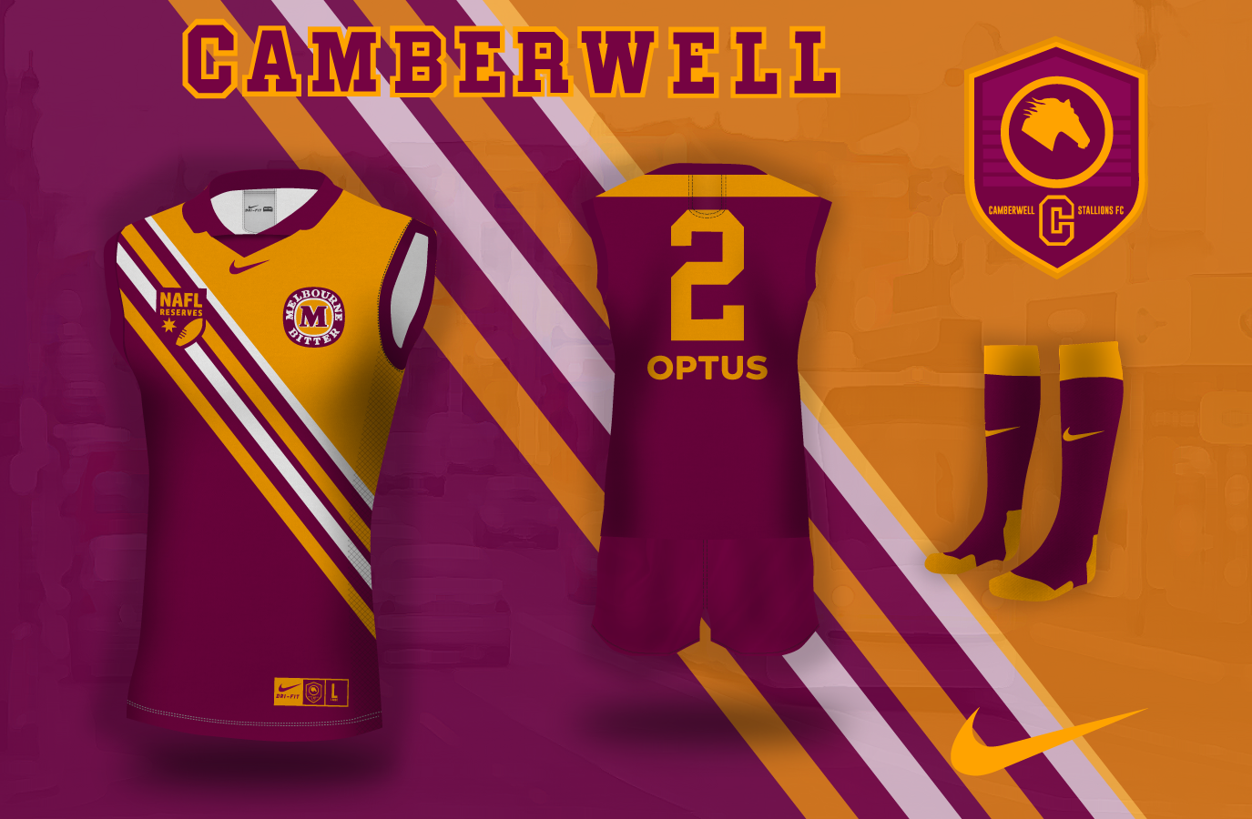
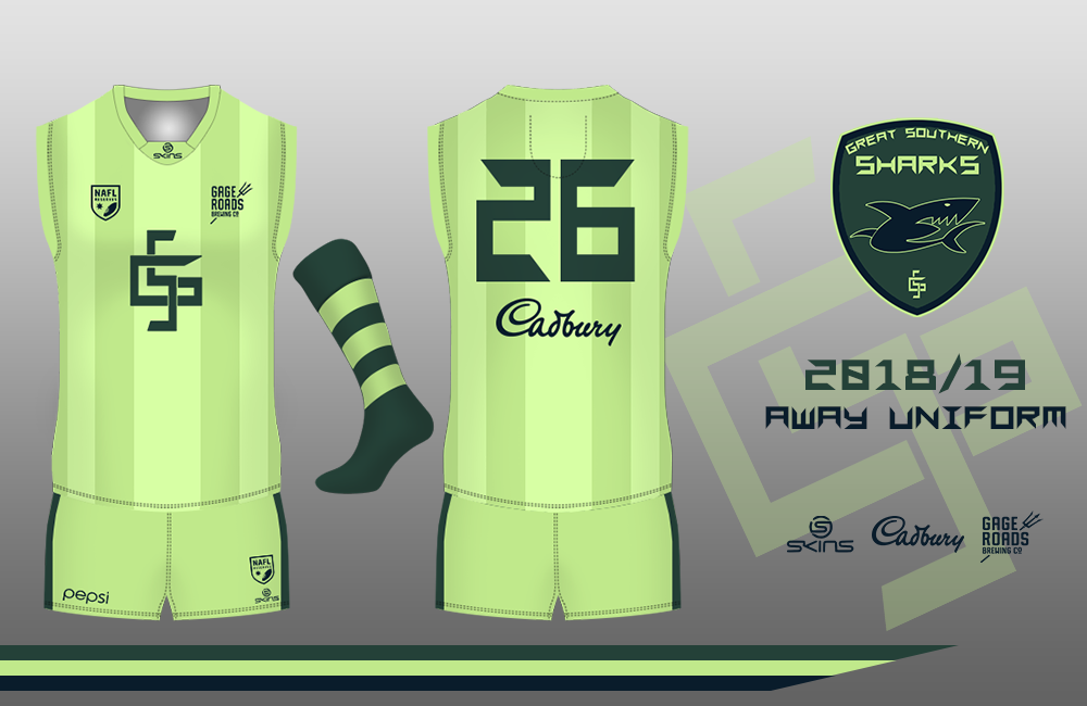
Camberwell Stallions vs Great Southern Sharks

1593ly.png

560931_da025959158fa31c38f3e0447527ef48.png


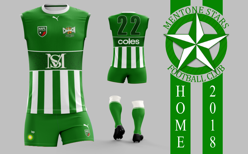
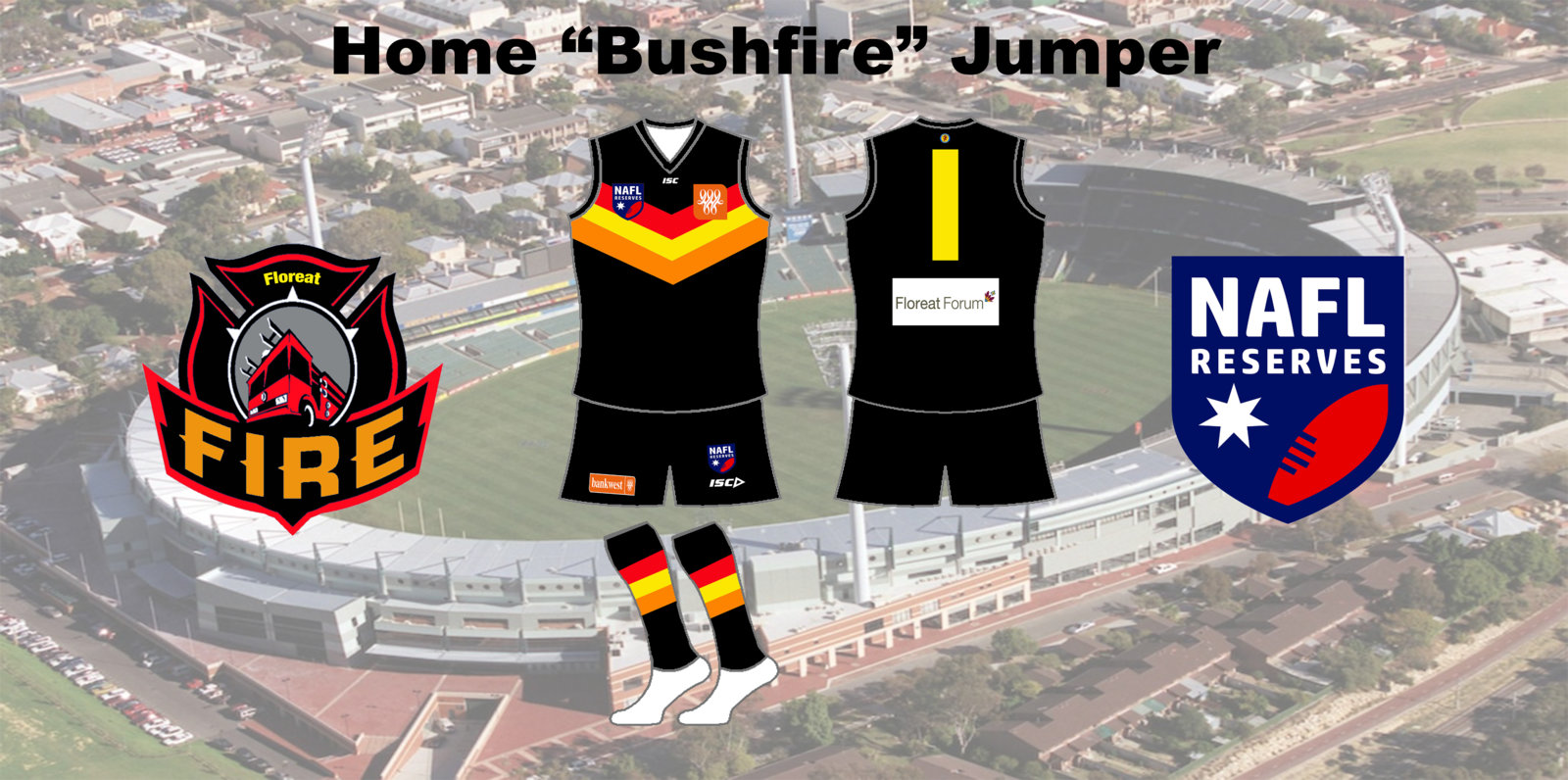
Mentone Stars vs Floreat Fire

ca099EX.png

566821_9f9dd64f5dbddd273f8cd89bc0b8de81.jpg


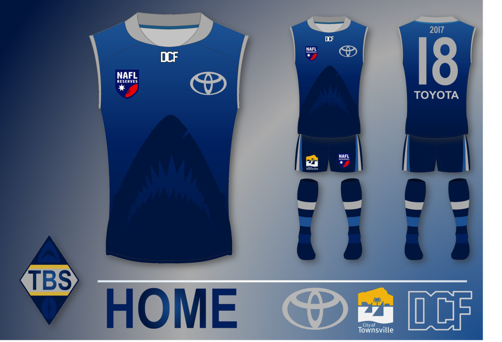
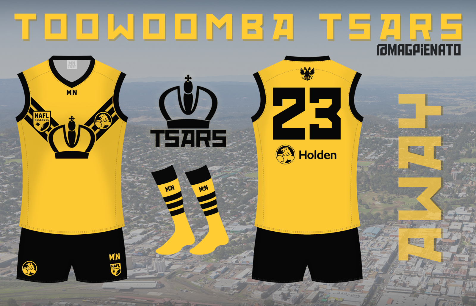
Townsville Bullsharks vs Toowoomba Tsars

41697985880_10d641d74d_b.jpg

572673_58bc97ef1a1b65ab8f7ebff5fc1c241a.png


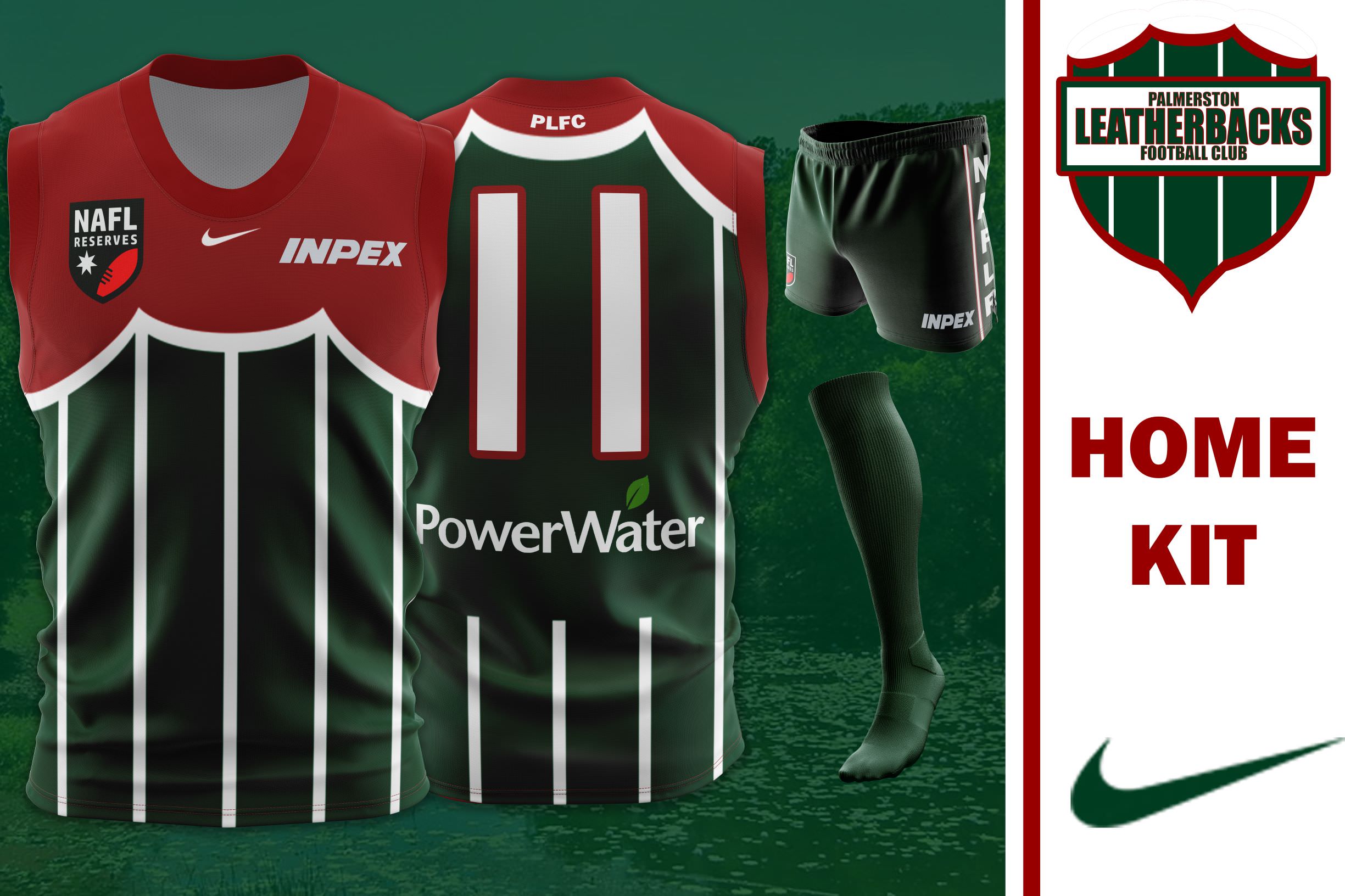
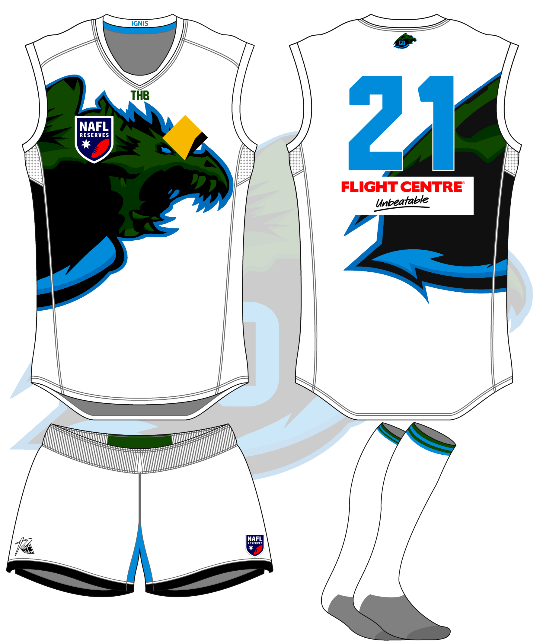
Palmerston Leatherbacks vs Geelong Dragons

FPcEC2y.jpg

AfUIhv0.png
 

Log in to remove this ad.

My first win in this comp and I feel like it wasn't warranted. Maybe it's due to the fact that, going off everyone else's reactions, it was just less worse than my opponent. At least he was more imaginative than what I was with my clash jumper.

Gonna be interesting to see how I go in Rounds 9-11
 
My first win in this comp and I feel like it wasn't warranted. Maybe it's due to the fact that, going off everyone else's reactions, it was just less worse than my opponent. At least he was more imaginative than what I was with my clash jumper.

Gonna be interesting to see how I go in Rounds 9-11
I think yours has the potential to become a great identity. Personally The design is great, just the colours are holding you back.
 
My first win in this comp and I feel like it wasn't warranted. Maybe it's due to the fact that, going off everyone else's reactions, it was just less worse than my opponent. At least he was more imaginative than what I was with my clash jumper.

Gonna be interesting to see how I go in Rounds 9-11
Are you Brooke? If so, I absolutely love the colour scheme and I think the design is a good start and can really be fleshed out. Only issue is execution. Probably just a tad pixellated right now.
 
My first win in this comp and I feel like it wasn't warranted. Maybe it's due to the fact that, going off everyone else's reactions, it was just less worse than my opponent. At least he was more imaginative than what I was with my clash jumper.

Gonna be interesting to see how I go in Rounds 9-11
You won it fair & square mate. I like your design and look forward to seeing it develop over time. Cheers.
 
My first win in this comp and I feel like it wasn't warranted. Maybe it's due to the fact that, going off everyone else's reactions, it was just less worse than my opponent. At least he was more imaginative than what I was with my clash jumper.

Gonna be interesting to see how I go in Rounds 9-11

Don't get yourself too down - a win is a win, and it's always good to get on the board.

In terms of the design, and as others have said, it absolutely has the potential to become a powerhouse, but the execution is what holds it back (not that I should be talking about execution - probably my weak point)

Clearing up the pixelation is always a good start wherever possible, because while the design may look good in theory, it's hard to pick a pixelated design over the realistic templates used by teams such as Whittlesea and Camberwell. Unfortunately, these design competitions don't just run on the jumper, but the entire

Also, little things that help make a design look like a real guernsey is what is holding back the design. Just fixing up the placement, size and type of logo used is important in tying together a design (for example, using the longer Kmart logo and lifting the Bunnings logo). What you have done well is reverse the Bunnings logo - good job!

Keep at it, there's no need for a major overhaul, just fine tuning to help make the design better and to grow the identity
 

(Log in to remove this ad.)

I think yours has the potential to become a great identity. Personally The design is great, just the colours are holding you back.
I wanted to use green, I just couldn't get it to work. I'd either look too dark or too fluorescent.
Are you Brooke?
Can confirm, I am not Brooke nor do I know a Brooke.
Clearing up the pixelation is always a good start wherever possible, because while the design may look good in theory, it's hard to pick a pixelated design over the realistic templates used by teams such as Whittlesea and Camberwell. Unfortunately, these design competitions don't just run on the jumper, but the entire
Yeah, I think I'm gonna have to wrap my head around pixelation. Was avoiding it due to not quite trusting myself in executing it properly
 
Back
Top