
Freight Train
Once hit the sign at the Mercantile Mutual Cup
- Moderator
- #1
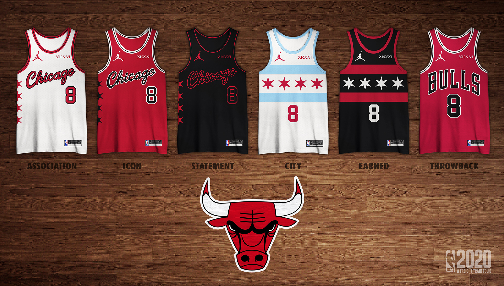
Simple stuff - going to take the modern day NBA and redesign, rebrand and/or relocate teams.
Enjoy.
Follow along with the video below to see how to install our site as a web app on your home screen.
Note: This feature may not be available in some browsers.
Please bring back the Sonics!
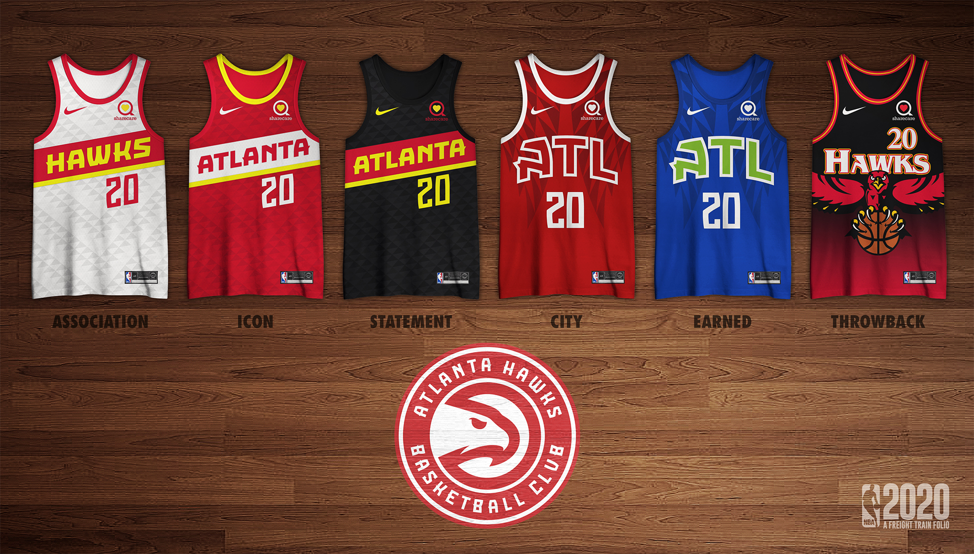
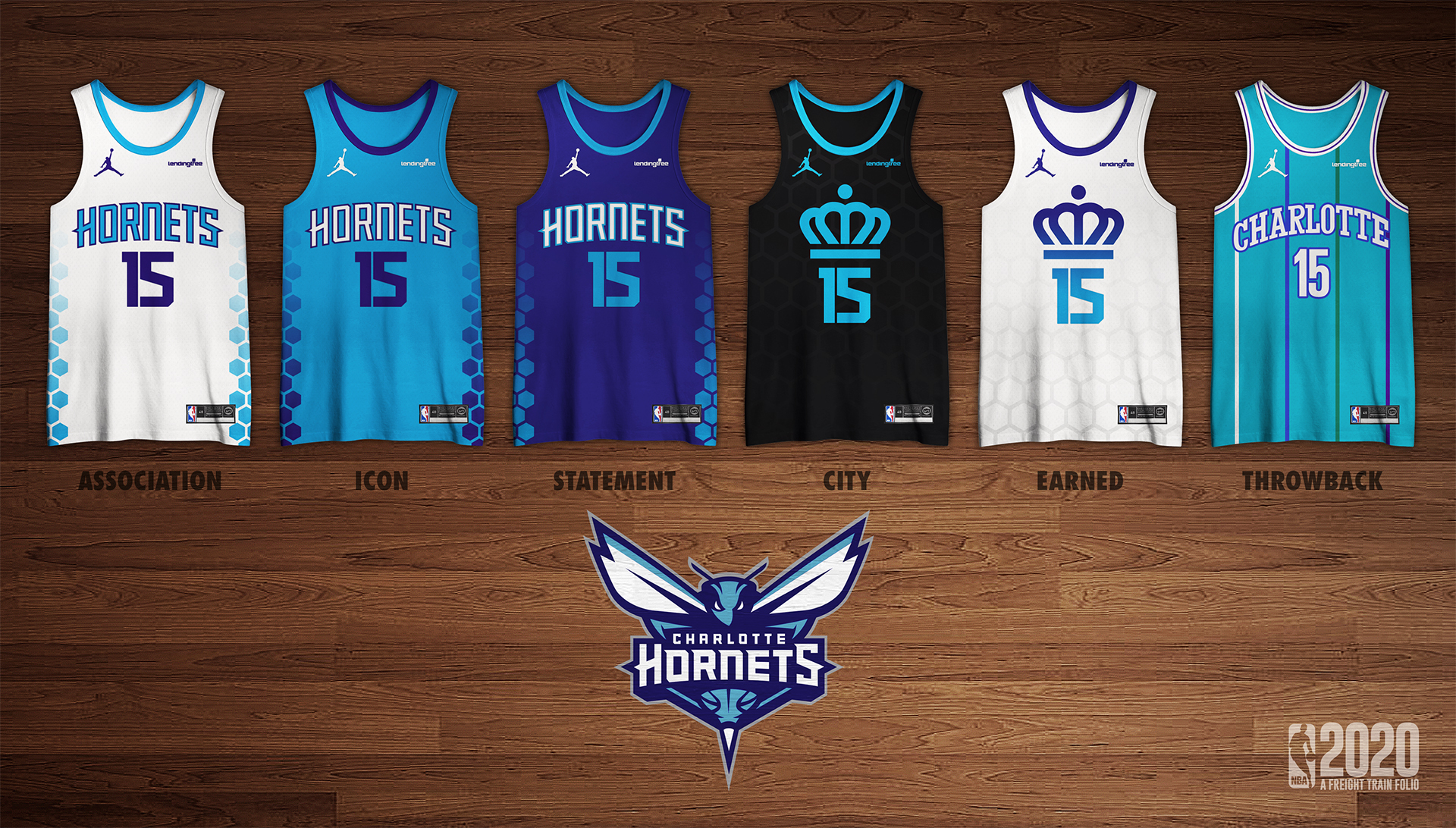
For someone who doesn't follow the NBA or much basketball at all, what are Earned jerseys?
Those who qualified for the previous seasons playoffs "earn" that extra jersey.

Keen to see how you take on the Raptors
are there gonna be any expansion teams like Seattle, Vancouver, Montreal, St. Louis, Louisville, Kansas City, Los Vegas and San Diego are all considered front runners for expansion
This set made me Brooklyn NUT
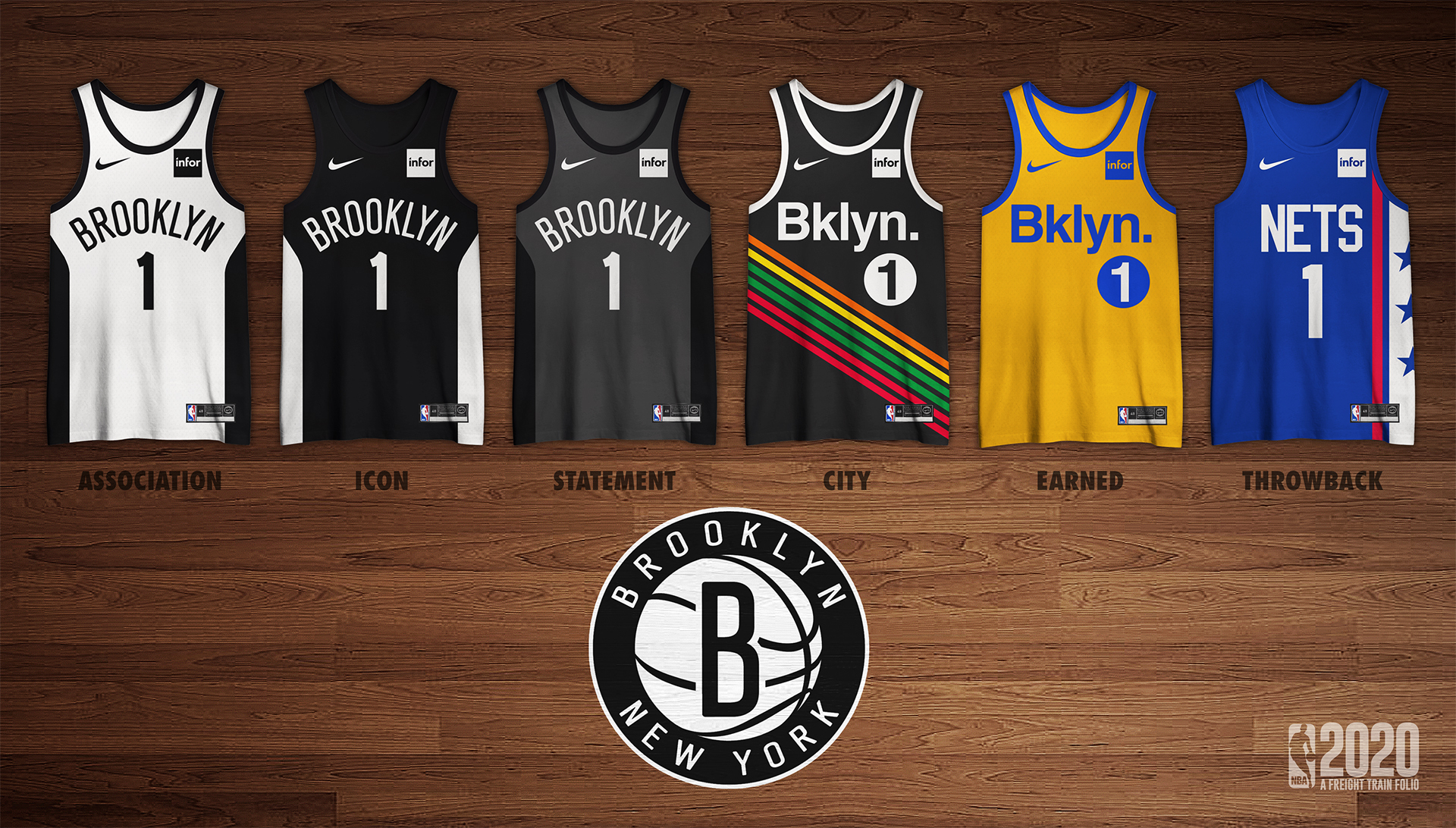
Brooklyn Nets
Not much to change with the Nets aside from using the sidepanel motifs of the previous City jersey, representing the arches of the Brooklyn Bridge. The City jersey shows the subway lines that run to the Barclays Centre and the Earned jersey is the colours of the Brooklyn borough. For the throwback, the Nets will wear the classic 70s design.
What are you up to? Cleveland?should probably finish this hey.
