Discussion New AFLW Jumpers for 2022 (Season 7)

Remove this Banner Ad

Status
Not open for further replies.
Aug 23, 2010
26,864
29,588
Information Superhighway
AFL Club
Essendon
Other Teams
Exers, Gryffindor, Rich+Ess AFLW, Tassie
Surprised this hasn't been created yet.

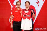
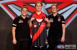
Essendon's AFLW guernsey's interesting.


It's got the Cotton On logo on the scapula rather than on the chest which has been claimed by Telstra.

Also, the tweaked NAB AFLW logo is something else.

Finally, the cut off sash is a bit of a no from me.

P.s. Can a mod please choose the correct prefix?
I don't know which one is the right one.

Cheers.

I first mentioned the Telstra collar sponsor a few weeks ago in the old thread. I assume it will be a league wide sponsor. I cannot stand the new league sponsorship lockup. It looks dreadful.

As for the season title- it is AFLW Season 7.
 
I first mentioned the Telstra collar sponsor a few weeks ago in the old thread. I assume it will be a league wide sponsor. I cannot stand the new league sponsorship lockup. It looks dreadful.

As for the season title- it is AFLW Season 7.
2022 part 2 has also been used.
 

Log in to remove this ad.

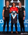
A quick mock of how the new logo and sponsor positioning may look across the board. Credit Mero and footyjumpers.com for the graphics which I have added the sponsor logos to mock.

I mocked the gold premiers logo which I assume would be used given the modification of the sponsor lockup. Teams with stripes I have had to include a coloured box in the background of Cotton On.
1655075745213.png
 

(Log in to remove this ad.)

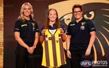
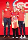
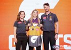
Gws is worse then the Hawks. I didnt think the aflw kit could gdt worse.

Just use the men's kit, you can put a spin on the tradition design but just make it a strong and central g (I prefer og placement)
I think when it is worn on, the women's body shapes will make that positioning look a bit more natural, need to see it being worn though
 
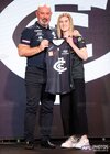
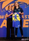
Okay yes, that would be involved in the decision making. But then you could start talking about why Carlton, GC and WCE don't have their logos just as low to compensate for a bigger chest, compared to a man's cut?

So it can't just be because of boobs...
 
Okay yes, that would be involved in the decision making. But then you could start talking about why Carlton, GC and WCE don't have their logos just as low to compensate for a bigger chest, compared to a man's cut?

So it can't just be because of boobs...
I believe a number of decisions in history have been made for that reason alone.
(I may have made some myself...)
 
Status
Not open for further replies.

Remove this Banner Ad

Back
Top