


Yep as if they are all in the uniform manufacturing business and the club doesn't know how to work with and choose a supplier.I don’t mind it. Everyone’s so precious.
Navigation
Install the app
How to install the app on iOS
Follow along with the video below to see how to install our site as a web app on your home screen.
Note: This feature may not be available in some browsers.
More options
You are using an out of date browser. It may not display this or other websites correctly.
You should upgrade or use an alternative browser.
You should upgrade or use an alternative browser.
Rumour new apparel sponsor?
- Thread starter scottishfiction
- Start date
- Tagged users None
Chevrons higher up looks better imo
There isn't a good uniform or merchandise manufacturer in Australia, period. They are all cheap and lack creativity. Just follow US (Pro and Collegiate) manufacturers and you'd make a mint here..
Re: Sekem - Not sure how anyone tells from a poor photograph how the jersey is 'cheap'. Will hold judgement until they are on the players.
It's driven by the clubs. It's no wonder so many apparel companies have gone into administration over the years.
- ISC x 2
- BLK
- X-Blades
- ZOO
- Dynasty
- Kombat
- KEA
The list goes on. Apparel isn't easy, especially when using overseas manufacturing with language barriers. The Australian market has an over saturation of suppliers with them all under cutting each other, some even use the same manufacturing.
Sekem gear is trash though.


I must be looking at a different jumper because it honestly doesn’t look bad at all. The way some people are carrying on is a bit over the top.
For me it's more that other tops etc that look average. Just a bit uninspiring.
Bring back Drum
Mundy4Hundy
- Jul 8, 2019
- 3,380
- 10,231
- AFL Club
- Fremantle
Called it......page 1.I believe we have a contingency plan if Sekem are found to be unsuitable.
View attachment 1010884
Quality seems OK...
View attachment 1010886
Ketut fixed price in Legian I believe.
- Mar 29, 2019
- 11,516
- 16,106
- AFL Club
- Fremantle
- Other Teams
- Arsenal, Glory, Bulls
After looking at it a bit more, it's honestly not that bad, I don't mind the chevrons being higher. I don't think anyone can really judge it until they see it on a player.
- Nov 9, 2001
- 1,828
- 6,421
- AFL Club
- Fremantle
- Other Teams
- need to take a good look at themselves
Higher chevrons are great.
I love my woollen Sekem original away jumper. No problems with Sekem - just that particular guernsey is weirdly lumpy.
I love my woollen Sekem original away jumper. No problems with Sekem - just that particular guernsey is weirdly lumpy.
Looks good to me. Don’t see what the fuss is. Can’t wait to see it on a real person.
If the chevrons were higher and Sekem moved them down ppl would be saying the same things.
I’ll probably be buying one with the extra cash I got helping rig our election in Biden’s favor in over a dozen states and then concealing the evidence from multiple investigators.
Ooops. Did I type that out loud? Never mind what I just said. Fake news!
On iPhone using BigFooty.com mobile app
I believe we have a contingency plan if Sekem are found to be unsuitable.
View attachment 1010884
Quality seems OK...
View attachment 1010886
Suddenly our team store has a "I'm not gay, but $20 is $20" shirt in purple
Sydneys supplier is Nike. They look pretty good.
Nah Nike are shocking nowadays
The material looks super cheap and the advertised guernseys on their site don't even have cuffs.
Looks like a small improvement over the last Nike guernsey when they heat pressed all of Carltons logos, that was just plain diabolical

Shadow Man
Premiership Player
I like that we've gone with a local WA identity.
Wizard
Brownlow Medallist
Looks like there is some more gear here if your interested in the "on-field" range.
Guernsey looks fine in the end
Chappy also looking fine
Nothing
Norm Smith Medallist
- Jul 30, 2009
- 9,113
- 14,316
- AFL Club
- Fremantle
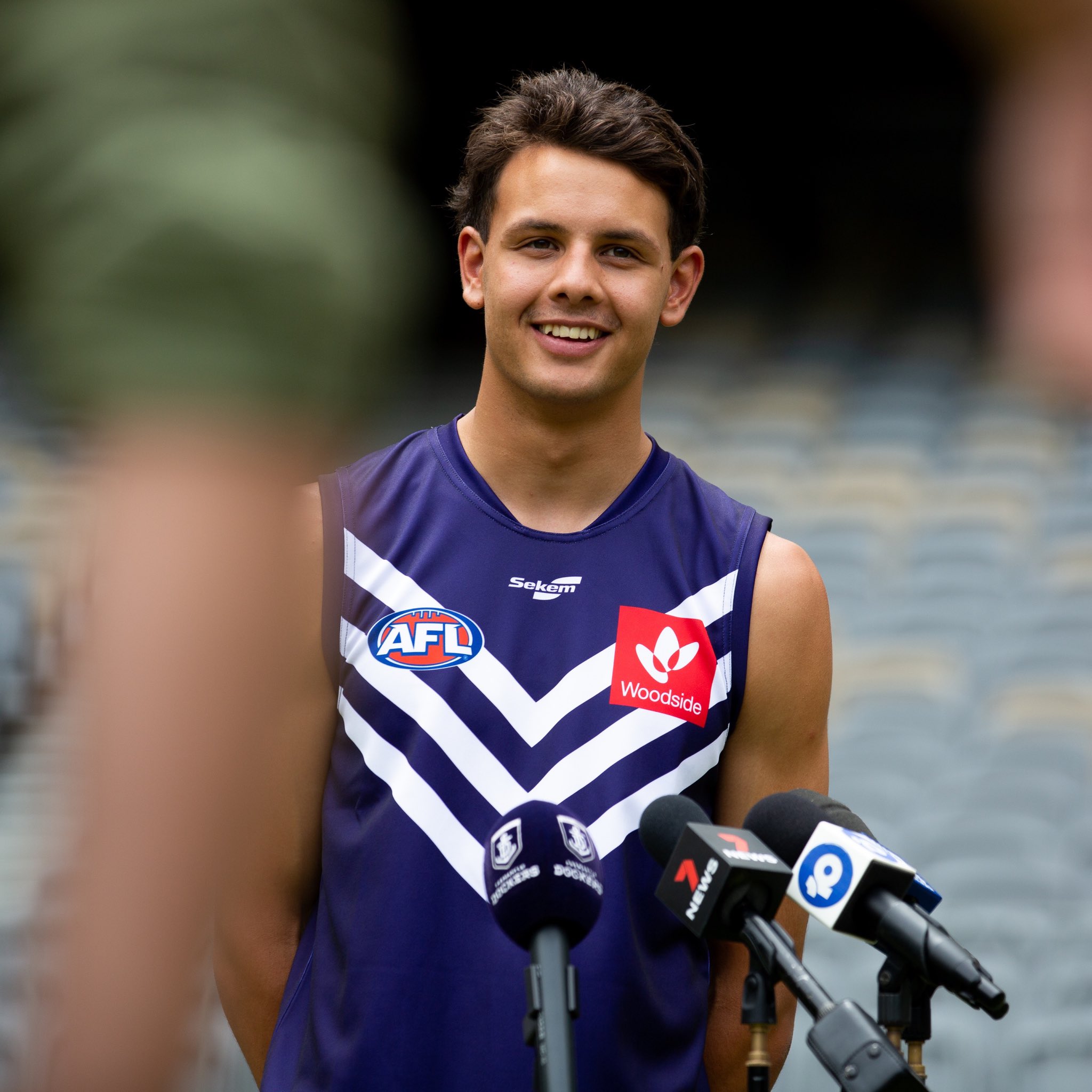
The mannequin shot was never meant to be released. Someone jumped the gun.Yeah, that guernsey looks good on an actual player. Feel there was plenty of overreaction from just seeing it on a mannequin.
Those earlier images turned out to be completely wrong. The things people were complaining about ... stripes too narrow, stripes shifted up too far, logos up near the collar ... these have not actually eventuated. There's probably some slight differences in positioning, angle of V, etc, but it looks more than fine to me.
Unlike us as a BF community to go early and melt about something that isn't even true. I'm shockedThose earlier images turned out to be completely wrong. The things people were complaining about ... stripes too narrow, stripes shifted up too far, logos up near the collar ... these have not actually eventuated. There's probably some slight differences in positioning, angle of V, etc, but it looks more than fine to me.

FreoBraddles
Team Captain
- Feb 19, 2016
- 569
- 2,953
- AFL Club
- Fremantle
West Coast signed with Castore (Liverpool based - do Roosters, West Indies cricket, Andy Murray among others).
Looks like it was tough for clubs to secure apparel sponsors if West Coast couldn't attract a major name
Looks like it was tough for clubs to secure apparel sponsors if West Coast couldn't attract a major name
Similar threads
- Replies
- 39
- Views
- 3K
- Replies
- 583
- Views
- 19K
- Replies
- 1K
- Views
- 56K
