Navigation
Install the app
How to install the app on iOS
Follow along with the video below to see how to install our site as a web app on your home screen.
Note: This feature may not be available in some browsers.
More options
-


LIVE: Richmond v Melbourne - 7:25PM Wed
Squiggle tips Demons at 77% chance -- What's your tip? -- Team line-ups »


You are using an out of date browser. It may not display this or other websites correctly.
You should upgrade or use an alternative browser.
You should upgrade or use an alternative browser.
Rumour new apparel sponsor?
- Thread starter scottishfiction
- Start date
- Tagged users None
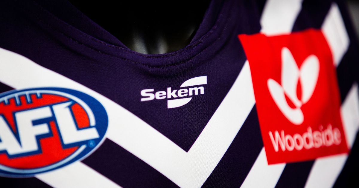
Looking good in local! Freo unite with Burley Sekem
The Fremantle Dockers and a WA football institution have joined forces, with Burley Sekem coming on board as the club’s new official apparel partner.
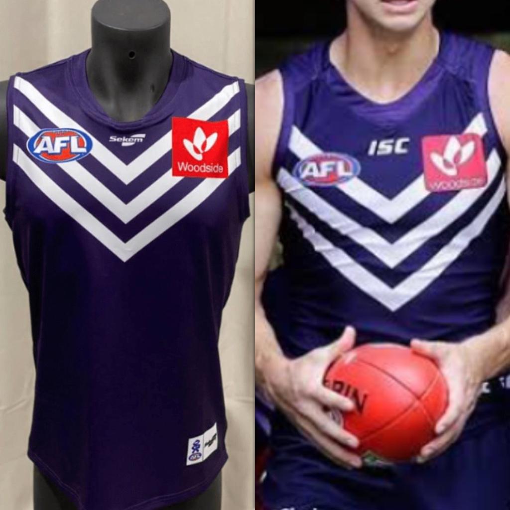
The zoomed in photo must mean the club thinks they butchered it, show us the whole thing!
Looks like logos are almost at the collar
Haha looks like the Best and Less jerseys for 20 dollars. Yikes
It looks so badHaha looks like the Best and Less jerseys for 20 dollars. Yikes
Van_Dyke
Moderator
- Moderator
- #56
Sekem - Page 1 - The Dock, Fremantle Dockers Team Store
 teamstore.fremantlefc.com.au
well the products can't look any worse in person than the pictures on the team store
Sometimes nostalgia should be left in the past
Looking good in local! Freo unite with Burley Sekem
The Fremantle Dockers and a WA football institution have joined forces, with Burley Sekem coming on board as the club’s new official apparel partner.www.fremantlefc.com.au
The zoomed in photo must mean the club thinks they butchered it, show us the whole thing!
Or they're just zooming in on the logo of their new partner.
Yeah but there is no second photo showing the whole guernsey, something that would be vital for an announcementOr they're just zooming in on the logo of their new partner.
Sometimes nostalgia should be left in the past
If they do a version of that 95 guernsey as a retro round then all is forgiven
- Jun 6, 2010
- 4,030
- 12,851
- AFL Club
- Fremantle
- Other Teams
- Dillon Panthers
Huge difference.

Sent from my iPhone using Tapatalk
Sent from my iPhone using Tapatalk
Purple_Turtle
Stockholm Syndrome
- Oct 12, 2019
- 2,847
- 6,044
- AFL Club
- Fremantle
- Other Teams
- South Fremantle, Hull City
Is there a point to moving the Chevrons up?
eeshHuge difference.
Sent from my iPhone using Tapatalk
just looks cheap
Looks like a Bali knockoff
- Jun 6, 2010
- 4,030
- 12,851
- AFL Club
- Fremantle
- Other Teams
- Dillon Panthers
Is there a point to moving the Chevrons up?
It does make your pecks look bigger. Lol
Sent from my iPhone using Tapatalk
nah just a 2nd rate manufacturerIs there a point to moving the Chevrons up?
So cheap. Knock offs of Big W/Best and Less.Huge difference.
Sent from my iPhone using Tapatalk
Guess it’s a tough financial climate. Would’ve liked Puma, or someone like adidas. ISC had good fan gear.
Bet you anything they not only look terrible, but they'll feel terrible, cheap, and you'll feel the shame that Freo should have felt when shacked up with this corner cutting nonsense of a company.
- Mar 29, 2019
- 11,516
- 16,106
- AFL Club
- Fremantle
- Other Teams
- Arsenal, Glory, Bulls
I mean unless you're someone who buys the new guernseys every year then is anyone really gonna buy it when they've already got one of the old ISC ones?Bet you anything they not only look terrible, but they'll feel terrible, cheap, and you'll feel the shame that Freo should have felt when shacked up with this corner cutting nonsense of a company.
Wizard
Brownlow Medallist
If we don’t see the green Guernsey as a once off this season I’ll *ing spew.
- Mar 29, 2019
- 11,516
- 16,106
- AFL Club
- Fremantle
- Other Teams
- Arsenal, Glory, Bulls
I remember how many people wanted change and us to be taken more seriously by dropping the anchors (a symbol of staying at the bottom) and taking a newer design, and 10 years later people are clamouring for the anchors back??
- Nov 9, 2001
- 1,828
- 6,421
- AFL Club
- Fremantle
- Other Teams
- need to take a good look at themselves
It's a rule. As soon as the novelty completely wears off a new kit, nothing is so attractive as the retro nostalgie of the old.
When we wore the anchor guernsey in the most recent retro round, all sorts of supporters of other clubs were commenting on how cool they looked. And they did. They looked cool.
That Sekem jumper up there looks like it was sewed by the work experience kid. What the hell is going on in the neck there above the Sekem logo. Were they trying to install lights?
There isn't a good uniform or merchandise manufacturer in Australia, period. They are all cheap and lack creativity. Just follow US (Pro and Collegiate) manufacturers and you'd make a mint here..
Re: Sekem - Not sure how anyone tells from a poor photograph how the jersey is 'cheap'. Will hold judgement until they are on the players.
Re: Sekem - Not sure how anyone tells from a poor photograph how the jersey is 'cheap'. Will hold judgement until they are on the players.
Similar threads
- Replies
- 39
- Views
- 3K
- Replies
- 583
- Views
- 19K
- Replies
- 1K
- Views
- 56K
