- Oct 27, 2016
- 5,938
- 10,623
- AFL Club
- Collingwood

- Other Teams
- Packers, Raptors, Renegades
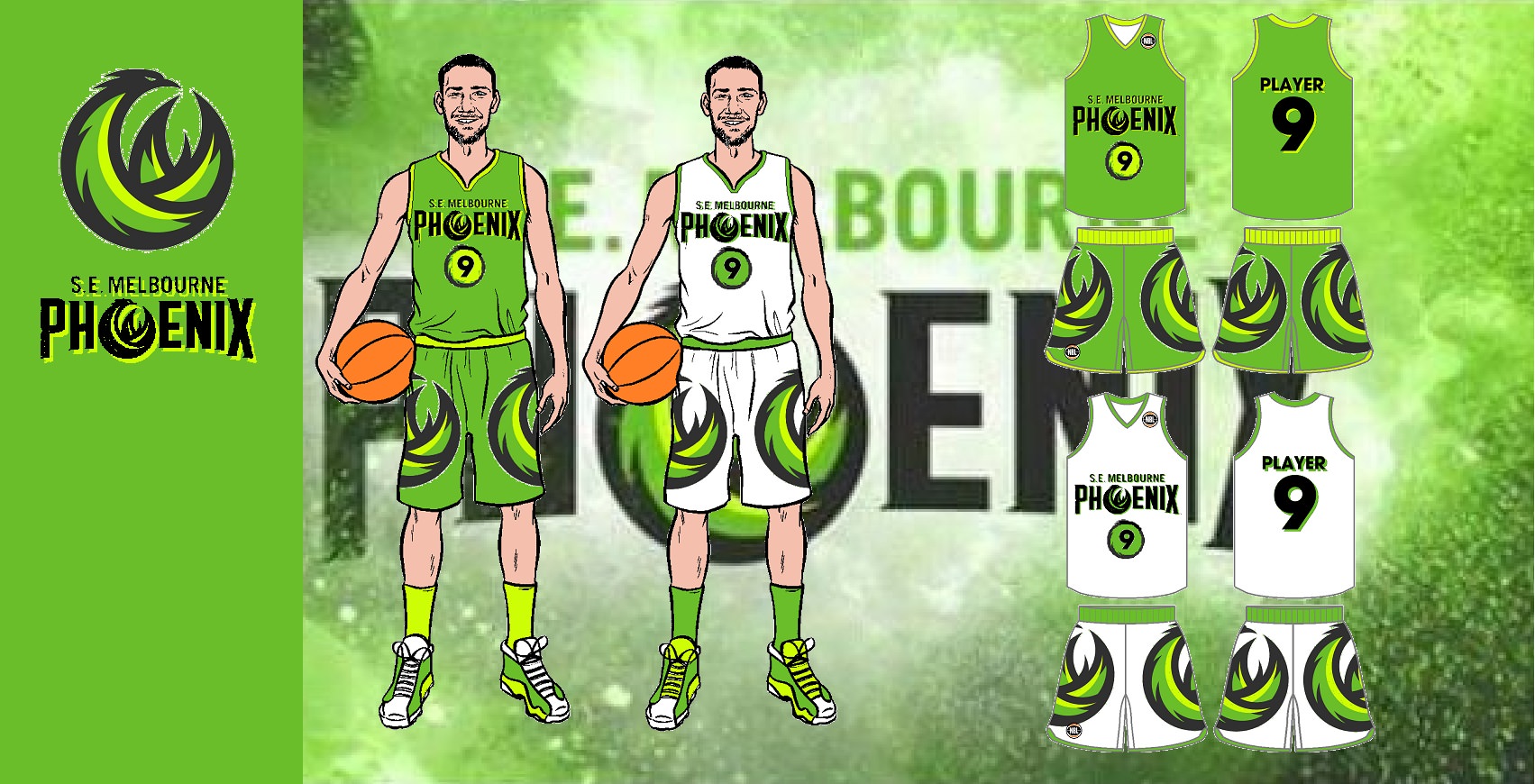
Think about the money though. Townsville, yeah you might build a bit of a loyal fanbase like in Cairns, but the population size of Melbourne and the money that comes from that, it just makes senses to have another team there especially in the growing SE suburbs. Hate the name though, I definitely wont be going for them.Bring back Townsville before any second stupid Melbourne team who will go bust in 3 years time anyway
On [device_name] using BigFooty.com mobile app