

fancyscum
Radical Crommunist
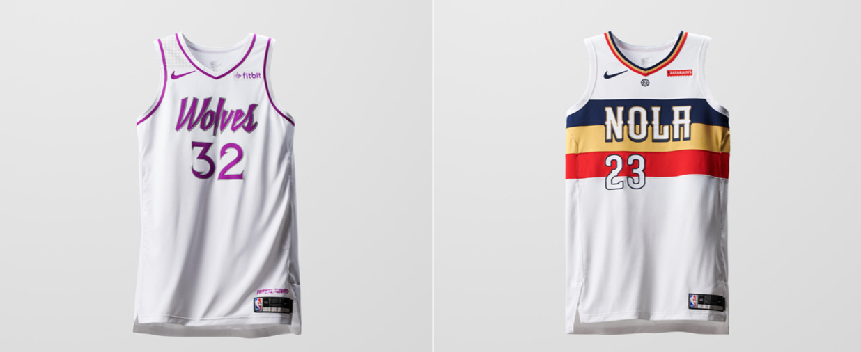
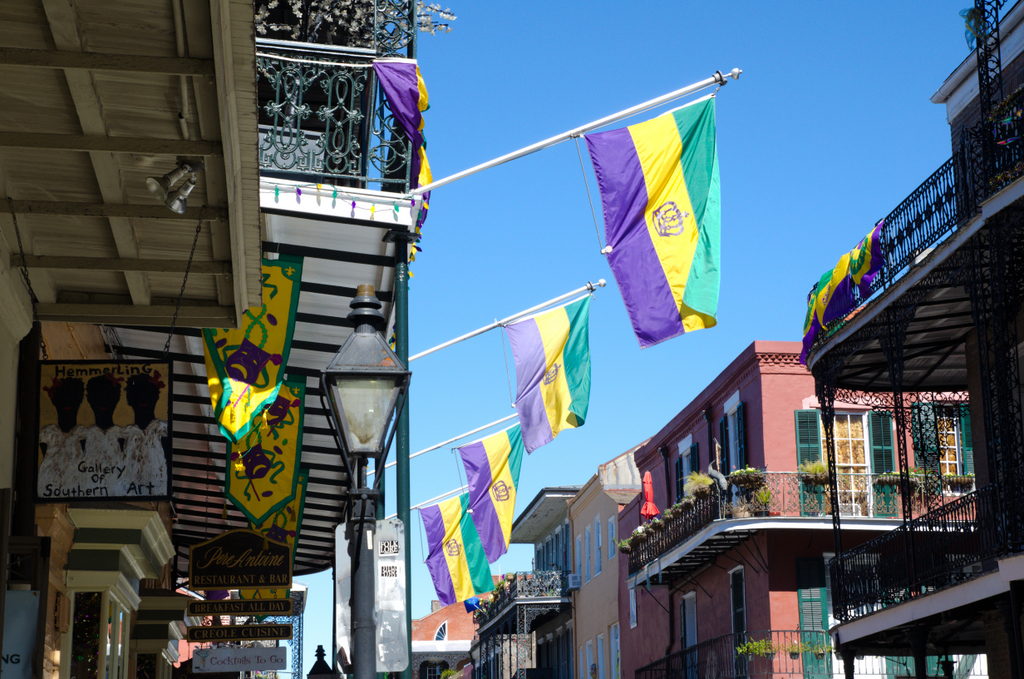
That New Orleans jersey looks familiar

Follow along with the video below to see how to install our site as a web app on your home screen.
Note: This feature may not be available in some browsers.
That New Orleans jersey looks familiar
Love clevelands one as well, too bad no ones going to see it tho.Cleveland's
Cleveland's is amazing, the balance of the design while not being too subtle, and the three shade blue is so nice.
Cleveland’s and San Antonio he winners for mine.
How many jerseys is too many though
On iPhone using BigFooty.com mobile app
Cleveland’s and San Antonio he winners for mine.
How many jerseys is too many though
On iPhone using BigFooty.com mobile app

SWOOP City

Maybe because their mascot is a bird? That's the only connection I can find at least.What the f***en f*** is Swoop City?
Rip City for Portland is based on a historic piece of commentary yelled out as Portland hit a long distance buzzer beater during a comeback against the Lakers in 1972.
Buzz City for Charlotte is based on the campaign for Charlotte to get the Hornets name back after the original Hornets moved to New Orleans and the Bobcats were formed.
Swoop City is a soulless garbage attempt to cash in on terms like this. The NBL actually has a heap of really cool history they could go on, Adelaide has a heap of cool imagery they could base a City themed jersey on. Instead they've completely f***ed it.
Adelaide's should be based around the city of churches IMO.What the f***en f*** is Swoop City?
Rip City for Portland is based on a historic piece of commentary yelled out as Portland hit a long distance buzzer beater during a comeback against the Lakers in 1972.
Buzz City for Charlotte is based on the campaign for Charlotte to get the Hornets name back after the original Hornets moved to New Orleans and the Bobcats were formed.
Swoop City is a soulless garbage attempt to cash in on terms like this. The NBL actually has a heap of really cool history they could go on, Adelaide has a heap of cool imagery they could base a City themed jersey on. Instead they've completely f***ed it.


View attachment 602402
Gave it a crack at improving on some of these city jerseys - some probably aren't really improvements but ultimately a disappointing set from First Ever.
- Adelaide - Church City (bit less wordy than City of Churches) is probably the most identifiable city nickname in Australia - however going with a cross for the design seemed to be leaning a bit less on the architecture and more on the religious aspect. Instead, went with the wings, representing the piping shrike. Wine red colouring represents the wine regions of South Australia.
- Brisbane - Honestly don't mind what First Ever have done for this one but "River City" seems a bit of a stretch. Brisvegas in a script workmark, with the Bridge still shown on the singlet and a fully blue and gold colour scheme.
- Cairns - Now this one I felt a bit odd making and the designs are purely as placeholder. I'm not an Indigenous artist and I don't have access to the source artwork, but with what First Ever have put out, the indigenous aspect seems like an afterthought. Go all in, go full orange and even use a snake as the main element in indigenous artwork. Obviously, you'd need a local designer from the region to do the actual design.
- Illawarra - Tough to do this one and perhaps someone from the area would be better off, but played off the "Steel City" aspect to do a black and chrome style jersey. Steel bar across the front with the city's famous "The Gong" nickname across the front.
- Melbourne - Went with Hosier Lane as inspiration, Melbourne is of course famous for it's street art and the concept seemed to work well enough as a basketball jersey.
- NZ - Used the Silver Fern flag as inspiration, replacing the royal blue with the crisp aqua section, representing the clear waters in Auckland. However, they are the NZ Warriors so the "city" is really the whole nation so I chose Aotearoa as the wordmark.
- Perth - Struggled the most with this tbh, but wanted to move away from the Red Army nonsense. Instead, took the ball of the existing design for the sunset concept and essentially borrowed the Utah Jazz city design. The top section with the black on yellow is also a nod to the original Wildcats designs of the 80s.
- Sydney - I like that they used black and gold but by god, they butchered it so bad. I've already done the black and gold thing heaps so went with a deeper shade of purple and metallic gold instead of the usual yellow-gold. The arches represent the Harbour Bridge, and Sydney as a name is identifiable enough as is.
Much better! We're past being the City of Churches though; Festival City perhaps?View attachment 602402
Gave it a crack at improving on some of these city jerseys - some probably aren't really improvements but ultimately a disappointing set from First Ever.
- Adelaide - Church City (bit less wordy than City of Churches) is probably the most identifiable city nickname in Australia - however going with a cross for the design seemed to be leaning a bit less on the architecture and more on the religious aspect. Instead, went with the wings, representing the piping shrike. Wine red colouring represents the wine regions of South Australia.
- Brisbane - Honestly don't mind what First Ever have done for this one but "River City" seems a bit of a stretch. Brisvegas in a script workmark, with the Bridge still shown on the singlet and a fully blue and gold colour scheme.
- Cairns - Now this one I felt a bit odd making and the designs are purely as placeholder. I'm not an Indigenous artist and I don't have access to the source artwork, but with what First Ever have put out, the indigenous aspect seems like an afterthought. Go all in, go full orange and even use a snake as the main element in indigenous artwork. Obviously, you'd need a local designer from the region to do the actual design.
- Illawarra - Tough to do this one and perhaps someone from the area would be better off, but played off the "Steel City" aspect to do a black and chrome style jersey. Steel bar across the front with the city's famous "The Gong" nickname across the front.
- Melbourne - Went with Hosier Lane as inspiration, Melbourne is of course famous for it's street art and the concept seemed to work well enough as a basketball jersey.
- NZ - Used the Silver Fern flag as inspiration, replacing the royal blue with the crisp aqua section, representing the clear waters in Auckland. However, they are the NZ Warriors so the "city" is really the whole nation so I chose Aotearoa as the wordmark.
- Perth - Struggled the most with this tbh, but wanted to move away from the Red Army nonsense. Instead, took the ball of the existing design for the sunset concept and essentially borrowed the Utah Jazz city design. The top section with the black on yellow is also a nod to the original Wildcats designs of the 80s.
- Sydney - I like that they used black and gold but by god, they butchered it so bad. I've already done the black and gold thing heaps so went with a deeper shade of purple and metallic gold instead of the usual yellow-gold. The arches represent the Harbour Bridge, and Sydney as a name is identifiable enough as is.
