News New basketball uniforms/logos/courts etc.

Remove this Banner Ad

They've won in red so keep it, but this 'we the north' thing is just a cheesy scheme from some pussy ass 'rapper.'
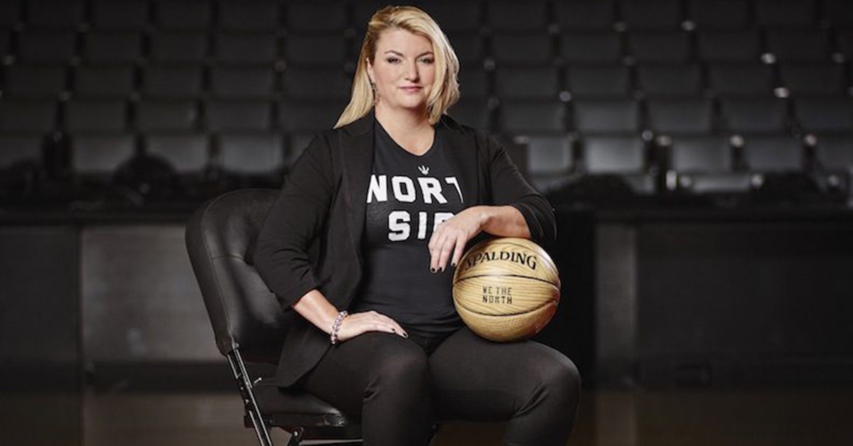
Drake did not create the 'We The North' brand.
If we were to rebrand with that jersey we would probably change the "North" to Raptors or Toronto anyway.

But I couldn't care less what we wear, I just want my 'chip with the dip.
 
As a Rockets fan I have been waiting so long for a redesign and I'm not quite sure I like this one though. If I were the rockets uniform designer, I'd go with something more like this.
received_450943405719371.jpeg

On SM-G973F using BigFooty.com mobile app
 

Log in to remove this ad.

Golden State Warriors making some subtle but nice changes, no doubt to freshen up their brand before moving into their new San Fran stadium. Logo font is remarkably stronger than before but the main difference I can see is the shade of blue and 'gold'. The royal blue and gold never really clicked with me, thought it was too vibrant so this is welcome change at least for me.
golden_state_warriors_2019_logo_before_after.png
Will be interesting to see if there's going to be a full kit rebrand or if their just going to update the logo/font and colours and keeps things relatively the same.

696898
 
Last edited:
Golden State Warriors making some subtle but nice changes, no doubt to freshen up their brand before moving into their new San Fran stadium. Logo font is remarkably stronger than before but the main difference I can see is the shade of blue and 'gold'. The royal blue and gold never really clicked with me, thought it was too vibrant so this is welcome change at least for me.
View attachment 696879
Will be interesting to see if there's going to be a full kit rebrand or if their just going to update the logo/font and colours and keeps things relatively the same.

I don't love the new font, but its one hundred million times better than the old font. I think the way it just floats around the logo irritates me. I'd rather it was within a roundel or something.

The new colours and bridge design look a lot cleaner though.
 
Golden State Warriors making some subtle but nice changes, no doubt to freshen up their brand before moving into their new San Fran stadium. Logo font is remarkably stronger than before but the main difference I can see is the shade of blue and 'gold'. The royal blue and gold never really clicked with me, thought it was too vibrant so this is welcome change at least for me.
View attachment 696879
Will be interesting to see if there's going to be a full kit rebrand or if their just going to update the logo/font and colours and keeps things relatively the same.

View attachment 696898
Isn't the new one royal blue and old one more of a sky?

The new font looks pretty generic and maybe it's the roundel, but I instantly thought of Chelsea Football Club.

It's not bad though so I shouldn't be harsh. I hate their unis and the big logo on the front of them, but those singlets are worn constantly and all over the world so not carrying it over would be self-sabotage.

The secondary 'The Bay' logo is smarter than it is good. Firstly, the dual-city single-area use of 'The Bay' and 'The City' really unifies the enclave and has a pretty cool feel to it. But the logo just doesn't work. It's got every little element in it. There's the sun, a sunset, the mountains, the sea, the reflection, the basketball. It does pretty well to tie in half-a-dozen symbols but half-a-dozen is just too much. It is a pretty cool idea though and the 80s-recalling sunset-gradient is a worthwhile idea.
 
Not really a new logo but this probably fits best on here. Just some early concepts for Toronto expansion identity, as well as a bunch of logo variations which didn't make the cut, a lot of them look quite clean. The last photo was the initial colours for the Raptors but from what I read about they wanted to add red in order to connect it more with Canada. Thank God.

701046

toronto-raptors-original-proposed-logos-590x590.png

701048
 

(Log in to remove this ad.)

I would think that too, using old logos and fonts, there's no way Nike would make a design like that without some kind of throwback purpose which it doesn't appear to have. Even still if the cuffs were red it wouldn't make a bad city jersey imo
Has to be a fan made concept. There’s a couple of fake M&N Raptors designs going around.

On SM-G960U1 using BigFooty.com mobile app
 
It's been amazing seeing the development of the Vice kits. From a design concept on Reddit similar to what we do here, to a tweet reaching Mickey Arison, to the white Vice jersey, the court, the black Vice jersey and now this.
 

A. That’s a fake jersey, like one of the repros you can find through Reddit.

B. Really hope that isn’t the Vice jersey this season, would honestly be the blandest so far. A brighter cyan would look cool but they use a dull cyan on the other Vice jerseys.
 
A. That’s a fake jersey, like one of the repros you can find through Reddit.
That was my thoughts initially but I couldn't see anything that gave it away (admittedly I'm not as good with telling fake NBA jerseys)
The tags are a bit sketch I suppose, if it is a player issue. But could just be a retail with the sponsor on it.

SportsLogos.net has allegedly claimed they are legit, do they have a good track record on these things?

Also yeah the blue needs to be more vibrant if I was ever gonna cop one.
 
As much as I love the Vice look, I feel like a blue version this season would probably make the look a bit tired. Wouldn't be complaining if the Heat either put it aside for a few seasons or just kept the black iteration.
Also, that Sac throwback is very nice.
 
That was my thoughts initially but I couldn't see anything that gave it away (admittedly I'm not as good with telling fake NBA jerseys)
The tags are a bit sketch I suppose, if it is a player issue. But could just be a retail with the sponsor on it.

SportsLogos.net has allegedly claimed they are legit, do they have a good track record on these things?

Also yeah the blue needs to be more vibrant if I was ever gonna cop one.
The Nike logo looks like what is typically found on fakes (the embroidered style as opposed to a heat press) plus I don’t think Nike has that collar in their range although happy to be corrected here.
 
OKC new unis are aight. Interesting they've switched the names around, not too sure how I feel about that. I've always felt that the location of your team should be on the Away seeming you're 'repping' your city and the home spectators already know where you're from so what's the point? A bit nitpicky but otherwise an upgrade.

Home
960x0.jpg

Away
s.jpg

Alt
ww.jpg

City (Remembrance of 1995 OKC Bombings)
fefe.jpg
 
OKC new unis are aight. Interesting they've switched the names around, not too sure how I feel about that. I've always felt that the location of your team should be on the Away seeming you're 'repping' your city and the home spectators already know where you're from so what's the point? A bit nitpicky but otherwise an upgrade.

Home
View attachment 714256

Away
View attachment 714252

Alt
View attachment 714254

City (Remembrance of 1995 OKC Bombings)
View attachment 714255
Rumour has it we’re rocking the blue at home (we pretty much did last season as well) so that’s why the wordmarks have switched.
 
OKC new unis are aight. Interesting they've switched the names around, not too sure how I feel about that. I've always felt that the location of your team should be on the Away seeming you're 'repping' your city and the home spectators already know where you're from so what's the point? A bit nitpicky but otherwise an upgrade.

Home
View attachment 714256

Away
View attachment 714252

Alt
View attachment 714254

City (Remembrance of 1995 OKC Bombings)
View attachment 714255

Definitely agree with your thinking but home and away colours have gone out the window, so I guess it's fine to change it.
 
Oh rightio that makes a lot more sense. Idk i really like how home is white in the NBA, point if difference from other sports in the world.
Rumour has it we’re rocking the blue at home (we pretty much did last season as well) so that’s why the wordmarks have switched.

On SM-G960U1 using BigFooty.com mobile app
 

Remove this Banner Ad

Back
Top