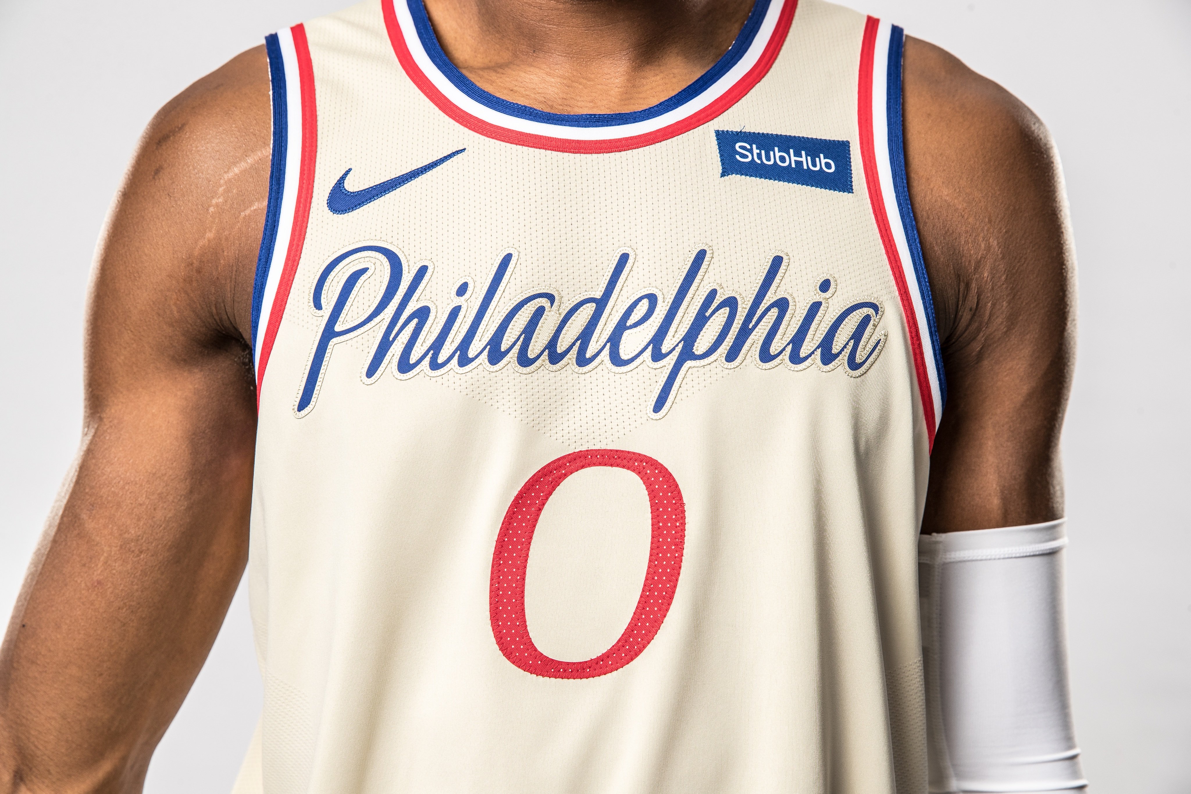
A few more 'Statement Editions'


Follow along with the video below to see how to install our site as a web app on your home screen.
Note: This feature may not be available in some browsers.
Like that we're doing something different, love the celtic theme that TBH is heavily under used for how cool and diverse of a design style it is.View attachment 771531
New boston city jersey
Surely they could’ve had a silhouette of st peters cathedral I think it is that is behind Adealide oval on the frontIllawarra and brisbane are pretty good, Adelaide feels very lazy and all the rest seem either bland or half assed. I liked the designs from last season and wpuld have gotten a sydney one if the gold wasnt off and the sky line imagery wasnt elongated, this year is a hard pass for me. I wish this years sydney kit used some gold and/or blue, while also enlarged the skyline to a similar extent as the brisbane kit.
South East Melbourne is consider the 'heartland' of Australian basketball with the legacy of the SEABL.Heartland??

NBL City jerseys 2019/2020
And yet they're still s**t.I like this year’s batch a hell of a lot more than last years.
Imo, the standard kits of the nbl are alright (with some being pretty good), bbl (of what I have seen) is overall pretty good, aleague is pretty good this year (overal)And yet they're still s**t.
NBL, BBL and A League all with terrible kits in the same summer.
I hope you wear contact lenses when you driveImo, the standard kits of the nbl are alright (with some being pretty good), bbl (of what I have seen) is overall pretty good, aleague is pretty good this year (overal)
those shops could do with a vacuum
NBL City jerseys 2019/2020
RIP Swoop City
NBL City jerseys 2019/2020
, guess I've gotta come up with a new profile title now.Church CityRIP Swoop City

I dunno, I think they're on the improve. They certainly aren't as bad as last year's. Also the sponsors seem to be less intrusive in general this year, which is nice.
Chief Cardinal of ChurchvilleRIP Swoop City

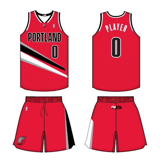
The TrailBlazers have pulled off a design on their singlets for agesLooks great if it's a footy/soccer guernsey. Not really sure if it works for bball but I'll give it a pass.
View attachment 783022