Navigation
Install the app
How to install the app on iOS
Follow along with the video below to see how to install our site as a web app on your home screen.
Note: This feature may not be available in some browsers.
More options


You are using an out of date browser. It may not display this or other websites correctly.
You should upgrade or use an alternative browser.
You should upgrade or use an alternative browser.
News New basketball uniforms/logos/courts etc.
- Thread starter E92_
- Start date
- Tagged users None
some of these could look pretty slick.
i like that more classic editions might be used as well. that suns classic jersey may have more sales than the valley jerseys from the last couple years. pistons back in the real is dope too.
utah's new black and gold scheme that they've been teasing for a while seems a bit underwhelming at first design-wise, but has the chance to look good if they get the rest of the guernseys right.
wizards cherry blossom one is nice. clippers one with the sails is a cool idea. sixers jersey is interesting but has potential to be solid, but fans could go either way on it or reckon. portland & spurs i like as well.
Xanthippus
Team Captain
- Oct 7, 2020
- 478
- 297
- AFL Club
- Collingwood

the hawks is fake. everything else is legit.
akkaps
Community Leader
- Mar 20, 2012
- 47,443
- 32,665
- AFL Club
- Carlton
- Moderator
- #2,106

Australia’s National Basketball League Honors Indigenous Community with Special Edition Jerseys
Second annual NBL Indigneous Round to be held March 4-14; goal is to
 news.sportslogos.net
- Sep 14, 2010
- 4,198
- 1,374
- AFL Club
- Adelaide
- Other Teams
- LA Lakers
The Washington Wizards and Nationals have teamed up for their cherry blossom jerseys:

Nationals, Wizards unveil collaborative cherry blossom jerseys

Nationals, Wizards unveil collaborative cherry blossom jerseys
Kickpuncher
Now I am become Donuts, the Destroyer of Ports
- Feb 13, 2007
- 12,393
- 20,932
- AFL Club
- Port Adelaide
Been leaked a day early apparently.
I don't think the sword in the shield needed removing, looks a little bland now. Only needed the colour change tbh.

I don't think the sword in the shield needed removing, looks a little bland now. Only needed the colour change tbh.
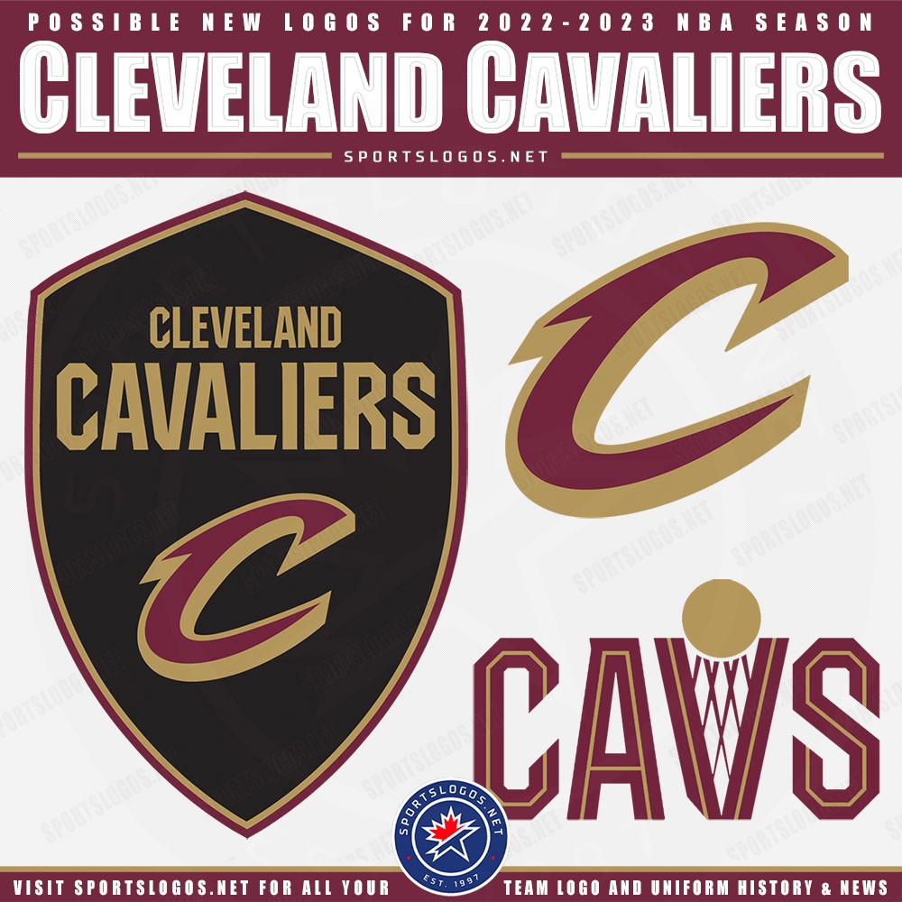
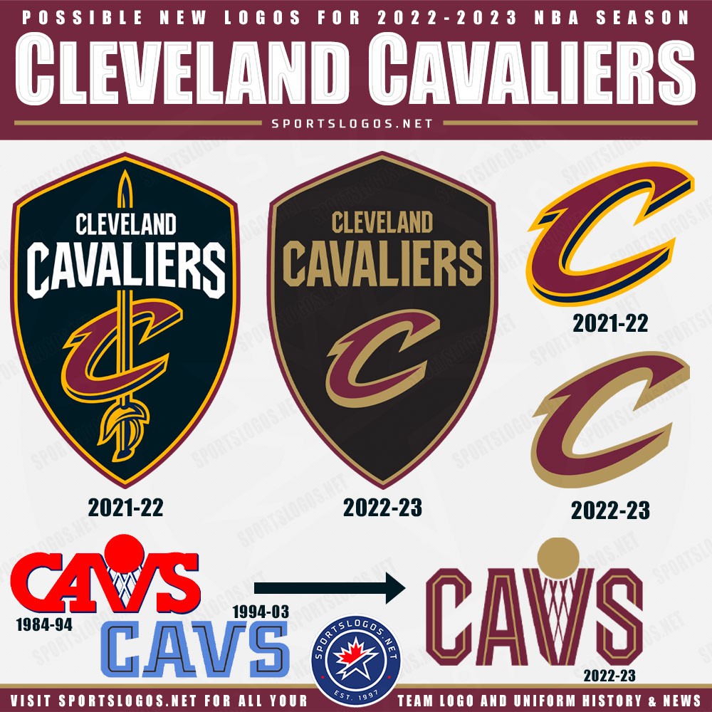
Weird choice. Feels more like NFL branding now.
Boring. The amount that someone got paid for this is probably ridiculous.Been leaked a day early apparently.
I don't think the sword in the shield needed removing, looks a little bland now. Only needed the colour change tbh.
- Sep 14, 2010
- 4,198
- 1,374
- AFL Club
- Adelaide
- Other Teams
- LA Lakers
Didn't they just rebrand recently as well? Settle on something please Cleveland. The colour change is alright, but everything else is boring. Didn't quite nail it with the fauxback wordmark.
yuck. the vibrant gold was the best part of their scheme.Been leaked a day early apparently.
I don't think the sword in the shield needed removing, looks a little bland now. Only needed the colour change tbh.
- Sep 14, 2010
- 4,198
- 1,374
- AFL Club
- Adelaide
- Other Teams
- LA Lakers

I like the mountains coming back, but the rest...

Rubber Arm
AFL Sucks
- Oct 10, 2018
- 1,643
- 3,572
- AFL Club
- North Melbourne
- Other Teams
- ^ I don't actually go for North.
a quick edit to make the white one much better.


- Sep 14, 2010
- 4,198
- 1,374
- AFL Club
- Adelaide
- Other Teams
- LA Lakers
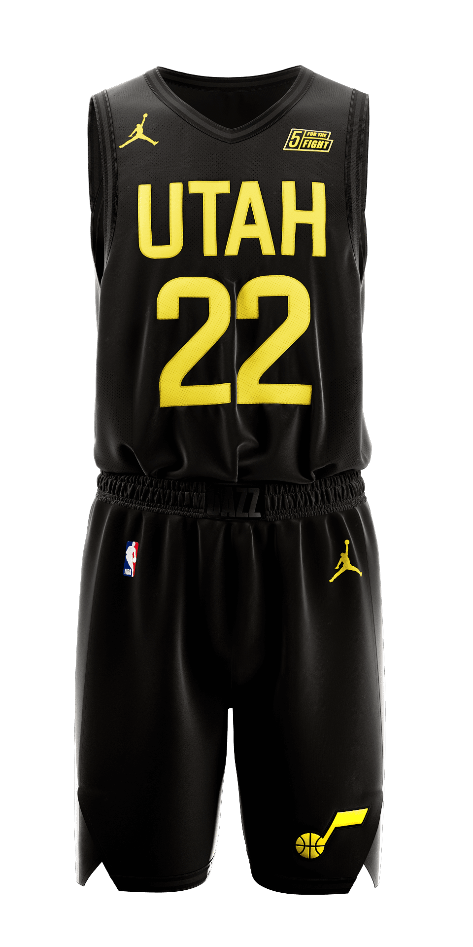
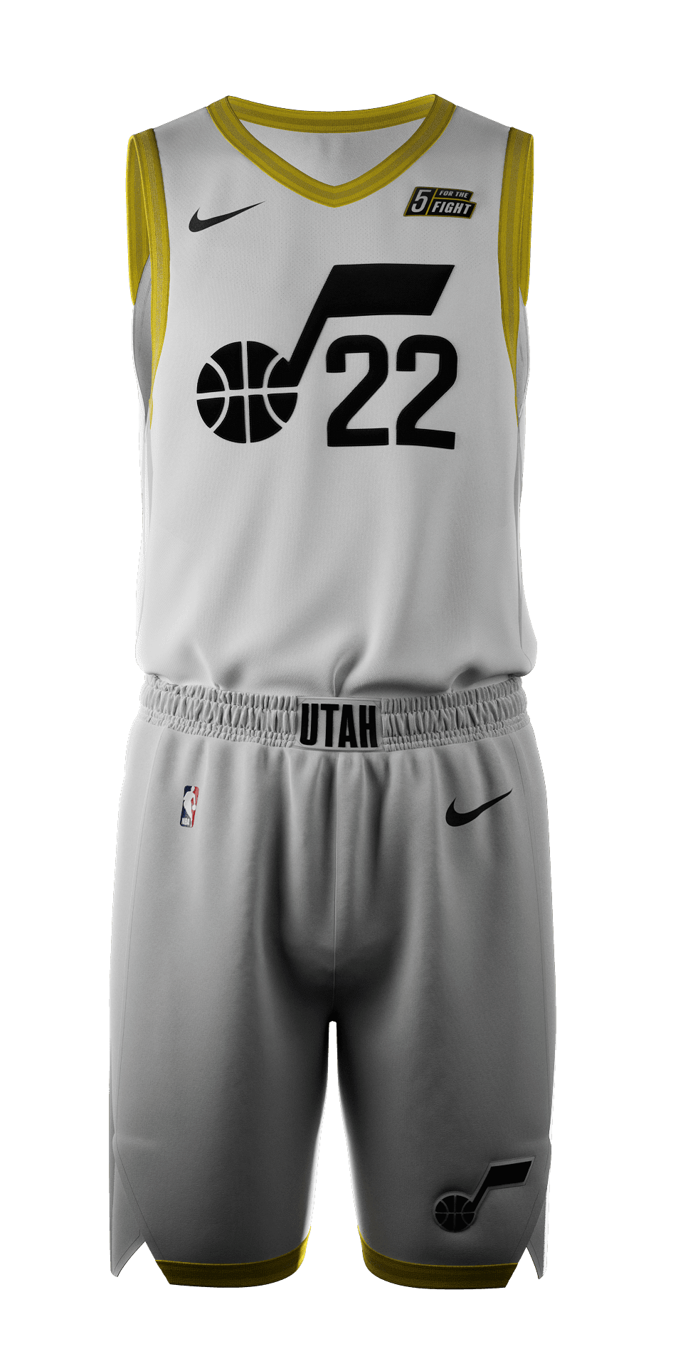
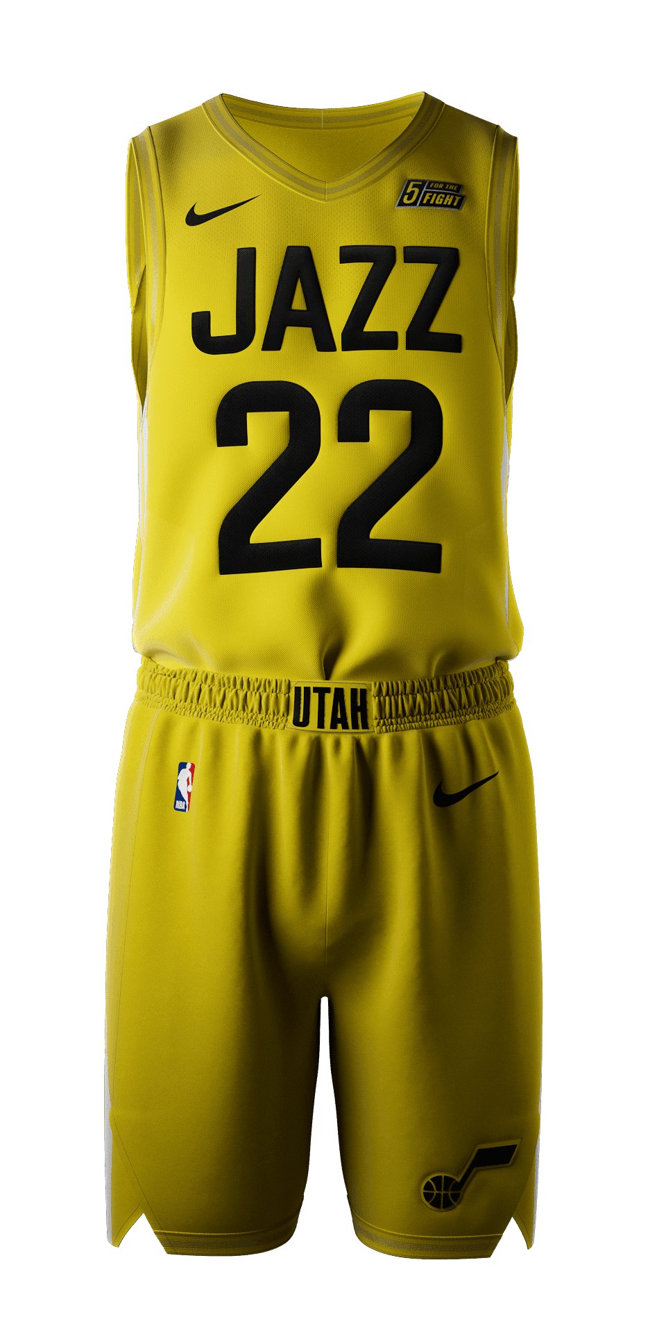
These new Jazz uniforms won't be around for long. From Andy Larsen of the Salt Lake Tribune:
Guess at least the team is listening to the criticism, but it's still pretty amateur to rebrand for two seasons, then rebrand again.
Andy Larsen: The Utah Jazz’s new jerseys are awful — and clearly, the team knows that
When the team announced the new look on Friday, the focus was on none of these colors, but purple. The team’s press release headline doesn’t mention any of black, white, and yellow, and instead reads: “Purple is Back for Utah Jazz in 2022-23 Season and Will Be Cornerstone Color Moving Forward.” The team’s video reveal of the new jerseys tacked on the black, white, and yellow stuff at the end, apologetically.
Purple wasn’t the plan for the franchise’s rebrand, but became the plan after initial public reaction to the black/white/yellow scheme was exceptionally critical. But because they locked in that latter scheme with Nike, the purple jerseys are either the “City” jerseys or the “Classic” set, expected to change every year. That’s why the video also revealed two new other purple jerseys, to be worn in the 2023-24 season.
We’ll see if the Jazz can convince Nike and the league to move on from the white, yellow, and black Association, Icon, and Statement jerseys more quickly than teams are usually allowed to.
Guess at least the team is listening to the criticism, but it's still pretty amateur to rebrand for two seasons, then rebrand again.
Andy Larsen: The Utah Jazz’s new jerseys are awful — and clearly, the team knows that
- Jun 12, 2012
- 20,534
- 65,313
- AFL Club
- Port Adelaide
Whoever did this is on the money. Easy fix that looks sensational.


Kickpuncher
Now I am become Donuts, the Destroyer of Ports
- Feb 13, 2007
- 12,393
- 20,932
- AFL Club
- Port Adelaide
Seems going simplistic is becoming the trend.


- Sep 14, 2010
- 4,198
- 1,374
- AFL Club
- Adelaide
- Other Teams
- LA Lakers
I miss the early LeBron era jerseys.
- Sep 14, 2010
- 4,198
- 1,374
- AFL Club
- Adelaide
- Other Teams
- LA Lakers
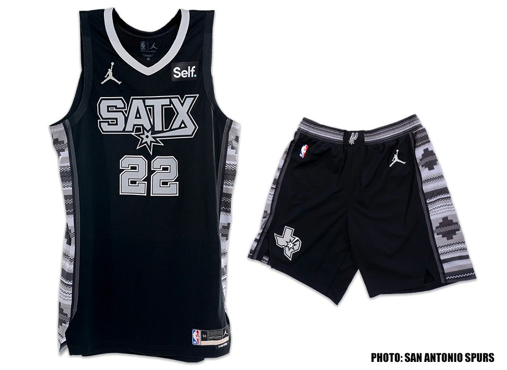
We've got a new Statement jersey in San Antonio:
And in Detroit, the Horse's Head has officially been announced:
And in Detroit, the Horse's Head has officially been announced:
- Sep 14, 2010
- 4,198
- 1,374
- AFL Club
- Adelaide
- Other Teams
- LA Lakers
- Sep 14, 2010
- 4,198
- 1,374
- AFL Club
- Adelaide
- Other Teams
- LA Lakers
For anyone who might be interested, the guys behind A blog responsible for the collection and documentation of NBA Jerseys past, present and future. have moved off of Tumblr and made a footyjumpers.com style site:
NBA Teams | Basketball Jersey Database
NBA Teams | Basketball Jersey Database
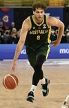
Some of the new kits for the 22/23 NBL season. Looks like Wildcats includes some kind of indigenous artwork detailing. Spirit of Tasmania onboard as sponsor for JackJumpers.


Freight Train
Once hit the sign at the Mercantile Mutual Cup
- Moderator
- #2,124
Some of the new kits for the 22/23 NBL season. Looks like Wildcats includes some kind of indigenous artwork detailing. Spirit of Tasmania onboard as sponsor for JackJumpers.
View attachment 1502337View attachment 1502339
View attachment 1502342
Wildcats uniforms are featuring artwork from local Indigenous artist, Kevin Bynder - worked with him on a few of the NBL1 West First Nations uniforms, along with other projects.
Also fun fact, the font used on the Wildcats wordmark is Crillee Extra Bold, the same used on the club’s logo and uniforms during the late 80s/early 90s.
I've been awaiting the 36ers release of their new jerseys for the season, but I realised, why do they need to change it every season? Keep it very similar every year IMO then re-design.
Similar threads
- Replies
- 29
- Views
- 4K
