Prediction New Club Logo

Remove this Banner Ad

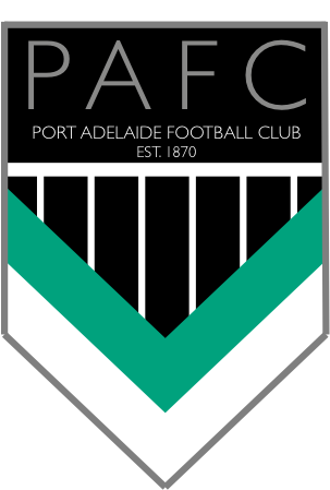
The more I look at it, the more I understand where they would be going with that logo if it is indeed the one they want to use. The triangle part at the bottom is meant to represent the chevrons on the AFL jumper (hence why the white and teal are the same size), whereas the prison bar/wharf pylon part is meant to represent the 'heart' of the club.

It's the monogram that makes it look tacky. It looks like two design elements joined together. Swap it out for a font and you get something like this (forget the font used, that's just something I threw in there):

View attachment 737773

I actually don’t mind this.


On iPhone using BigFooty.com mobile app
 
Whilst I don't love the new logo as per the image posted in this thread, it's important to remember that this is based on a rough sketch that's leaked and may only be an early draft. I will hold off blasting the club until the final product is released.
 

Log in to remove this ad.

Kinda like this from maybe 9 years ago

View attachment 738464
I made this on PowerPoint 7 years ago on an alt.

:
23k9esm.png


Port Adelaide:

This is a minimalist design, obviously based off Port's AFL (the teal and white V's) and SANFL guernseys (the prison-bar design). The colour of the font and outline is silver, the Power's often forgotten quarternary colour, which although not featured in any current guernsey, is still present in our club song. I might make the teal/white V's a little thinner.
 
I'd also have put 150th in there somewhere, like what Collingwood did.

Agree with this.

Collingwood did a specific season logo for the 125 years and then only changed their official club logo because the 125 year logo was popular. Going along the same route wouldn't have been a bad idea
 
Agree with this.

Collingwood did a specific season logo for the 125 years and then only changed their official club logo because the 125 year logo was popular. Going along the same route wouldn't have been a bad idea
Pretty sure that is the route we are going.

We know how this club operate.

Watch them promise it is just one year change while already having decided it is permanent.

On SM-G960F using BigFooty.com mobile app
 
Agree with this.

Collingwood did a specific season logo for the 125 years and then only changed their official club logo because the 125 year logo was popular. Going along the same route wouldn't have been a bad idea

I hope we do a lot better than they did with the final result though. Both their 125th logo and the current one they derived from it are pretty awkward to look at imo.
 
I hope we do a lot better than they did with the final result though. Both their 125th logo and the current one they derived from it are pretty awkward to look at imo.
Yeah I have some issues with the Collingwood logo execution as well. It could be a perfectly good logo with better refinement
 
Whilst I don't love the new logo as per the image posted in this thread, it's important to remember that this is based on a rough sketch that's leaked and may only be an early draft. I will hold off blasting the club until the final product is released.
Say this is true and the club are reading this thread looking for feedback before deciding on a final version, so far it feels like a lot of criticism with less direction (unlike the very clear bigfooty stance on the guernsey aka bringbackthebars)

Dylan8 El_Scorcho bomberclifford Pappagallo WLWLWLWLWL you guys all seem to have various combinations of passion and talent for design, do you have a preferred logo? Optimally it would be great to have one or two bigfooty recommendations incorporating all the appropriate cultural, historical and stylistic elements which we could then send to the club.

Otherwise I fear it's going to be another attempt at pleasing everyone which results in pleasing no one.
I forgot I had a much more developed thing with this logo I was working on. Might package it up into something more coherent if I can be bothered.

UkTXLAc.png


ykINyCW.jpg


6eOmM1J.png


mpTkJCa.png
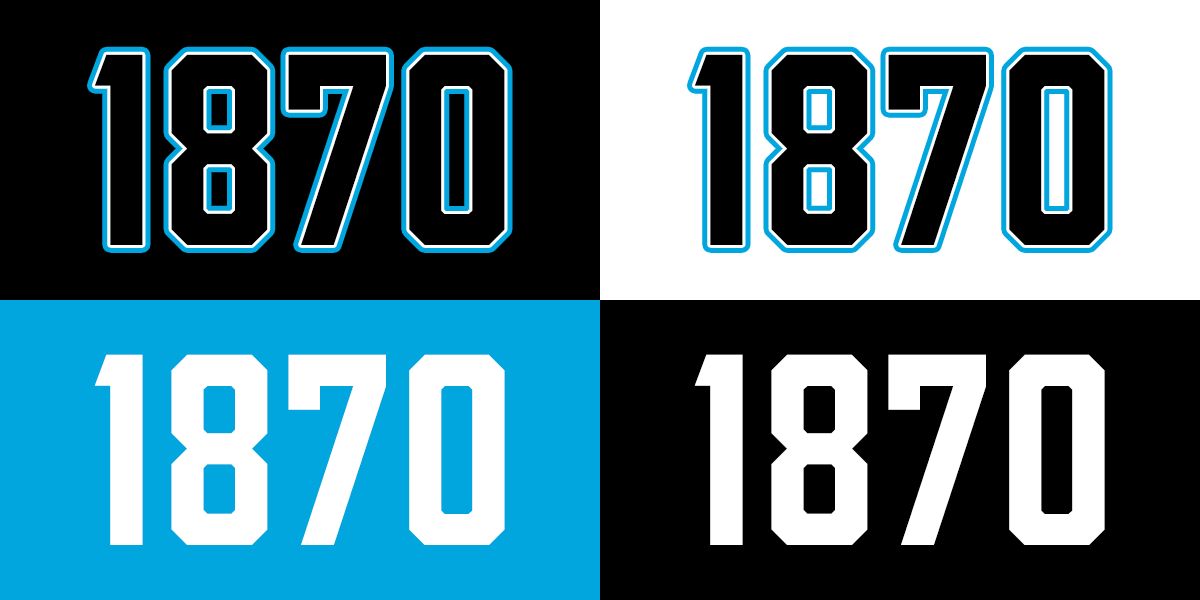
What I posted here is what I think is the best concept I've personally come up with in the never ending quest for the perfect one club logo. I believe it satisfies a few criteria I want in a new logo: a natural progression from the current logo, emphasis on Port rather than Power, a reference to 1870, a reference to the Power nickname, and a nod to heritage (number panel in this case). Also, the central icon and the wordmark can be used independently from the rest of the logo.
 
What I posted here is what I think is the best concept I've personally come up with in the never ending quest for the perfect one club logo. I believe it satisfies a few criteria I want in a new logo: a natural progression from the current logo, emphasis on Port rather than Power, a reference to 1870, a reference to the Power nickname, and a nod to heritage (number panel in this case). Also, the central icon and the wordmark can be used independently from the rest of the logo.
Nice, I do remember these now, they look great. Simple yet striking. Two things that would need to be considered before proposing them:

TEAL: We seem to be favouring the steel-grey / silver over the teal now, for example the away guernsey; those delicious looking steel prison bars could also be a stepping stone to wearing them long term. So if we are moving away should we propose removing teal completely?

POWER: Are we so sold on the power as a moniker that we would further cement it with this logo? Or would a logo not referencing power make it easier to de-emphasise and ultimately move away from.
 

(Log in to remove this ad.)

ok so this is an idea I've had since I heard about a new logo or whatever we're going to do. This is an extremely rough knock up I just did in 15 minutes but you get the general idea. Lighthouse, wharf pylons, an ode to the black diamond corner etc


738993
 
Nice, I do remember these now, they look great. Simple yet striking. Two things that would need to be considered before proposing them:

TEAL: We seem to be favouring the steel-grey / silver over the teal now, for example the away guernsey; those delicious looking steel prison bars could also be a stepping stone to wearing them long term. So if we are moving away should we propose removing teal completely?

POWER: Are we so sold on the power as a moniker that we would further cement it with this logo? Or would a logo not referencing power make it easier to de-emphasise and ultimately move away from.
Both of these things are too bedded into our brand for mine. Teal is great, especially as a third colour and for merch. It's distinctly us in the Australian sports landscape too. I think in my concept an ideal ratio of teal to black and white is reflected.

The Power moniker is also popular in the fan base and widely used externally. We've done enough to move more Port than Power over the last ten years to solidify our image as an old, traditional club rather than a new franchise. I think a hard swerve away from the Power nickname would alienate too many people.
 
ok so this is an idea I've had since I heard about a new logo or whatever we're going to do. This is an extremely rough knock up I just did in 15 minutes but you get the general idea. Lighthouse, wharf pylons, an ode to the black diamond corner etc


View attachment 738993
I was thinking about teal as water under wharf pylons as part of a logo the other day. Looks great here. Not sold on the lighthouse idea though.
 
I was thinking about teal as water under wharf pylons as part of a logo the other day. Looks great here. Not sold on the lighthouse idea though.
Yeah I was thinking of what else to sub in but the idea kind of follows the geography of water > wharf > lighthouse >up Commerical road > black diamond corner.
 
I forgot I had a much more developed thing with this logo I was working on. Might package it up into something more coherent if I can be bothered.

UkTXLAc.png


ykINyCW.jpg


6eOmM1J.png


mpTkJCa.png
I'd love to see what that top version would look like with either the black diamond corner or lighthouse in it's place.

Your logo design has really grown on me.

Sent from my SM-G950F using Tapatalk
 
Nice, I do remember these now, they look great. Simple yet striking. Two things that would need to be considered before proposing them:

TEAL: We seem to be favouring the steel-grey / silver over the teal now, for example the away guernsey; those delicious looking steel prison bars could also be a stepping stone to wearing them long term. So if we are moving away should we propose removing teal completely?

POWER: Are we so sold on the power as a moniker that we would further cement it with this logo? Or would a logo not referencing power make it easier to de-emphasise and ultimately move away from.

If teal was binned I wouldn't care but I think using it in minimal ways is fine. Just not on the uniform. It is a great retro guitar colour but not good on a Port jumper. It is a good highlight colour.

I think we should just remain with the Power nickname. We are chanting it. The chant sounds good. The jumper is the big issue, we must win that fight, that jumper is Port, it is us, but we've got to be content and consistent with the nickname. I believe that if the club properly explained why that 'Power' nickname was chosen we would probably appreciate it more … ?? I don't think they ever did. Boulton's silly reference to the Torrens island power plant was not the reason, I don't understand why he said that.
 
I'd love to see what that top version would look like with either the black diamond corner or lighthouse in it's place.

Your logo design has really grown on me.

Sent from my SM-G950F using Tapatalk
What if the lightning bolt was removed and replaced by the PBs? That has potential too imo.
 
ok so this is an idea I've had since I heard about a new logo or whatever we're going to do. This is an extremely rough knock up I just did in 15 minutes but you get the general idea. Lighthouse, wharf pylons, an ode to the black diamond corner etc


View attachment 738993
The teal being the Port River. Very clever.
 
ok so this is an idea I've had since I heard about a new logo or whatever we're going to do. This is an extremely rough knock up I just did in 15 minutes but you get the general idea. Lighthouse, wharf pylons, an ode to the black diamond corner etc


View attachment 738993

See now this you would want tattood on your body. Never thought that about our Power logo. The opposite in fact.
 

Remove this Banner Ad

Back
Top