Navigation
Install the app
How to install the app on iOS
Follow along with the video below to see how to install our site as a web app on your home screen.
Note: This feature may not be available in some browsers.
More options

You are using an out of date browser. It may not display this or other websites correctly.
You should upgrade or use an alternative browser.
You should upgrade or use an alternative browser.
Prediction New Club Logo
- Thread starter chiwigi
- Start date
- Tagged users None
- Mar 17, 2014
- 3,635
- 4,444
- AFL Club
- Port Adelaide
If only the club was established a year earlier...we could've been the 69ers.Unpopular opinion time - 1870 by itself is not a logo. Establishment dates are good as a part of something bigger but not as the main focal point.
TeeKray
Moderator
- Moderator
- #53
Lol, this has so much potential to be balls.
Strap yourselves in.
Strap yourselves in.
70sDinosaur
Premiership Player
And the Birkenhead Bridge.The lighthouse.
- Dec 31, 2013
- 16,404
- 40,986
- AFL Club
- Port Adelaide
- Other Teams
- Dallas Mavericks
What if 1870 was swapped with "PAFC" and right above or below it in the black area you have a small "1870" in white?
Doesn't really do it for me tbh. Just looks a bit basic and the diamond is a kind of obscure reference which we haven't seen before.
- Dec 31, 2013
- 16,404
- 40,986
- AFL Club
- Port Adelaide
- Other Teams
- Dallas Mavericks
If only the club was established a year earlier...we could've been the 69ers.
"Oh baby!" - Dwayne Russell
- Dec 31, 2013
- 16,404
- 40,986
- AFL Club
- Port Adelaide
- Other Teams
- Dallas Mavericks
The unique part of our identity is the word PORT. I'd like to see that word used as the main part of the logo with a small amount of teal and possibly the prison bars in there somewhere. You see the word PORT, you know exactly who it means.


70sDinosaur
Premiership Player
If nothing else, the lines of the diamond are a pretty good representation of how we move the ball around the field when in possession of it.Doesn't really do it for me tbh. Just looks a bit basic and the diamond is a kind of obscure reference which we haven't seen before.
70sDinosaur
Premiership Player
Agree with this.The unique part of our identity is the word PORT. I'd like to see that word used as the main part of the logo with a small amount of teal and possibly the prison bars in there somewhere. You see the word PORT, you know exactly who it means.
View attachment 674792
As an SA expat living in Melbourne, I've noticed the change from our early AFL days.
In the beginning, I used to have to tell people I support Port Adelaide. Now, you just have to say Port and everyone knows what you mean. The word/name Port was always a great brand by itself and now it's an established part of the national football consciousness.
It's one of the few advantages we have - we should push it hard.
Forzaport
Brownlow Medallist
Unpopular opinion time - 1870 by itself is not a logo. Establishment dates are good as a part of something bigger but not as the main focal point.
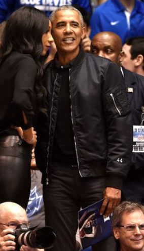
I agree that 1870 itself isn't a logo but it can still be used to great effect on our apparel. Imagine wearing a jacket with just "1870" on the sleeve, the same way Obama is rocking the "44" below.
bomberclifford
Importer/Exporter
I'm not very confident it will be any good.
bomberclifford
Importer/Exporter
If you were starting a new football team in Port Adelaide, it had never had one, what would be the image that represents the Port today?
The Port Admiral Hotel.
bomberclifford
Importer/Exporter
My guess is it'll be faux-heritage.
In the words of The Hitcher, that green thumbed cockney bastard, it'll be "Elements of the past and the future combining to make something not quite as good as either"
In the words of The Hitcher, that green thumbed cockney bastard, it'll be "Elements of the past and the future combining to make something not quite as good as either"
70sDinosaur
Premiership Player
Why? Is Jack Watts designing it?anyone else legitimately worried about this. could go **** up quite easily!
Why? Is Jack Watts designing it?
after seeing the newish P range... i hope they arent the same people who decided that
- Feb 29, 2012
- 6,180
- 7,247
- AFL Club
- Port Adelaide
Thanks diamond one from page one is sexy as
Pear1870
Section 301
- Aug 25, 2018
- 726
- 1,902
- AFL Club
- Port Adelaide
I understand the admin sucks, but the logo of 2 logos put together is only a short term thing. We need a singular logo that represents the whole club.
But the two logos is our logo due to the two separate competitions the club plays in.
Are you suggesting we remove the magpie logo from the SANFL team identity.
Do you believe the AFL (and Collingwood) will allow us to incorporate a magpie in a new logo used for that competition?
Do you agree that the logos for each division is the perfect logo for NTUA and quite perfectly identifies the club as it is?
I can understand the club considering something for the 150th year (only) because of merchandizing revenue, assuming supporters will purchase in a spending frenzy. Not sure that will happen given the level of disenchantment.
My concern is the club initializing a one of for one year only to then making the logo a more permant arrangement, again for merchandizing sales. We are talking bean counters, making change to club identity, that ultimately reduces club identity. Does anyone trust the current administration not to do that? Let's remember how the co-captaincy issue panned out and apply that to this. I'll make an educated guess and state they wont be listening to members because (1) it has already been decided and (2) members don't count.
RussellEbertHandball
Flick pass expert
Port Adelaide is stronger than Port IMO.Agree with this.
As an SA expat living in Melbourne, I've noticed the change from our early AFL days.
In the beginning, I used to have to tell people I support Port Adelaide. Now, you just have to say Port and everyone knows what you mean. The word/name Port was always a great brand by itself and now it's an established part of the national football consciousness.
It's one of the few advantages we have - we should push it hard.
If you say you go for Port, do you get the you support Port Power back from them?
I hate that we had to run with Port Power for 3 years to differentiate ourselves from Port Magpies. Both should have been Port Adelaide. In the AFL we should have been Port Adelaide or just Port, but not Port Power. But nobody in the history of a national sporting competition in the world that I'm aware of was forced to split into 2 and go thru the his BS, so we learnt on the job and made a few errors in the early days.
Pear1870
Section 301
- Aug 25, 2018
- 726
- 1,902
- AFL Club
- Port Adelaide
Yes YESS YESS
PORD ADELAIDE BUCANEERS!!!!!
Yes YESS YESS
PORD ADELAIDE BUCANEERS!!!!!
Under my buccanhat
Pear1870
Section 301
- Aug 25, 2018
- 726
- 1,902
- AFL Club
- Port Adelaide
Port Adelaide is stronger than Port IMO.
If you say you go for Port, do you get the you support Port Power back from them?
I hate that we had to run with Port Power for 3 years to differentiate ourselves from Port Magpies. Both should have been Port Adelaide. In the AFL we should have been Port Adelaide or just Port, but not Port Power. But nobody in the history of a national sporting competition in the world that I'm aware of was forced to split into 2 and go thru the his BS, so we learnt on the job and made a few errors in the early days.
Agree with Port Adelaide for both AFL and SANFL. The lightning bolt for AFL, the Magpie for SANFL. But Port Adelaide for both.
Far Kern
Rat
Look over here, at anything other than the prison bars.
Happy to drop the Magpie logo altogether. The maggies I grew up loving ceased to exist a long time ago. Put it in the memory bank where it belongs.
Similar threads
- Replies
- 14
- Views
- 588
