Navigation
Install the app
How to install the app on iOS
Follow along with the video below to see how to install our site as a web app on your home screen.
Note: This feature may not be available in some browsers.
More options
You are using an out of date browser. It may not display this or other websites correctly.
You should upgrade or use an alternative browser.
You should upgrade or use an alternative browser.
Prediction New Club Logo
- Thread starter chiwigi
- Start date
- Tagged users None
- Apr 6, 2014
- 6,645
- 9,636
- AFL Club
- Port Adelaide
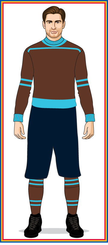
Early 20th century SA state team wore brown and turquoise (nearly teal)

Imagine it remained like that. That would've been the crows colours and we would certainly have not chosen teal.
- Apr 6, 2014
- 6,645
- 9,636
- AFL Club
- Port Adelaide
9
The crows have a jumper that is close to that 1930 jumper. Bloody self-righteous copycat knobs. If only Collingwood had not seen the 1899 jumper. Bloody sanfl.
Pooh brown is a tough marketing colour in more modern times. Its an old colour from when times were more simpler and life had less options. SANFL (when it was SAFA/SAFL in 1907 name change)
View attachment 740542
The crows have a jumper that is close to that 1930 jumper. Bloody self-righteous copycat knobs. If only Collingwood had not seen the 1899 jumper. Bloody sanfl.
- Apr 6, 2014
- 6,645
- 9,636
- AFL Club
- Port Adelaide
See post above re White Sox
Baseball does sports branding particularly well. They get the balance right between traditional nostalgia and merch-able graphics that create team/club brands that are easily identifiable.
I think the San Antonio Spurs branding is also pretty good. Great use of black and silver and a unique name/icon symbol.
Yes the Spurs logo works well.
I just assumed St Pauli wore black and white after seeing all the skull and crossbones flags while walking around Hamburg.Some of my faves are brown.
Cleveland, St Pauli, Old school Penrith!
RussellEbertHandball
Flick pass expert
They saw the 1891 jumper and that's where they got the idea when they split away from the Brittania FC in 1892.9
The crows have a jumper that is close to that 1930 jumper. Bloody self-righteous copycat knobs. If only Collingwood had not seen the 1899 jumper. Bloody sanfl.
bomberclifford
Importer/Exporter
St Pauli
Hadn't seen that before. Nice example of using a local architectural feature in the branding without it being too twee.
Fairly tight execution too.
What's the story with the skull and cross bones? Is that a fan thing? Or is it something different?
Love this extension of the brand image using a gaff tape style font.


Last edited:
bomberclifford
Importer/Exporter
- Oct 28, 2007
- 3,277
- 3,277
- AFL Club
- Port Adelaide
- Other Teams
- Port
Would love this gif'd with chattering teeth.
- Mar 3, 2014
- 12,124
- 20,269
- AFL Club
- Port Adelaide
- Other Teams
- dallas cowboys ferrari f1
Ween.Some of my faves are brown.
Cleveland, St Pauli, Old school Penrith!

- Aug 21, 2007
- 31,651
- 98,923
- AFL Club
- Port Adelaide
- Other Teams
- Aston Villa, San Antonio Spurs
Now we're talking.
- Jun 12, 2012
- 20,509
- 65,265
- AFL Club
- Port Adelaide
chiwigi
I’ll make tears from your Wines.
- Thread starter
- #639
The skull and crossbones are a part of Hamburg culture and pirate history.Hadn't seen that before. Nice example of using a local architectural feature in the branding without it being too twee.
Fairly tight execution too.
What's the story with the skull and cross bones? Is that a fan thing? Or is it something different?
Love this extension of the brand image using a gaff tape style font.
View attachment 740851
View attachment 740853
The fans adopted it as the club is an anarcho/leftist leaning club and as a counter to much of the right wing imagery used at other German clubs.
They saw the 1891 jumper and that's where they got the idea when they split away from the Brittania FC in 1892.
Because Footscray has already registered blue, white, red....
The irony....
bomberclifford
Importer/Exporter
- Jun 12, 2012
- 20,509
- 65,265
- AFL Club
- Port Adelaide
The Jolly Rogerer.
- Dec 31, 2013
- 16,404
- 40,986
- AFL Club
- Port Adelaide
- Other Teams
- Dallas Mavericks
The Jolly Rogerer.
Loves a good motorboat.
Power Raid
We Exist To Win Premierships
I’m no design genius but I really prefer simple.
Light houses, pirate ships, Zeus etc to me all look like we’re trying too hard. Monogram or Dylan’s design look good to me.
On iPhone using BigFooty.com mobile app
Agree
Light houses too phallic
Poo pirates too easy to give s**t to
Zeus has no connection to our branding
Simple is best
What's wrong with phallic?Agree
Light houses too phallic
Poo pirates too easy to give s**t to
Zeus has no connection to our branding
Simple is best
Or do you just prefer pumping fists?
On SM-G960F using BigFooty.com mobile app
Suit
All Australian
- Sep 25, 2013
- 953
- 1,850
- AFL Club
- Port Adelaide
- Other Teams
- • UCI: MTS, LTS • F1: DR, CL, MV
Zeus has no connection to our branding
Agreed, but holly f**k do I hate the current incarnation of Thunda! Btw, I certainly wasn't suggesting that we use/adopt the word 'Zeus' in our branding/logo, just the image/iconography.
Look, I'm all for a monogram logo. However, people are foolish to think that appealing to children isn't important. Thus, we will still need to maintain a mascot.
I would argue that 'Thunda' in the image of the Greek god (with all the accoutrement), is vastly superior to the current Dean Brogan caricature dressed in a black/teal/silver gimp suit. Mythology is a dominant force in today's pop-culture.
Last edited:
Similar threads
- Replies
- 14
- Views
- 605
- Replies
- 1K
- Views
- 73K


