
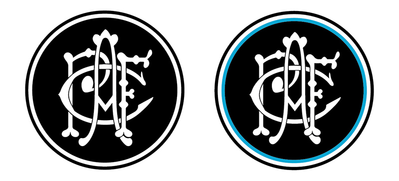
Probably been proposed before, but:

Follow along with the video below to see how to install our site as a web app on your home screen.
Note: This feature may not be available in some browsers.
The white circle needs to be made thicker like the Magpies logo.Probably been proposed before, but:
Agreed, but holly f**k do I hate the current incarnation of Thunda! Btw, I certainly wasn't suggesting that we use/adopt the word 'Zeus' in our branding/logo, just the image/iconography.
Look, I'm all for a monogram logo. However, people are foolish to think that appealing to children isn't important. Thus, we will still need to maintain a mascot.
I would argue that 'Thunda' in the image of the Greek god (with all the accoutrement), is vastly superior to the current Dean Brogan caricature dressed in a black/teal/silver gimp suit. Mythology is a dominant force in today's pop-culture.
Tommy Lighthouse?However, people are foolish to think that appealing to children isn't important. Thus, we will still need to maintain a mascot.
Can anyone clever mock that up?
Don't forget butt pirates. What if people call us butt pirates.Agree
Light houses too phallic
Poo pirates too easy to give s**t to
Zeus has no connection to our branding
Simple is best
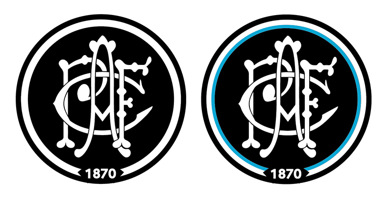
Not exactly what you were asking, but somewhere in between:
Its better.Not exactly what you were asking, but somewhere in between:
Not exactly what you were asking, but somewhere in between:
Zeus has no connection to our branding
Just make the letters to be actually intertwined, and that is it!Not exactly what you were asking, but somewhere in between:
You are asking for this:The white circle needs to be made thicker like the Magpies logo.
It could have either 1870 or Port Adelaide where it says Magpies.
Then I would 100% vote for this.
Can anyone clever mock that up?
On SM-G960F using BigFooty.com mobile app
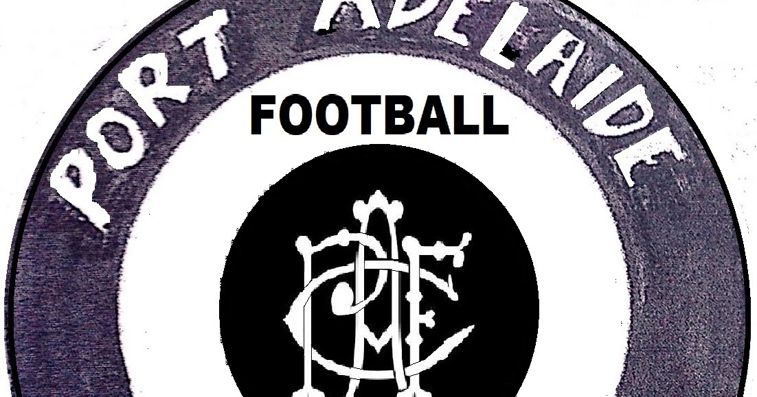
 farwestfooty.blogspot.com
With all due respect it looks like a skeleton orgy.Probably been proposed before, but:
Don't knock it til ya try itWith all due respect it looks like a skeleton orgy.
Sorry but that looks like a dog's breakfast.Probably been proposed before, but:
With all due respect it looks like a skeleton orgy.
Sorry but that looks like a dog's breakfast.
That is awesomeNot exactly what you were asking, but somewhere in between:
That font looks s**t houseNot exactly what you were asking, but somewhere in between:
.
Ugggghhhhh.Probably been proposed before, but:
