Prediction New Club Logo

Remove this Banner Ad

That is awesome
462e06f384a1c73bb523cbc2f052368a.gif


Sent from my SM-G920I using Tapatalk
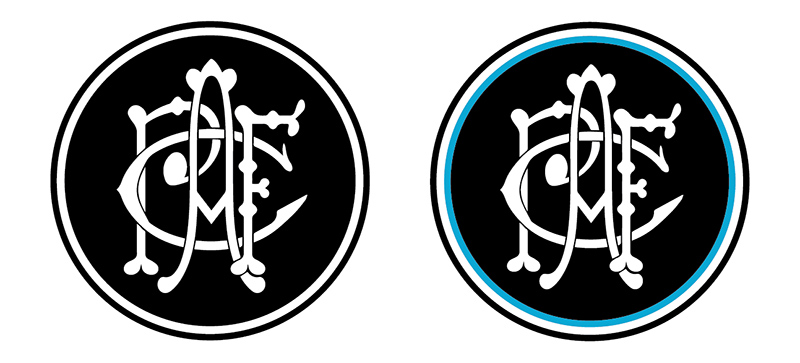
I'd still like to see it with the white thicker and the wording inside the white ring like the Maggie's logo.

Also the monogram inverted so it is black on a white background like the Magpie in the Maggie's logo.

On SM-G960F using
BigFooty.com mobile app
 

Log in to remove this ad.

I'd still like to see it with the white thicker and the wording inside the white ring like the Maggie's logo.

Also the monogram inverted so it is black on a white background like the Magpie in the Maggie's logo.

My issue with trying to evoke the structure of the Magpies logo is that the round logo was an SANFL thing, not a Port Adelaide thing.

Dkh5U82XoAAPElk.jpeg.jpg
 
Last edited:
That depends how picky you want to get on the finer details of the logo I guess.

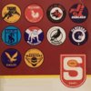
But the truth is I don't know the exact number but it is the logo from the flags of my youth.

On SM-G960F using
BigFooty.com mobile app

7 before Crows entered AFL
11 before Port entered AFL
+ 2 post AFL entry
 
How many?
On the other hand, it's the only real pre AFL logo that has any legitimacy or evokes any emotional reaction from supporters. I'd 1000% take anything inspired by it over that ancient monogram no one has seen before last year.
 
On the other hand, it's the only real pre AFL logo that has any legitimacy or evokes any emotional reaction from supporters. I'd 1000% take anything inspired by it over that ancient monogram no one has seen before last year.

The issue is that once you remove the Magpie image, the word MAGPIES, and the SANFL type, you are left with nothing but a circle within a circle. I'm not against using a roundel for the main logo, but making it match the proportions and colour way of the SANFL logo is a pointless exercise, particularly now.

The opportunity in front of the club is to develop a very strong brand in the AFL that ticks all the boxes without just being a slapped together hybrid of random things that a few select groups of supporters think should be in the logo.

The heritage monogram shouldn't be the prime logo but it does have a place in the overall visual identity system, as would a well drawn version of the Ports script.
 
The issue is that once you remove the Magpie image, the word MAGPIES, and the SANFL type, you are left with nothing but a circle within a circle. I'm not against using a roundel for the main logo, but making it match the proportions and colour way of the SANFL logo is a pointless exercise, particularly now.
Well duh you gotta fill in the blanks

743318

Anyway, not a direction I'd go in.
 

(Log in to remove this ad.)

The opportunity in front of the club is to develop a very strong brand in the AFL that ticks all the boxes without just being a slapped together hybrid of random things that a few select groups of supporters think should be in the logo.
For sure. I reckon we're really close to it already too. What we've done with some of our merch, particularly the PA monogram and PORT stuff, just needs to be consolidated. Same typeface across logos, merch, etc. Also have matching digital branding. But it's all kinda there. Any new logo will be the lynch pin. Anyway we're gonna * it up with some slapdash s**t lol. Can't think of any AFL team that does branding as good as the best NBA, MLB stuff. I mean North rejected this in favour of their 2006 lookin' ass logo.
 
For sure. I reckon we're really close to it already too. What we've done with some of our merch, particularly the PA monogram and PORT stuff, just needs to be consolidated. Same typeface across logos, merch, etc. Also have matching digital branding. But it's all kinda there. Any new logo will be the lynch pin. Anyway we're gonna fu** it up with some slapdash s**t lol.

I agree that we're close but my concern is that there is no one within the club who really understands branding. Yeah we've got people who know the theory, or run businesses with a brand, but no one who has an insight into building and designing a multi-faceted visual identity system. It's all being done piecemeal.


Can't think of any AFL team that does branding as good as the best NBA, MLB stuff. I mean North rejected this in favour of their 2006 lookin' ass logo.

I don't think that is much chop either. That kangaroo's head is terrible.
 
For sure. I reckon we're really close to it already too. What we've done with some of our merch, particularly the PA monogram and PORT stuff, just needs to be consolidated. Same typeface across logos, merch, etc. Also have matching digital branding. But it's all kinda there. Any new logo will be the lynch pin. Anyway we're gonna fu** it up with some slapdash s**t lol. Can't think of any AFL team that does branding as good as the best NBA, MLB stuff. I mean North rejected this in favour of their 2006 lookin' ass logo.
It may not be perfect, but this logo is way better than the current one they have.
 
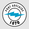
Go easy plebs. I put this together with a combination of Microsoft Paint and Photos (just like my other 'logos' I made in this thread).

743616
 
Last edited:
Fist device

From what I've heard Dylan, you love a good fist device....

Look, I couldn't be bothered making my own bolt (so I flogged it off the current logo). All I did was crop/scale/rotate it, so that it filled the negative space better.

Plus, one could say it's un hommage to the logo that has served us for over two decades.
 
Go easy plebs. I put this together with a combination of Microsoft Paint and Photos (just like my other 'logos' I made in this thread).

View attachment 743616


Funnily enough, I don't mind this.

Type needs work and not entirely sure of the 1870 diamond at the base, but it's one of the better efforts posted here.

That fist device, in an utterly bizarre way, sort of works. It mildly resembles a heraldry element.
 
Last edited:
Go easy plebs. I put this together with a combination of Microsoft Paint and Photos (just like my other 'logos' I made in this thread).

View attachment 743616
I like it. It showcases us going downhill over the last 5 years and projects out year 6.
 
I like it. It showcases us going downhill over the last 5 years and projects out year 6.

Using the thunderbolt to slow our slide down the Wharves of Oblivion.
 

Remove this Banner Ad

Back
Top