Prediction New Club Logo

Remove this Banner Ad

Funnily enough, I don't mind this.

Type needs work and not entirely sure of the 1870 diamond at the base, but it's one of the better efforts posted here.

Yeah, I wasn't sold on the diamond base. Font definitely needs work, however I was limited to what was on offer in MS Paint. You should just be grateful I didn't choose Comic Sans!

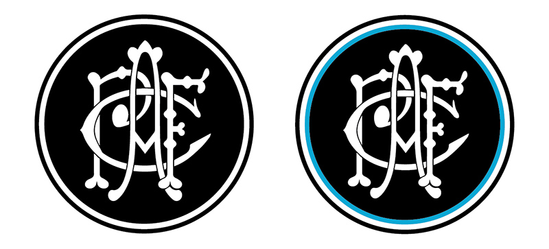
Just knocked these out...

743705

Thanks, I hate it.

Bahahaha....

Was just experimenting with the same poxy MS Paint font in monogram form (with different colour colour schemes), so that it all ties in with each other...
 
Is there a timeline for when this new logo will be released/launched?

I have no confidence in them getting this right.
 

Log in to remove this ad.

I love a good logo/branding exercise. The most frustrating thing about this thread is even the MS Paintjobs are better than what we'll be dealt.
 
Yeah, I wasn't sold on the diamond base. Font definitely needs work, however I was limited to what was on offer in MS Paint. You should just be grateful I didn't choose Comic Sans!

Just knocked these out...

View attachment 743705


Bahahaha....

Was just experimenting with the same poxy MS Paint font in monogram form (with different colour colour schemes), so that it all ties in with each other...


I really liked the diamond.
 
I've always loved the tradition in soccer of putting stars above logos to represent titles (eg Brazil).

Would be amazing to do something similar with our new logo, especially due to our history of premierships. Could have 5 stars (four Champions of Australia and 2004 AFL flag).
View attachment 743777
alright mate 36 stars it is
 
In reference to my comments about a redrawn PAFC monogram and a custom typeface for the Port Adelaide brand, check out this extension of the White Sox brand identity that included a redraw of their famous wordmark.


Redrawn script.

View attachment 740399


Applied to player uniform

View attachment 740400


Development sketches

View attachment 740401
Forgot to put this up last week after your post bomber, but arguably the most successful sports team of the last 130 years, keeps it simple and black and white and sometimes a bit of silver - The All Blacks.


743866 743867 743868

743872


And their silver logo that like Port guernsey looks gray.


743875
 
alright mate 36 stars it is
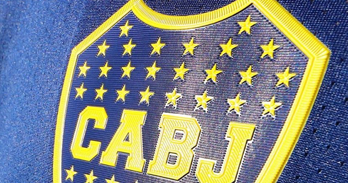
Club Atlético Boca Juniors (ARG) - each star is a title.
iu
 
Last edited:
I've always loved the tradition in soccer of putting stars above logos to represent titles (eg Brazil).

Would be amazing to do something similar with our new logo, especially due to our history of premierships. Could have 5 stars (four Champions of Australia and 2004 AFL flag).
View attachment 743777

Go the US flag but vertical black and white.

Each star representing our premierships
 
I've always loved the tradition in soccer of putting stars above logos to represent titles (eg Brazil).

Would be amazing to do something similar with our new logo, especially due to our history of premierships. Could have 5 stars (four Champions of Australia and 2004 AFL flag).
View attachment 743777
So, we have 36 SANFL, 4 Aus Champ., and 1 AFL Premierships. That would be 41 stars.
 

(Log in to remove this ad.)

I just bought a LA blue Dodgers cap for school sports next Friday, I always rock up with the wrong colour, so that solves that.

I like thew simplicity of the LA, similar to the NY for the Yankees.

When you think of the PAFC you think of the Prison Bars - whether you like it or not the most identifiable aspect of the PAFC brand is the jumper we can't wear, so whatever we do it's kinda fluffing around the edges isn't it.

Logos are great and all but it needs to be considered as part of the jumper, it's not that often you see the logo by itself, all be it on scarves etc...

On the way home from buying my cap I ran into a person with a PA "new era' branded Port Cap - that has legs, it just isn't done very well as per bomberclifford has mentioned.

If we are going to get rid of the 'Power/lightning bolt' it serves that person well too.

I get the intent with the prison bars shield but it's just trying to do what we can't do - wear our jumper.

I'm going back out to dig holes for my deck, but wondered if there was a way to deal with the bars differently (just looked at how the US baseball teams often use the pinstripe/heritage), but also wanted to see a jumper with the PA on it.

Rough as below but worth a quick look at the basic elements combined (colour/form).


746421
 
I just bought a LA blue Dodgers cap for school sports next Friday, I always rock up with the wrong colour, so that solves that.

I like thew simplicity of the LA, similar to the NY for the Yankees.

When you think of the PAFC you think of the Prison Bars - whether you like it or not the most identifiable aspect of the PAFC brand is the jumper we can't wear, so whatever we do it's kinda fluffing around the edges isn't it.

Logos are great and all but it needs to be considered as part of the jumper, it's not that often you see the logo by itself, all be it on scarves etc...

On the way home from buying my cap I ran into a person with a PA "new era' branded Port Cap - that has legs, it just isn't done very well as per bomberclifford has mentioned.

If we are going to get rid of the 'Power/lightning bolt' it serves that person well too.

I get the intent with the prison bars shield but it's just trying to do what we can't do - wear our jumper.

I'm going back out to dig holes for my deck, but wondered if there was a way to deal with the bars differently (just looked at how the US baseball teams often use the pinstripe/heritage), but also wanted to see a jumper with the PA on it.

Rough as below but worth a quick look at the basic elements combined (colour/form).


View attachment 746421
Don't mind it, but with white PA and white colour and cuff. Pointless teal is pointless
 
Don't mind it, but with white PA and white colour and cuff. Pointless teal is pointless


I think the opposite.

We need to own something that is us in the AFL - we will never be able to be the black and white like Collingwood, so get closer to using the bars in a way which is different and black and white whilst the teal PA works as a secondary element which is what's required to not be Collingwood if you get what i mean, I like the teal.
The bit that makes our jumper unique is actually the horizontal bar at the top, the stripes are also smaller (personally it's nothing like Collingwood).

The thing people need to take into account too is the jumper is strong becuase of all the past success it represents.

If the Magenta jumper won 300 premierships we'd want to wear that, if that makes sense.

I saw that game last night and Brisbane were tough as, the jumper reminded me of Voss, Black, Scott brothers and the way they played in it - so it represents ho players behaved in it. Personally until we start being Port again none of this will matter.
 
We need to own something that is us in the AFL

Unpopular opinion, I know, but that's what the lightening bolt/thunder motif is.

I'm not particularly wedded to it, but deciding to ditch that for something 'new' is an odd move.
Regardless of what you like/dislike on a personal level, the bolt has represented us in the AFL for over 20 years.

To dismiss it so lightly, for something that isn't really any better, from a traditional point of view, is an extremely risky move.
 
white colour and cuff.

One of the biggest problems we have, in my opinion, is this weird obsession with guernsey details like this.

The colour of the collar and cuff is irrelevant.
The gap between the 'bars' is irrelevant.
The height of the horizontal bar is irrelevant.

We need to allow ourselves the freedom to not have to replicate every minor detail of the PB guernsey.

Sure, have a replica of famous era guernseys as merch, but if and when we get to wear it in the AFL, it shouldn't need to be bound by these arbitrary details.


Would anyone really see it as a loss if we wore something like this one in the AFL?

70424371_2912106778859789_7836940440333975552_n.jpg
 

Remove this Banner Ad

Back
Top