Prediction New Club Logo

Remove this Banner Ad

Looking at it again, I am more inclined to have stars and "Port" written on the top of the badge, instead of the "PA" monogram.

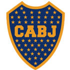
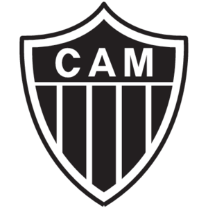
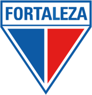
It would be something like mixing Boca Juniors (ARG), Atlético Mineiro (BRA), and Fortaleza (BRA) with Port Adelaide. Here, the four logos:
1572619502476-png.773332
iu
iu
180px-FortalezaEsporteClube.png


I imagine:
- Five lines lines of small white stars (18/17/18/17/18) on the top;
- "PORT" written on the center;
- Then, the prison bars;
- Finally, a teal chevron on the bottom.

It would be necessary to raise the bars a bit, so the horizontal line could go from side to side, as it does now. I would also get rid of the teal border. The teal chevron above the white one on the bottom (just as thick) would be enough.

Moreover, no "curves." The angles would be sharper, similar to those in Fortaleza's logo. It would look similar to what Janus have done here: https://www.bigfooty.com/forum/attachments/portnew-png.737773/

----

Still, I have no idea where to put a "1870" in a meaningful way. It could be vertically on the middle of the bars or inside the chevrons, in black; but I don't know.

If anyone believes the concept has potential and is interested in drawing it, I would appreciate the effort. I have no idea how to do it myself.

Thanks in advance.

----

P.S.: The 88 stars would stand for:
- 1 AFL flag;
- 4 Championship of Australia titles;
- 36 SANFL flags;
- 3 AFL Minor premierships;
- 44 SANFL Minor premierships.
We don't celebrate minor premierships in afl
 
We don't celebrate minor premierships in afl
I know. Have you seen the list of Boca's titles?

Seriously, flags will always matter the most, but I believe that Minor premierships should have some sort of recognition. Becoming a star on the badge would do it, for instance.
 
Last edited:
I know. Have you seen the list of Boca's titles?

Seriously, flags will always matter the most, but I believe that Minor premierships should have some sort of recognition. Becoming a star on the badge would do it, for instance.
I've seen the list of Boca's titles but on the other hand I've also seen the list of Pele's goals, so... :sunglasses:
 

Log in to remove this ad.

I've seen the list of Boca's titles but on the other hand I've also seen the list of Pele's goals, so... :sunglasses:
My point, exactly! You've got it. They all matter. Some more; others, less; but they all count something... :)
 
I know. Have you seen the list of Boca's titles?

Seriously, flags will always matter the most, but I believe that Minor premierships should have some sort of recognition. Becoming a star on the badge would do it, for instance.

It would be nice if there was a meaningful second prize for the AFL clubs but there just isn't anymore. It's flags or nothing. Even the pre-season was more than a s**t and giggle once upon a time.


Sent from my iPhone using Tapatalk
 
I see what you did there...

Not final yet, but refined enough to show how it could be crafted a lot better.

Fattened the outer and inner borders and set the bars in a thicker line weight with a reduced number of 'pylons'.
Removed the rounded corners and the 1870, with a more interlocking monogram than the original.


The all black version Looks great as a badge on a beanie.

PAFC Pins-B.jpg
 

(Log in to remove this ad.)

bomberclifford

Would you please put a white outline outside the teal one, so the chevron actually matches the jumper, while still giving it the PB's white collar and cuffs, effectively giving it:

Black
Teal
White

View attachment 773850


Don't take this the wrong way, but there's a lot more to do on this project* so I wan't be doing any requests from posters. Time is short as it is. I do want to hear thoughts and feedback though.

I have some thoughts on the desire to 'replicate the guernsey' vs the need to design a strong and usable symbol for the long term. Essentially, I think the latter trumps the former and that the better symbols are the simplest ones.


*For the record, I'm working up complete visual identity guidelines for the club that will include merch, mascot, member promotions, etc. This will all be entwined with the BBTB campaign for the offseason and throughout next year. The snippets above are some mid-stage development mockups. (Edit: I should note that this it self initiated, not an official engagement with the club)
 
Last edited:
Not final yet, but refined enough to show how it could be crafted a lot better.

Fattened the outer and inner borders and set the bars in a thicker line weight with a reduced number of 'pylons'.
Removed the rounded corners and the 1870, with a more interlocking monogram than the original.


The all black version Looks great as a badge on a beanie.

View attachment 773854


Blind emboss for the inner invisible outer shape...
 
The bars look like cricket stumps...

Cricket stumps are much longer, the same length, made of wood, and the bail does not extend past the outside stumps.
 
Not final yet, but refined enough to show how it could be crafted a lot better.

Fattened the outer and inner borders and set the bars in a thicker line weight with a reduced number of 'pylons'.
Removed the rounded corners and the 1870, with a more interlocking monogram than the original.


The all black version Looks great as a badge on a beanie.

View attachment 773854

This version looks really nice and as I’ve said before your monogram shits all over the current one. Even little details work like the top serif on the A filling the space inside the P and, you know, the letters actually being the same size. I like how they’re broader too, it just feels stronger.

Another thing I noticed about the current logo is that the monogram isn’t even centred, it’s off to the right and it’s really obvious when you look at it in relation to the Bars. So there’s another tick for your effort. :D

I'm up to iteration #15 on the monogram. Lots of small adjustments to angles and proportions to try to get it right.

My aim is to get the visual space in the counter of the P to match the visual space in the apex of the A to really enhance the interlocking nature of the letters.

One thing that has become very apparent is that the monogram will need size variants to allow for the optical effect of the diminishing stroke:gap ratio, which is a bit of a lost art these days.
 
Not final yet, but refined enough to show how it could be crafted a lot better.

Fattened the outer and inner borders and set the bars in a thicker line weight with a reduced number of 'pylons'.
Removed the rounded corners and the 1870, with a more interlocking monogram than the original.


The all black version Looks great as a badge on a beanie.

View attachment 773854
This is the best I have seen....Perfecto.
 

Remove this Banner Ad

Back
Top