News New club logo

Remove this Banner Ad

This is a crock, if we had a new logo it would be plastered over everything, would have to be the most unusual logo reveal launching through the AFL store. Someone having a lend here I reckon.
 
Blame Sydney Opera house for that mess. Literally had to do a revamp in an off seaosn due to their commission wanting 50k (if that’s was reported) for each season using the Opera House. I’d imagine Roosters, 6ers will change along with Sydney Kings who always have done so.
 
The age is reporting it as legit.
I for one love it. Looks tough and imo buldings make poor logos.
Still got the big V and 1874 which makes me happy, balances the two eras nicely.
Hawks made a similar change in 2008 and they've won 4 premierships since


Log in to remove this ad.

I got an email this arvo about the new logo. Just noticed an article on the Swans website is up now too.
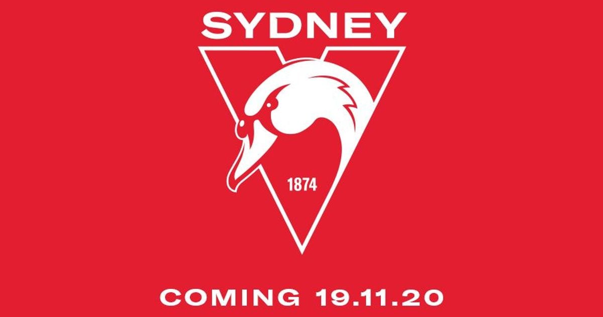
I don't mind it but would prefer they stick with "Sydney Swans". We are not Sydney FC and even the BF board named just as "Sydney" irks me more than it probably should
 
I got an email this arvo about the new logo. Just noticed an article on the Swans website is up now too.

I don't mind it but would prefer they stick with "Sydney Swans". We are not Sydney FC and even the BF board named just as "Sydney" irks me more than it probably should

I agree with you to a point on the Sydney name.

However from a geographical “ownership” point of view its way more powerful than “GWS”. I think from that point of view it is a pretty strong statement of ownership of the biggest city in Australia. Great for sponsorship, marketing etc
 
Not sure at first but I think it’ll grow on me.
Agree with the grow on me idea. Was thinking about an up yours opera house idea, one home game we will all wear our older jumpers as usual because we are not going to throw them away because opera house trustees got greedy! We all have banners , sue me you fargin iceholes!!
 

(Log in to remove this ad.)

My two issues with it are:

1. It only says "Sydney" and not "Sydney Swans"
2. The font is terrible.

I quite like the Swan, and the subtle Opera House-ish shape on the neck.

Happy for us to just go back to the red V without the Opera House/Swans tail at the bottom.
 
From an outsiders perspective.
It is a downgrade on the 2nd best logo in the league (Behind St Kilda)
But it's still decent. Still top third imo.
 
I like it.

I hope I like what it means for the club, maybe gives the young kids a logo that's only theirs, a logo repenting the rebuild and how we come out of it, doesn't happen often.

Maybe I'm reading too much into it.
 
Logo is fine. As someone mentioned the font is pretty average and it really should say Sydney Swans not just Sydney. The previous logo was one of the best in the league, though.

I don’t agree with going back to just the red V. That’s a good way of isolating all of NSW and looking like we’re a Victorian team again. The red V with maybe the harbor bridge in the middle would have been a good idea IMO.


Sent from my iPhone using Tapatalk
 
I don't mind the new logo. In business terms we were due for an update no matter how much we liked the previous one. I agree that there is something about the chosen font that is not great. I would also add est. to the year. The version on the white background looks more effective than the one on the red background.

Interesting to see what the further announcements will be. With the declaration the silhouette on the jumper won't be changing, I wonder if they will announce what the Melbourne based supporters have been asking for, that we will see the red V become a regular feature of games in Victoria.

New apparel partnership with Nike is rumoured I think?

Maybe cygnet will get a head upgrade to make him look more aggressive too
 

Remove this Banner Ad

Back
Top