News New Geelong logos

Remove this Banner Ad

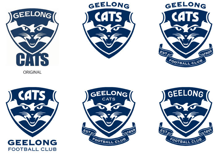
Re: 150 year merchandise

well don't you find it coincidental that all the 16 AFL clubs have changed their logos for next year to the shield design. It has to do with the 150 year celebrations. The AFL don't do anything by accident, every little detail is usually thought out in depth and in advance. You do not have to believe me, that's your prerogative as an individual. But I certainly do not agree with your Rabbitohs analogy, which is my prerogatived as well.


All these people saying we are changing the logo just for the hell of it or just because we have a new jumper/clothing sponsor/maker should wake up and smell the coffee.
i'm sorry... what? all that's happened is Hawthorn, Kangas and now you guys changing your logo to a shield design that is inconsistent between the three clubs, not to mention the fact that you already had a shield design.

i don't see Port or West Coast or Sydney or anyone else changing their logos for the 150th celebrations. :confused:
 
Re: Which logo is the offical logo?

Well as I said before we produce some things for the AFL and we were only given the Cats face version.

-Kris
 
Re: Which logo is the offical logo?

So you'd rather start a new thread which will probably be merged with the other one anyway? It's only 11 pages long.
Nah, Eliza, let's be so lazy that we can't read 11 pages (even if pressing ctrl+f launches a page search thing to make it easier) so we make our own thread about something that's been answered before in the logo thread. :rolleyes:
 

Log in to remove this ad.

Re: Do u like the new logos?

I've seen a couple of dodgy pictures of the logos throughout this thread. Though I might help you guys out.

(Bare with me, this is my first post. It's possibile that I could bugger it up!)

Geelong2008Logo2.jpg


Geelong2008Logo1.jpg


In a perfect world, I guess like many here, I'd prefer to stay with what we have. However that's clearly not going to happen. Initially I was taken by the silhouette cat design, but It has to be said that the 'face' design is growing on me.

I think if you read between the lines of the occasional press reports of which logo is likely to get the nod, ....I think we should start getting used to the 'cat face' design!

Cheers.

Wow fantastic quality - thanks for posting them.

Do you happen to work at the club or for the new apparel maker ISC :) ?

If we can't have both, maybe in 2009 we can have a compromised version of the two - cat face with ribbon/scroll in the one logo.
 
Re: Do u like the new logos?

Wow fantastic quality - thanks for posting them.

Do you happen to work at the club or for the new apparel maker ISC :) ?

If we can't have both, maybe in 2009 we can have a compromised version of the two - cat face with ribbon/scroll in the one logo.


Nope, don't work for either. These and many other interesting tidbits can be found by anyone, if you know where to look. It's all in the public domain. Where? ...Now that would telling. :D
 
Re: Do u like the new logos?

in fact, just doing some work myself, this is far better.
geelongxo5.jpg

sure, the cat's face could look far meaner, but this combines the best of both logos; traditional, yet modern. the cat's face should be meaner tho, then you'd have a gem.
 
Re: Do u like the new logos?

I really don't get why the top of the cats head is wavy, is it meant to be ears or something? Did the cat get a wavy combover?
IMO that's what wrecks that logo, the actual cats face is awesome, but the wavy thing is like "wtf?!"
 
Re: Do u like the new logos?

the cats face one is pathetic; largely because of the way the word 'CATS' looks... a tacked on afterthought.

i hope for your sake #2 is chosen.


Noises out of the club seem to suggest that they want something 'aggressive' and that they 'mean business' (a ridiculous point given we won the premiership?!).

Anyway, they are the catch cries. To my ears, that suggests the 'cat face'. The fact that there are two logos, only shows that perhaps they did originally intend on putting it to the vote. But my guess is that the decision has already been made.

Having said all of that however, I could very well be wrong. Whatever they do, I hope they choose one and not proceed with both. Having two competing logos would defeat the purpose of trying to create a uniform visual identity.
 
Re: Do u like the new logos?

in fact, just doing some work myself, this is far better.
geelongxo5.jpg

sure, the cat's face could look far meaner, but this combines the best of both logos; traditional, yet modern. the cat's face should be meaner tho, then you'd have a gem.
That's what I'd prefer. Putting the scroll their adds a nice touch.

They seem hellbent on putting the word Cats in the logo, so I'd also put the word 'Cats' in the blue space below 'Geelong' and above the Cat's head.
 

(Log in to remove this ad.)

Re: Do u like the new logos?

Don't want to burst the bubble of those who want a hybrid of the two logos. The club would have to go through the long trademark process all over again. It ain't gonna happen.

It's one or the other (or if they're stupid enough, both).
 
Re: Do u like the new logos?

I really don't get why the top of the cats head is wavy, is it meant to be ears or something? Did the cat get a wavy combover?
IMO that's what wrecks that logo, the actual cats face is awesome, but the wavy thing is like "wtf?!"

I think the wave is there to sharpen the focus on the eyes and act as eyebrows. Replace the wave with a straight line or remove it completely will make the cat face look weird. Believe me I have tried it in Photoshop :) .
 
Re: Do u like the new logos?

Don't mind either logo. Good idea to bring the cat in some form back to the logo. But the one they currently have (Well for 4 more days) is good as well. Will be interesting to see which new one they go with and how well it is received.

For me I would pick the really traditional one that looks like an 100 year log and leave it at that for 100 years. But if there was a vote between the three I would vote for the current one.
 
Re: Here are the new logo's

Here is my compromise between the two logos.

Unbelievable. The club would have spent a crapload on research and design, you spend 5 minutes in photoshop and come up with a better logo than the club could manage. I know it won't happen, but this one is a winner for mine! :thumbsu:
 
Re: Do u like the new logos?

The thing that bothers me most about these logos (particularly the 'face' one, ....the one we're going to get!) is that we are being rebranded as the 'Geelong Cats'. I've hated this trend of some clubs feeling the need to dumb down everything. This isn't basketball!

For the most part we've resisted this and have been 'The Geelong Football Club'.

It's gonna make me cringe the first time someone officially refers to us as the 'Geelong Cats'. ....never from these lips!!

Petty, maybe. But I think important.
100% agree.

I much prefer the English soccer style where you are simply "XXXX Football Club" and you have your nicknames, but they aren't incorporated (name wise) into your logo.

I don't see the word Gunners (Arsenal), Red Devils (Man U), Reds (Liverpool), The Magpies (Newc Utd) in their logos.

We are the Geelong Football Club. Our nickname is the Cats yes, but I don't see any great need to place a large emphasis. Unfortunately though, despite being settled by the English, we are more American with our sports teams and the nickname must be a prominent part of our name. I don't like it.

I mean look at the first logo, not even a mention of "Football Club".

Ashb23 said:
Unbelievable. The club would have spent a crapload on research and design, you spend 5 minutes in photoshop and come up with a better logo than the club could manage.
Crazy isn't it?

If there had been a simple consultation with members this would have come up. Unfortunately now it's too late to put forward suggestions, but that would have been better than the other two suggestions put forward.
 
Re: Do u like the new logos?

One of the rules of logo design is involve as few stakeholders as possible.
Otherwise they can easily turn into a 'camel' (A horse designed by a comittee)
 
Re: Do u like the new logos?

SO dissapointed in those logos.

Exected so much and after we win a flag we get dished up with these rubbish logos.

Keep the sheild logo GFC, its timeless. These 2 designs are rubbish.
 
Re: Do u like the new logos?

Ok, I was a little disappointed like a lot of you with the new designs. I think they are sort of on the right track but some serious consideration and refinement needed to be done before signing them off.

I have seen the first logo on some merchandise so it is definitely a goer.

For me the typography really needed some more thought. Impact and Copperlate are not exactly the most exciting typefaces, and their placement is a little puzzling. The cat wasn't bold enough. They eyes look quite vacant and the teeth just aren't menacing enough.

So I've had a quick play with the logo just to see if I could improve it at all. I've worked with the eyeline to portray a more focussed cat with bigger eyes. I have made the teeth a little more aggressive and changed the shield be more dynamic. I haven't played with type a great deal but included the old CATS type from the 80's-90's logo we love so much.

All up I feel it is a slight improvement.

gfc.jpg
 
Re: Do u like the new logos?

im a designer too....nice work man.

The 2nd and 3rd logos are a vast improvement. I hope people who have a say in the logo design look at threads like this, but its probably falling to deaf ears.
 

Remove this Banner Ad

Back
Top