
- May 28, 2010
- 1,709
- 2,132
- AFL Club
- West Coast
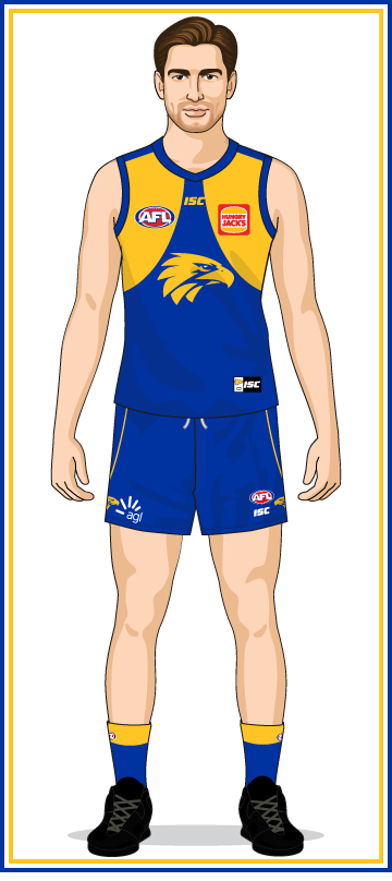
For 2019 and 2020 the Eagles logo on the left hand side of the shorts (player’s left) is not mirrored, but the regular logo that faces right.
Follow along with the video below to see how to install our site as a web app on your home screen.
Note: This feature may not be available in some browsers.
hey thats a good show don't dissLooks like a guernsey brand they’d have on that playing for keeps show on channel 10.
Sent from my iPhone using Tapatalk Pro
So far we've come up with this:
correct?
Just the jumpers, the pages don't work, obviously.
If you want a look at the full size of the image, right click on it and open it separately.
Awesome, thanks.From what I’ve seen and read
- Classic logo on BL guernsey is white
- La Trobe Uni logo on Carlton shorts is just the wording
- Johnnie Walker have been replaced by Hertz on the Melbourne shorts
- As previously mentioned, The Eagle logo is not mirrored on the WCE shorts
So far we've come up with this:
correct?
Just the jumpers, the pages don't work, obviously.
If you want a look at the full size of the image, right click on it and open it separately.


Brisbane's shorts are like this:
View attachment 787580
View attachment 787579
I might've made the fitzroy lions too big but the important thing is that they're there
Yours looks better, wish both lions were facing out
Then i take my request back. Still better if it was larger than it looks to actually bethey wrap around to the back of the shorts, the Fitzroy lion always faced left.
Last year's kit but with the first majestic collar would have been the best guernsey they've ever hadTalk about a fall from grace. Last years' kit was one of their best and now this. Classic must be pulling a lot of cash, I hope it doesn't get any worse that this but I won't hold my breath.
Brisbane's shorts are like this:
View attachment 787580
View attachment 787579
I might've made the fitzroy lions too big but the important thing is that they're there
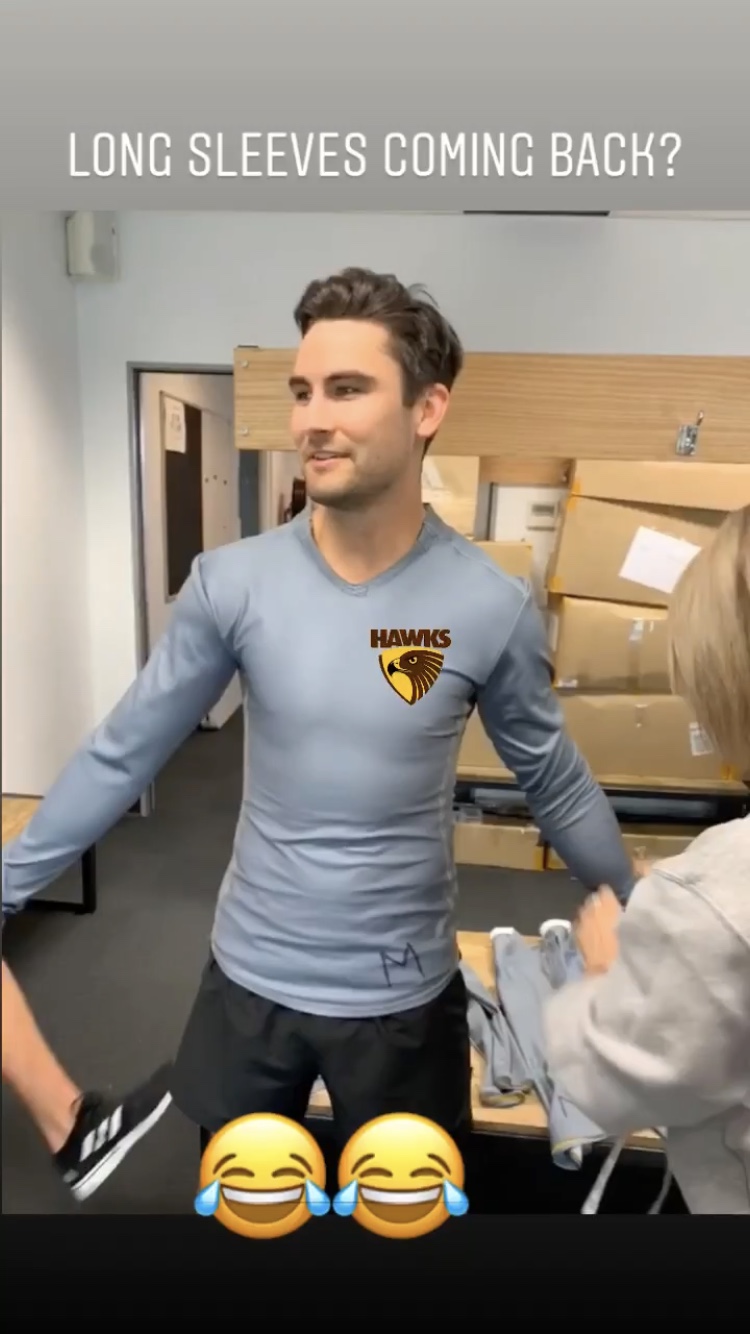

That’s our template so it looks like we’ll be able to wear long sleeves next season

That’s our template so it looks like we’ll be able to wear long sleeves next season
looks like a hint of yellow might be back by the old school pictures they put up on their storySt Kilda revealing guernseys tomorrow as per their Facebook story
Never thought of that. Good calllooks like a hint of yellow might be back by the old school pictures they put up on their story
Please god yeslooks like a hint of yellow might be back by the old school pictures they put up on their story
I'm gonna be a dick and shut that down for the home and away kits... unless it'll be a one off guernseylooks like a hint of yellow might be back by the old school pictures they put up on their story
My money is on a crappy crusaderI'm gonna be a dick and shut that down for the home and away kits... unless it'll be a one off guernsey
looks like a hint of yellow might be back by the old school pictures they put up on their story

 shop.afl.com.au
 shop.afl.com.au
Oh yeah, I knew that. BoooooI'm gonna be a dick and shut that down for the home and away kits... unless it'll be a one off guernsey
Underwhelming confirmed.
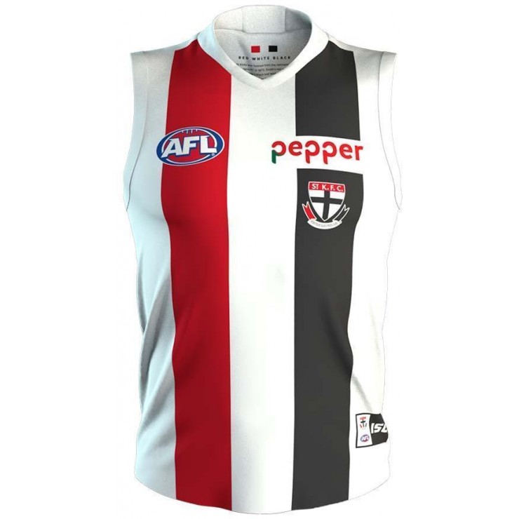
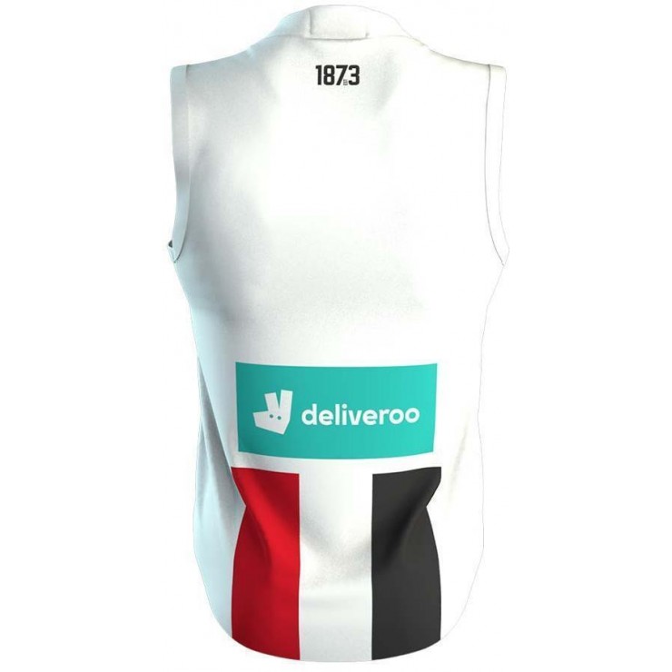
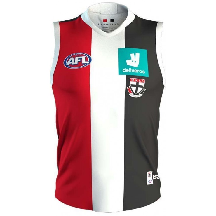
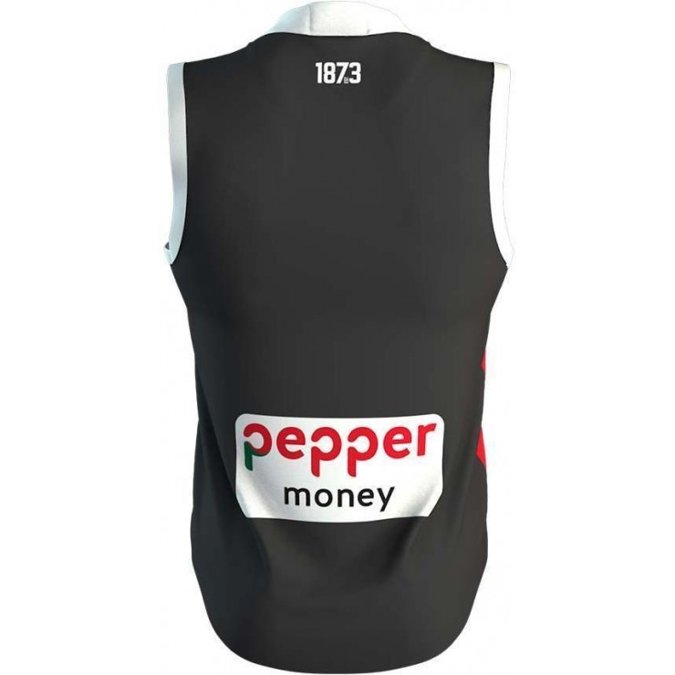
St Kilda Saints 2020 Men’s Home Guernsey
Rep your AFL team this season when wearing this St Kilda Saints 2020 Men's Home Guernsey. This is a replica Guernsey which will be worn by your players at their home ground Docklands Stadium. ISC has integrated AXIS fabrication within the fabric, which aids in keeping you cool through its...St Kilda Saints 2020 Men’s Clash Guernsey
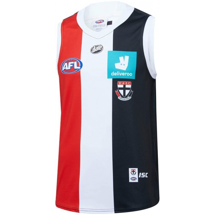
This St Kilda Saints 2020 Men's Clash Guernsey replicates what your players will wear as they travel away from home this AFL season. This Guernsey features a full sublimated design with the teams away strip, the Saints team crest can be found sitting proudly on the chest. No matter how intense...
