

- Dec 18, 2014
- 4,010
- 10,999
- AFL Club
- North Melbourne
- Other Teams
- Pierce & Pierce, Stratton Oakmont
Gen Z actually.Ok boomer
Follow along with the video below to see how to install our site as a web app on your home screen.
Note: This feature may not be available in some browsers.
LIVE: Richmond v Melbourne - 7:25PM Wed
Squiggle tips Demons at 77% chance -- What's your tip? -- Team line-ups »
Gen Z actually.Ok boomer
Okay ZoomerGen Z actually.
 shop.afl.com.au
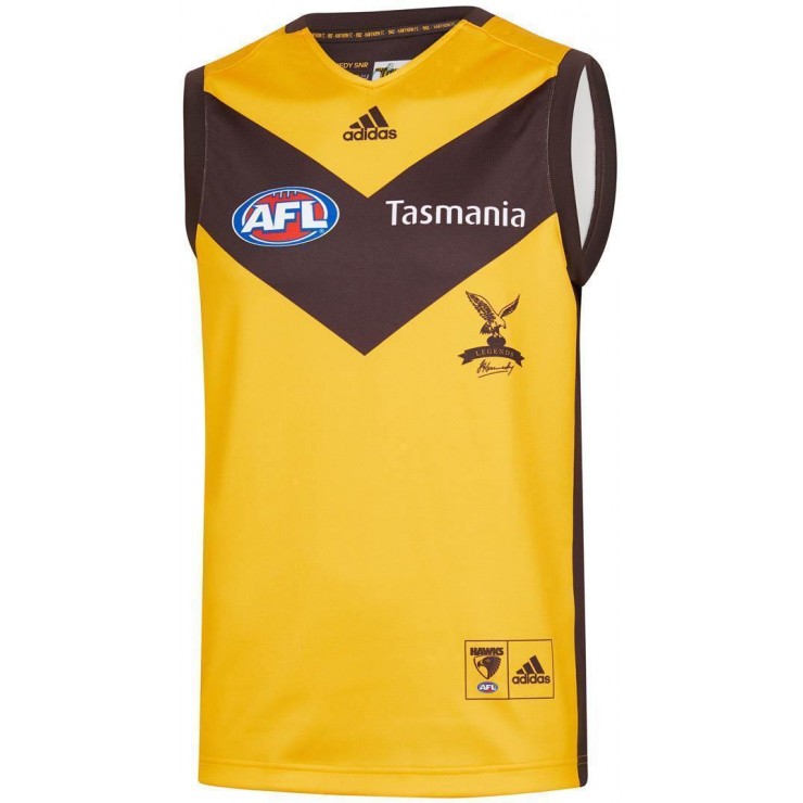
Hawthorn listing their Legends jumper as Away Jumper.
John Kennedy signature stays under the heritage Hawthorn logo
Hawthorn Hawks 2020 Men’s Away Guernsey
Take your passion for the Hawks to the next level in this Hawthorn Hawks 2020 Men's Away Guernsey from adidas. The Hawks Away Jumper is a replica design of the Guernsey worn by the players during away matches throughout the AFL season. This Hawks Away Guernsey uses adidas's Climalite performance...
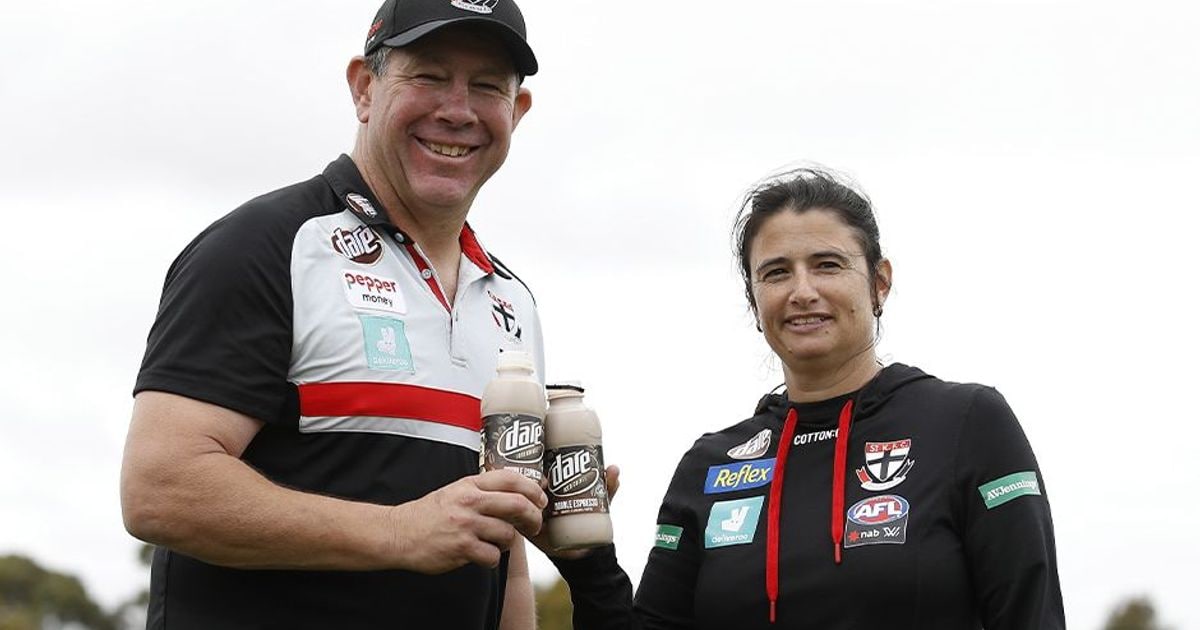
Post game interviews and player profile pictures come immediately to mind.That Dare logo is so small, you have to wonder if it’s really worth it. How much exposure will you get besides a pretty significant close up?
Post game interviews and player profile pictures come immediately to mind.

That Dare logo is so small, you have to wonder if it’s really worth it. How much exposure will you get besides a pretty significant close up?
Only they probably don’t want their brand to be associated with something like that...If StK have an ASADA sized scandal, Dare will be laughing to the bank.
Papers love to show pics below the neck for big stories
I think a dark navy blue would do the same. And blue is one of our official colours. So we could tweak that to be navy blue and voila, colours done
Anyone else a fan of how the grey works with the Suns colours? I doubt the AFL/Giants would be happy to allow the Suns to incorporate grey into their offical colours, but just that addition has made their look go from the worst in the AFL to a pretty nice one IMO.
How 'bout no.I think a dark navy blue would do the same. And blue is one of our official colours. So we could tweak that to be navy blue and voila, colours done
We're the pride ofI think a dark navy blue would do the same. And blue is one of our official colours. So we could tweak that to be navy blue and voila, colours done
Wow they really haven't work out the sponsor integration well on anything. Also Deliveroo should really consider using a monochrome version of their logo because the box doesn't really work on black or white, the logo really doesn't stand out.

Look at the sponsors behind Ratts and Searly... not sure why they just didn’t use that application.Wow they really haven't work out the sponsor integration well on anything. Also Deliveroo should really consider using a monochrome version of their logo because the box doesn't really work on black or white, the logo really doesn't stand out.
FYI I'd have gone with something like this:- Simplified Dare logo, boxless Deliveroo (the logo actually ends up slightly bigger) centre aligned to AFL logo and St Kilda Crest thinner white stripe etc.
View attachment 794056
I know right. Personally they should have used alternating squares for the backboard like other clubs use when a sponsor features a non-club background colour. It's almost like the club has fired their graphic designer.Look at the sponsors behind Ratts and Searly... not sure why they just didn’t use that application.
First year of sponsors, especially with colour preferences, are often not very good (probably partly due to the rush and/or unknown marketing results). I do like your concept, although for stk i would think pertruding logos would be highly likely in any version/level of compromise.Wow they really haven't work out the sponsor integration well on anything. Also Deliveroo should really consider using a monochrome version of their logo because the box doesn't really work on black or white, the logo really doesn't stand out.
FYI I'd have gone with something like this:- Simplified Dare logo, boxless Deliveroo (the logo actually ends up slightly bigger) centre aligned to AFL logo and St Kilda Crest thinner white stripe etc.
View attachment 794056
Okay LyntonI think a dark navy blue would do the same. And blue is one of our official colours. So we could tweak that to be navy blue and voila, colours done

Has he mentioned that before?Okay Lynton
Nah. For the last 3 or 4 years port have had a training guernsey or two with collars like that. I don't know why.
Port’s ISC gear has this collar... potentially the next ISC collar?
