Mero
Norm Smith Medallist
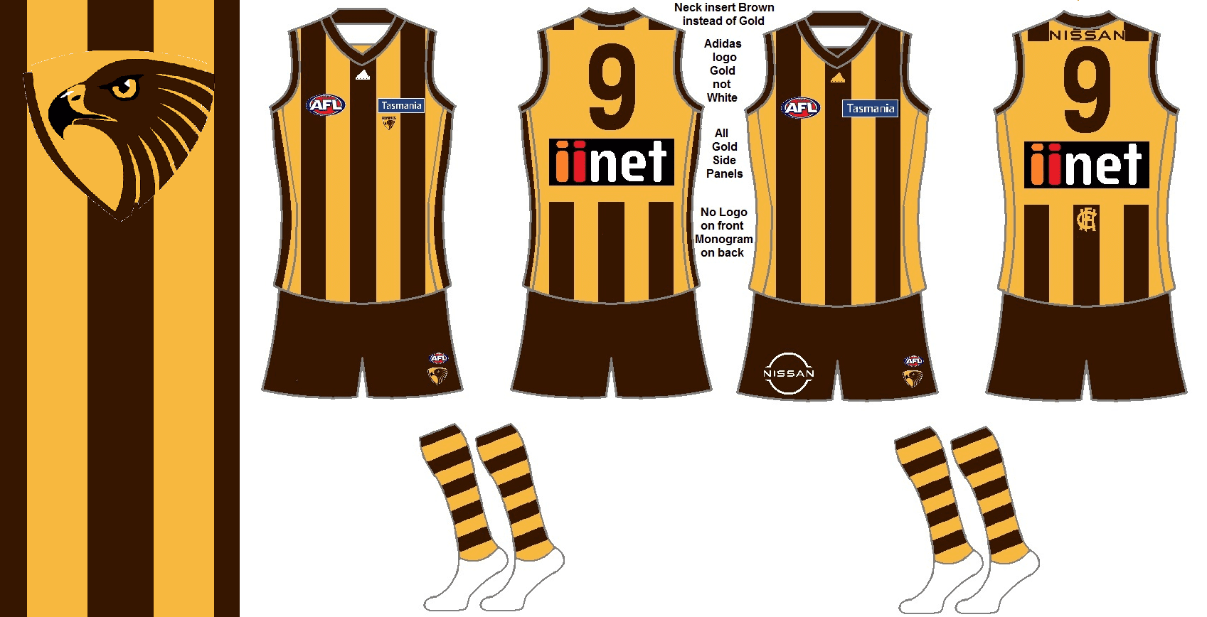
Probably the elastic material which is not the same as the jumper.I like the idea of the side panels here, but the fact that they appear to be a different brown to the printed stripes is off-putting.
Follow along with the video below to see how to install our site as a web app on your home screen.
Note: This feature may not be available in some browsers.
Probably the elastic material which is not the same as the jumper.I like the idea of the side panels here, but the fact that they appear to be a different brown to the printed stripes is off-putting.
Big step up imo, this is what I wanted Collingwood to do with their jumpers. I still maintain that Hawthorn look best with a plain gold back but this looks really really good.Some higher-res pics. The side panels are faux panels, as in the design doesn't follow the stitching. Which would lead to me calling it a 'wrap-around' or '5-stripe' design rather than saying they are side panels. A bit like the Pies clash jumper of the early 2010s. It also appears that the brown is the same colour across the board.


I like Port doing it as sort of a hark back to the SANFL a days where every club had their logo on their jumper, however the low position (under the sponsor) looks awful for any team that isn’t St Kilda.FFS, St Kilda are the only club that should have their logo on their guernsey.
Every other club needs to stop this experiment and ruining perfectly good jumpers.
Less is more you idiots.
Port's new logo should have been a roundel for this reason. The connection you are making here would have been far more pronounced I think, with all the SANFL logos being on that template back in the day much like VFL ones on the shield. Hope the crows do a roundel when we finally ditch the raven.I like Port doing it as sort of a hark back to the SANFL a days where every club had their logo on their jumper, however the low position (under the sponsor) looks awful for any team that isn’t St Kilda.
Logo on the guernsey is so dumb. Reminds me of 04/05 when we were absolutely shithouse
If its been on the kit for long enough, it ends up working. When it is first put on people will probably not like it.I know everyone's saying 'except St Kilda' when it comes to club logos on jumpers, but I really think this works

It is accepted because it's been there for so long, no other reason. You can read the backstory about it on their website, if you're unfamiliar and curious.I gotta ask, why is the logo generally only accepted for St Kilda? Is it the logo itself? Or something else I'm missing
Legend.This is obviously where the designers drew their inspiration from:

The AFL have let the cat out of the bag re: sponsorsPepper money confirmed for “the upper back” of saints guernsey. Still waiting for the second sponsor but saints look to be holding onto the upper back sponsor from this year.
Pepper back Saints community
https://www.saints.com.au/news/841272
Seems strange to be named co-major and not having the front of the away.Pepper money confirmed for “the upper back” of saints guernsey. Still waiting for the second sponsor but saints look to be holding onto the upper back sponsor from this year.
Pepper back Saints community
https://www.saints.com.au/news/841272
Idiots - St Kilda are now allowed to have four sponsors on guernsey instead of the standard two. Ridiculous.The AFL have let the cat out of the bag re: sponsors
We will never get it back
I think it works well for St Kilda and Geelong because they have really classic timeless logos. (The full cat logo, not the shitty cat head logo) they remind me of most European soccer logos. I think we can look at these two logos 50 years in the future and still think theyre good logos. That's the problem with a lot of footy team logos. In a couple of years they will look dated. I also think Freo, Ports new one, Carlton and Collingwood now have pretty good timeless logos imoI gotta ask, why is the logo generally only accepted for St Kilda? Is it the logo itself? Or something else I'm missing
Port's new logo should have been a roundel for this reason. The connection you are making here would have been far more pronounced I think, with all the SANFL logos being on that template back in the day much like VFL ones on the shield. Hope the crows do a roundel when we finally ditch the raven.
Damn Gibbsy, put a warning on that for dark mode users.This is obviously where the designers drew their inspiration from:


Link to some of the 2021 Brisbane Lions on field and training guernseys https://shop.lions.com.au/classic-sportswear/
