- Sep 6, 2005
- 144,971
- 94,830
- AFL Club
- Fremantle
- Thread starter
- #51
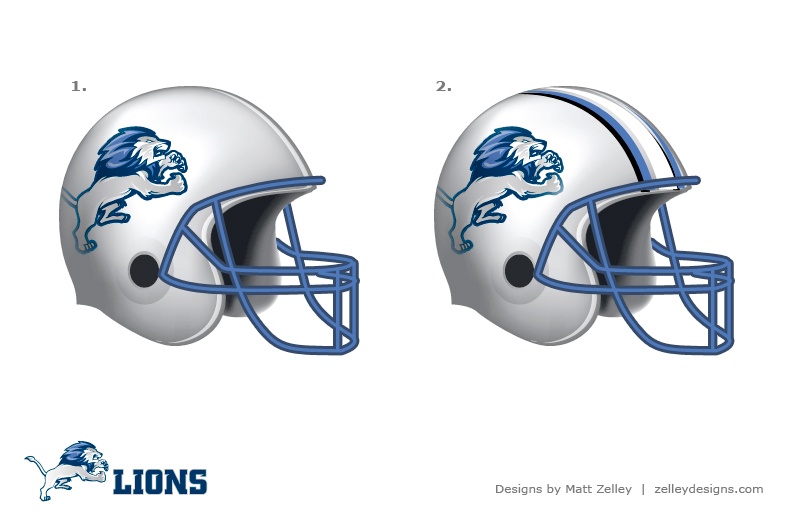
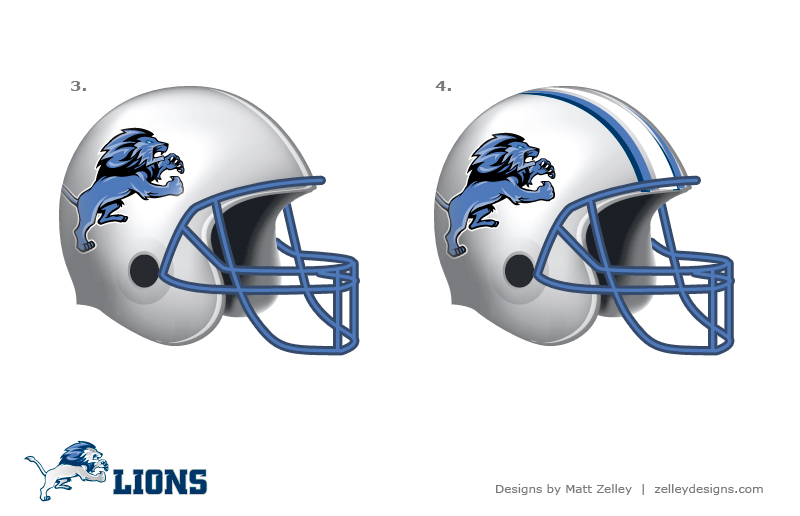
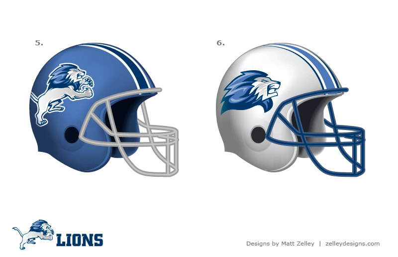
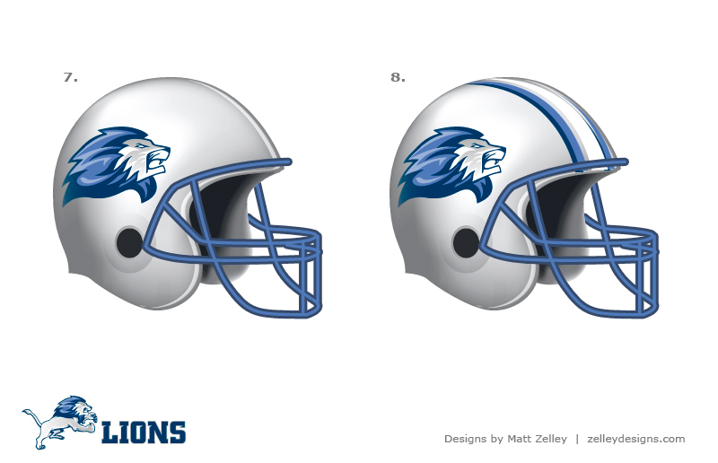
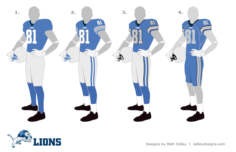
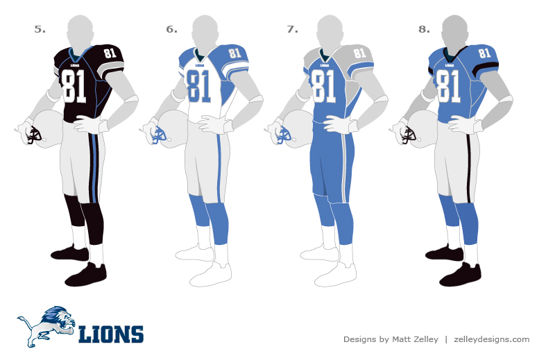
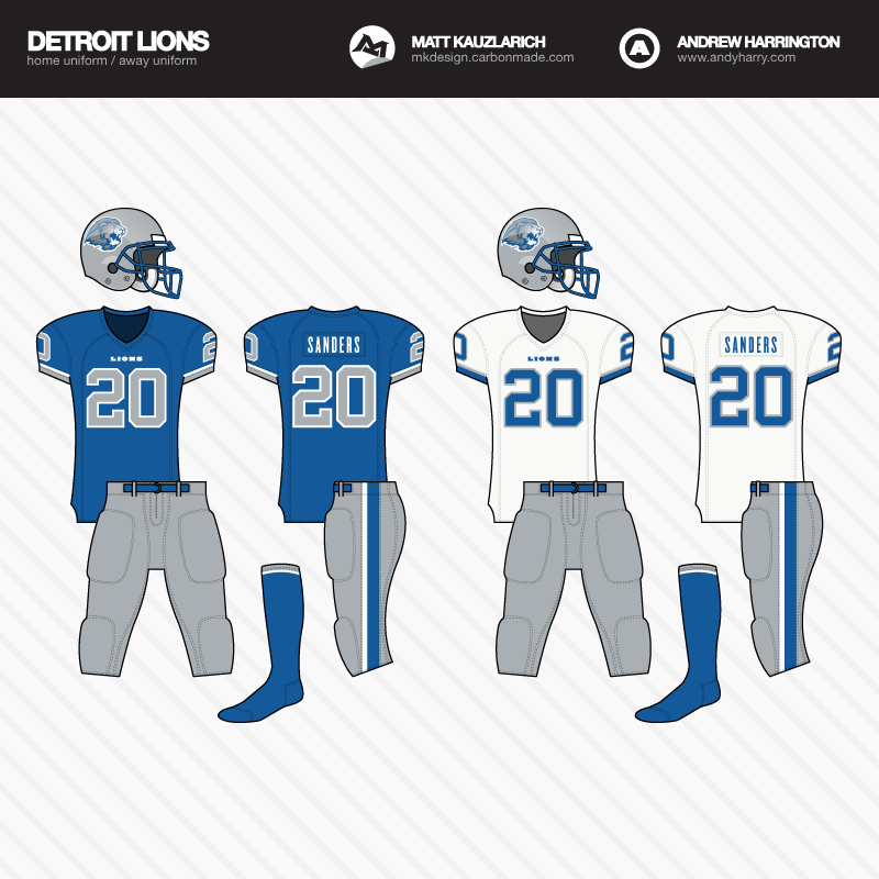
Re: Detroit Lions---New Uniform Changes 2010
the guy who did that lions design is now visiting the lions board im registered to and getting feedback and ideas to re-do the jersey and helmet.
the guy who did that lions design is now visiting the lions board im registered to and getting feedback and ideas to re-do the jersey and helmet.

") )
)