- Feb 28, 2009
- 37,099
- 34,268
- AFL Club
- Essendon
- Other Teams
- Baltimore Ravens, Atletico
Whats the "Denver thing"?
Follow along with the video below to see how to install our site as a web app on your home screen.
Note: This feature may not be available in some browsers.
Whats the "Denver thing"?
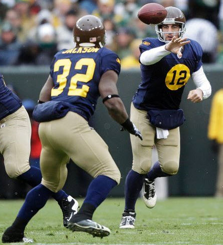
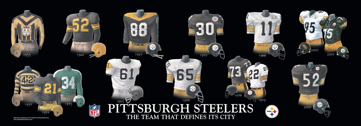
Remember people they're throwbacks. They're not wearing them because some guy at Nike or Reebok thought they look good.
I actually don't mind the Steelers throwback.
Remember people they're throwbacks. They're not wearing them because some guy at Nike or Reebok thought they look good.
I actually don't mind the Steelers throwback.
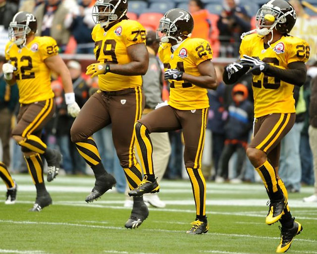
I don't think it looks good at all. Here is the whole uni (which they will wear twice this season apparently)

Let's be fair, they're only churned out so teams/manufacturers can draw more money from the fans.Remember people they're throwbacks. They're not wearing them because some guy at Nike or Reebok thought they look good.
I actually don't mind the Steelers throwback.
I think i could handle this bumble bee look with black pants......but the gold pants makes it a Barry Crocker.
Arent throwbacks supposed to commemorate a teams history? If so, why commemorate a 2 win season?

Let's be fair, they're only churned out so teams/manufacturers can draw more money from the fans.

Roger Goodell has already fined the logo for not wearing its helmet.