Workshop New SANFL Jumpers

Remove this Banner Ad

Yatmax

Channel your inner Mark Zanotti
Sep 13, 2016
195
250
Adelaide, SA
AFL Club
North Melbourne
Other Teams
Coburg
Hi all,

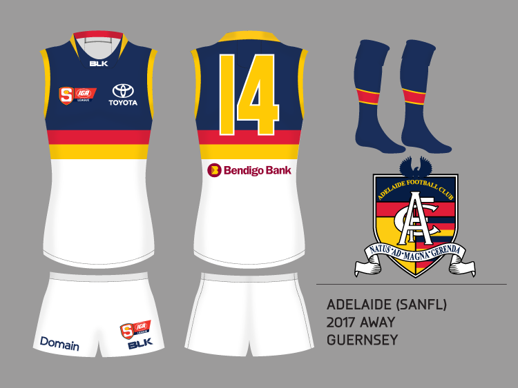
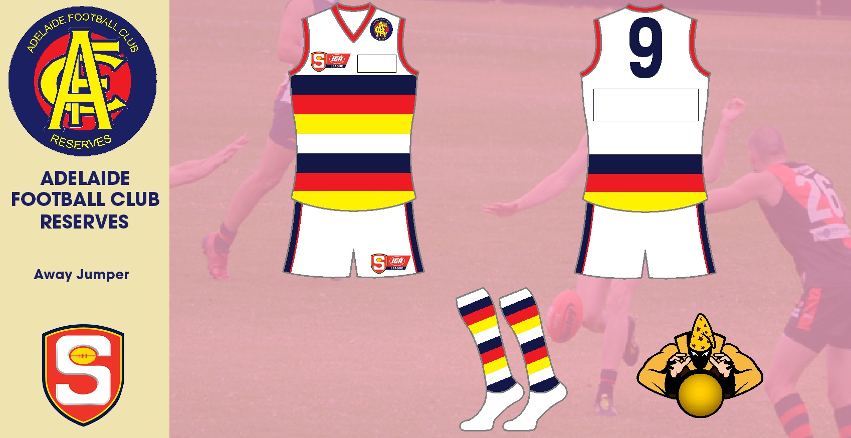
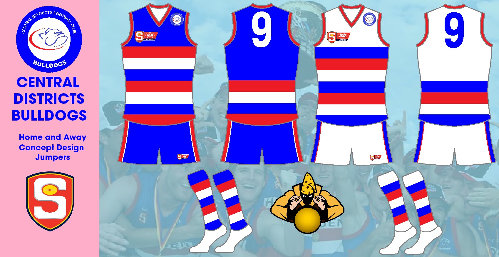
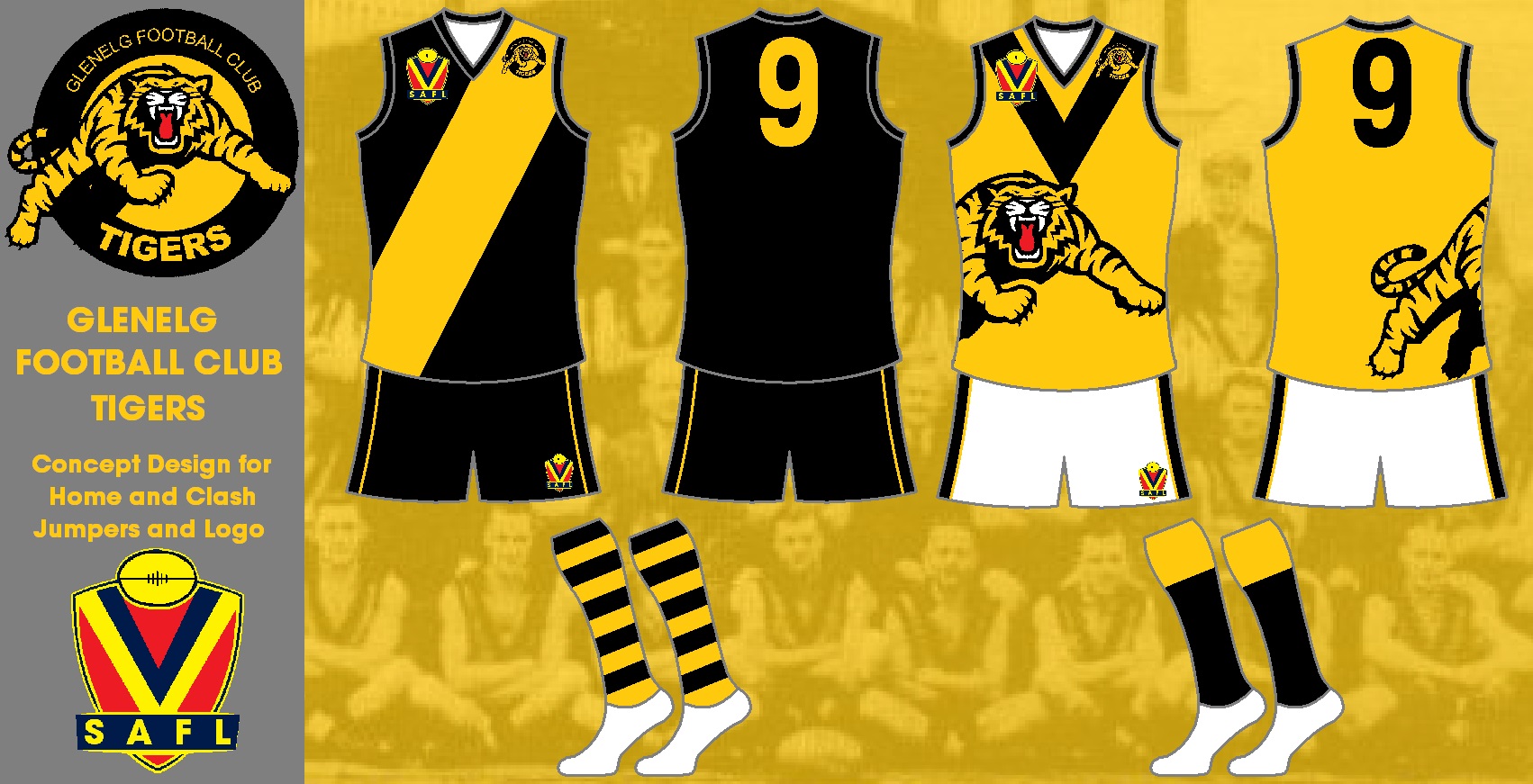
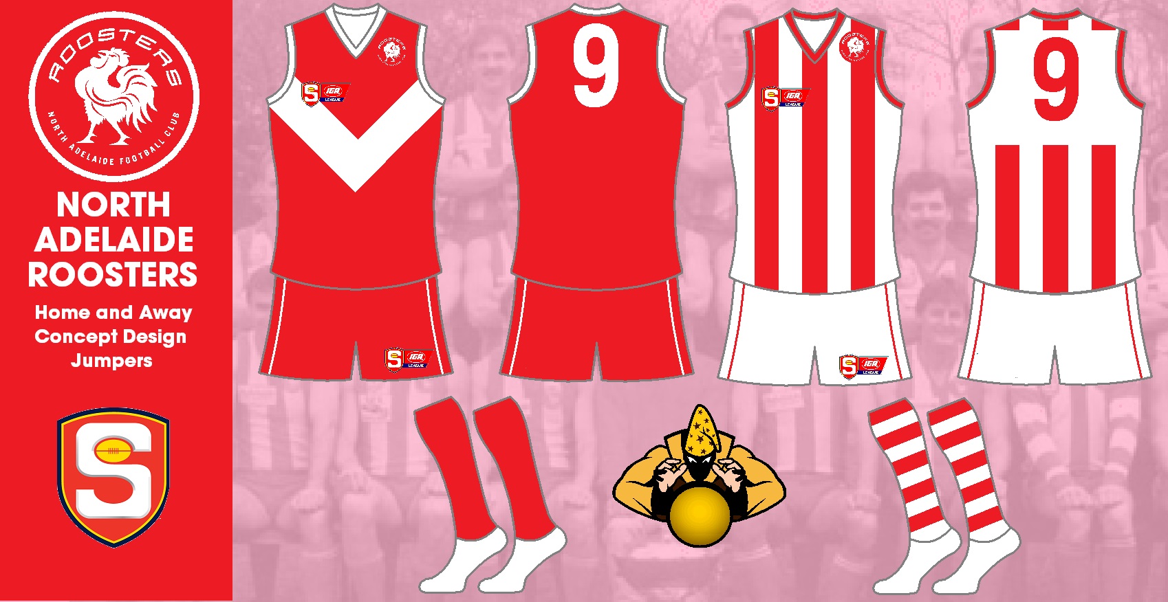
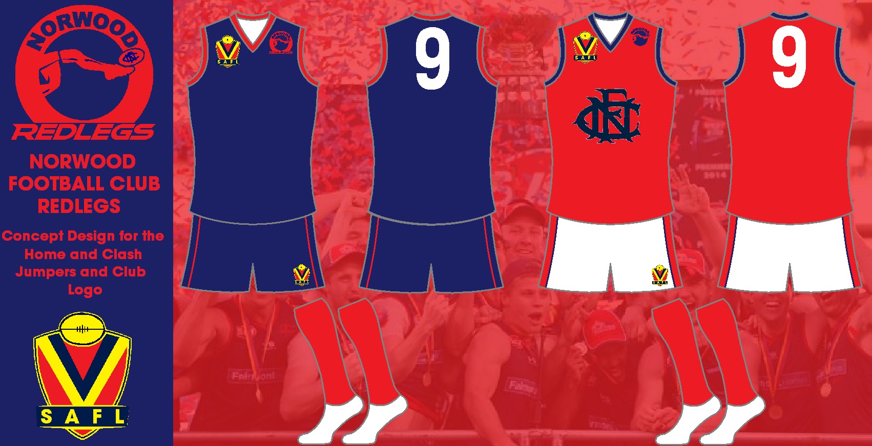
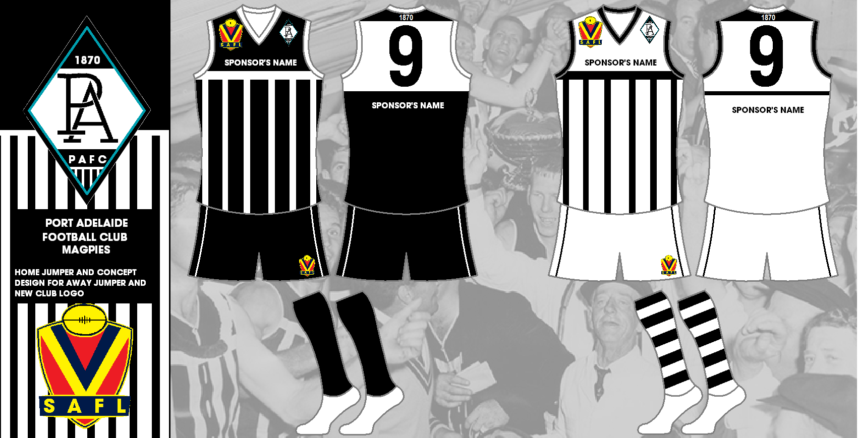
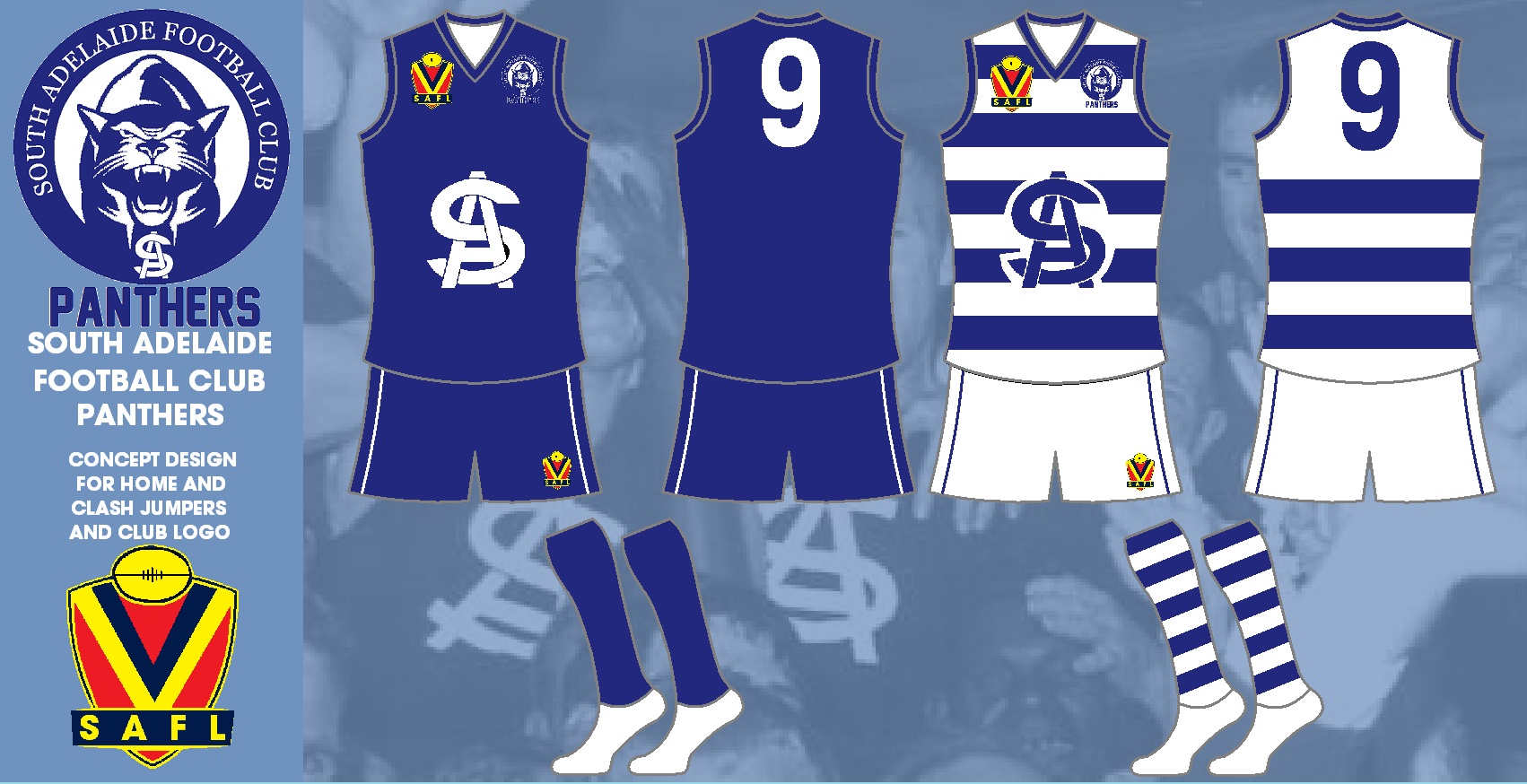
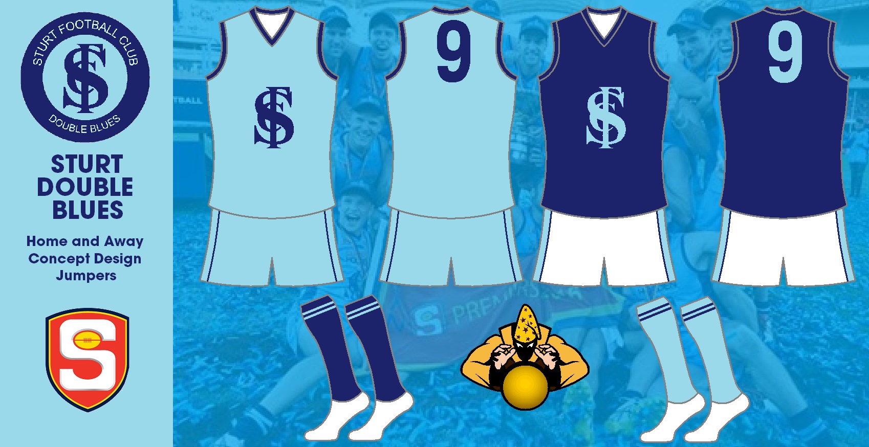
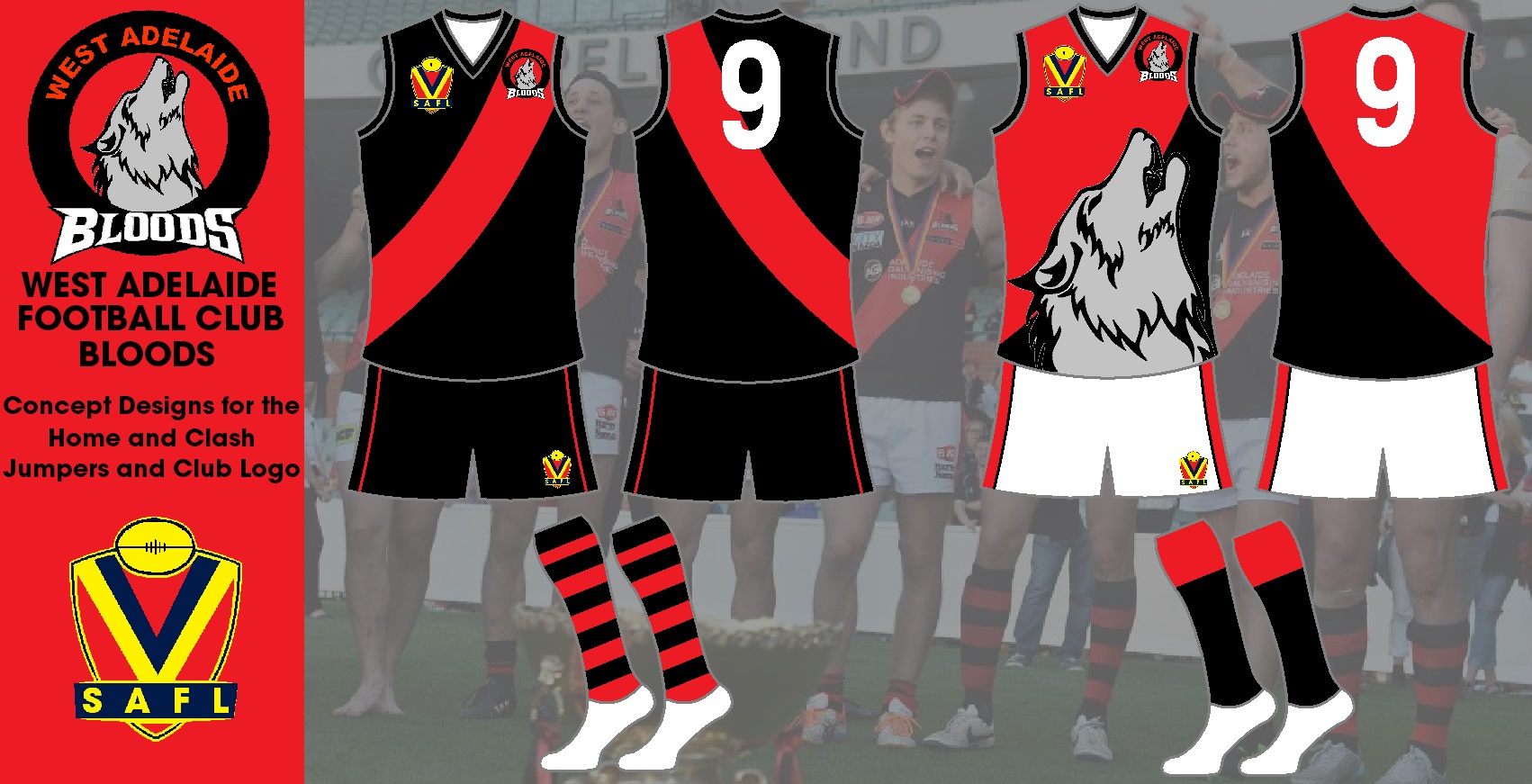
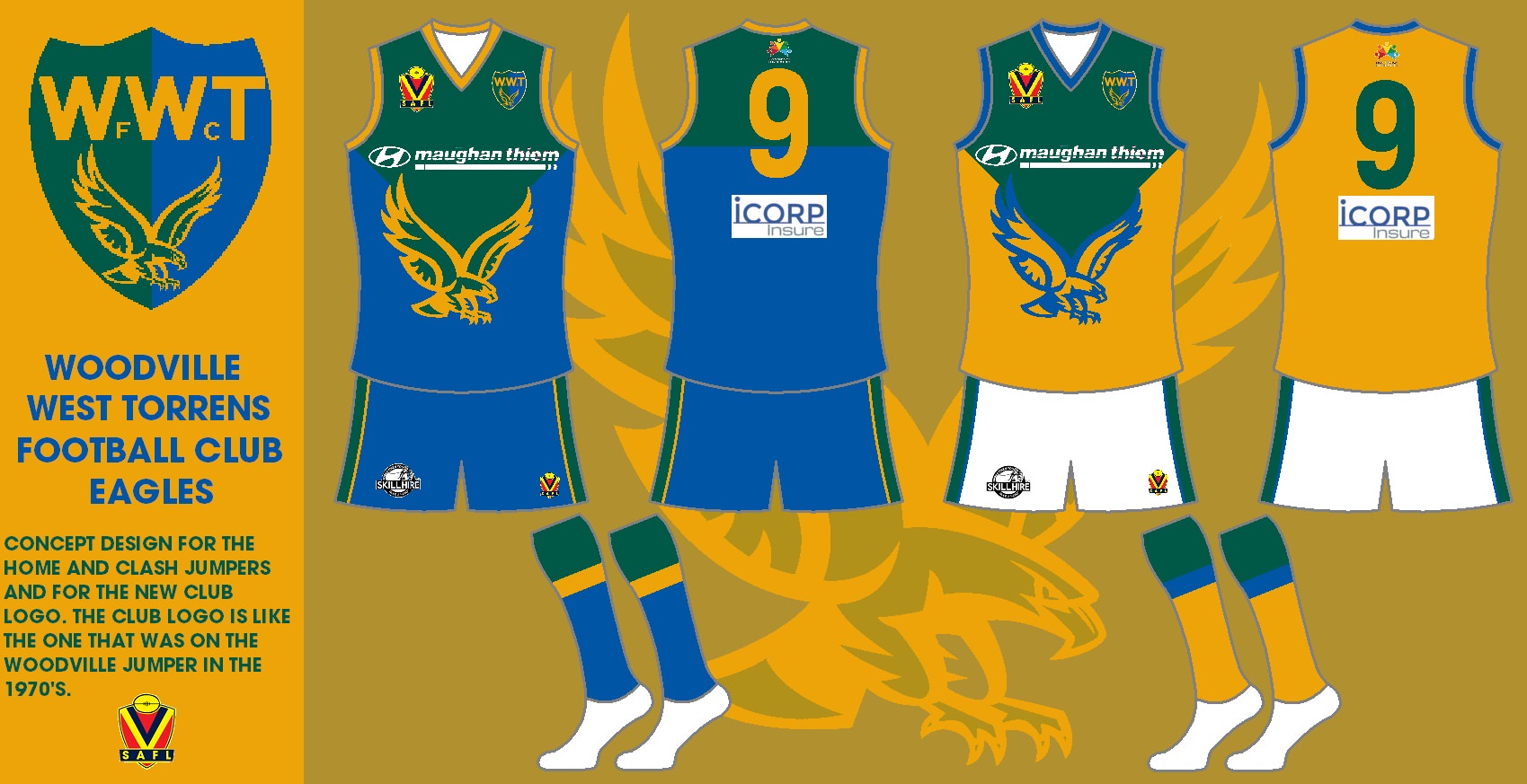
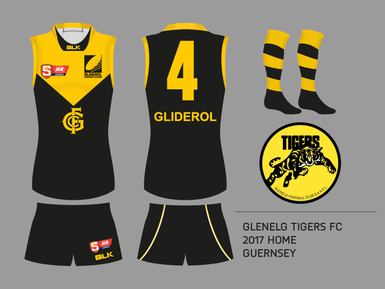
As you probably noticed in the title, this thread is about making new SANFL (South Australian National Football League) guernseys. This can also include logos or any SANFL related stuff that you can make new...

If you don't know much about the SANFL, go here
http://en.wikipedia.org/wiki/South_Australian_National_Football_League

Get Going!!
 
Norwood used the old ISC template last year. Would look a lot better on the new template
 
Don't know how successful this thread is going to be due to the lack of non-SA interest in the SANFL but I'll give a few designs a go for sure.
I don't think that the current Adelaide guernsey is bad but it does bug me that they just don't make the design hoops. I mean, the 'wide v' design is so wide that it just looks like they had a problem with the printing rather than it being a standalone design. I've also ditched the rainbows and just repeated the design from the front onto the back.
TWKx4GW.png
 

Log in to remove this ad.

Here are the ones that I have put up on my thread.

Adelaide Reserves
ZHpQ9Ia.jpg


Central Districts
kLr4yme.jpg


Glenelg
4eU6hNG.jpg


North Adelaide
voHRZWk.jpg


Norwood
wneGG9H.jpg


Port Adelaide
cD7kYGW.png


South Adelaide
jD6ozYW.jpg


Sturt
DTSbGpd.jpg


West Adelaide
8Ql3vXY.jpg


Woodville West Torrens
aMOABLy.jpg
 
Last edited:
I've also ditched the rainbows and just repeated the design from the front onto the back.
I think most of their guernsey has to be white. Looks better than their current design, Maybe white back where the number is and keep the red n yellow hoop?
 
I reckon Centrals could do with getting the hoops on their socks the right way around:

View attachment 291132

I remember heckling a player lining up for a shot in the 2003 Grand Final with "Your socks are on upside down", so it's been like that for a while.
maybe the hoops on the jumper are the wrong way round? o_O
 
maybe the hoops on the jumper are the wrong way round? o_O

True, but I'd *like* to think the main item in the uniform is the jumper.

The Crows also regularly get their hoops upside down on miscellaneous paraphernalia.

467790_gl.jpg


At least the jumper and socks match up though - as far as my memory serves.
 

True, but I'd *like* to think the main item in the uniform is the jumper.

The Crows also regularly get their hoops upside down on miscellaneous paraphernalia.

467790_gl.jpg


At least the jumper and socks match up though - as far as my memory serves.
You've backed up a complaint about hoops being in the wrong order on misc. items with a picture of 3 crows players in ties.
They're not going to all get the ties tied in the correct order of navy-red-yellow, otherwise they'll just get misfitting ties.
 
You've backed up a complaint about hoops being in the wrong order on misc. items with a picture of 3 crows players in ties.
They're not going to all get the ties tied in the correct order of navy-red-yellow, otherwise they'll just get misfitting ties.

It's not about where they're tied.

Sloane's tie is different to the other two. His goes gold/red/blue whereas the others run the other (correct) way.

It's probably just a manufacturing fault.
 

(Log in to remove this ad.)

The eagles next home?

pmdilUXtp


(I didn't colour in the neck and shoulder on purpose, respectively)
 
The eagles next home?

pmdilUXtp


(I didn't colour in the neck and shoulder on purpose, respectively)
Nice concept! Maybe have the divide between the blue and green in line with the white curved line
You could also try sharpening the eagle & sponsors logos, lining up the Telstra logo with the SANFL one, and (my preference) adding yellow collar & cuffs. Probably need at least some yellow (& perhaps green) on the back to distinguish it from South.
I'd like to see them change to something like this, and relegate their yellow to it's rightful position as a clash jumper!
 
I've got a few different home kits that i've made, not necessarily original ideas but just what I think looks best.

GLENELG: My intention here was to move away from an AFL jumper because as classic of a look that it is, it just looks a bit amateurish these days when the SANFL is clearly the second tier of Australian Rules Football. I have tried to keep a traditional feel by using a guernsey used during the 60's with the club monogram at the point of the vee yoke.
lm7u05u.png

WEST: Out of fairness I would assume that if Glenelg would have to change their jumper away from an AFL design then West Adelaide would have to do the same. A simple inverse here is more than effective and sticks to a classic design.
BQqKrpn.png

ROOSTERS: As much as I love the current North Adelaide jumper I like the red and white stripes just that little bit more.
4gJRDDX.png

PORT:
I have introduced a teal yoke onto the magpies prison bar jumper as this is club now serves power reserves team and the jumper worn should reflect that.
QRcJyiC.png

As for the rest of the teams I would keep their home jumpers as they are currently, only tidying up the sponsors like I have done here into the AFL positions. This isn't exactly practical given the financial standing of these clubs but they really do spoil the fantastic designs on show in the SANFL.
 

Remove this Banner Ad

Back
Top