Navigation
Install the app
How to install the app on iOS
Follow along with the video below to see how to install our site as a web app on your home screen.
Note: This feature may not be available in some browsers.
More options
-


LIVE: Richmond v Melbourne - 7:25PM Wed
Squiggle tips Demons at 77% chance -- What's your tip? -- Team line-ups »


You are using an out of date browser. It may not display this or other websites correctly.
You should upgrade or use an alternative browser.
You should upgrade or use an alternative browser.
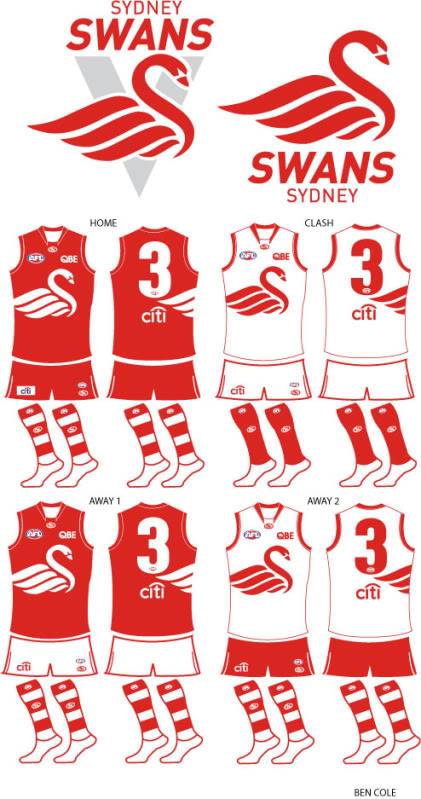
Workshop New swans alternatives
- Thread starter THEHIGHFLYINGHAWKER
- Start date
- Tagged users None
- Banned
- #2
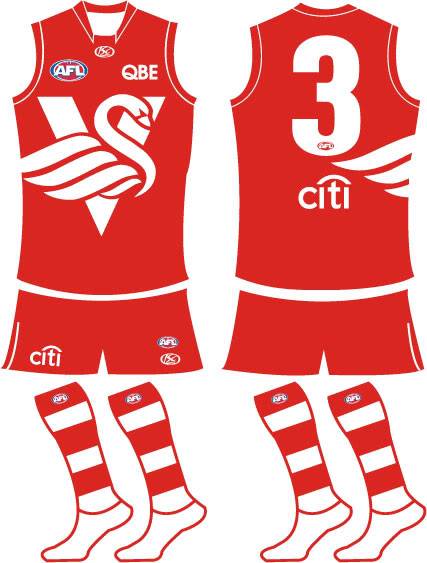
They are great, did you try it with a V tho?
THEHIGHFLYINGHAWKER
All Australian
- Thread starter
- #3
haven't tried it with a v, i'll give it a crack.
- Banned
- #4
Cool they look great as they are now anyway
THEHIGHFLYINGHAWKER
All Australian
- Thread starter
- #5
- Banned
- #6
It looks alright but it's better without it imo.
THEHIGHFLYINGHAWKER
All Australian
- Thread starter
- #7
i agree but thought i'd give it a try anyway.
THEHIGHFLYINGHAWKER
All Australian
- Thread starter
- #9
thanks gibby, i like the originals without the v too.
- Banned
- #10
The V concept looks very "North Adelaide" to me.
Yeah I was going to say that haha the V makes the jumper too busy
THEHIGHFLYINGHAWKER
All Australian
- Thread starter
- #11
yes i agree, i like simple jumpers with minimal graphics on front and back. easy to spot the numbers and doesn't look all scattered like the current hawks one and the crows alternative.
Willie Stark
Debutant
Only little nit-picking thing wrong with it is that the wings don't flow properly from the front of the guernsey to the back... Otherwise I love them.
THEHIGHFLYINGHAWKER
All Australian
- Thread starter
- #13
i got lazy willie so it was only a quick demonstration to show them on the back. my bad.
- Apr 5, 2001
- 2,454
- 105
- AFL Club
- Brisbane Lions
- Other Teams
- Mernda, Murch/Toolamba, Man City
That would be a great jumper for the Shepparton Swans in the GVFL
Punk Rooster
Rookie
I have no problem with that whatsoeverLove the original concepts. They could even go with the new logo for next year. The V concept looks very "North Adelaide" to me.

Swansea called, they want their logo back.
Yes it looks good, but what does it prove exactly? That another teams logo looks good on a plain red guernsey? At least the logo with a V is a good concept that can be expanded on (an original logo replacing that of swanseas).
And just to expand, before you think i'm an ass, I have no problem with people using existing logos. However, just chucking them on a guernsey isn't really a concept, it's a logo on a red background. You can't take that and think "oh that would make a good guernsey, just need to think up a new similar style logo" like you can with at least the V option because there isn't anything to it apart from the swansea logo..
THEHIGHFLYINGHAWKER
All Australian
- Thread starter
- #17
yeah it's an update on swansea's logo, not denying that for a second. however if you look closely i have made alterations. they would never use it but i thought it was a cool logo that needed a little bit more.
CM Sean
Premiership Player
I love these designs, looks awesome
Brenton Davy
Brownlow Medallist
Love the original concepts. They could even go with the new logo for next year. The V concept looks very "North Adelaide" to me.
And not a thing wrong with that either!
members section
Team Captain
none anywhere near as good as the current one
Similar threads
- Replies
- 61
- Views
- 3K
- Replies
- 15
- Views
- 2K
- Poll
- Replies
- 1
- Views
- 412
